


“Una croce per Villa Croce. Massimo Grimaldi inaugura la nuova stagione del Museo genovese.
E con la neo-curatela di Ilaria Bonacossa arriva anche il logo che non c’era
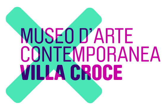
[...] E così, in cima al comunicato stampa, in bella vista nello spazio dell’intestazione, spicca subito una spessa croce verde, soluzione facile facile ma diretta, stampigliata sulla scritta in blu “Museo d’Arte Contemporanea Villa Croce”. Corrispondenza immediata tra segno e nome: un timbro, una preferenza, un simbolo matematico. Una X, semplicemente, che sull’invito diventa grigia, connotandosi come tipico logo camaleontico: forte nella forma, mutevole nel colore. In sostituzione di quello che invece non era propriamente un logo, ma una spoglia scritta dentro una casella rettangolare [...]”.
[...] E così, in cima al comunicato stampa, in bella vista nello spazio dell’intestazione, spicca subito una spessa croce verde, soluzione facile facile ma diretta, stampigliata sulla scritta in blu “Museo d’Arte Contemporanea Villa Croce”. Corrispondenza immediata tra segno e nome: un timbro, una preferenza, un simbolo matematico. Una X, semplicemente, che sull’invito diventa grigia, connotandosi come tipico logo camaleontico: forte nella forma, mutevole nel colore. In sostituzione di quello che invece non era propriamente un logo, ma una spoglia scritta dentro una casella rettangolare [...]”.
Helga Marsala, Artribune.com


There are many kinds of cross (in Italian, “croce”): this one does not live alone; it is reactive, dynamic, vital. Whenever is needed it changes
position, going up or going down through different layers, and each time it changes colour in a different way. A cross to choose, a cross to
delete, a cross to take upon oneself a responsability. A museum of contemporary art is a place where everyday someone has to take a decision to address the future of art and, on the other hand, visitors have to find everytime a new way to try to understand the present in a world that is changing very fast: to do that, people are often called to make a cultural, mental effort and this Brand aims to introduce them to this experience before visiting the oncoming exhibition. It does not want to be reassuring but surprising and encouraging. Typography and the “cross” play together creating new interactions between tradition and innovation, institutions and context, present and future.

