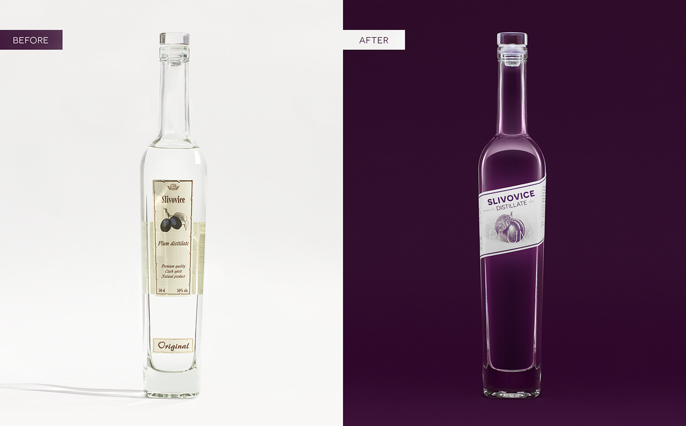
Task: to redesign a label for the line of fruit distillates.
LO'R Special Drinks produces distillates from the year 1994. The label design of its products didn't change from the very beginning until finally, the manufacturer came up with the idea of a redesign.
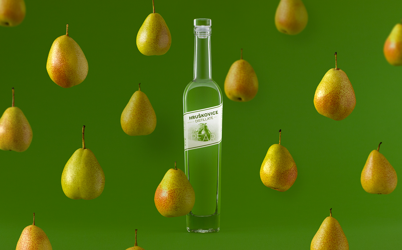
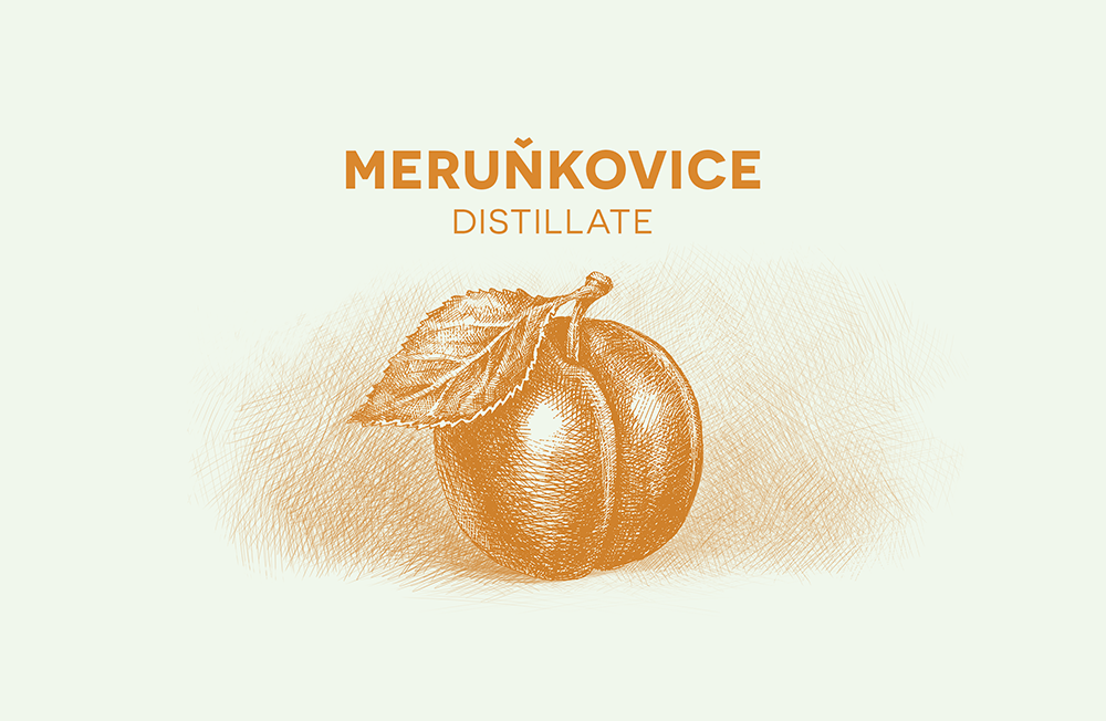
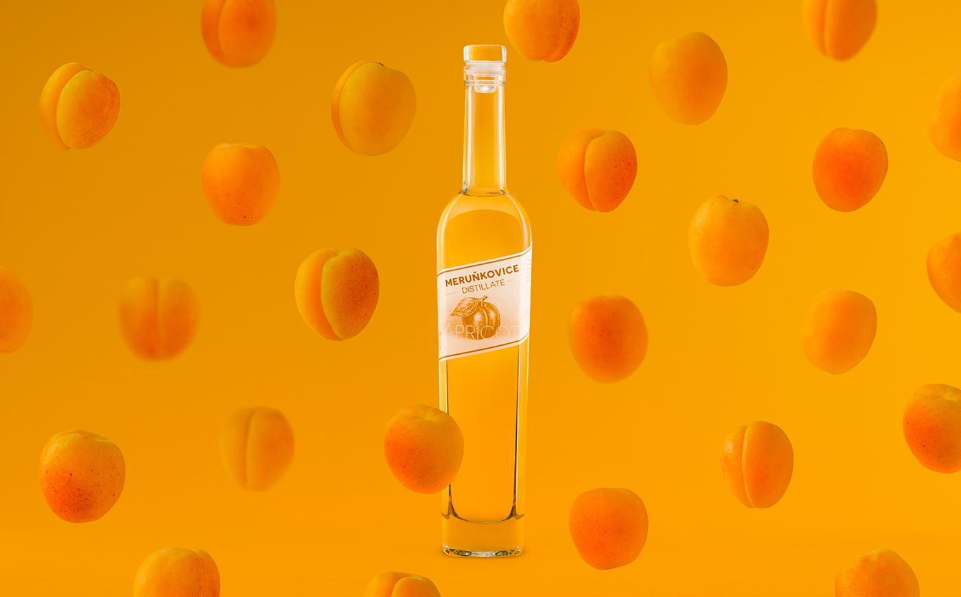
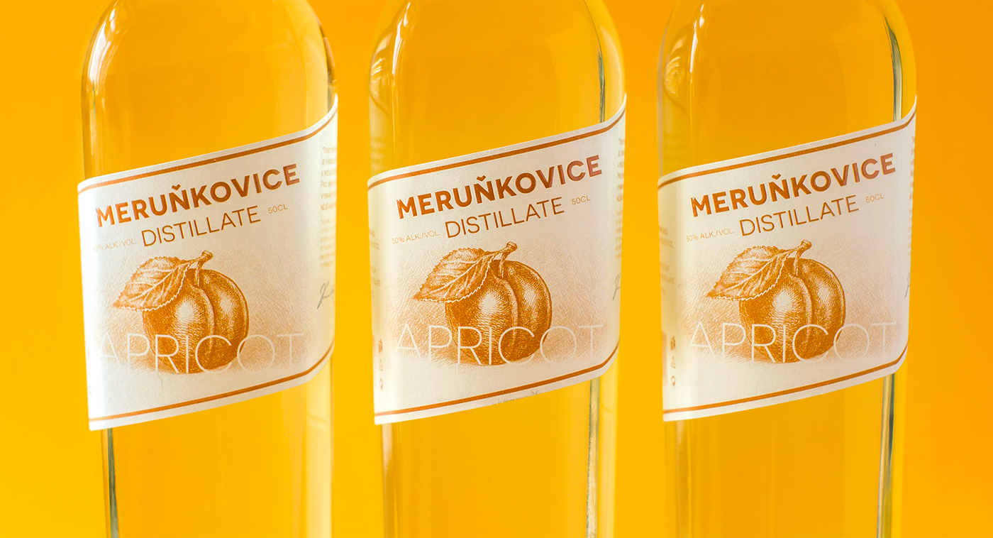
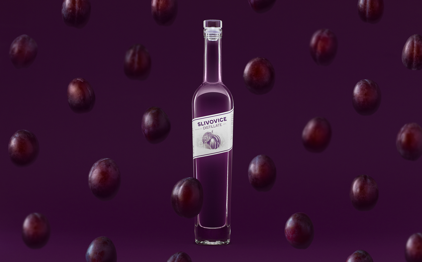
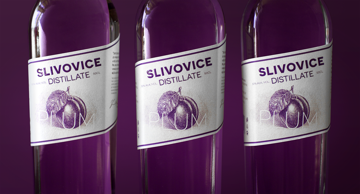
Fruit distillates are one of the most popular alcoholic beverages in the Czech Republic. Brands produce a variety of products of different quality and taste. There is even a "traditional guideline" for the label design, which the manufacturers try to follow and the customers are used to. It consists of an illustration of the main fruit ingredient combined with the name of the product. The main goal of the redesign was thus to keep a traditional layout but to add a fresh look to the label.
Solution.
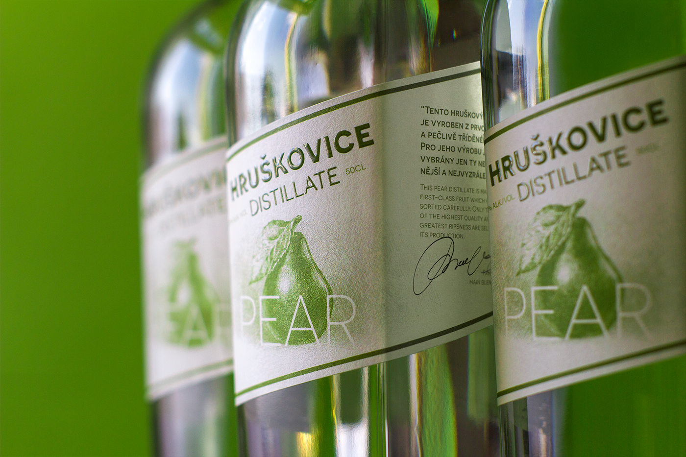
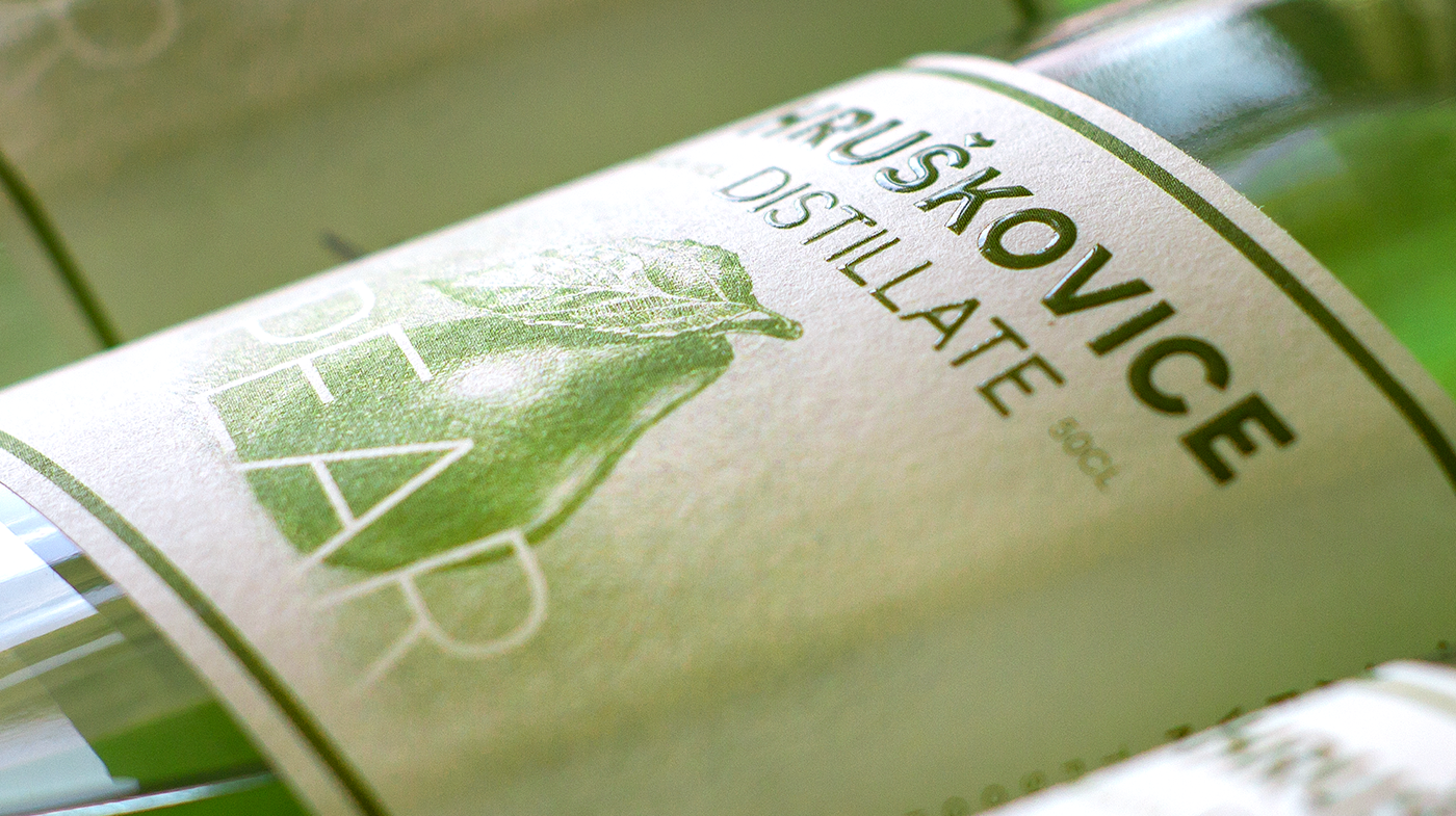
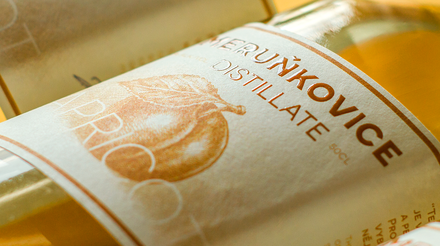
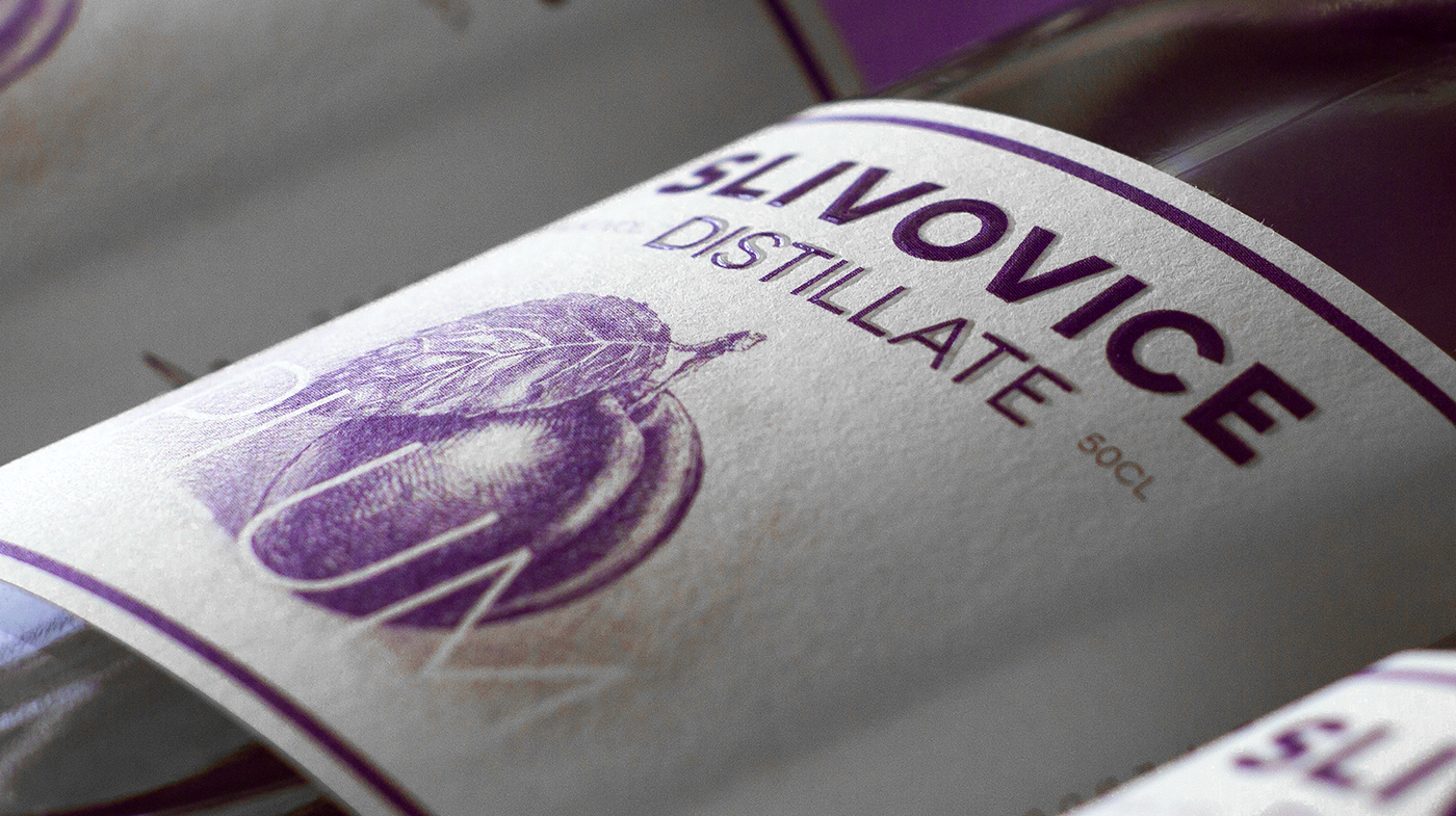
To add a handmade touch and support the tradition, minimalistic pencil illustrations of fruits were chosen. They were drawn with passion for detail and accuracy. All unnecessary information was removed from the label to make it clear and well-balanced. A combination of modern Sans-Serif font and hand-drawn illustration was the right choice. This way the classic style of the label was preserved, while a fresh look was added.
The originality of the label is in its diagonal format. It adds inner movement to the composition. Also, it reminds of a ribbon worn on the chest, once more, referring to traditions. Framing lines gently accentuate the shape of the bottle and support the dynamics of the label.