


One of my dream jobs as a lettering artist would be to work for an NBA team or even for the NBA itself. I'm always super excited when my love for lettering and basketball start to intertwine.
In the 2018 Finals the Golden State Warriors and the Cleveland Cavaliers matched up for a record fourth year in a row. This Finals was a little different from past three though–and no, it wasn't because the Cavs were massive underdogs–but rather it was because the NBA changed up 'The Finals' logo.

When the NBA debuted the new logo, I think it was safe to say most fans weren't digging it–myself included. I felt it was just so underwhelming, not to mention the addition of the YouTube TV logo being thrown on it as well.
I decided to make my own logo that was inspired by the old Finals logo.
So my design birthed out of this hypothetical scenario, where the NBA comes to me and says "Hey Scott we absolutely love your work. Can you redesign The Finals logo for us?" And I go, "Are you kidding? Absolutely! I'm sure you'll love it!" And they do!
Seriously though, I don't really see this as a redesign, but rather as fan art. I wanted to make this and see if NBA fans agree with me that the NBA Finals needs to bring back some of what was lost in the new design.
THE OLD LOGO
I felt like The Finals itself lost some of its elegance when the NBA got rid of the old logo. If you're not sure what I'm talking about, here's what the old logo looked like:

Now the NBA has played with different variations of the logo, but it's remained pretty much the same since its inception. It originally debuted in the 1986 NBA Finals (shoutout to the '86 Celtics) and graced the NBA's championship series until 1995 when the NBA went with a variety of different designs. That is, until 2004 (shoutout to the '04 Pistons) when the script logo made a comeback.
The NBA used this version of the logo until last year (2017 Finals). Then in September of last year, the NBA announced a new set of logos for the Playoffs, Eastern and Western Conference Finals, as well as the NBA Finals. Like I said, I felt like The Finals lost some of its elegance when the script logo went bye bye. I mean, The Finals are the height of the basketball world, let's have a design that reflects that.
This year's Finals also marks the first time (at least from what I can remember) that we've seen any type of sponsorship actually put into the logo itself (what up YouTube TV?).
THE DESIGN OF THE OLD SCRIPT LOGO
I've been watching the NBA for well over 20 years and I have a ton of good memories wrapped up in that old Finals logo. When I see it I'm often reminded of:
- The '04 Pistons destroying the superteam Lakers.
- The '08 and '10 Finals featuring the Celtics and the Lakers
- The '14 Spurs putting on a basketball clinic after losing the '13 Finals in heartbreaking fashion.
So while the old logo brings back some fond memories, that's not to say it was a perfect logo by any means. When envisioning what my take on the logo would be, there were elements I thought should reused from original design and things I thought should be fixed.
Let's start with the good.
There are three things that I believe made the old script logo memorable:
- The crossbar/shooting star connecting to the dot of the "i"
- The exaggerated swash on the 'F' that extended below the baseline
- The swash coming off of the 's' at the end
- These were things I wanted to keep in the design I made. I wasn't going for a drastic overhaul.
AREAS OF IMPROVEMENT

Here are the areas where I thought the logo could be improved:
- Some of the curves could've been smoother
- The star, which was the dot for the 'i' was too big
- The crossbar was coming in at a weird angle
- The 'The' could've been a little cleaner
My goal was to fix the areas that needed improvement, but try and keep what (I thought) made the logo unique and distinctive.
So here's how that process went...
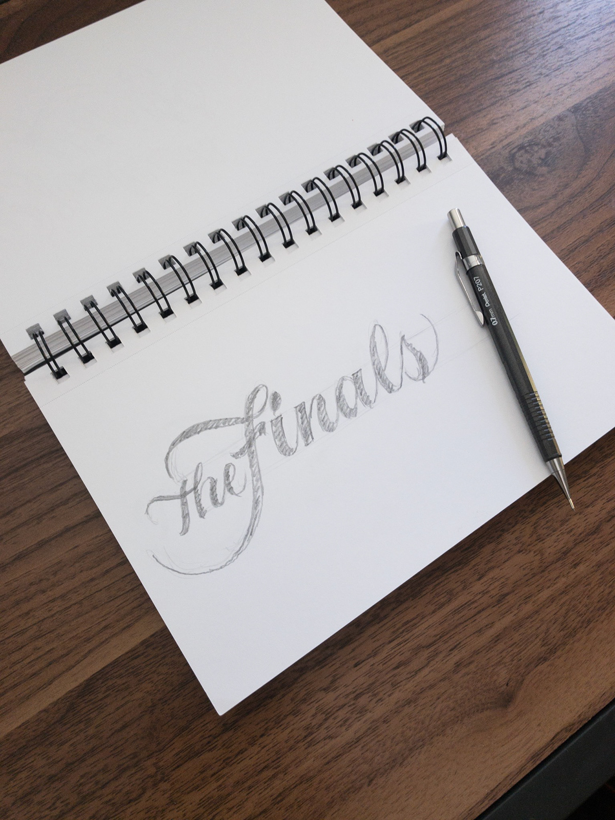
INITIAL SKETCHES

I scribbled around with a few "skeleton" concepts to see what might work. Since this was somewhat of an "updated take" on the old logo I didn't focus on any other styles except for the "elegant script" as I like to call it.
Once I felt I had a good idea of how I wanted the letters to flow, I began filling the skeleton out. Even at this point in the process I'm just looking to get something respectable, since I can tweak it and make changes once I start vectorizing on the computer.
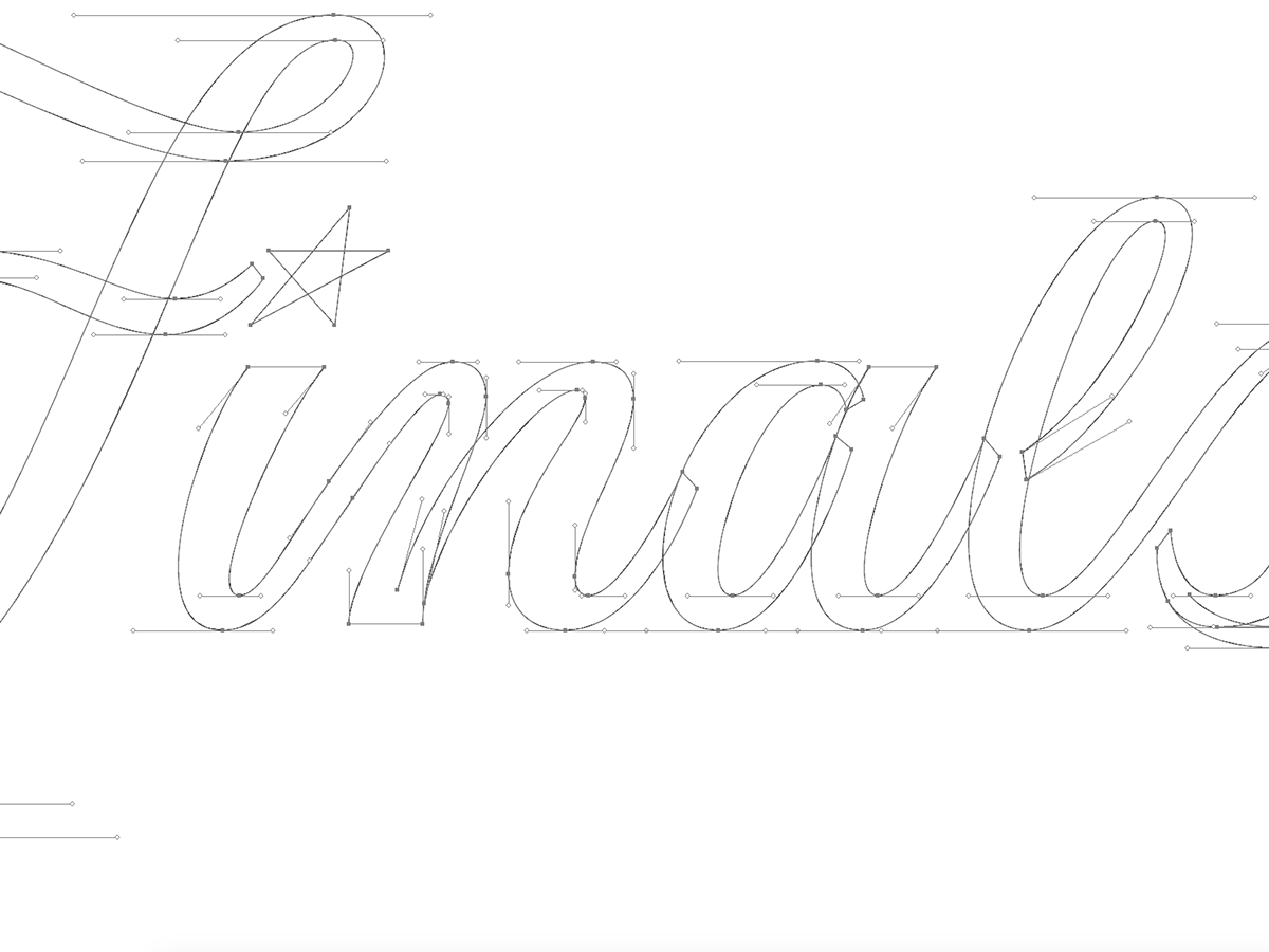
DESIGN WORK
Once I get a sketch that looks somewhat respectable, I'll start tracing it with the Pen Tool in Illustrator.
As I was working, I was started to wonder: Did the NBA decide to do a complete overhaul because they knew they were going to be adding sponsorship to the Finals? Did they have a hard time figuring out how they were going to place 'Presented by YouTube TV' next to the old logo? Was the easiest solution to just do a complete redesign? I think it's entirely possible that that's what the NBA might've been thinking.
Look how cramped the old logo was when they added the NBA logo to it:

It seems crowded. Now imagine adding a sponsor's logo to that.
So that was something I was mindful of when coming up with my take on the design. Here you can see I'm playing around with different lockups.

I ultimately settled a design similar to this, which allows the NBA logo as well as the sponsor's logo to coexist peacefully next to each other:
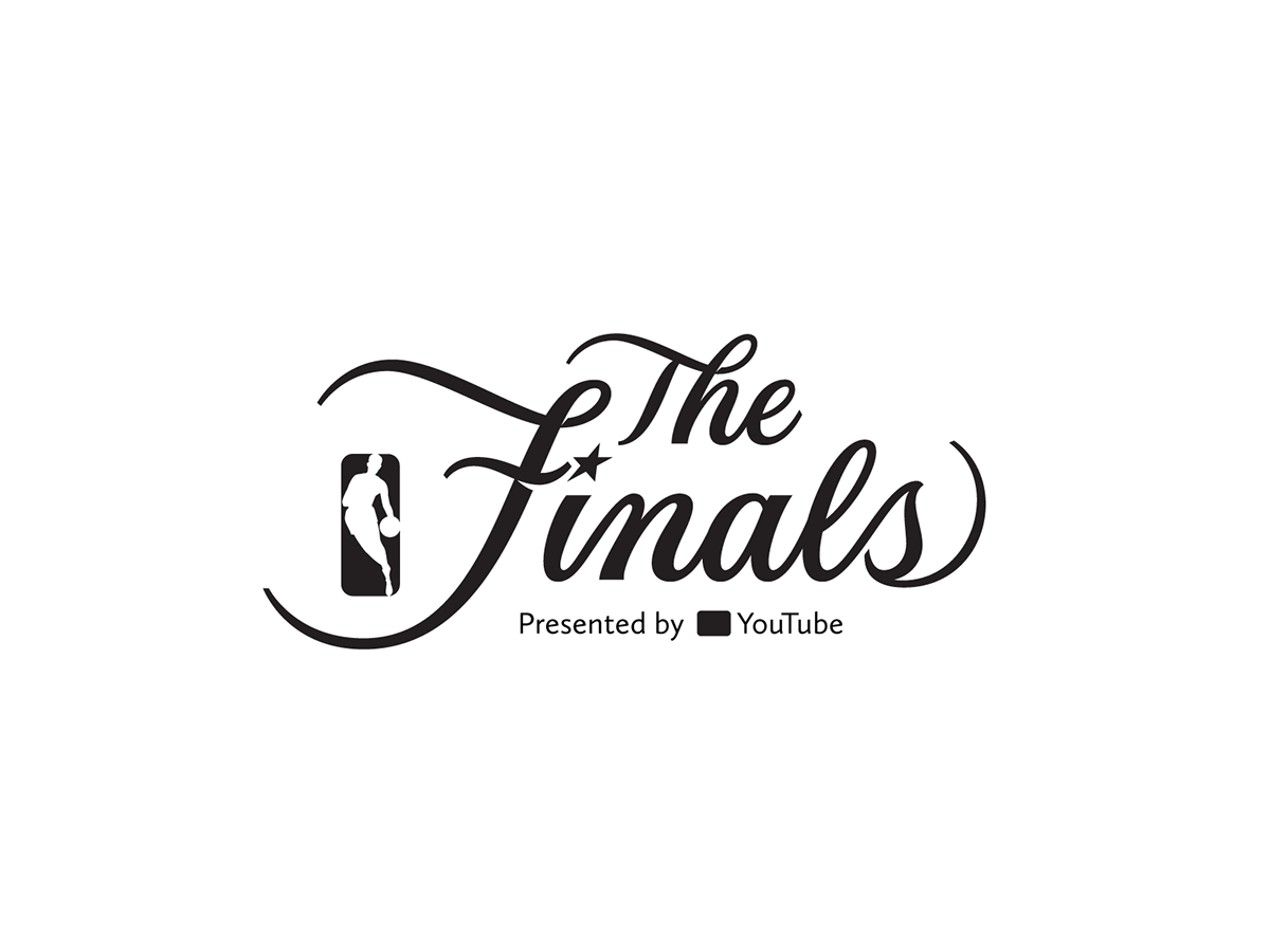
After a few days of making non-stop tweaks here and there, this is ultimately what I ended up with:
IN CONTEXT
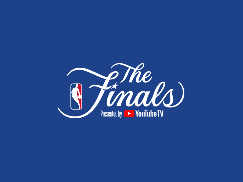
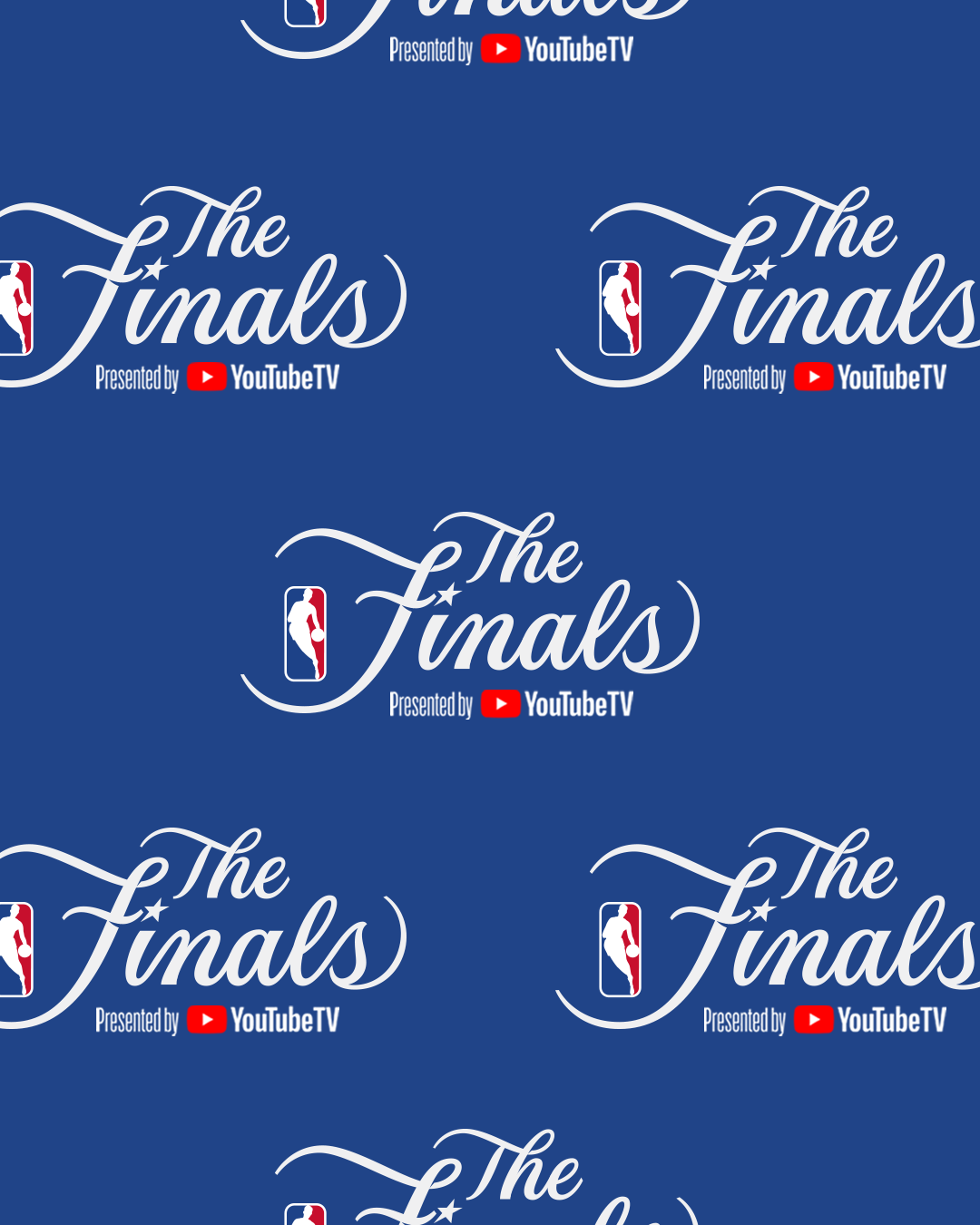
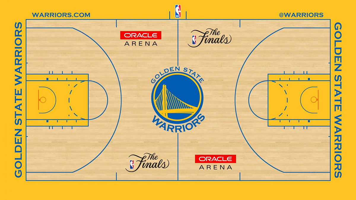
After I finished up with the design, it was time to start seeing what it looked like in various contexts. I added the NBA's official color palette, put it on a mockup of the court, and made a repeating pattern on a blue background--much like what you see when players and coaches are addressing the media.


If you made it this far, THANK YOU! I hope you enjoyed getting a peak at my design process. If you're a fan of the NBA and you weren't really feeling the new logo, let me know what you think about this one!
Peace.


