Back in 2015, I had the idea of pursuing a side project that revolved around the idea of selling basketball inspired products. I initially wanted to sell t-shirts, but had aspirations of selling other products as well.
With most ideas I have, I usually just put them on the back burner until I forget about them. But for some reason I didn't do that with this one--I actually pursued this one. In early 2016, I started constructing a visual identity for the brand.
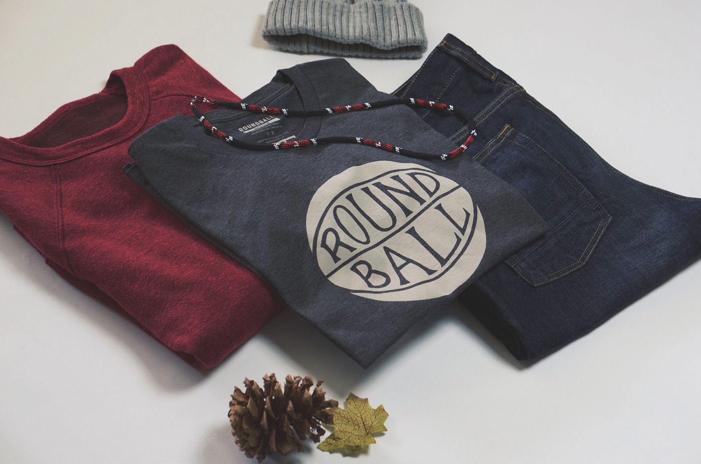
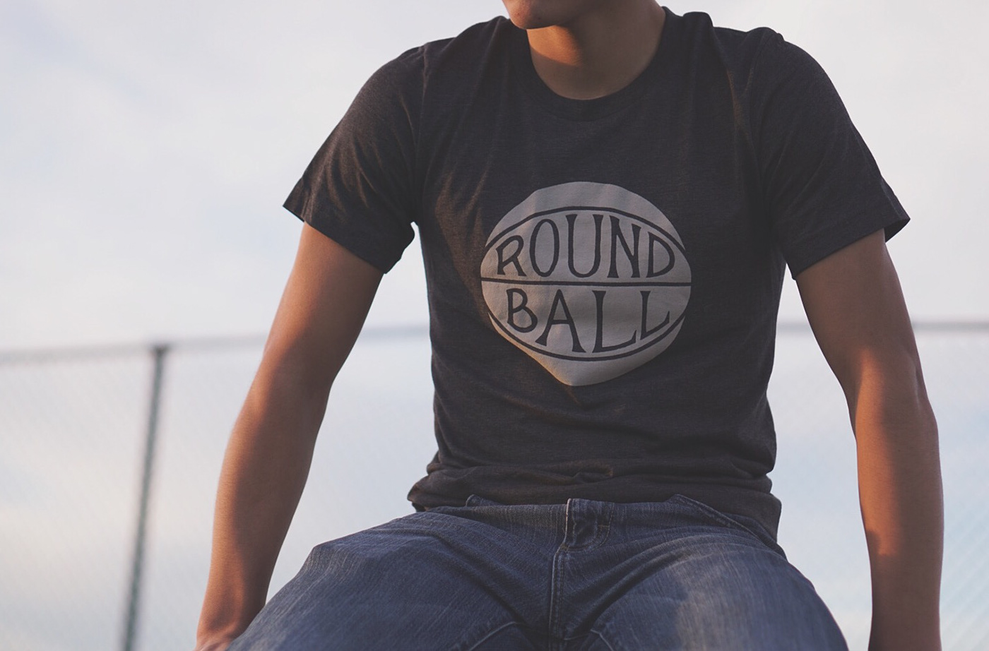
I ultimately settled on the mark you see above.
My goal was to create something modern, but yet had a vintage feel to it. That was probably my biggest challenge--combining those two contrasting ideas in a singular mark. Even to this day, I'm satisfied with how it turned out, which I can't really say about a lot of my work.
I also created a custom typeface for the brand as well. It was my take on the varsity-style, block type.

After that, I designed one of the t-shirts, which ended up looking like this:
I also did a weekly newsletter that came out every Friday morning. The newsletter initially started out as a curated list of the week's best basketball content from around the Internet. But then I had the idea to write my own articles to accompany the newsletter as well.

Six months in though, I decided to stop writing my own articles, and after one year I stopped the newsletter as well. The reasons for doing so definitely deserve their own blog post, but it came down to the fact this initially started out as a side project to sell some of my artwork that quickly turned into a weekly blog and newsletter. Being that I still work a regular 9-5, I didn't have the time to work on both lettering and my side project. It's actually more complicated than that, but that's what it boiled down to.
Was this project a failure? That depends on how you look at it. I definitely learned some valuable lessons, so we'll see...