Issho is a Japanese (with a British twist) restaurant based in Yorkshire.
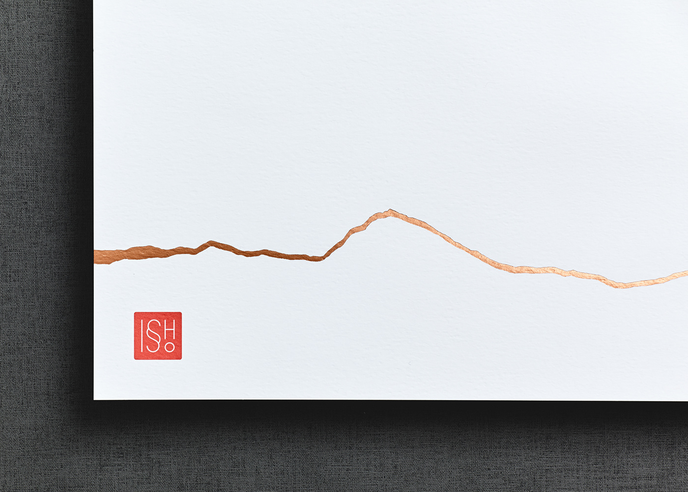
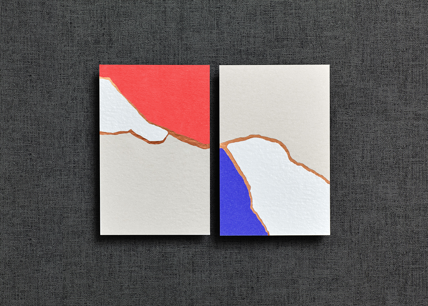
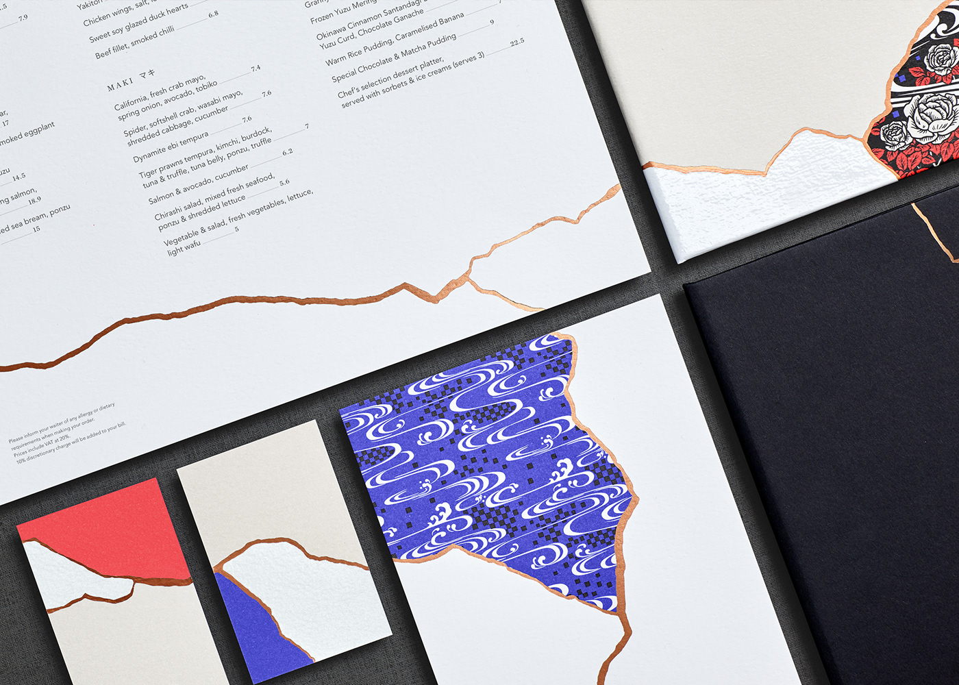
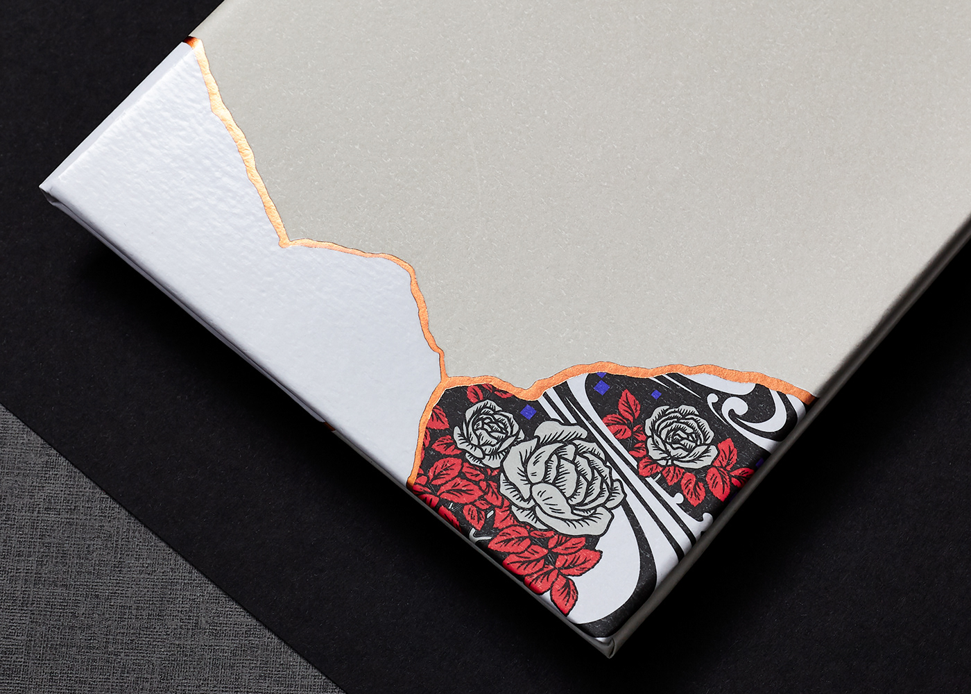
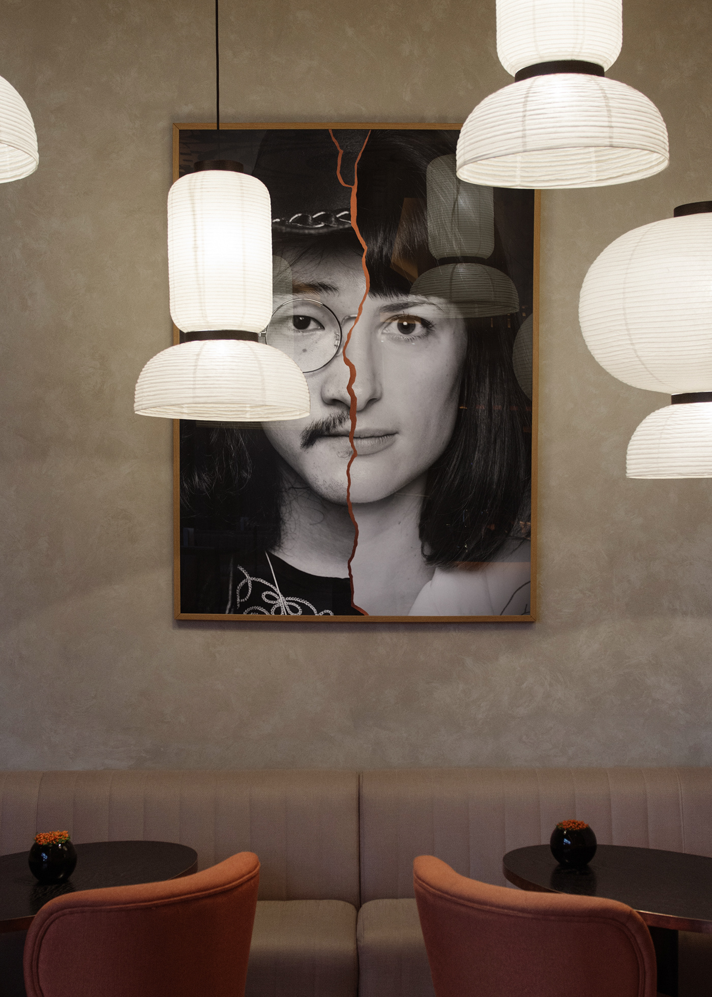
Issho translates to 'together' in Japanese, so the idea of ’togetherness’ was a theme throughout the branding with kintsugi being at the very core. Kintsugi is an ancient Japanese art form where repairing an item with gold joins makes the object more desirable than before. Often different pieces of pottery are used like 'patches' with varying patterns, colours and textures.
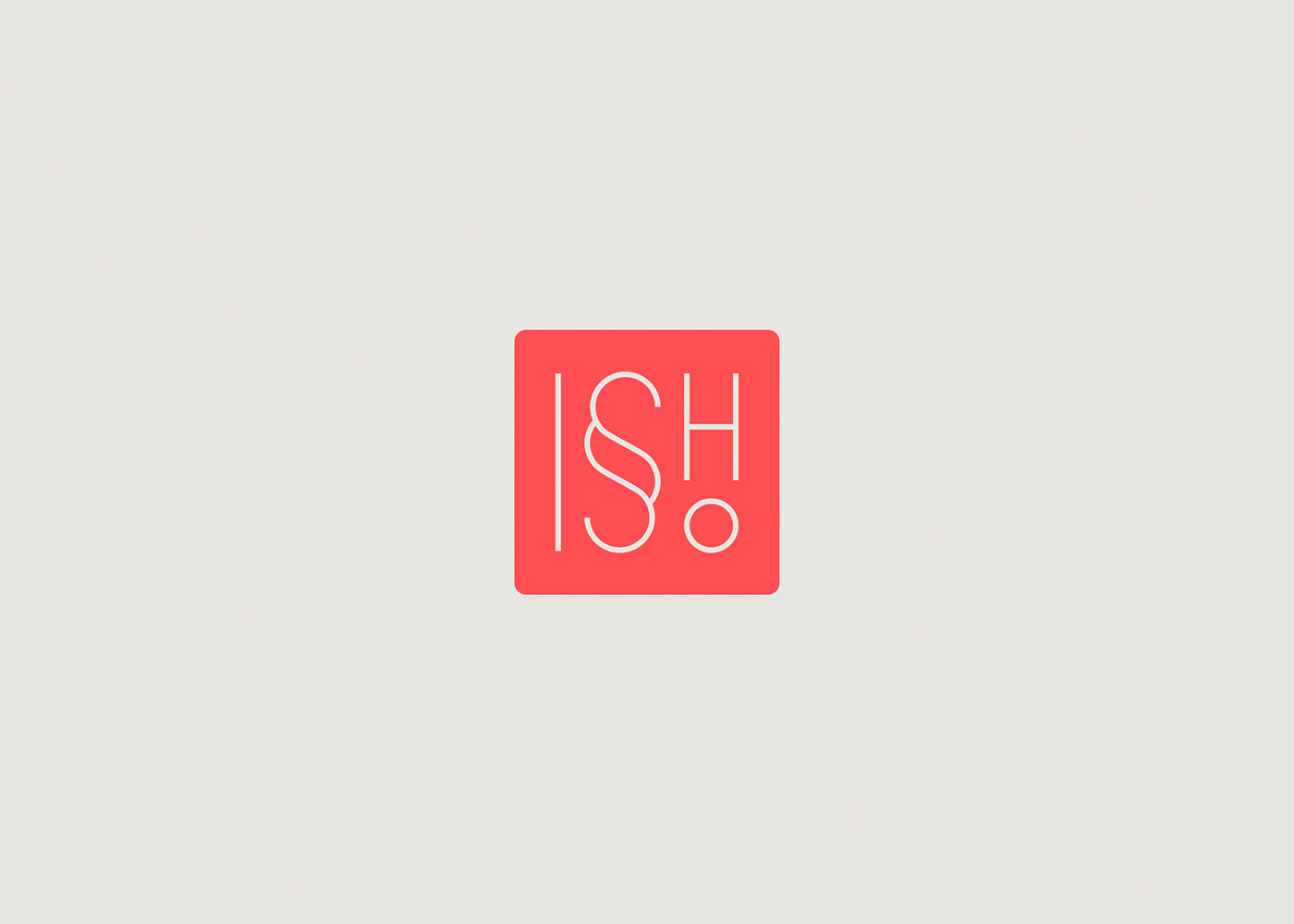
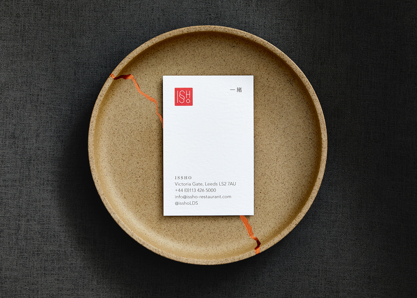
To echo this theme, the logo uses a 'double s' glyph within a hanko seal and used quietly, with the copper kintsugi join being the main focus.
The copper join is used in a single minded way across all menu and printed items, sometimes on its own in a way which disrupts the copy like on the food menu and other times with different finishes and patterns, for example the drinks menu has a pattern in one section, a UV varnish in another and a colour in the third.
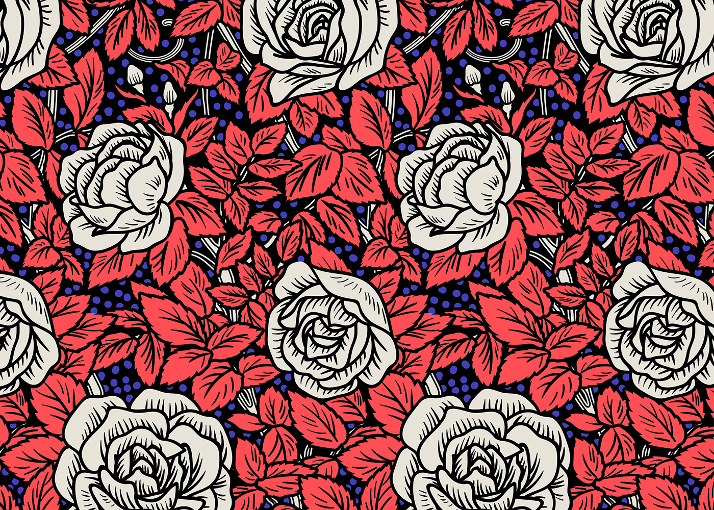
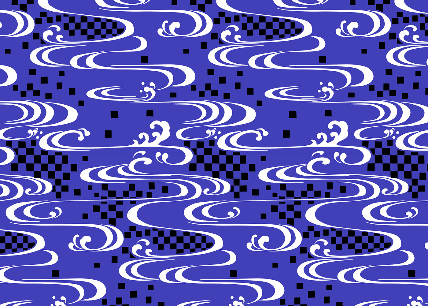
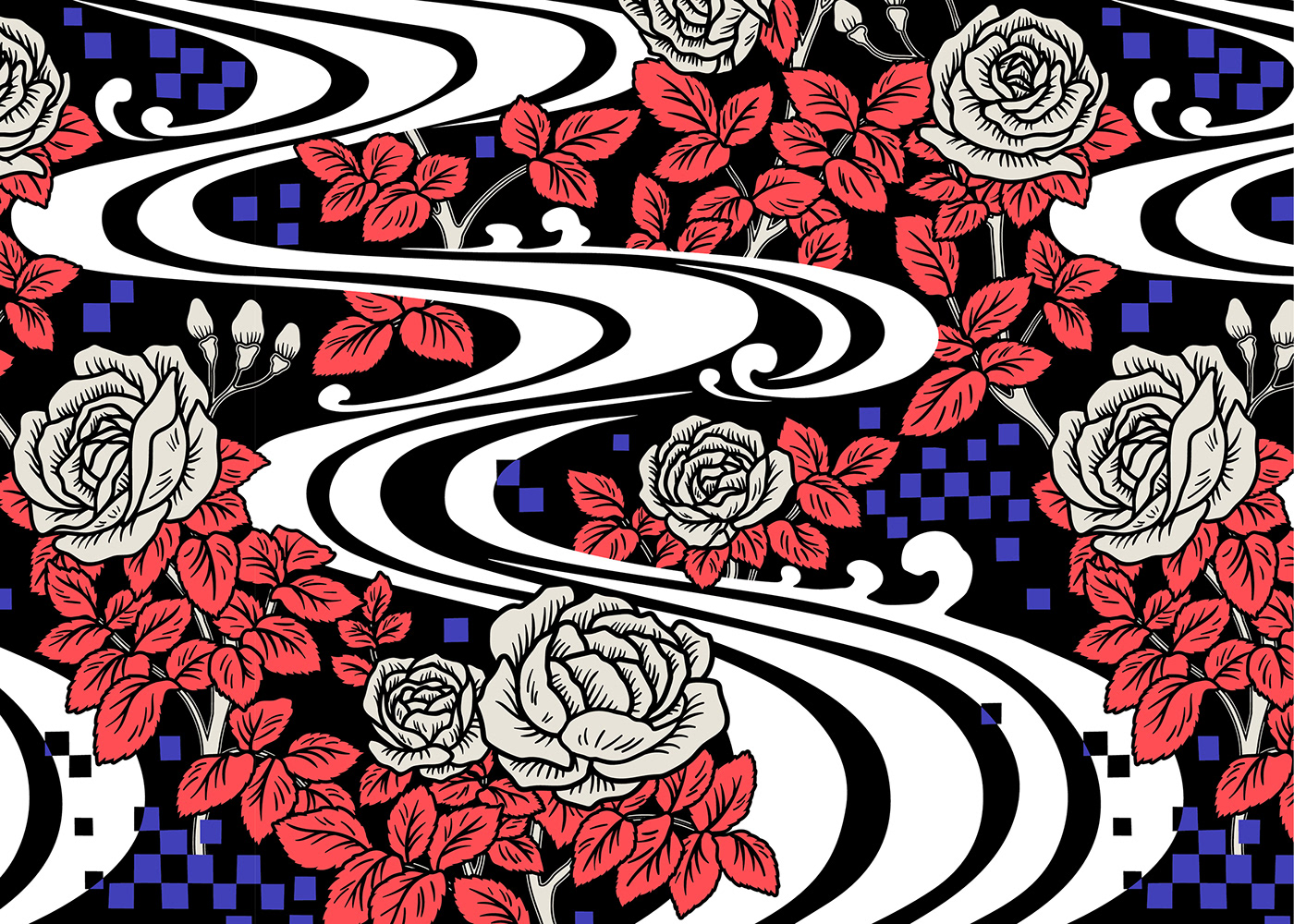
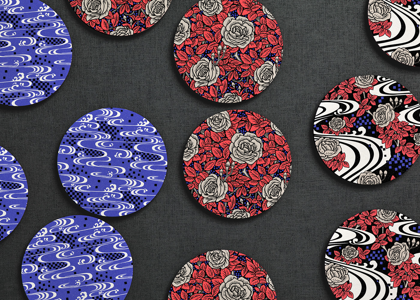
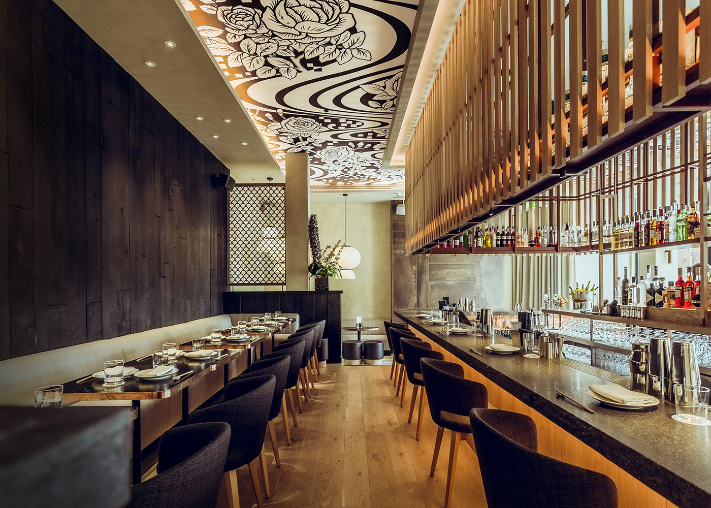
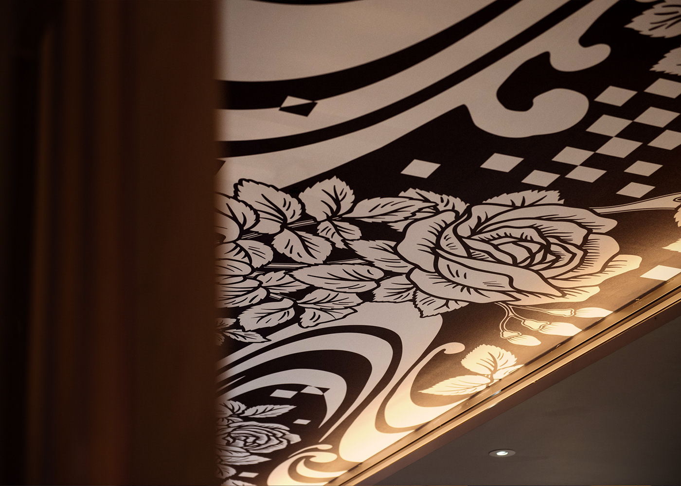
We created three modern patterns with the Japanese/British with London-based pattern house, Eley Kishimoto. As the restaurant is based in Leeds, The British pattern features the white rose of Yorkshire and to complement some of the water details in the interior (including fish scale screens) the Japanese pattern was created with an ichimatsu stream reference. A third pattern brings both of these two elements beautifully together. The black and white version of the third 'together' pattern was also used in the ceiling of the interior.
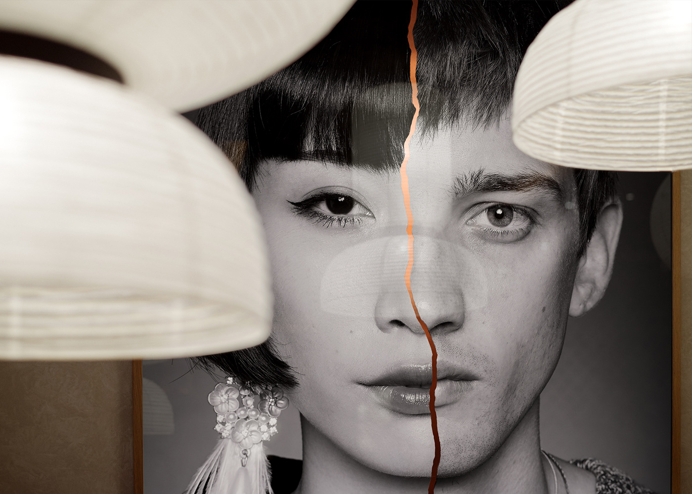
We created six large artworks of Japanese/British people, shot by Laura Lewis and Benjamin Bentley, joined by a large copper foil. These were hung in various locations within the space.
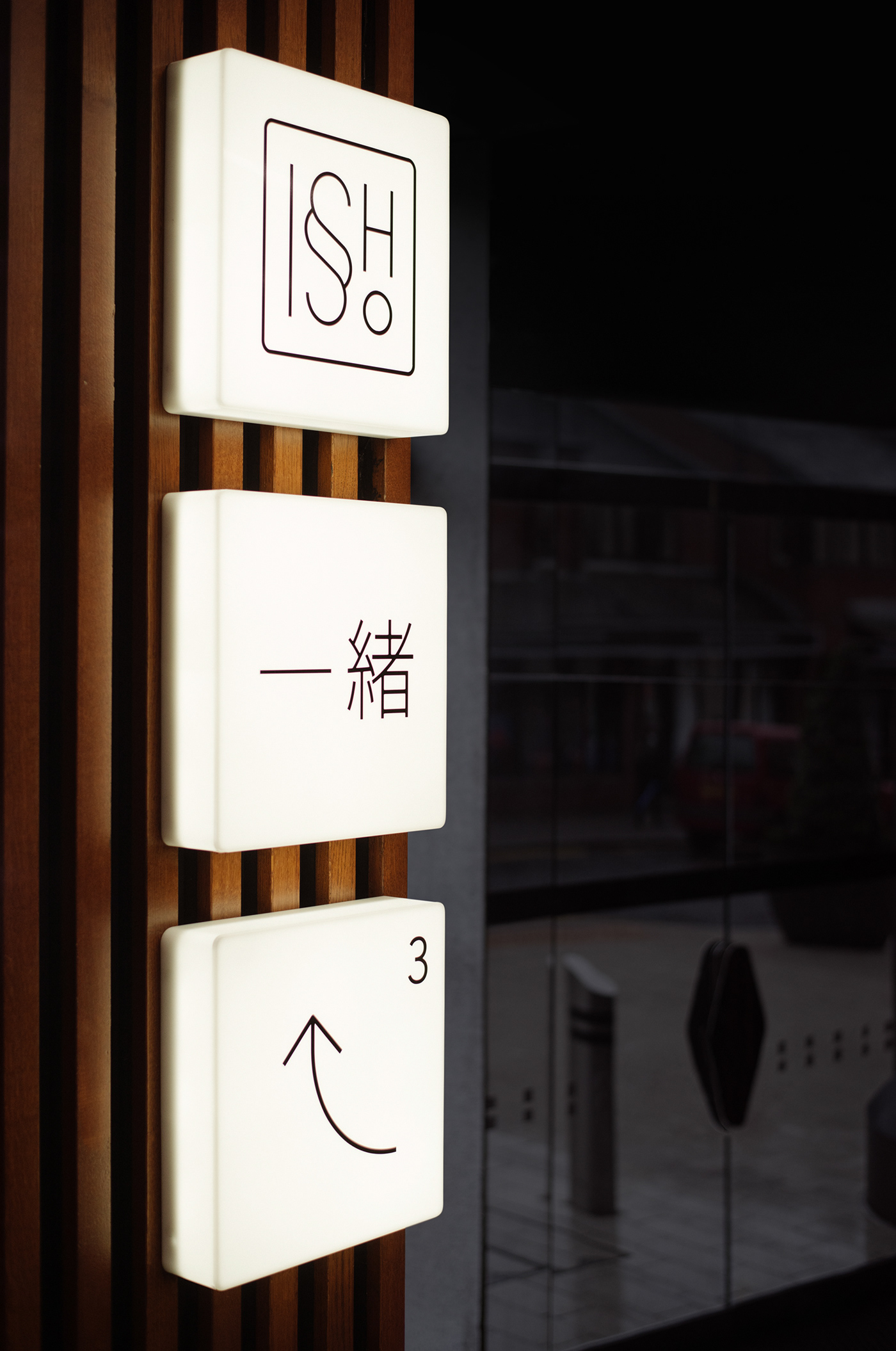
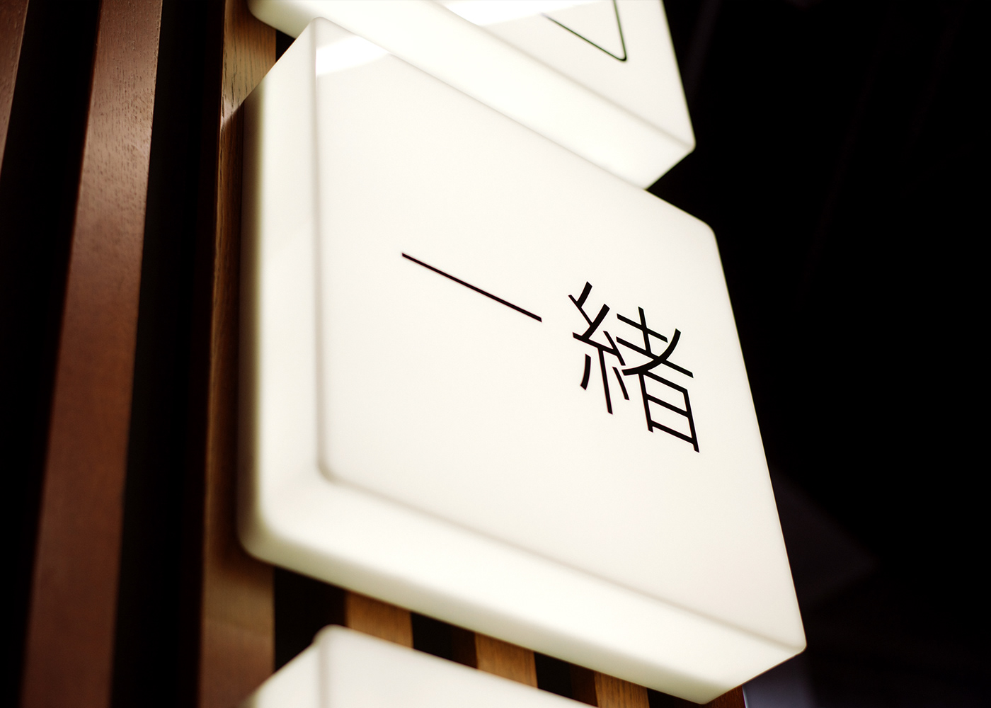
A distressed metal plate with a copper kintsugi join was used for the signage with warm light boxes used for directional signage to reference a traditional Japanese paper lamp stand
Finally, we had over 50 small plates and dishes made to act as the bill holders for the end of the meal.