


The German company Ehrmann has long been known in Russia as a producer of milk yoghurts and desserts with the same name. But this time Ehrmann comissioned our agency to create an absolutely new brand with no link to the company's parent brand.
A task
Ehrmann produced a great product based on the recipe of Greek yogurt: a thick consistency with a creamy taste, a natural non-caloric composition, various fruit fillers. The company's technologists did everything to make this yogurt a real treatment.
But how should the package look like? During the research, we realised that the category of Greek yoghurts is not entirely understandable to the Russian buyer, and in retail we can see Greek yogurts from different producers that look like twin brothers: all have a blue background, a Greek font, a pattern , columns. But what value do they all have for our buyer? It was clear to us that we had to offer a different decision for our client. Clearly, we need to create a new brand.
Decision
For large sales and wide scale of our client's business in the created brand, we needed to identify a powerful consumer trend. The yoghurt market is oversaturated with similar offers.
These same yogurts have a lot of protein and relatively few calories, and they have a natural composition. A large number of people are concerned about a balanced diet, it would be good if it was delicious and fun. Women, the main audience, already know that for any eaten dessert you have to "work out" on fitness or torture yourself with pangs, that there is no willpower! And what if you do not have to torture and do not have to work out?
"Pleasure without a sense of guilt" - a lot of protein, relatively few calories, natural composition is a great idea for a quick and healthy snack with pleasure.
So, the main idea of positioning was the topic of proper nutrition - a hearty snack with pleasure and without an aggravating sense of guilt for the eaten sweetness or sushi. Diet is the main topic in communications. The society is tired of artificial additives, unhealthy substitutes or even empty products that are not useful for the body.
Isn’t it a value, when you realize that everything has been done right and you get pleasure from it?
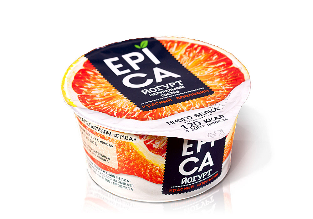
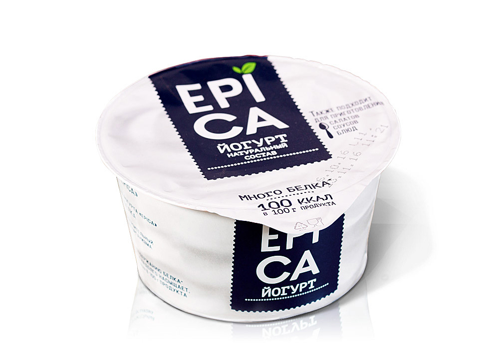
We thought that the new name EPICA emphasizes the nature and idea of positioning the product. Consumers have been waiting for a long time for a product like Epica - and it’s really an epic moment!
To support this positioning, we placed on the front side a block of text with the inscription "a lot of protein" with the indication of calories per 100 g of product, which indicates the functionality of the product. Without this small, but very important detail, communication would lose all meaning.
We wanted to show that the packing is the fruit itself. To create such a feeling, we needed the ideal fruit with impressive slices of pulp. The logo in this case should be placed on a contrasting line. In our case, it has a dark blue color, which perfectly corresponds to the category of yogurts standing on a cold shelf. White capital letters perfectly emphasize the logo and create a contrast with the dark blue color. All this helps to highlight the product on the shelf.
The EPICA yoghurt line perfectly integrated into the growing trend for healthy eating and caring for the diet. Today, the EPICA is a flagship brand in the Ehrmann portfolio with customer-friendly communication expressed in design and presentation of verbal information. Epica is a hearty and tasty and it’s really an epic pleasure!


