-----
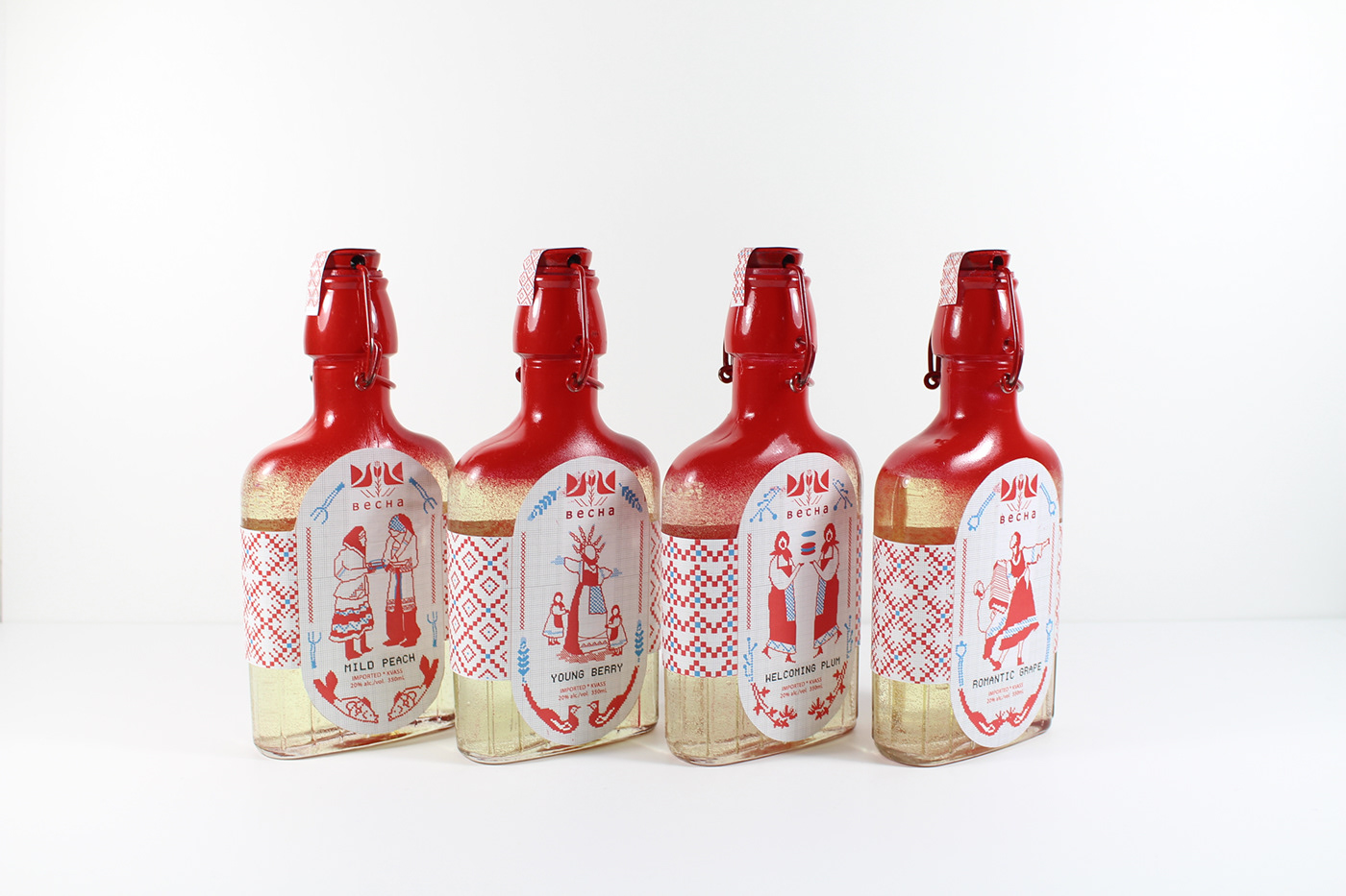
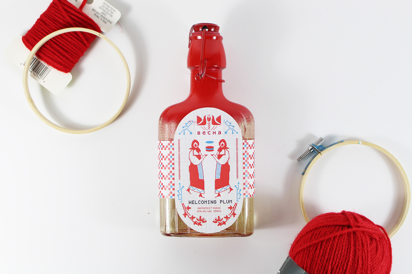
Becha is a beverage company producing Kvass, a traditional Russian alcoholic beverage made from bread in Russia. It is also the special commonly drunk during festivals. Becha means “Spring” in Russian and represents a vivid and energetic atmosphere. The package design is considered to do in an Eastern Slavic embroidery style, and package concept is based on the week-long festival of Maslenitsa which celebrates the beginning of Spring(Becha): a Russian festival concept with Russian classical drinking.
The Logo is consist of two sparrow birds and flower. Sparrow always appeared and tweet after winter in Russian so that people though the sparrow bird as the messenger of spring. The flower on the center is a important pattern which shows in Eastern Slavic embroidery. It is not only a element in spring but also fit the design style.
This festival has a duration of seven days with each day having special activities. The label design is based on these activities. There are six beverage containers, and each label shows a different day’s activity. The frame around each label are the symbols of spring which have a strong connection with Maslenitsa. The beverage also has the outer container, that is built from 12 embroidery hoops further reinforcing the packaging concept.


--------------
Thank you for watching


