
The Brief.
Need to create the visual identity for a new contemporary studio focused on architecture and interior design. Somehow it needs to be tuned with the Mexican culture, this could be applied to a Spanish name or by some means embedded in the brand’s DNA. Modern + Sophisticated graphics will be the key in this project.
The Name.
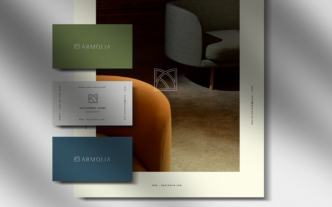
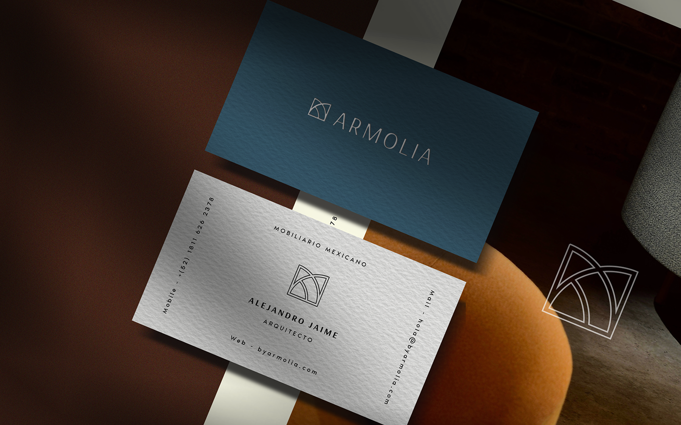
The name Armolia is a combination of two Spanish words. “Armonía” meaning harmony, will represent a variety of measurements and well defined detailing. The second word; “Mobiliario”, meaning furniture, define the main essence which they will be using to fulfill their client’s needs. Why? Because these are the actions the design studio will be making with every future project.
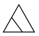
Transformation Glyph
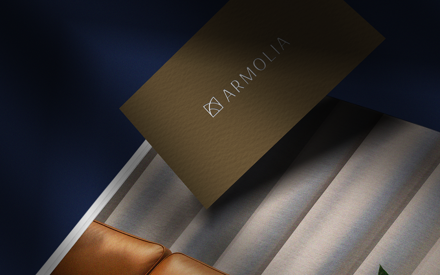
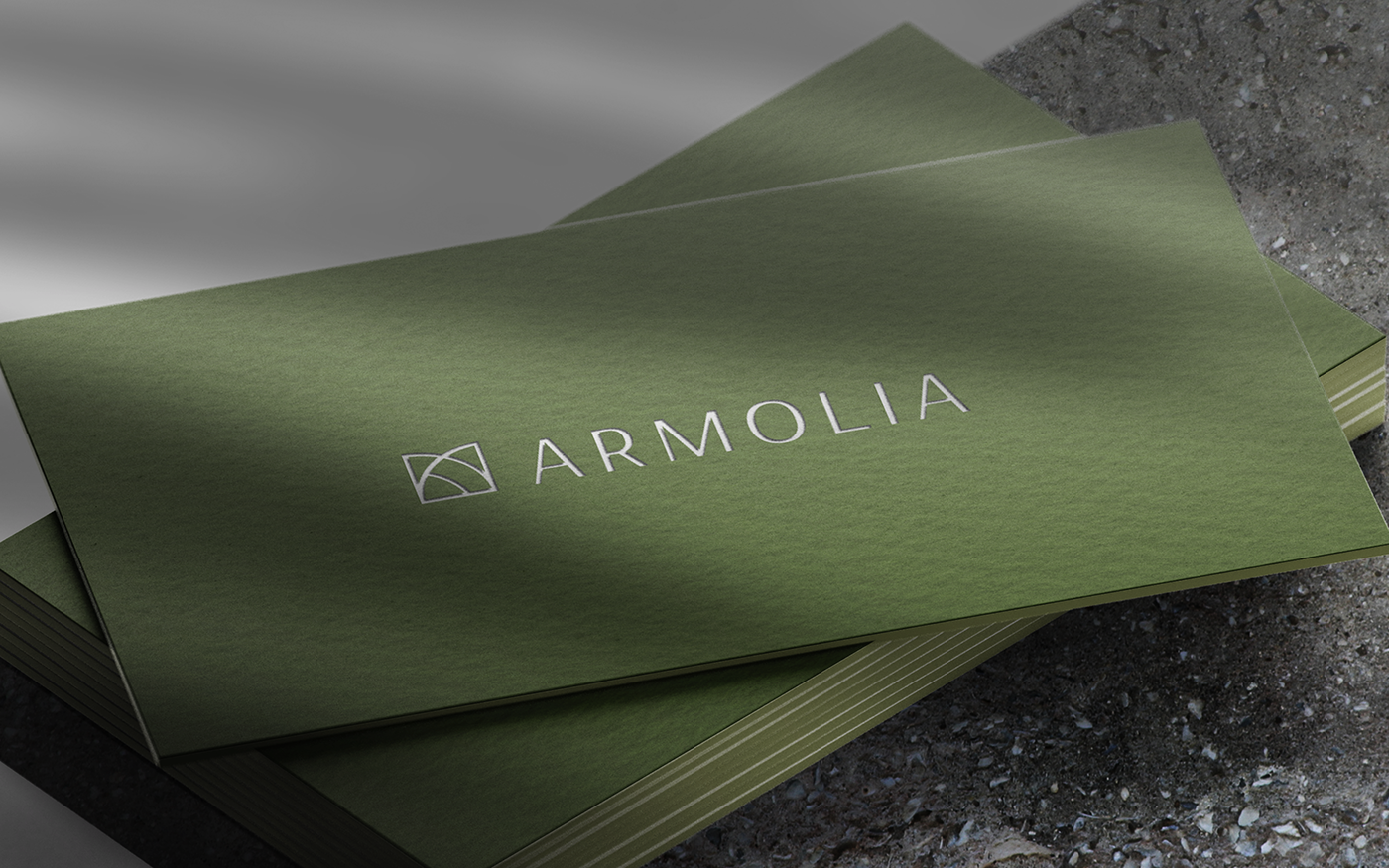
The Logotype.
Everything will involve around the glyph of transformation. Glyphs are symbols that represent something specific. In this case, it will portray change. Why transformation? Because it is the primary mission an interior & architectural studio can offer.
The proposal is based on the glyph representation of “transformation”. This means that the work that needs to be done will focus on the monogram of letters “A — M—A”. The icon create a defined and unique personality.
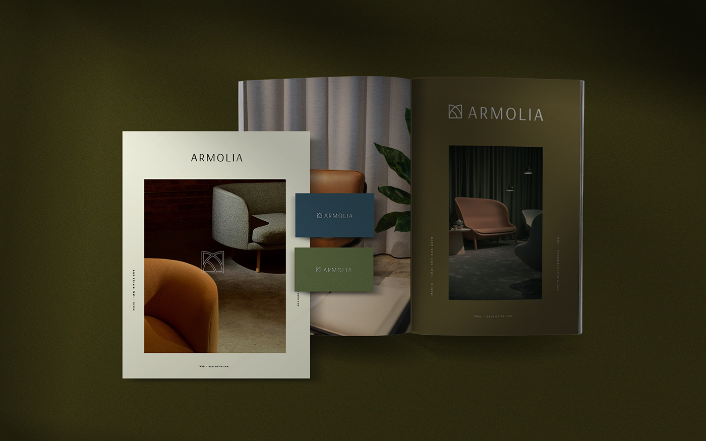
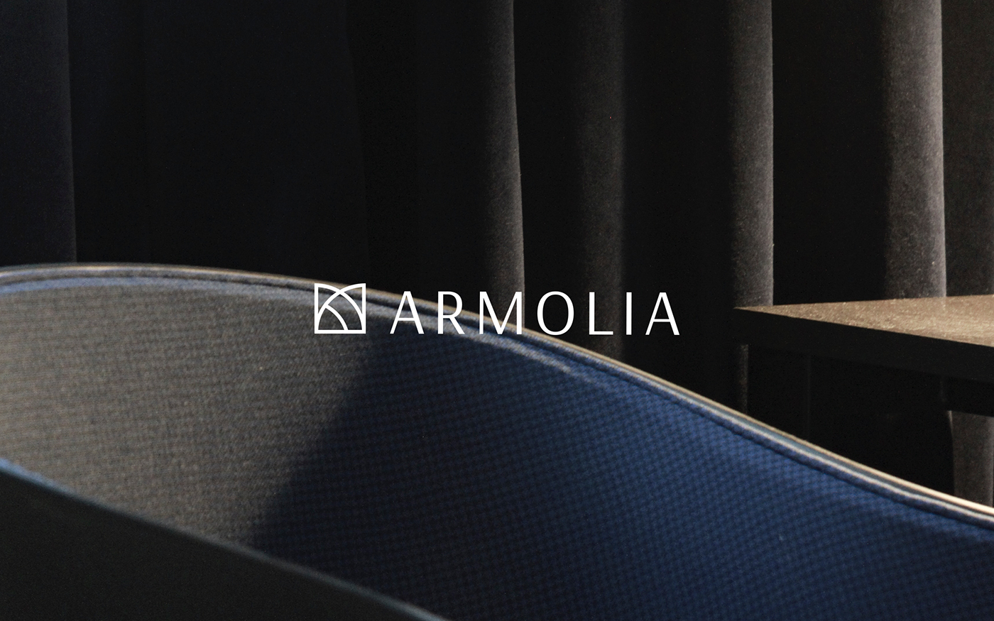
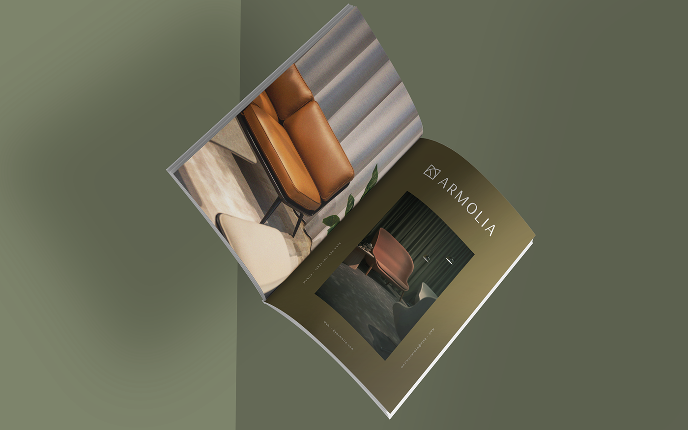
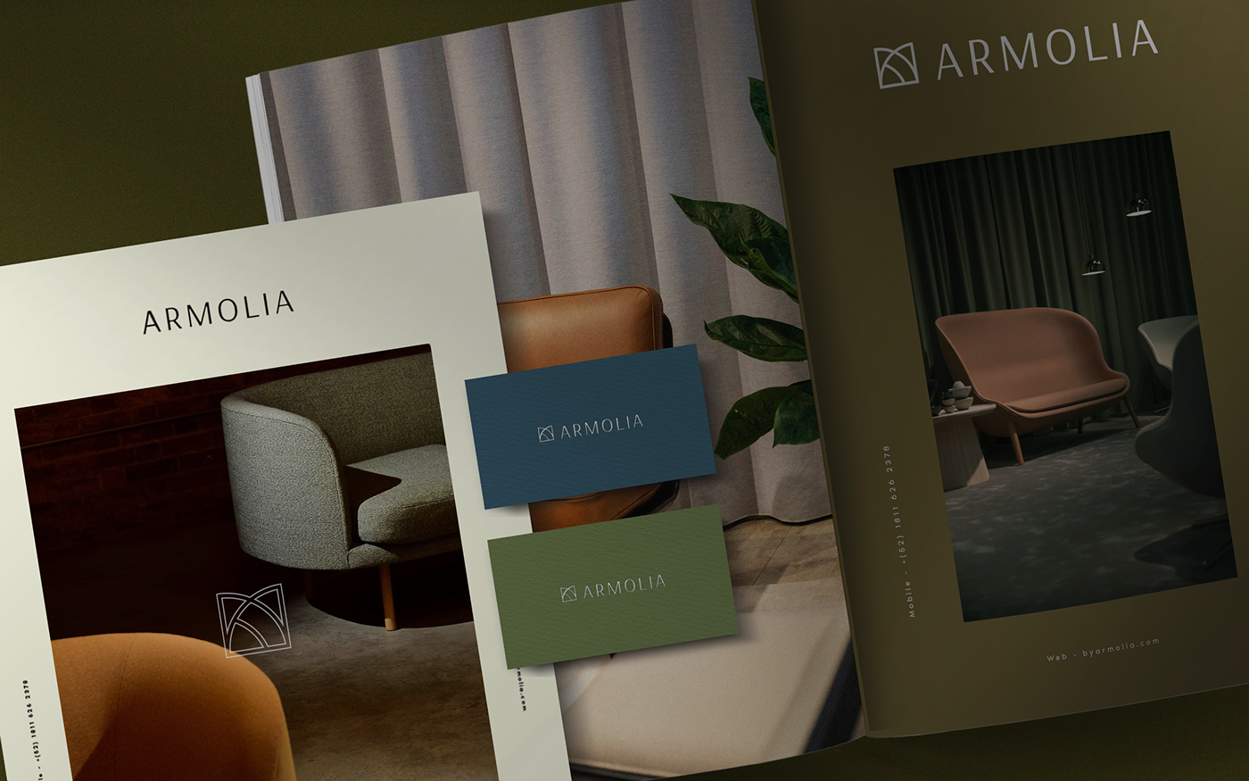
The Identity.
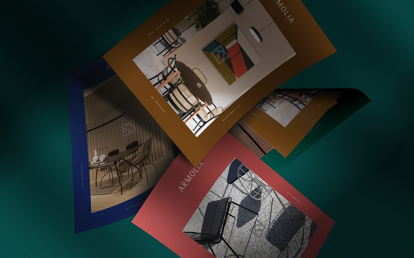
The visual identity of Armolia is inspired in elegant spaces, fancy textures and an honest lifestyle.The modern and sophisticated layout generate an atmosphere of new ideas, proposals, and ways to think.