
My lifecell is a mobile application for people who use lifecell mobile operator.
The application can help people to control their balance and other tariff details.
The application can help people to control their balance and other tariff details.
The application for mobile operator..how many people download it and why?
What do they want to find? And how can this app make their life easy?
These questions I researched and want to show you case study
based on redesign My lifecell mobile app.
based on redesign My lifecell mobile app.
The application has a lot of promotional information, there is no way to refill the balance through the mobile application, also without an internet connection.
There are some difficulties in navigation, there is no opportunity to view the history
of the expenses in detail. It is difficult to find tariff plans in the list of offered.
General interaction with the application is overloaded with various services and functions.
General interaction with the application is overloaded with various services and functions.

My role was to redesign the current application. Show a completely new concept, research, user interface, conduct tests for users, evaluate the effectiveness
of the redesign. Create a new UI, new interactions for users with application and create the more user-oriented design, based on the general needs and goals of users.

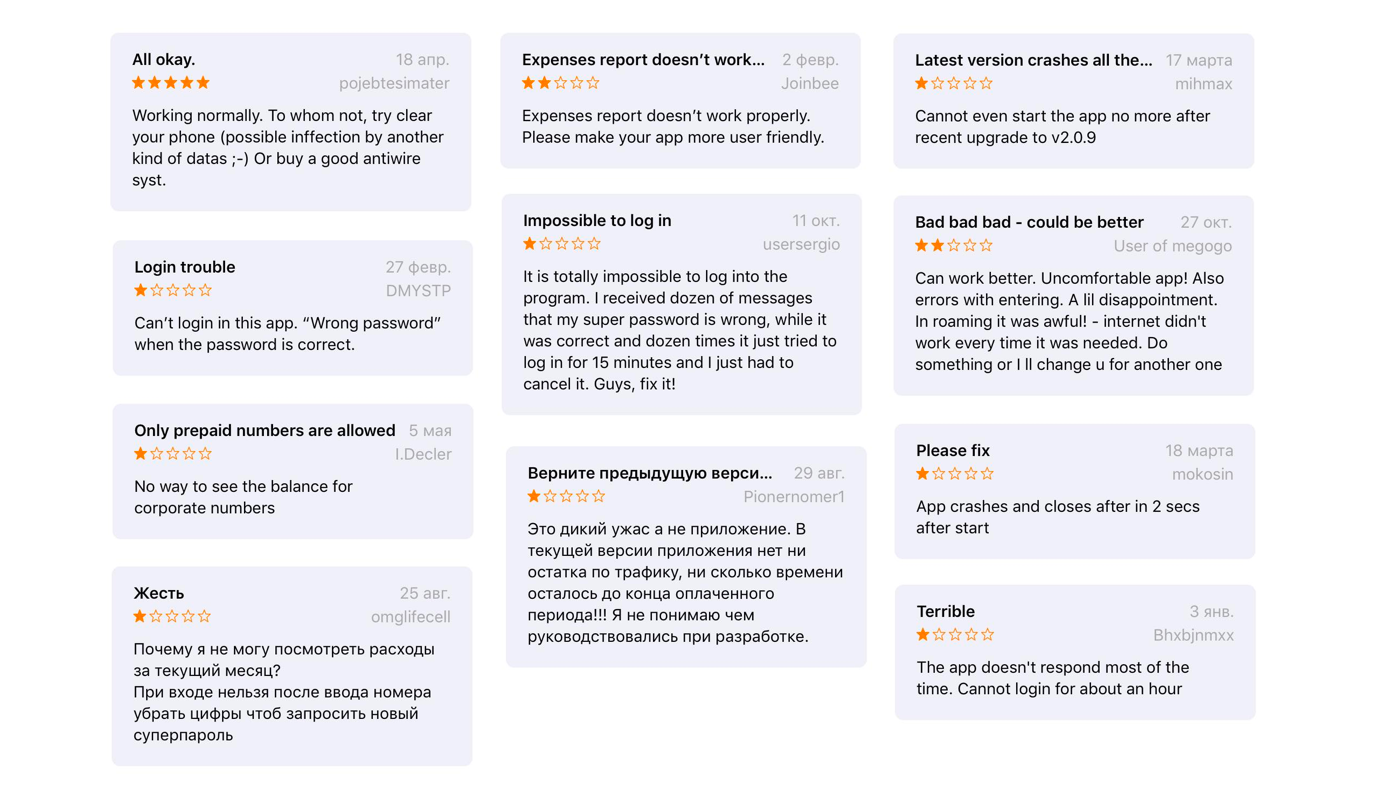
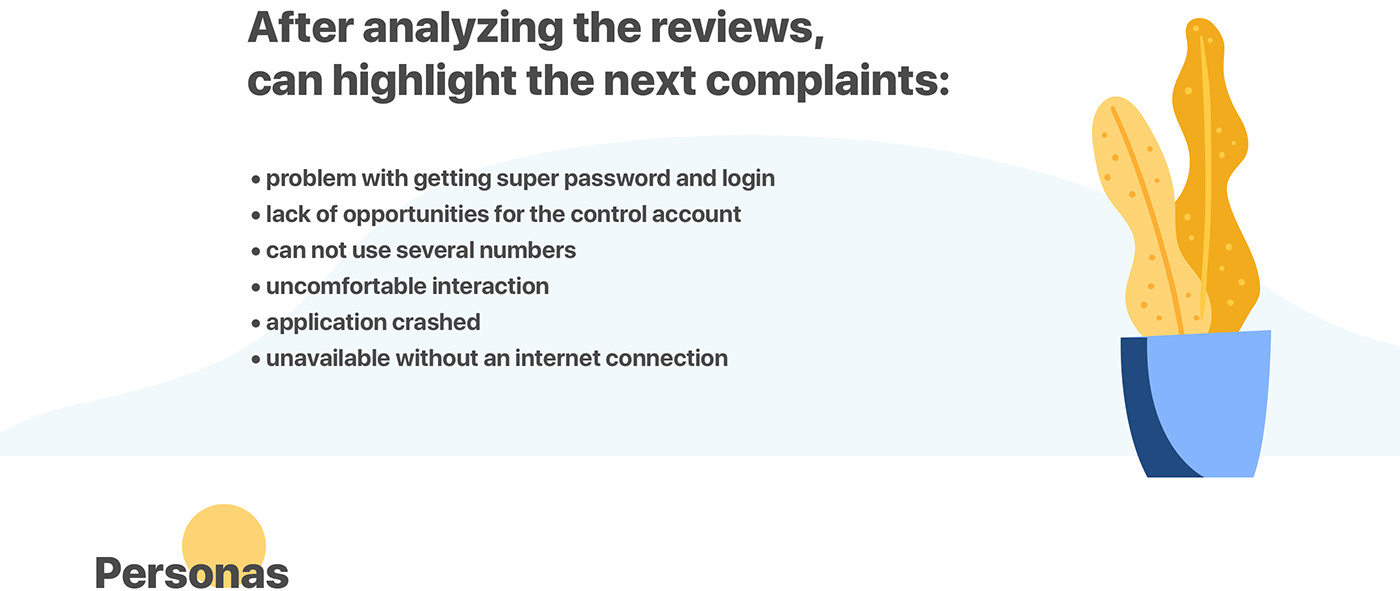
In the process of working on the project, I conducted an analysis of user feedback.
I processed reviews on the App Store, to make sure that the selected issues are really important to the user.
I processed reviews on the App Store, to make sure that the selected issues are really important to the user.
The App has a very low rating. It is only 2,3.
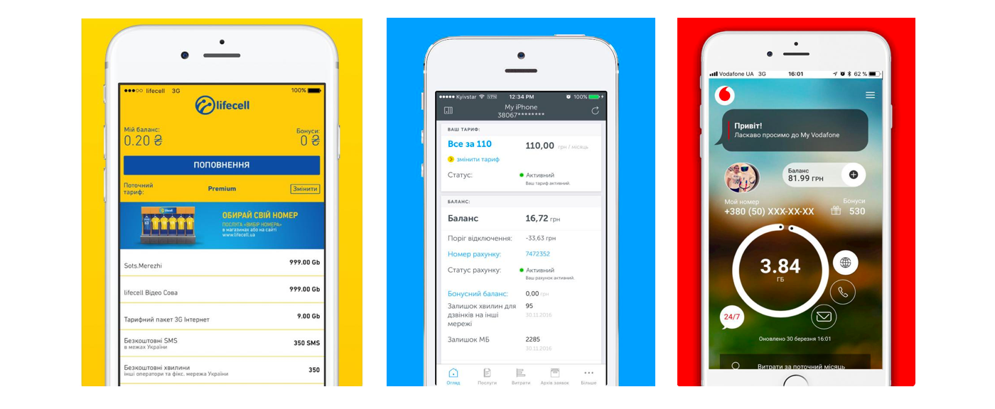
I also processed reviews of similar applications of competitors for comparison (lifecell,
Kyivstar, Vodafone).
In such applications, users are given the opportunity to get a quick access to the company's tariffs, to learn news and promotions, money balance,
and also to refill it if necessary.
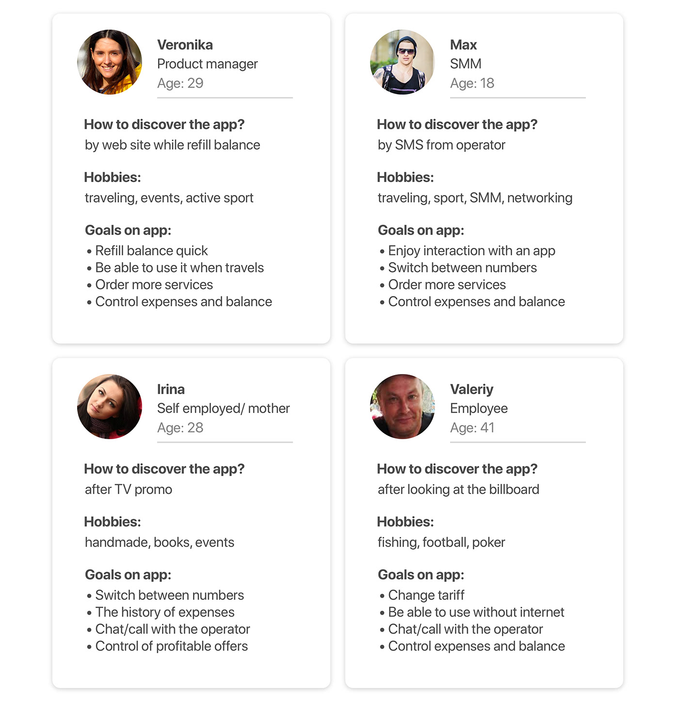
All users have different goals when interacting with the application.
For this, I have identified 4 types of users and assigned Personas.
Personas perfectly show how users find the application,
and why to download.
For this, I have identified 4 types of users and assigned Personas.
Personas perfectly show how users find the application,
and why to download.
After interviews and surveys of users (a group of 20 people), I created Red routes.
Red routes are the main functions due to which users would like to interact with the application.
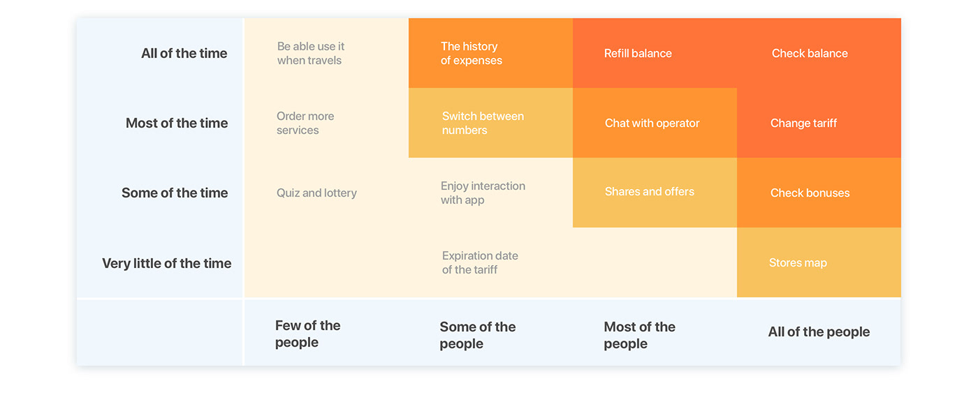

After the research, it becomes clear that there are several scenarios that can be identified and taken into use:

Let's work on the Scenario 1. Veronika wants to refill the balance with the application.
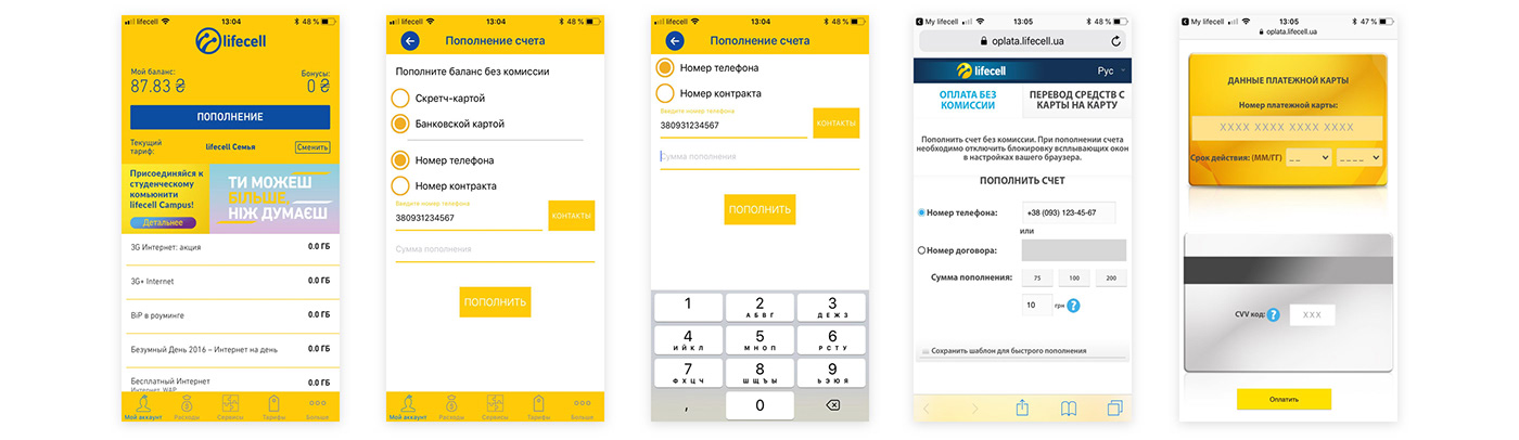
My lifecell app. Refill the balance with the application in the current version
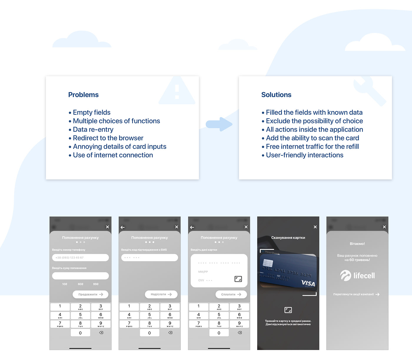
Refill the balance with the application if apply the problem solution

I worked through all the user flows and designed interaction based on them.
How the user can refill the balance, how can control the balance and expenses.
How can it be better log in without "super password". How to make the whole
interaction easy and comfortable.
I had to remove several functions from the application. From my point of view,
the application should solve only the main problems. The application should
help users get the result right now.
Users don't waste time and their interaction with the application is not annoying.
In this case, users will be back.


In UI part I used the main corporate color. Just made this color a bit warmer.
I'm an absolute fan of minimalist design with bright accents.
I'm an absolute fan of minimalist design with bright accents.
My main task is to make the interface almost invisible to the user
but at the same time leave the user in a pleasant impression of the interaction.
but at the same time leave the user in a pleasant impression of the interaction.
I like rounded corners and soft shadows. As well as illustrations. I think that the illustrations create a special atmosphere and it is very important.


During this research, I understood how important to hear users feedback.
How to highlight main functions and don't use a lot of services. An application for the mobile operator can be very useful. People would like to use it if it is comfortable and will help with their goals.
For users, it is convenient to use chatbot to quick communication with the operator.
This speeds up the communication process. This is more convenient than calling the call center.
This speeds up the communication process. This is more convenient than calling the call center.
Users want to use the application without the Internet. They want to be able
to refill the balance without access to the Internet and in roaming.
to refill the balance without access to the Internet and in roaming.
https://www.freepik.com/makyzz
https://www.freepik.com/free-vectors/templates
https://www.sketchappsources.com/free-source/1812-material-icons-set-sketch-freebie-resource.html


