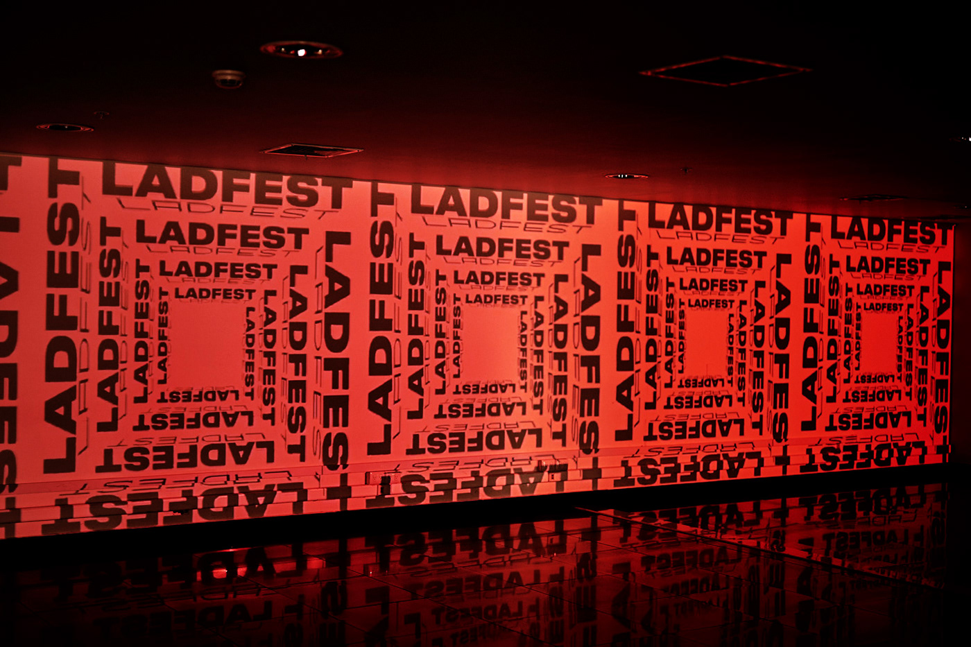
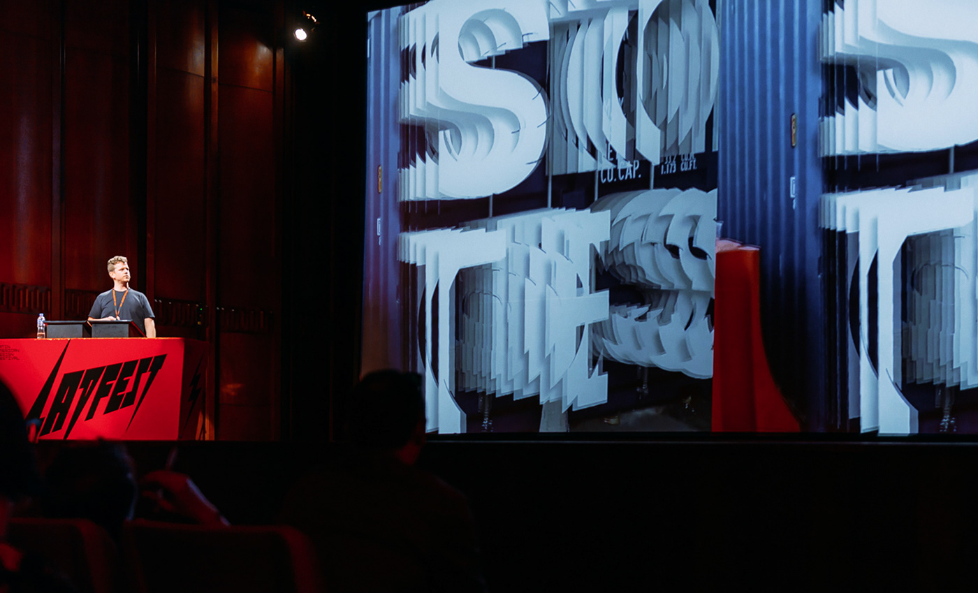
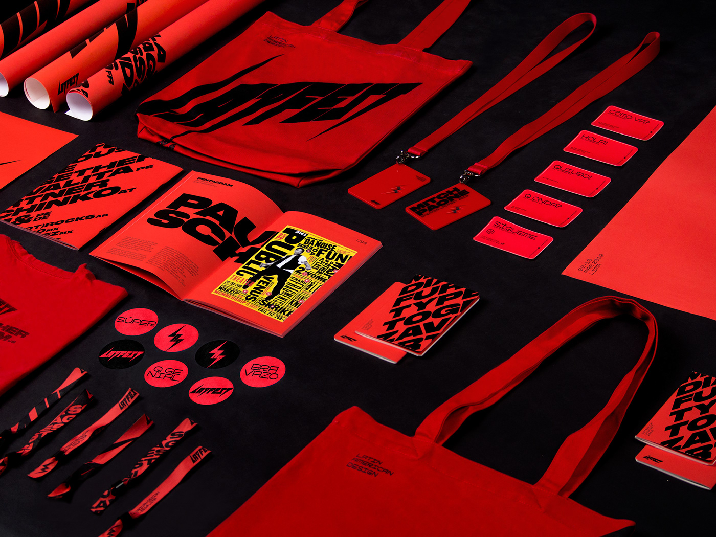
For the design of the 4th edition of the Latin American Design Festival, we applied two rules, we can only use two colors and we can only use two typefaces.
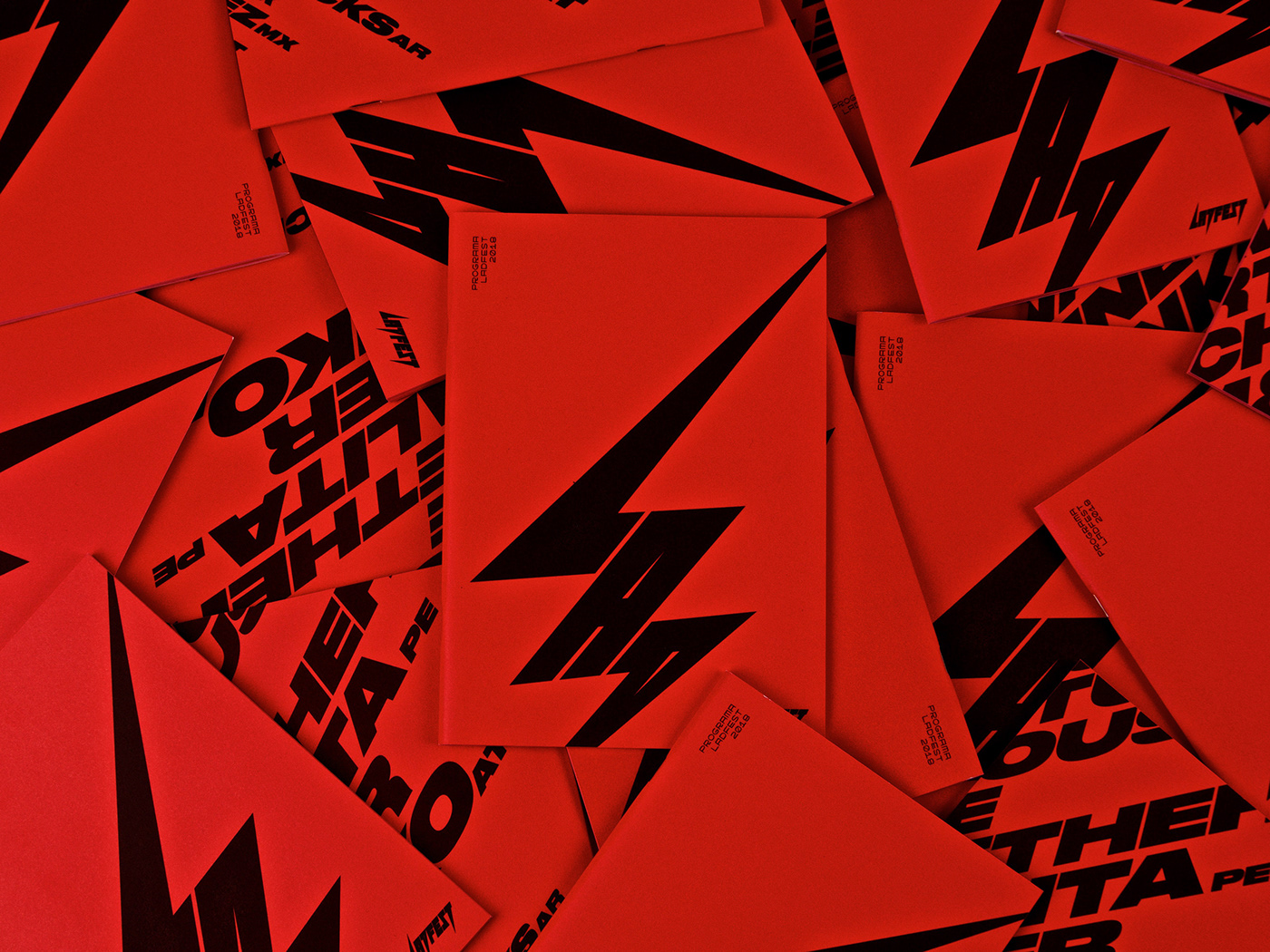
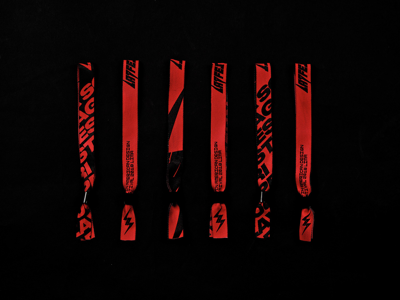
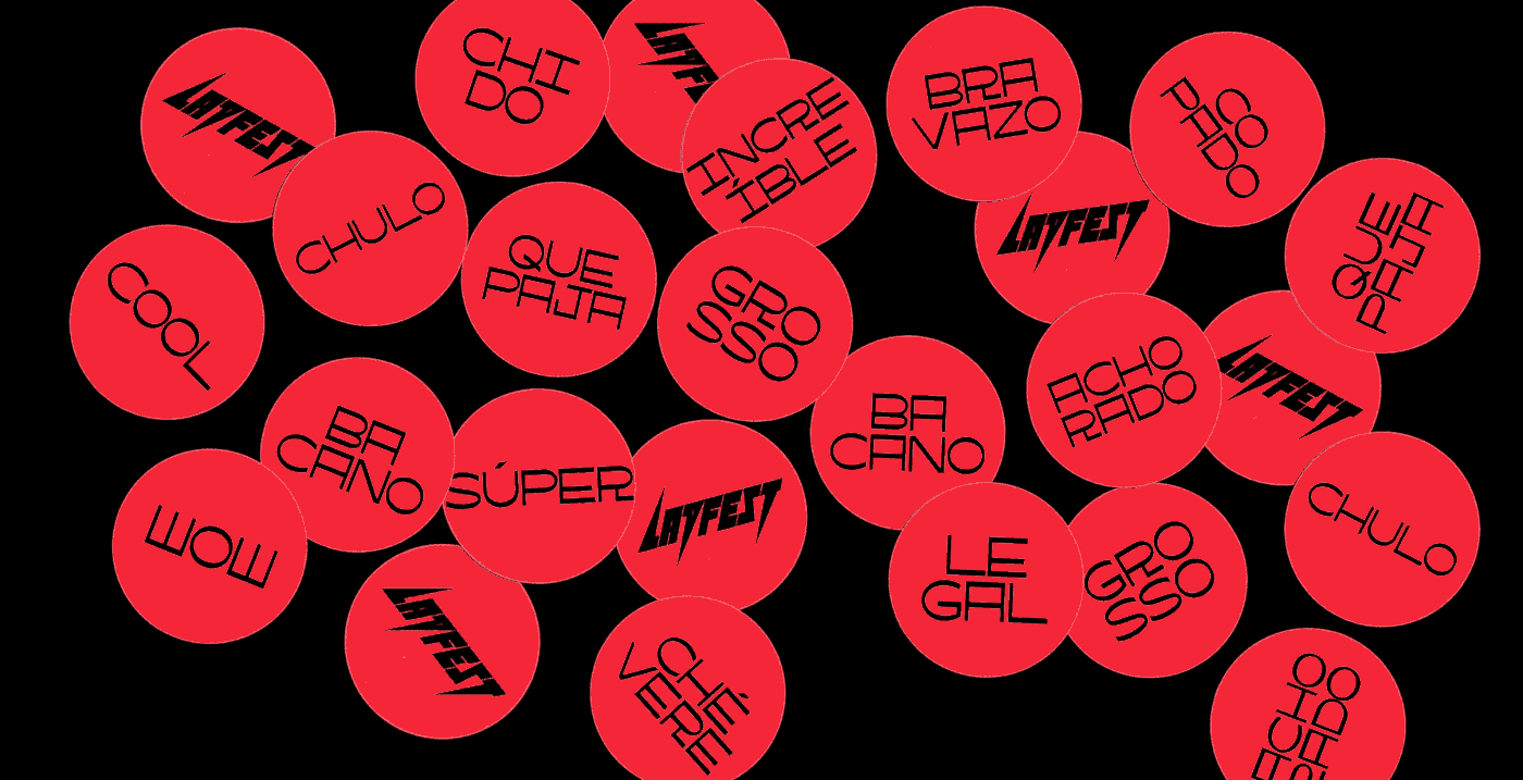
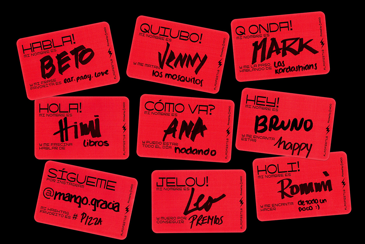
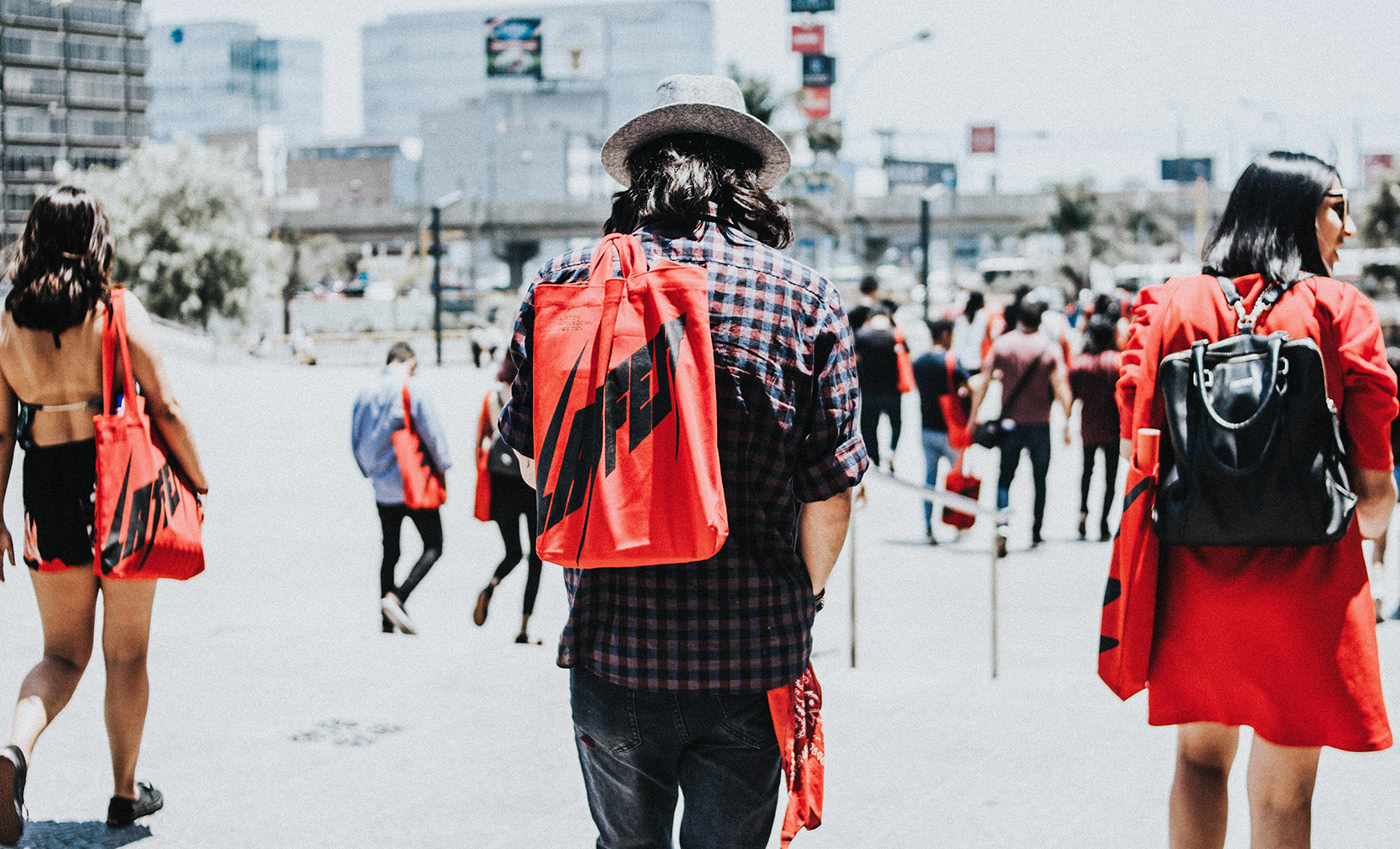
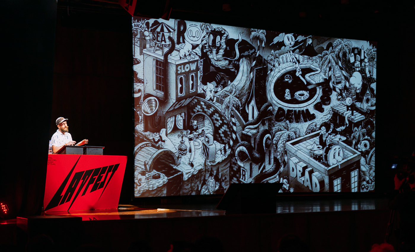
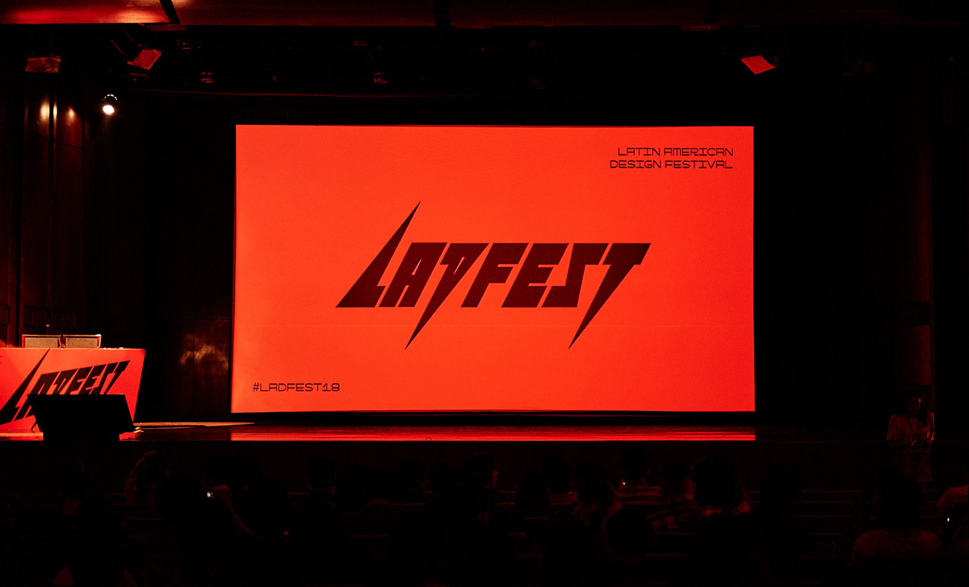
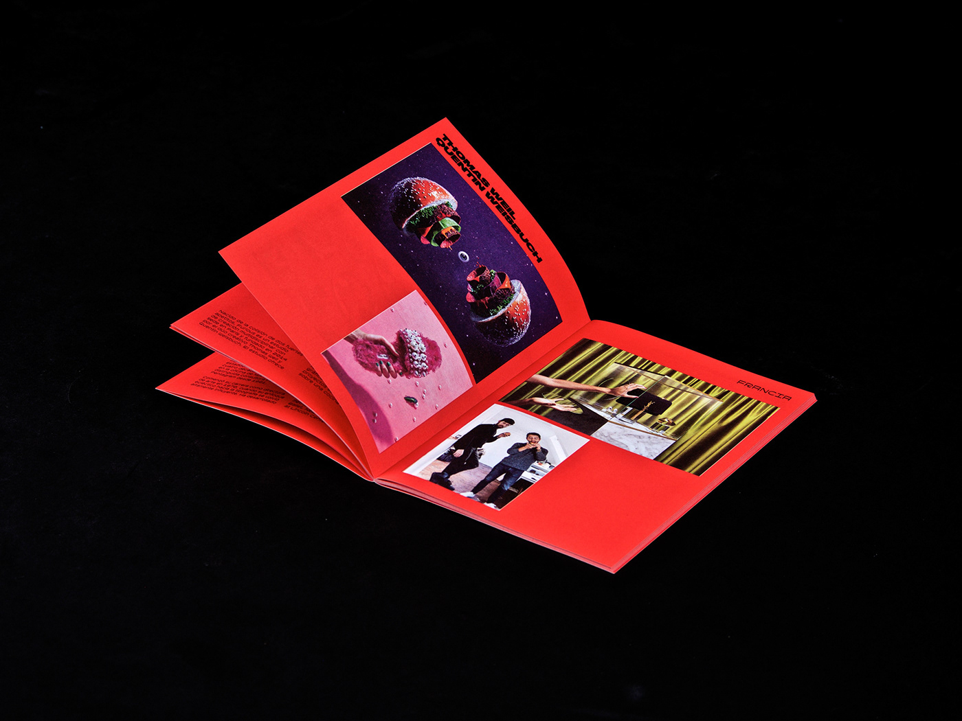
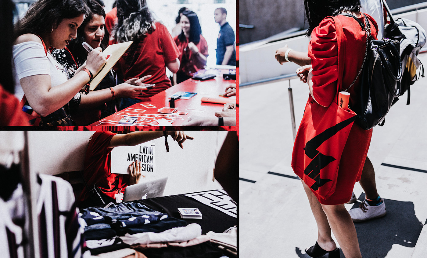
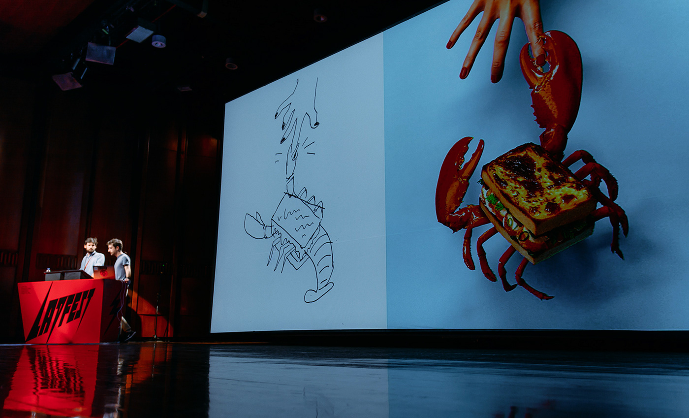
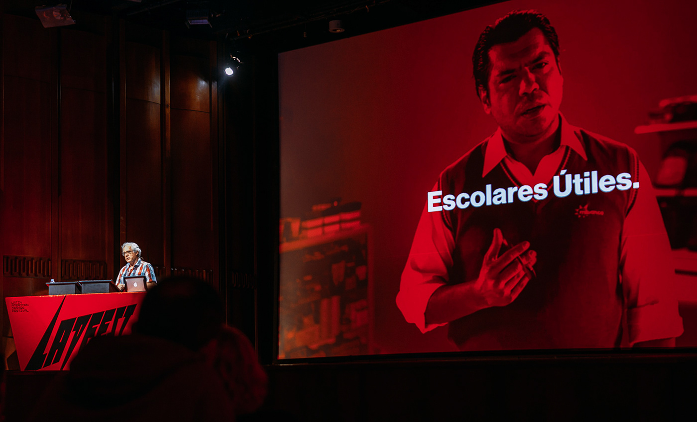
Celebrating 4 years of LADFEST, we came with the idea of the cube and the 4 sides, giving different perspectives in design as a good concept of what is the festival about. We decided to use red and black as the most used colors in graphic design and only two typefaces, a super extended (Druk - Commercial Type) and a light contemporary serif (Fifty - Ecal Typefaces). The graphics gave the crowd a good energy to the festival.
Celebrating 4 years of LADFEST, we came with the idea of the cube and the 4 sides, giving different perspectives in design as a good concept of what is the festival about. We decided to use red and black as the most used colors in graphic design and only two typefaces, a super extended (Druk - Commercial Type) and a light contemporary serif (Fifty - Ecal Typefaces). The graphics gave the crowd a good energy to the festival.