
Leap Design & Technology Conference
Leap is a fictional mentoring organization that is creating a conference this year. With the focus on technology and design. A bold and unique branding makes it stand out from the crowd and their competitors.
Typography
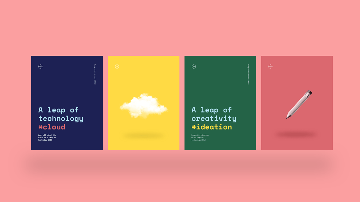
The typeface is called "space mono". The typeface has some rather odd characteristics, combined with some bold colors and use of image a bold style emerges. ]
The use of color
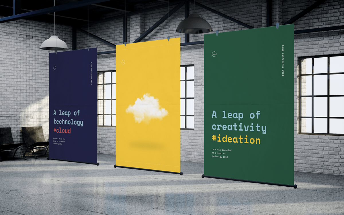
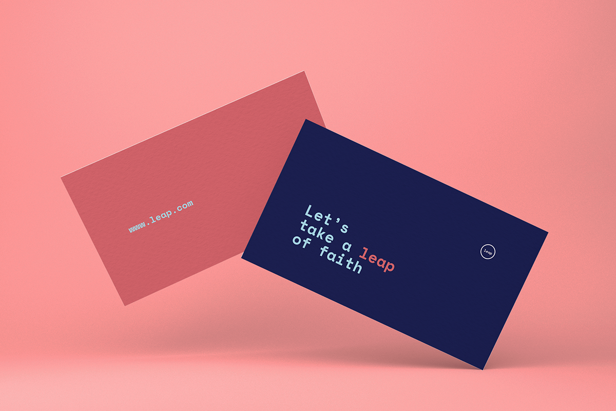
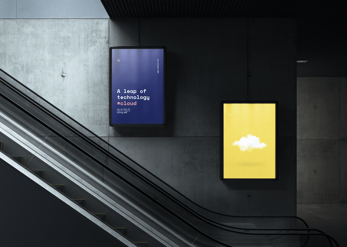
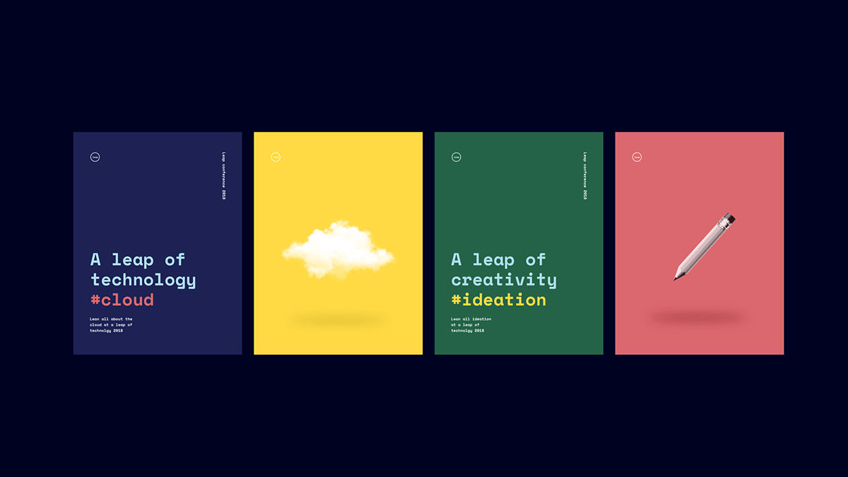
To make the brand recognizable everywhere, I adjust the color palette to it's purpose and message. All brand expression that are about technology have a blue and yellow main color, with light blue and red accents. For design it's red and green as the primary color, and light blue and yellow as secondary colors.
The webdesign has a unique approach as well, being visually very different from other website out there. The navigation has a small explanation beneath in, in a very small font which is not readable. But when you hover over the navigation the text increases and becomes readable.
To explain items on posters and on the website I chose a very cliché image style, to make it fun, bold and different.


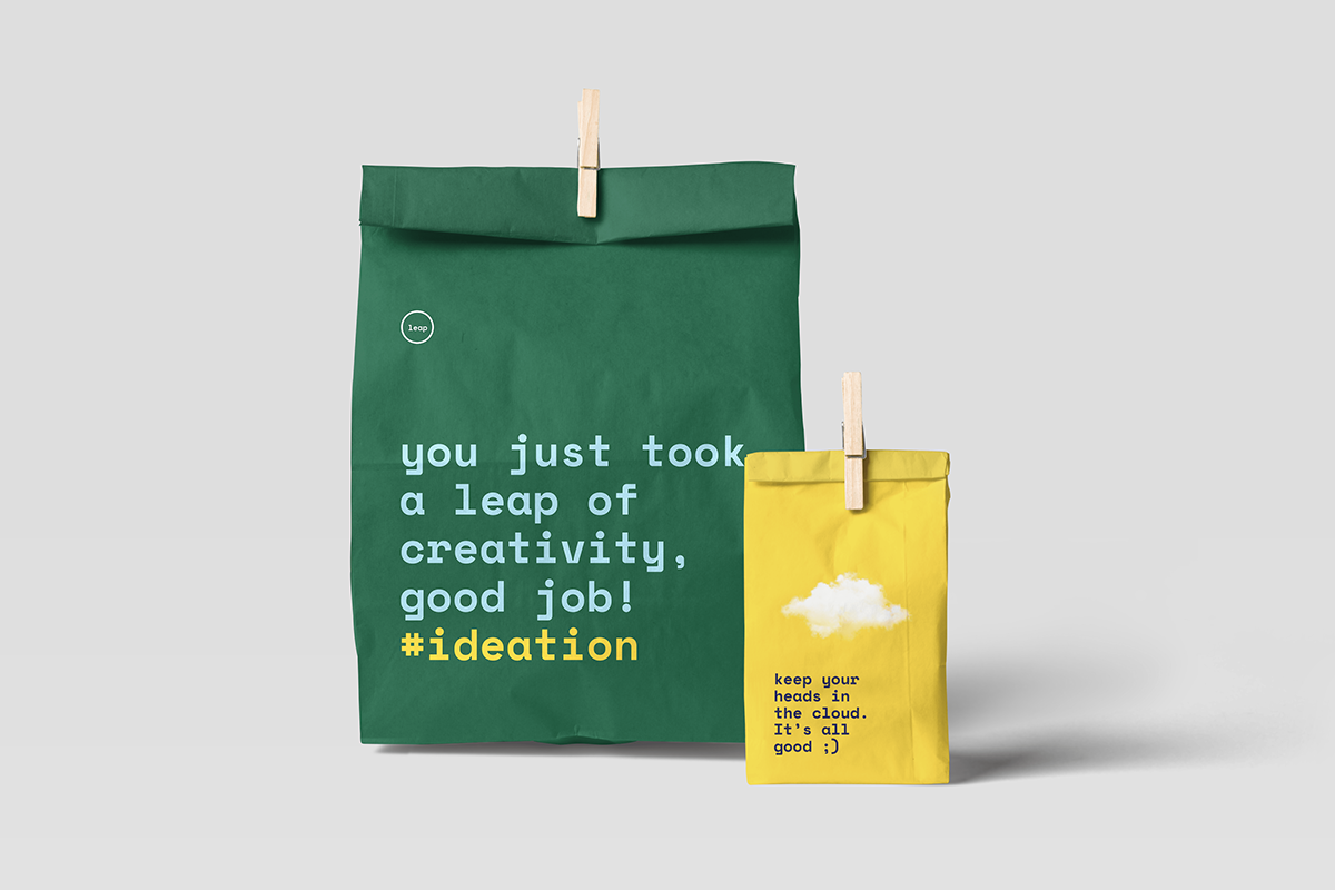
And to finish the event a goodie back with some motivational words and tips.
Thanks for watching.


