Active protection
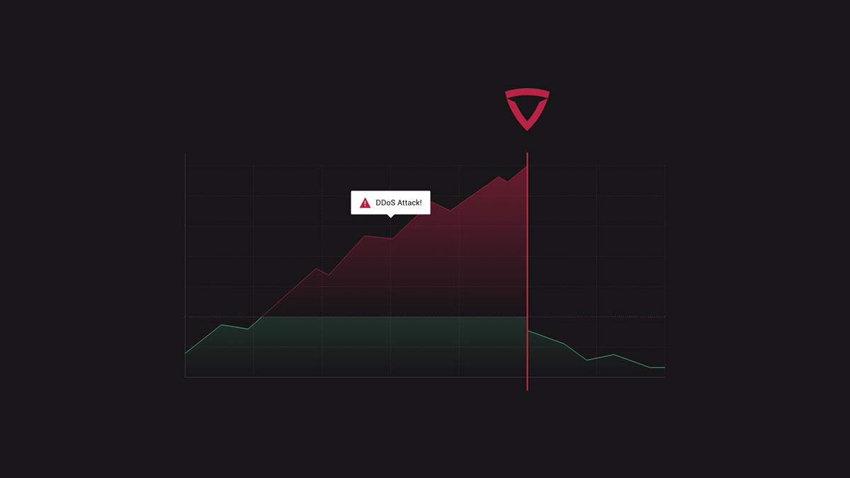
ITORO helps its clients maintain their network safe. The company fights against DDoS attacks, offering end-to-end services of active system security. It not only recognizes the potential threats, but also filters, redirects and blocks them, so that network can work properly.
The project goal was to develop a strong brand identity that would establish the company in the market and clearly communicate the offer to the audience.
Aktywna ochrona
ITORO to firma specjalizująca się w kompleksowym wdrażaniu usług obrony przed atakami typu DDoS. Cechą,
która wyróżnia ITORO jest aktywny system, dzięki któremu potencjalne zagrożenia są nie tylko wykrywane,
ale również filtrowane, przekierowywane lub blokowane, by zapewnić bezproblemowe działanie sieci.
Celem projektu było stworzenie silnej identyfikacji wizualnej marki, która skutecznie wyróżni ją na tle konkurencji
i w czytelny sposób przedstawi ofertę firmy.
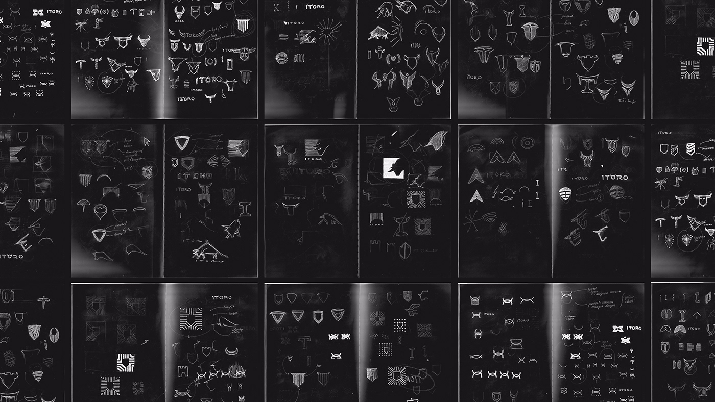


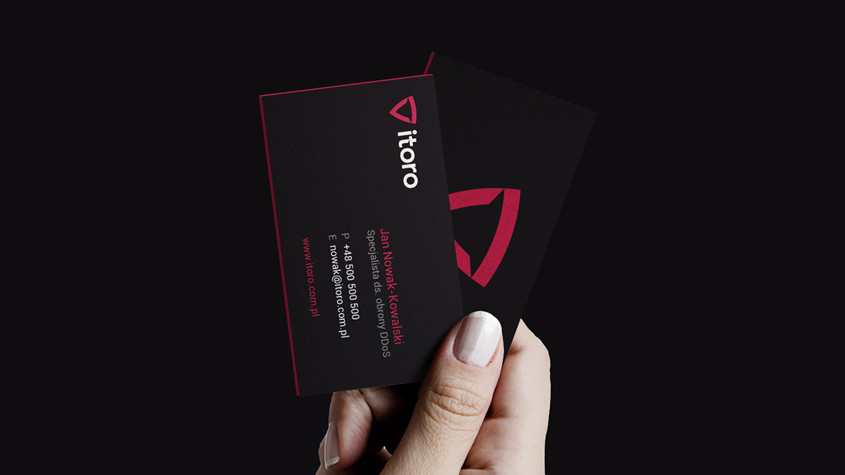
Finding the brand's character
I started from developing a dedicated visual language that would reflect the soul of the brand and its business profile.
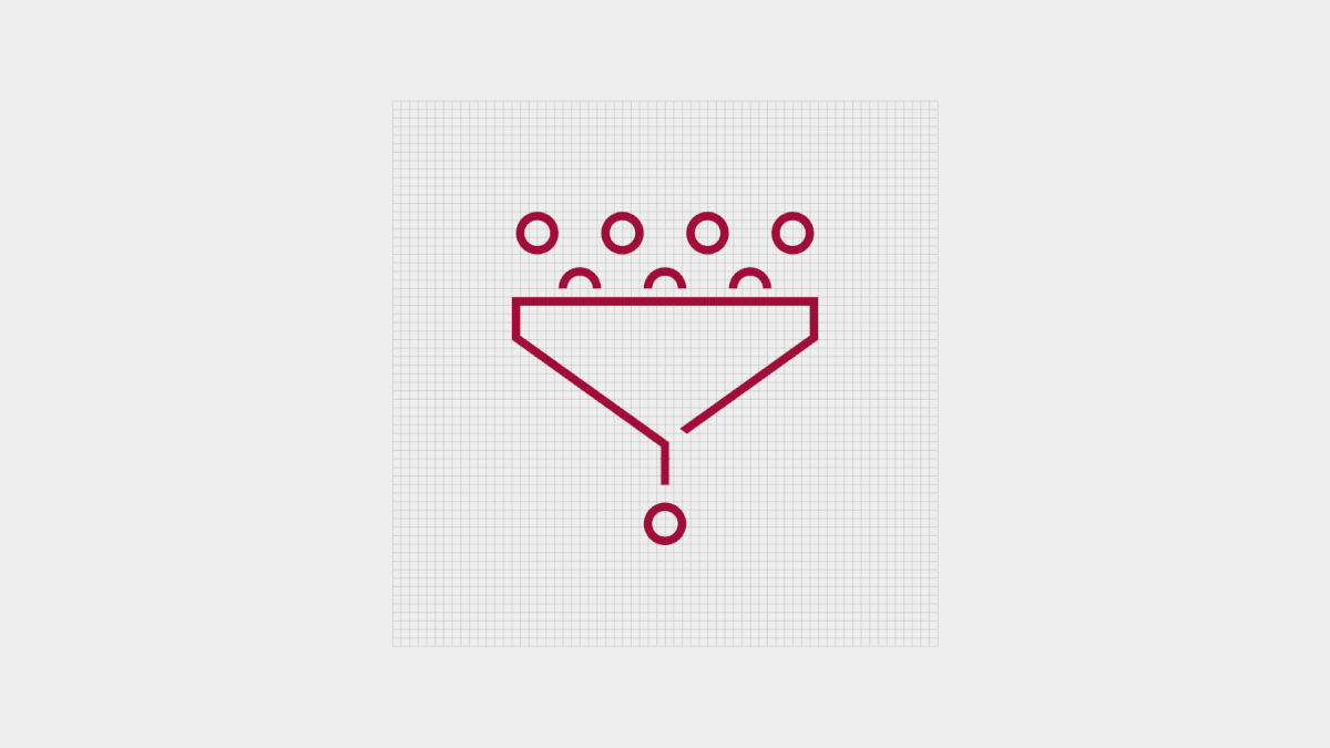
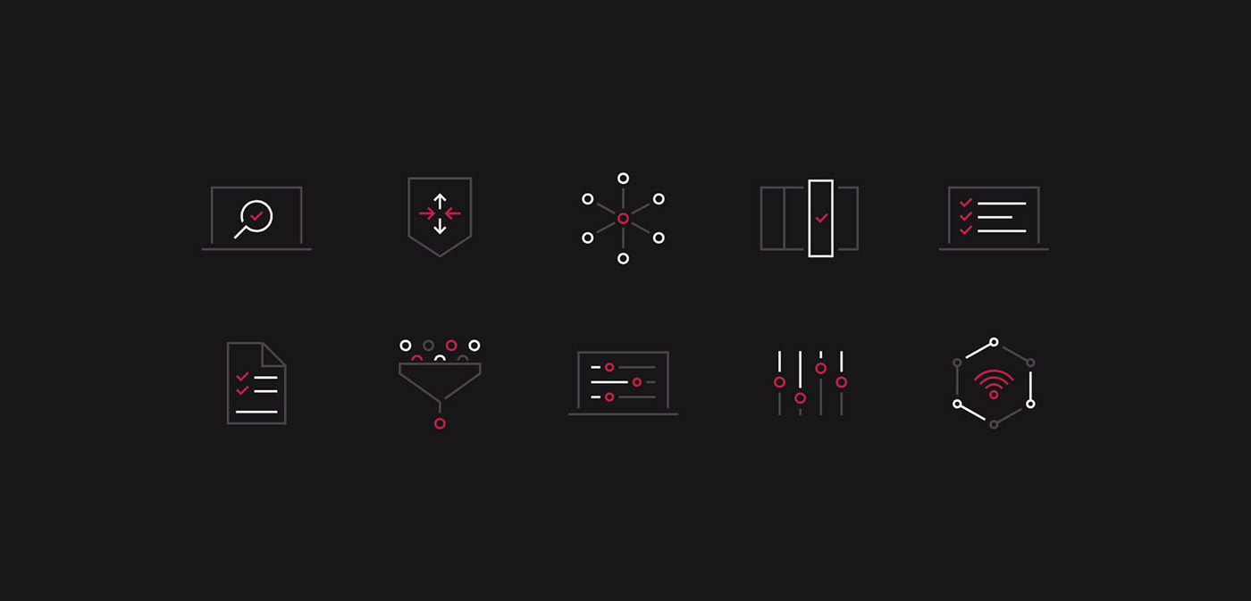
The logo design I made is based on two symbols - a shield (protection) and a bull (attack) which represent the dualism of ITORO's services. Later on I developed a composition scheme, color palette, a selection of typography and dedicated illustrations.
As a result, the brand gained its own language to communicate with its audience in a simple and consistent way.
W poszukiwaniu charakteru marki
Pierwszym krokiem było opracowanie języka wizualnego, który będzie skutecznie odzwierciedlał charakter i aspiracje marki. W tym celu powstał projekt logo, oparty na dwóch symbolach - tarczy (obrona) oraz byka (atak). Celem takiego podejścia była prezentacja dualizmu rozwiązań oferowanych przez ITORO.
Kolejnymi elementami narracji wizualnej było stworzenie palety kolorystycznej, dobranie typografii, selekcja fotografii oraz zaprojektowanie zestawu ikon i ilustracji. W taki sposób marka zyskała swój język, umożliwiający spójną
i konsekwentną komunikację wizualną.


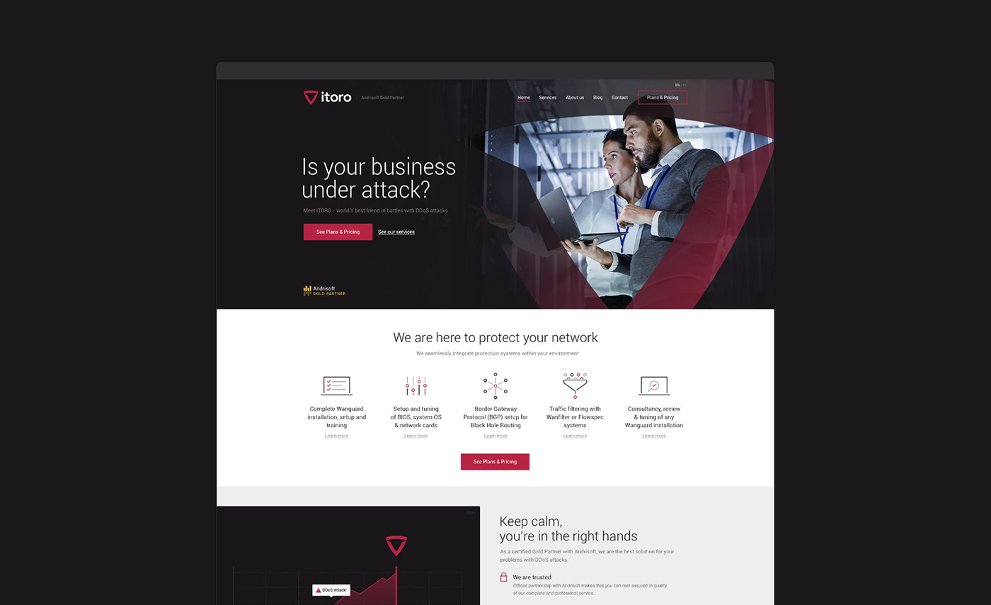
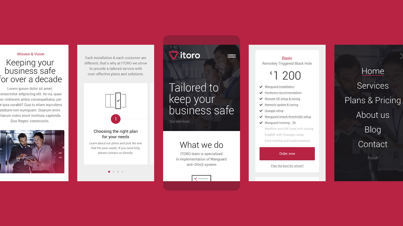
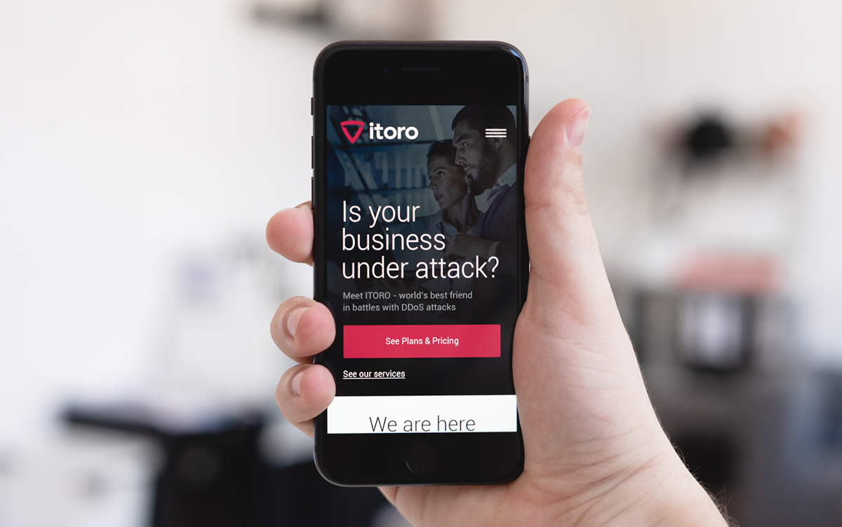
An online presence
ITORO’s service hub relies on the online activity, so designing an intuitive website experience was crucial. My first step was creating the content architecture and wireframes (UX), followed by functional prototypes. Next, I prepared a final web design (UI) using the visual language developed in the previous stage. The final design was optimized for RWD and ready for high resolution screens.
The last part of the project was supervision and audit of website production process. The website is now live
Marka w sieci
Głównym nośnikiem oferty ITORO jest strona internetowa, dlatego jej intuicyjne przygotowanie było kluczowe
dla sukcesu sprzedażowego.
Pierwszym etapem było stworzenie makiet funkcjonalnych (UX) prezentujących architekturę treści. Następnie strona została docelowo zaprojektowana (UI) przy wykorzystaniu opracowanego języka wizualnego. Cały projekt został przygotowany z uwzględnieniem RWD i dobrych praktyk SEO. Końcowym etapem prac był nadzór nad procesem wdrożenia strony oraz późniejszy audyt i ewaluacja dostarczonych rozwiązań. Strona jest dostępna pod adresem www.itoro.com.pl