
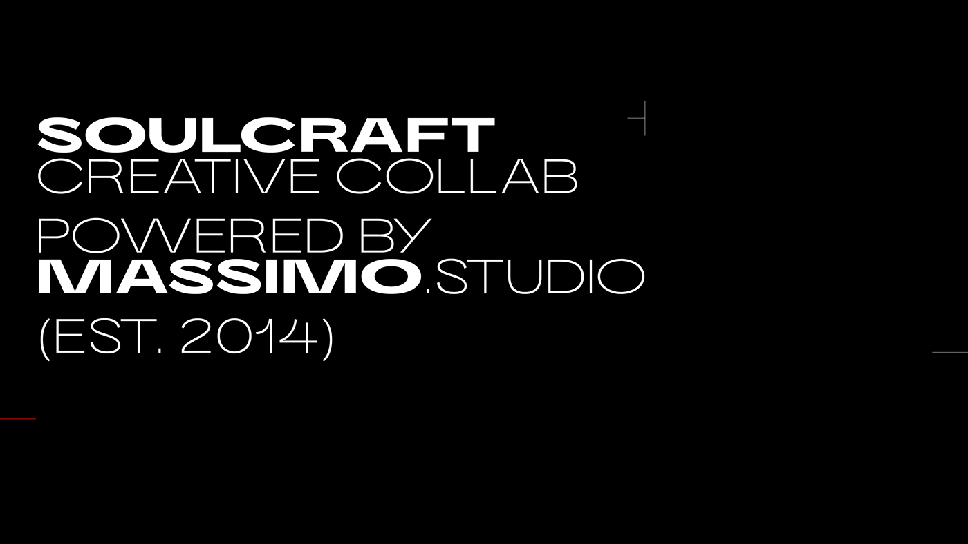
Massimo Typeface
Massimo Display and Sans evolved from a need to have a bespoke typeface that reflected the values and aesthetic of the studio, suitable for different applications across a wide range of materials. Early in the project, it was defined that a grotesque typeface would give the simplicity necessary for a versatile font without losing warmth and personality. Furthermore, an extended width would give the visual strength desired.
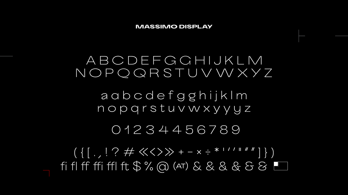
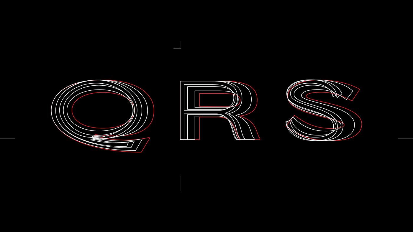
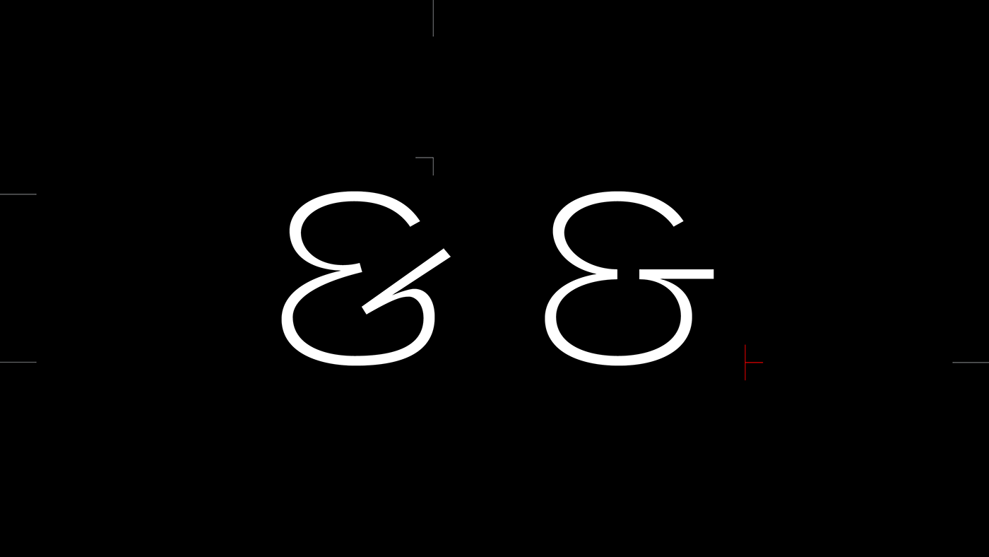
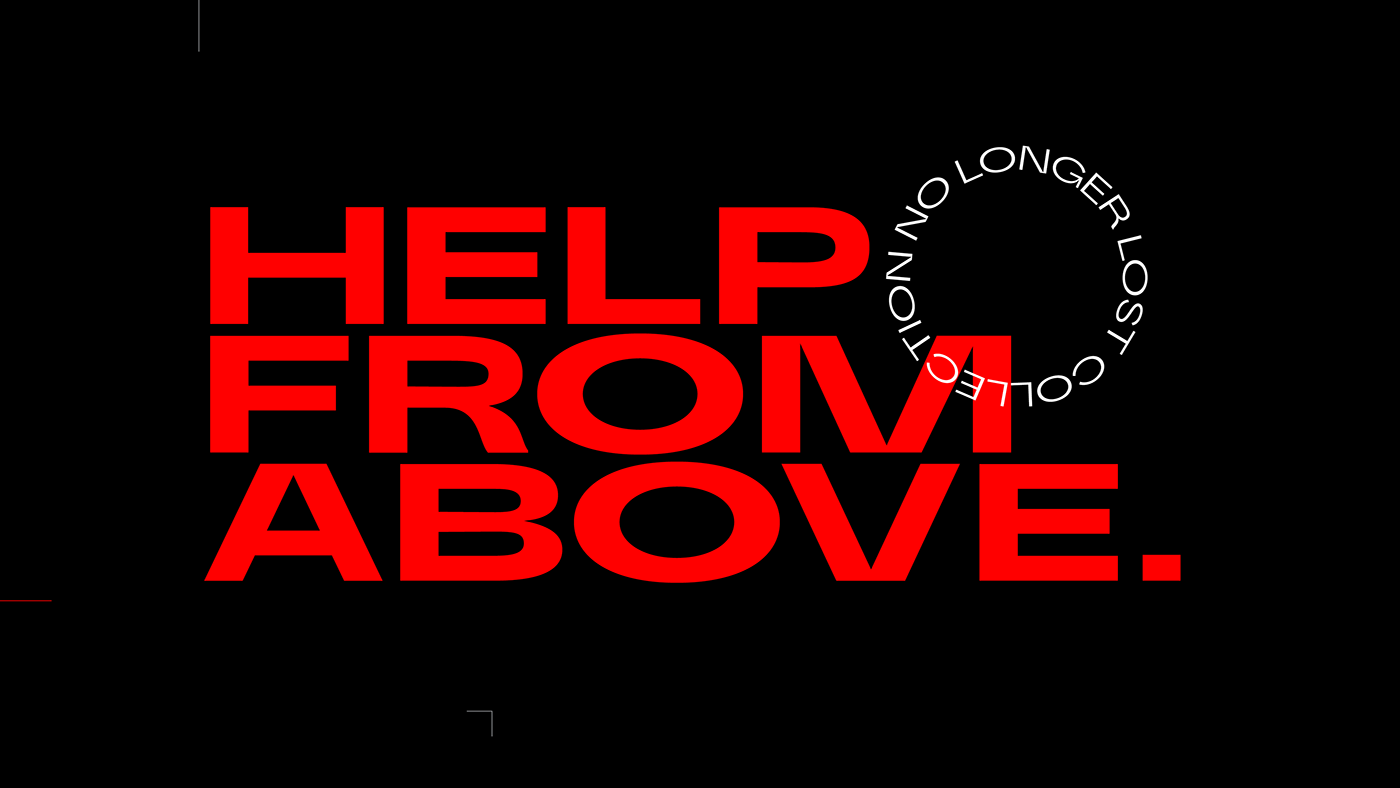
Massimo Display is an extended sans-serif inspired by classic grotesque characteristics mixed with deep joins functioning as ink traps that give the glyphs a distinctive personality. It is suitable for headlines and titles.
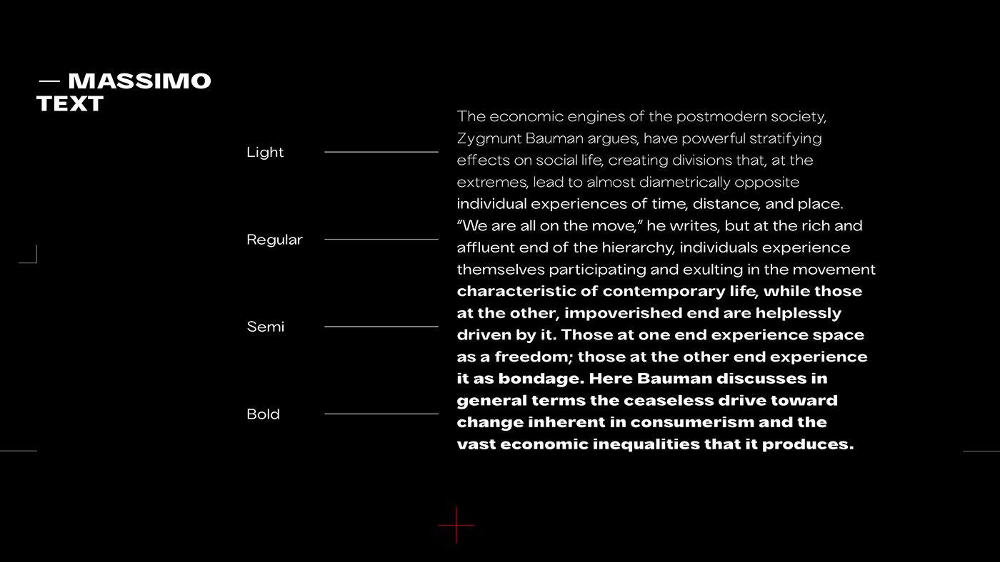
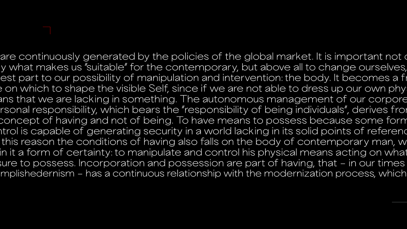
After designing Massimo Display, the need for an optical size suitable for small sizes and texts was noticed. Massimo Text has a smaller contrast between thick and thin strokes, which helps readability in text size. Also, the x-height was slightly increased and the width of each character was shortened - creating a more balanced composition when the typeface is set alongside Massimo Display.
Design Services
Concept
Concept
Type Development
Classification
Grotesque Geometric Sans-Serif


Thanks for watching!


