


EYEDENTITY PHOTOGRAPHY EXHIBITION
Commission Based Project

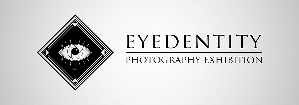
Brief — To create both logo & brand identity for an exhibition launched by a collaboration of seven individual photographers, each sharing the central theme of identity throughout their collections.
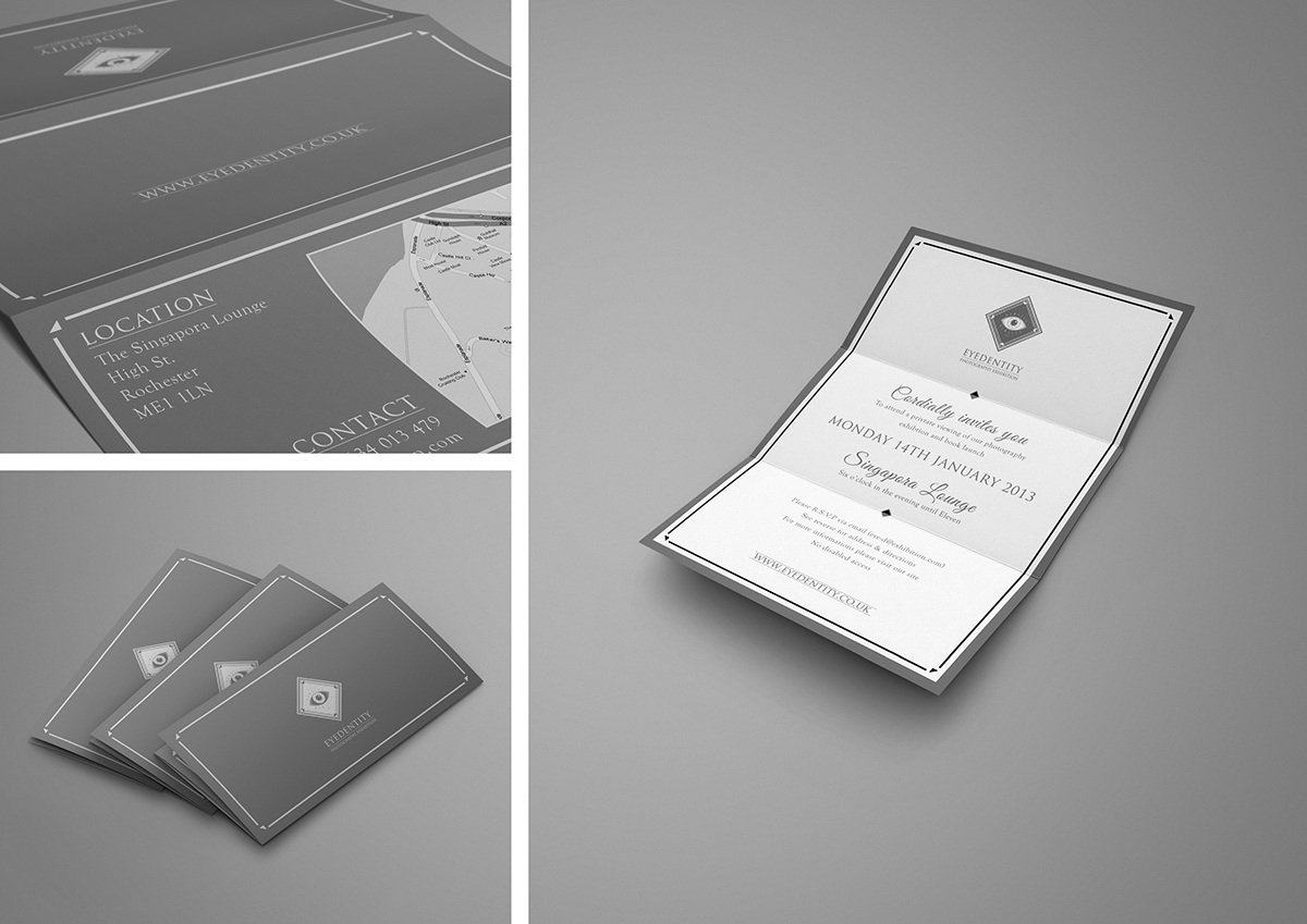
Creative Requirement — To create a bold tri-tonal logo (preferably black, white and neutral grey) focusing on a visual play of the words ‘eye’ & ‘identity’, whilst combining a strong link to photography. To convey the design in a clear, simplistic brand applied over various stationary such as letterheads, envelopes and business cards.
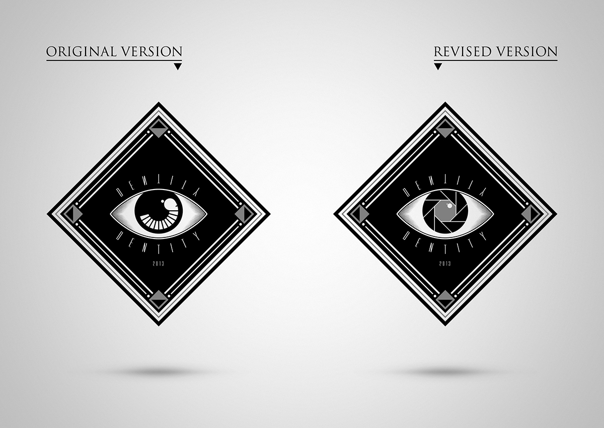
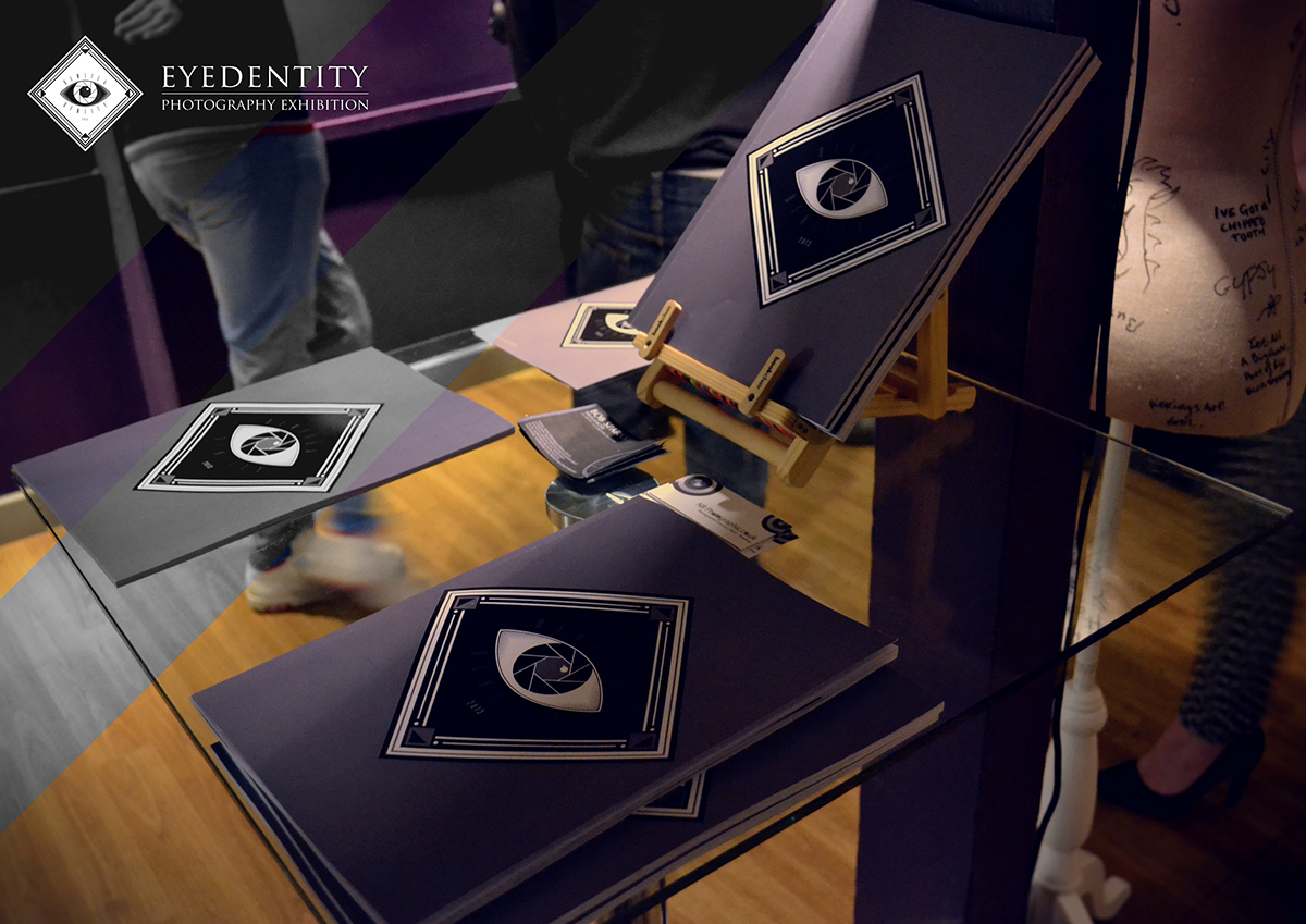
Creative Solution — Isolating the 'eye' syllable in the word 'identity' became a key concept, which itself pays homage to belief that eyes act as 'the windows to one’s soul'. With photography at the heart of the exhibition, replacing the iris with an aperture symbol helped marry both elements into one logo. Creating an identity for the exhibition required incorporating a greyscale colour palette with geometric elements found within the logo across all branding material.


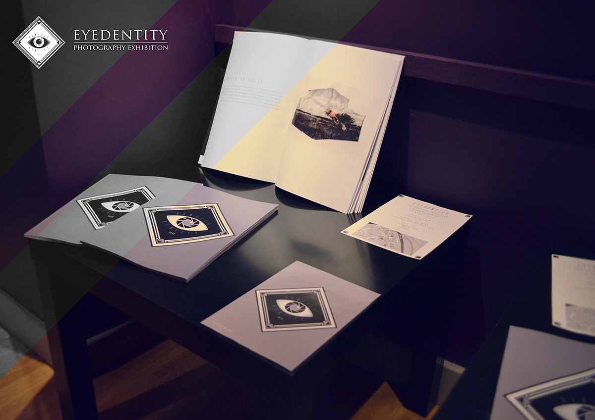

The exhibition features topics such as childhood innocence, the female, the male, the nature of the human kind within worldly environments and the self. Each piece shows analytical and perceptive views of the world around the artist, and relies heavily upon the viewer’s associations with the issued raised.

THANK YOU FOR WATCHING!
Keep in touch on my Facebook Page
If you liked this, please take a moment to click the appreciate button.


