

Overview
Steam is an e-commerce gaming distributor developed by Valve Corporation. The initial release of Steam was in 2003 while the mobile application launched in 2012. The platform has provided users with not only a source for buying games, but also a social network. Steam offers thousands of titles from the worlds largest developers but is also open to independent developers. Twenty years ago this would not have been possible.
Steams mobile app allows you to buy games and communicate with friends similar to the desktop application. The mobile application has seen very few updates and lacks a cohesive design. It is extremely buggy and users experience crashes during regular use.
The goal of this project was to minimize clutter in the menu system and introduce a clean modern user interface. I wanted to reduce user stress by simplifying the information presented.

InVision Prototype
Understanding the Problem
The biggest issue with the Steam App is that all of the main functions are buried under the hamburger icon at the top of the screen. Once you open the menu, you are overwhelmed with too much information at once. This makes the application hard to navigate and confuses the user. On top of all of that, the application feels like an old mobile website rather than an optimized application. The animations are buggy and loading times are extremely long. The app has potential but it hasn't been executed in the right way.
Testimonials
App Store reviews

Solutions
I chose to lighten up the theme but still keep it relatively dark. The dark theme matches the gaming aesthetic and the navy blue is a familiar colour for Steam users. Instead of using the hamburger icon for navigation, I implemented a navigation bar that mobile users are familiar with and comfortable using. Lastly, I have condensed the information on each page and presented what is most important to the user first.
Steam was designed for gaming. I wanted gaming to be the main focus of the application and I have accomplished this by:
• Designing the Home tab to feel like it was catered to the user, rather than an advertisement for everything that is on sale
• Using a background image from the users most played game on the Steam Guard tab
• On the Chat tab I have displayed what games friends are playing and when they were last online. One of the mobile applications most valued functions is for communicating with friends and seeing what games they are playing
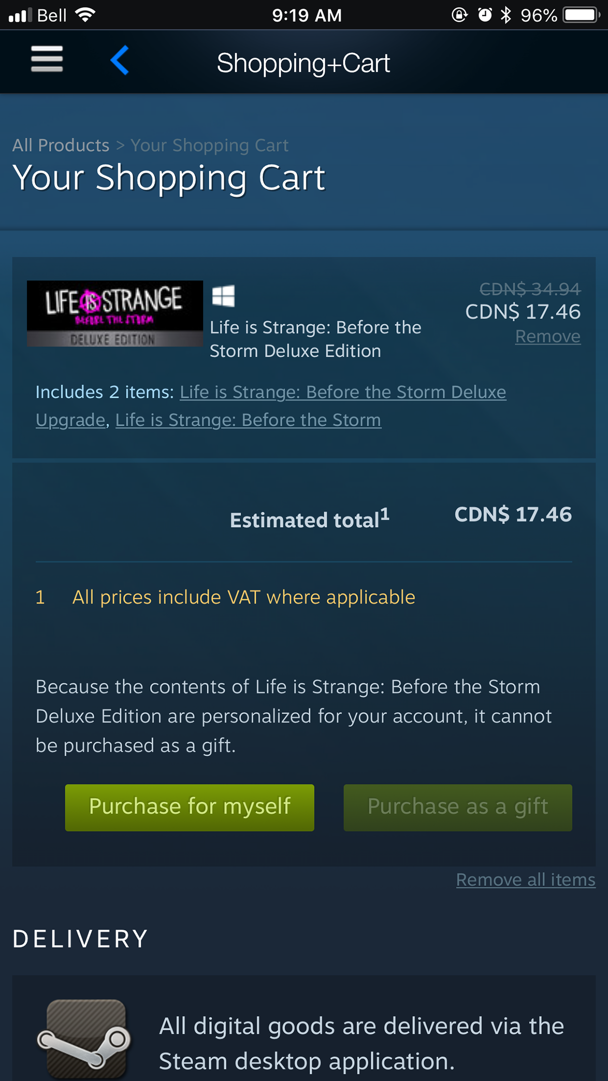
• Showing what games you have in your Cart first and how much they cost
• Displaying the logged in users recent activity first on their Profile page below their profile information. I have also displayed the users owned games right below that so friends can see what games they have in common
My redesign aims to simplify the user experience and focus on what is most important first all within a cleaner aesthetic.
Original Steam app design


Steam App Redesign


Process
Flowchart

Wireframes


Style Board


Feedback is appreciated! Thank You!


