


Opportunity:
Update the Doctor for Life brand to be more modern, as well as represent their business shift from medical only, to a well-rounded approach.
Update the Doctor for Life brand to be more modern, as well as represent their business shift from medical only, to a well-rounded approach.
Business Details:
Originally branded the Doctor for Life Health Institute, the company gained prospects through doctor referrals. Their medical expertise was the required last stop before a patient went through weight-loss surgery. Their medical methodology was founded on four pillars: nutrition, exercise, behavioral therapy, and pharmacotherapy. As they set out to appeal to the consumer market, they needed a way to continue to represent the sound medical practices they were founded on, but also appeal to consumers in earlier stages interested in sustainable weight-loss.
Originally branded the Doctor for Life Health Institute, the company gained prospects through doctor referrals. Their medical expertise was the required last stop before a patient went through weight-loss surgery. Their medical methodology was founded on four pillars: nutrition, exercise, behavioral therapy, and pharmacotherapy. As they set out to appeal to the consumer market, they needed a way to continue to represent the sound medical practices they were founded on, but also appeal to consumers in earlier stages interested in sustainable weight-loss.


Solution:
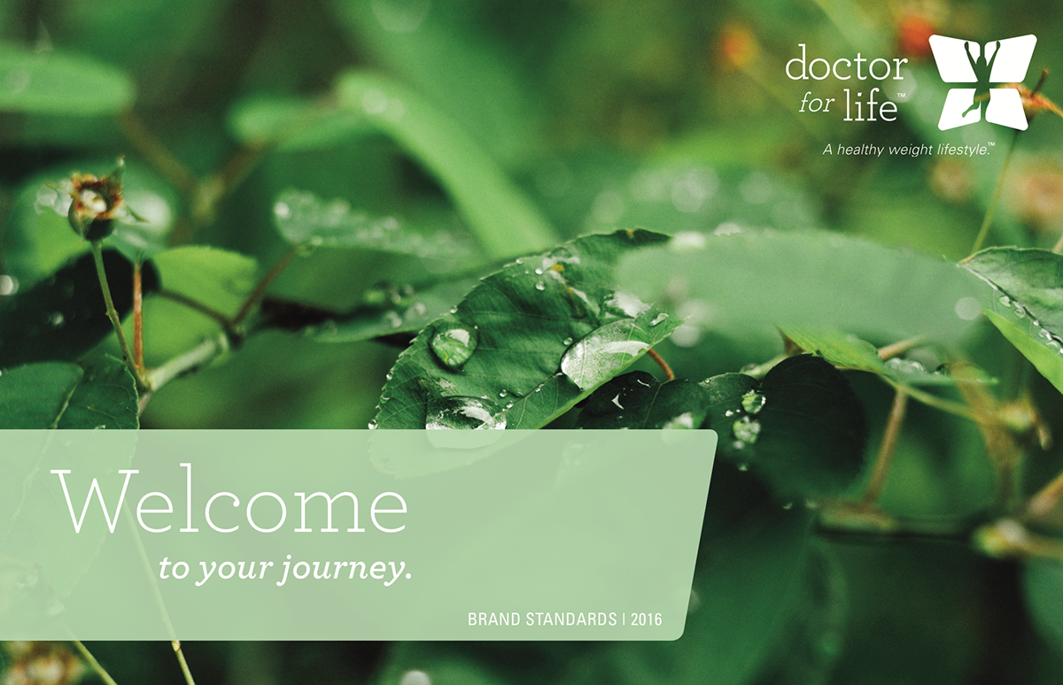
One component of the brand update was the company's logo. It was a must to keep a medically proportionate figure and a representation of the four pillars, the rest was up for change. The ideation process included competitor, inspirational, and symbology research with sketches for each phase. Of the iterations, they liked the classic butterfly symbology. It was a straightforward way to achieve a level of allusion, while also keeping the four pillars present. The specific sections of the butterfly were stylized so the shape could be pulled apart and applied to later creative. It was important this element slant to imply motion and energy. Yet, given the hopeless feeling often associated with weight loss, the shapes were curved to make the motion and energy feel more accessible. The pairing typography was selected to be approachable, but smart. A soft slab serif was the perfect fit.
One component of the brand update was the company's logo. It was a must to keep a medically proportionate figure and a representation of the four pillars, the rest was up for change. The ideation process included competitor, inspirational, and symbology research with sketches for each phase. Of the iterations, they liked the classic butterfly symbology. It was a straightforward way to achieve a level of allusion, while also keeping the four pillars present. The specific sections of the butterfly were stylized so the shape could be pulled apart and applied to later creative. It was important this element slant to imply motion and energy. Yet, given the hopeless feeling often associated with weight loss, the shapes were curved to make the motion and energy feel more accessible. The pairing typography was selected to be approachable, but smart. A soft slab serif was the perfect fit.
In leveraging color theory, we recommended expanding the current palette to include brighter and more contrasting colors. This decision was made as the healthcare industry is primarily “medical blue" and lifestyle brands are primarily softer hues. Most specifically, while keeping a version of the original blue in the color palette, we introduced a teal and ruled the original blue should be used less. This communicated medically founded, but lifestyle focused (the brand standards show the color hierarchy in more detail).
Through the exploration of healthy food brands, nutrition brands, fitness brands and the likes, our recommendation for the overall brand approach was to be simple, yet dynamic. We recommended a photo style and worked through some initial projects to show how this could be accomplished.
Materials:
Over the course of the relationship, we worked on a myriad of projects including the logo, a mini-brand standards, 360MP, website mockups, direct mail, leave-behind collateral, display ads, photography, videography, and video production work.
Over the course of the relationship, we worked on a myriad of projects including the logo, a mini-brand standards, 360MP, website mockups, direct mail, leave-behind collateral, display ads, photography, videography, and video production work.
To view the brand standards, click here
Client Appreciation:
A really unique and intriguing business opportunity, I will always have admiration for their idea and grateful for the opportunity to work with such passionate individuals. Wherever the road leads, best wishes to all involved.
A really unique and intriguing business opportunity, I will always have admiration for their idea and grateful for the opportunity to work with such passionate individuals. Wherever the road leads, best wishes to all involved.


