

Commissioned wall panel for izakaya Michizaki (Braga).
The brief was to create a seasonal wall panel, fitting the “momijigari” fall storyline – defined as the core theme of the restaurant’s fall season menu.
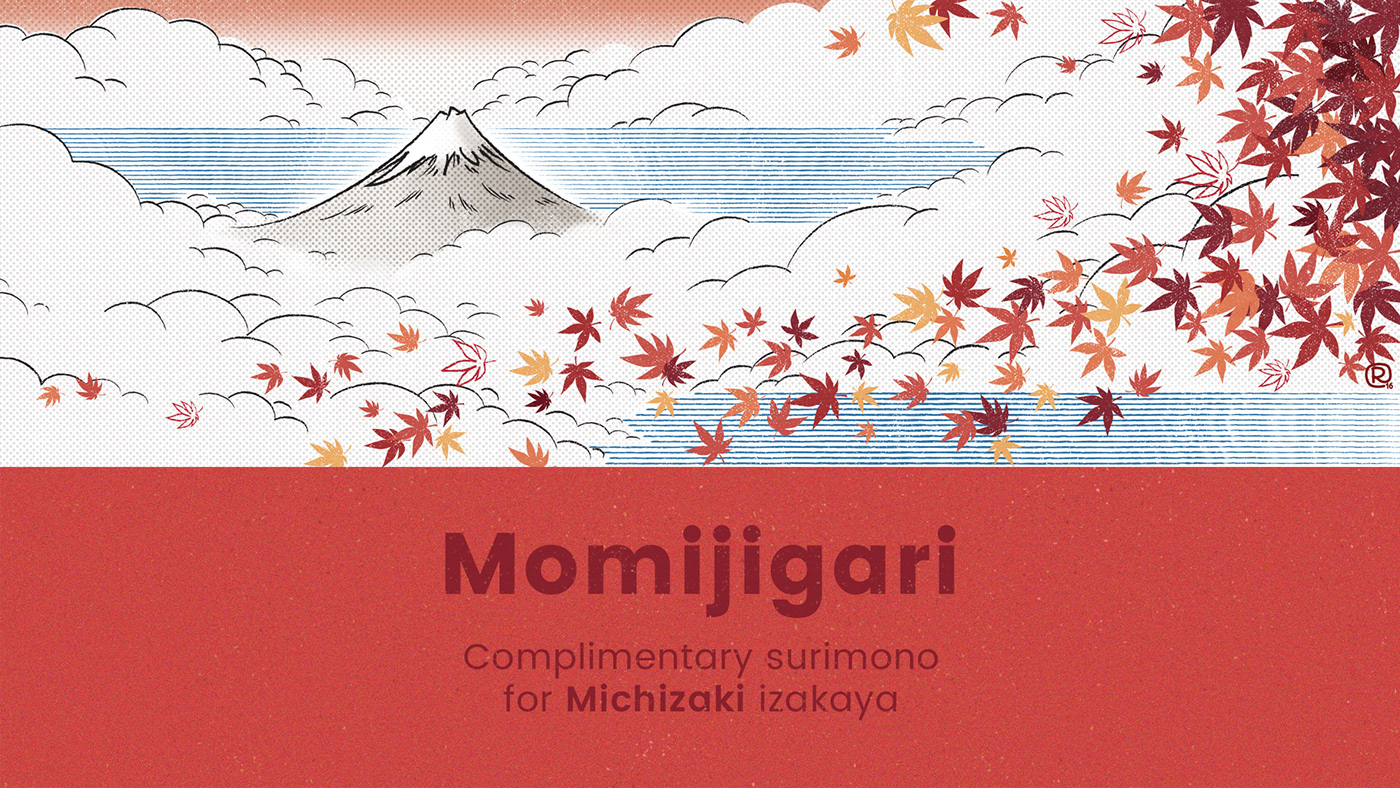
The concept of “momijigari” is deeply rooted in the Japanese tradition of getting together and visiting scenic areas ridden with red leaves during the fall season. Typically, those red leaves come from the Acer palmatum tree and are known as momiji – they also act as the symbol of fall season in Japan (on a more geeky note – those are the leaves seen in the NERV logo, on the anime series Neon Genesis Evangelion).
So, naturally, they became the central motif of my proposal. We also knew we wanted them to feel alive. We went for the synesthetic effect the rustling leaves getting gently blown by the wind. We also went for a movement effect in order to make the most of the wall length, directing the eye towards the sushi bar and the sushimen.
Because this is a traditional Japanese restaurant, we researched and chose an ukiyo-e inspired style, to stay in line with the brand’s values. We’ve kept in mind in trying to make the panel warm, but not not too loud, in terms of color or design, in order to play with the restaurant’s prevalent gorgeous furniture design (a play on the famous Great Wave of Kanagawa by Hokusai).
The illustrated panel was later converted into a surimono, a complimentary print to be offered to Michizaki's customers at the end of the season.

Thank you!


