A brutalist design brief becomes a playful brand identity based on contrasts.
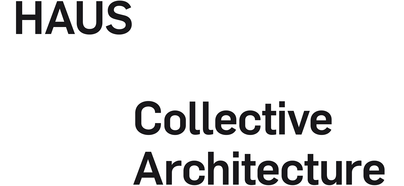
Established architectural consultancy HAUS asked us to create a new brand. With a minimalist aesthetic, it had to project the confidence, versatility and scale of the practice.


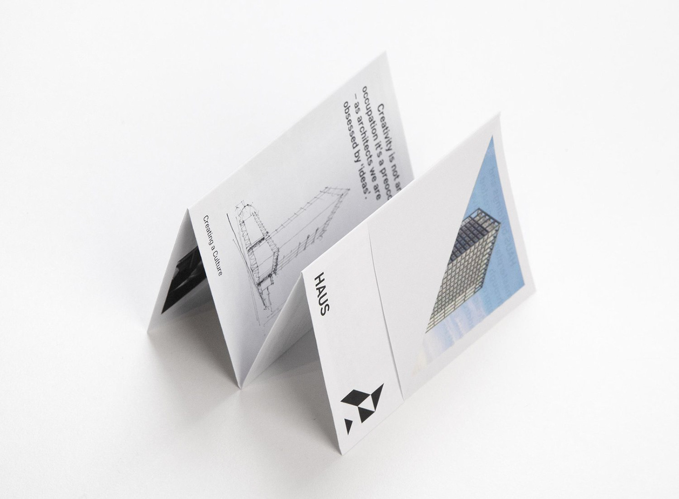
The firm's name evolved into an icon: an almost childlike rendering of a house, universally recognisable at the most subliminal level. Inspired by the structure of the traditional fachwerkhaus, we broke this icon into modular units which could combine and recombine. In a monochrome palette, these shapes become distinctive representations of the brand. Constant variation tempers their minimalism, and suggests the professional ingenuity of the practice. The lines of traditional German timbering hint at craft, but maintain a brutalist edge.

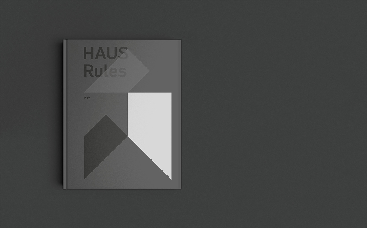
Iconography and text collide playfully in applications of the brand, with overlays and size variations held together by a robust grid system. The Flama typeface combines personality with a machined quality. Textured papers and stamped finishes bring softness to hard lines and tactility to the dynamic marque.


A spatial identity
The icon has exciting potential for 3D manifestation: from small art objects to installations in the physical environment.

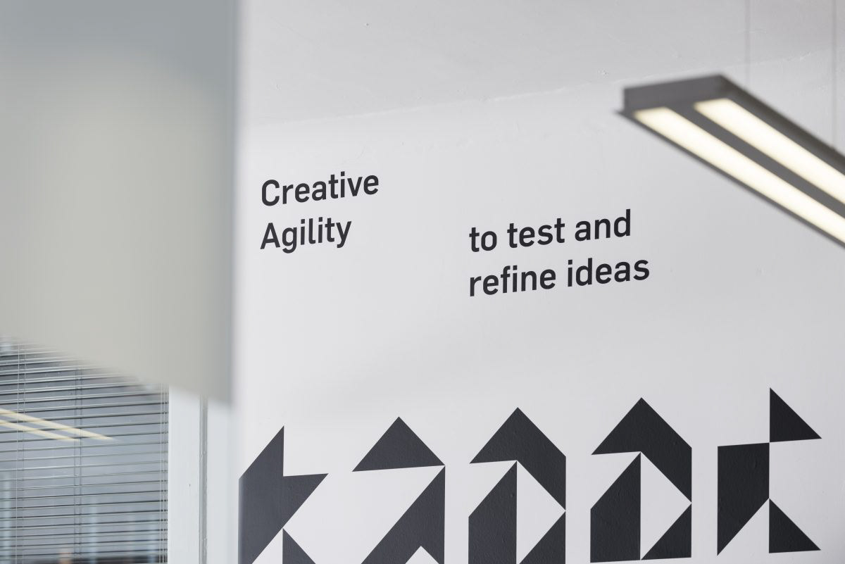


A new website utilises the robust HAUS grid system to make content placement a feature of the brand.
Modular units are a core component of the HAUS brand: deconstructing from the icon into different shapes across literature, presentation materials and environmental graphics. With a rigid grid system tying together these variations, we can play with the positioning of type and image. On the website, large-scale iconography clashes provocatively with a mix of text and image sizes, making functional information inviting to read. The minimal design aesthetic avoids fussiness. And the interaction with word and image brings the marque alive.

Project insights
We drew our design approach from the traditional German fachwerkhaus. The simple geometric structure of these buildings provided a natural framework for a flexible, engaging identity.
—
Client: HAUS
Role: Strategy / Design / Art-direction
Discipline: Corporate identity / Website / Promotional materials
Photography: Gordon Burniston
Website development: Shaun Woods / Bauholz
Letterpress printing: Glasgow Press
Role: Strategy / Design / Art-direction
Discipline: Corporate identity / Website / Promotional materials
Photography: Gordon Burniston
Website development: Shaun Woods / Bauholz
Letterpress printing: Glasgow Press
—
For more information about this project visit our website www.freytaganderson.com
To discuss a new project or idea please contact our Project Director Sophie Brown.


