DNEG –– Strategy / Brand Identity
With four Academy Awards for films such as Blade Runner 2049, Ex Machina and Interstellar, Double Negative is recognised as one of the most accomplished VFX studios in the industry. Their merger with Prime Focus, ranked as one of the largest VFX businesses in the world today, has created a new industry powerhouse.
Our challenge was to unify these two businesses by defining one clear vision that distilled the legacy and spirit of both brands into a single-minded strategy.

Understanding what matters
It was vital to garner input from across the businesses in London, Mumbai, LA and Vancouver. Through conducting over 40 depth interviews and undertaking creative working sessions with key stakeholders, we developed significant insights that shone a light on the common strengths and ownable opportunities for the new brand. In addition to our work with senior teams, we crowd-sourced opinions and ideas from the 8,000 strong global team and shared progress of the creative development throughout the design process.
Positive transformation
What we discovered was a shared passion across both companies for film and an insatiable drive to excel, chart new territories and invent new ways to tell stories. We saw a culture that empowered people to succeed and “where everyone is an Oscar winner”. Working with these shared values as a starting point we developed a unified brand purpose, core values and communications strategy based on ‘the positive power of storytelling.’

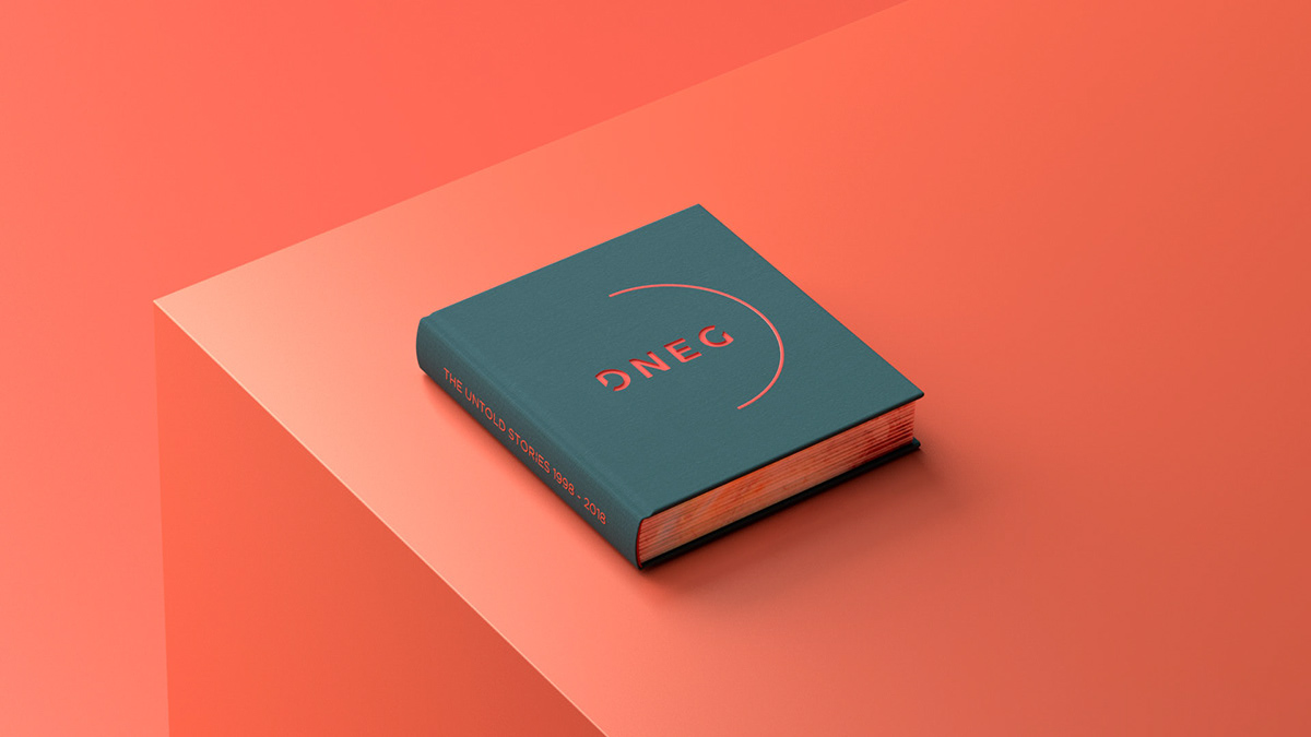
A name and logo for the next generation.
We took an evolutionary approach to the re-naming of the brand. Leveraging Double Negative’s industry moniker – DNEG – we were able to take fresh step forward while retaining the heritage and brand equity of the company’s illustrious 20-year history.
We designed a new logotype that is confident, modern and iconic. The D and G mirror each other in a subtle suggestion of constant motion and transformation. It’s crafted to work at any size, from the cinematic opening of a film to a discreet but memorable mark of quality on a movie poster.


A focus on craft, story and invention.
The brand language is intentionally pared back and restrained, featuring an ‘aperture’ - a graphic system that reflects the way we see the world. A visual metaphor, suggesting constant motion, moving forward and transformation. It is used to frame, focus, magnify and represent time.
The aperture highlights the detail and craft that goes into every single frame and the people behind it. It informs the way the brand moves and reacts: from the UI and iconography on the website; to the day/night cycle of the clocks for each office.
Even traditional linear elements like timelines are represented through the aperture.
Immersive, iconic frames and key art of films are used confidently. Images of the team are crisp portraits against the brand colours. Monochromatic reportage photography captures behind the scenes moments. A modern and muted palette of colours support the primary ‘coral’ orange of the brand.
The re-brand rolls out through the logo, tone of voice, a new website, studio interiors, merchandise, stationery and clothing for crew on set.


