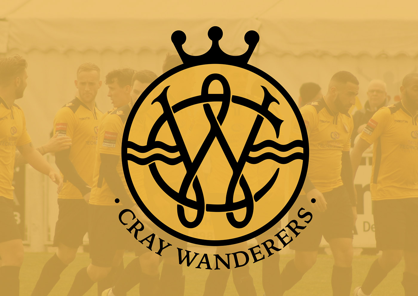
CRAY WANDERERS FOOTBALL CLUB
Crest Redesign Concept
Passion project for the rebrand and design of the Cray Wanderers Football Club crest.
Cray Wanderers was founded in 1860 (one of the oldest clubs in the world). Formed and established in the region of twin villages St Mary Cray and St Paul's Cray, near Orpington. The club currently play in the Isthmian League South Division.
Cray Wanderers adopted an altered version of the former Orpington Urban District Council's coat of arms as their club crest. The alterations being colours, which directly link to the clubs identity.
The wavy lines represent the River Cray. The crowns mark the urban development in the northern and central parts of the district. The sword and chain are taken from the badge of the nearby Royal Air Force base at Biggin Hill. The (Invicta) horse represents the county of Kent. Missing from the crest is the Orpington motto, 'Progredior' meaning 'I progress'. Replacing this is the club name and founding date.

Existing Crest
The fact that Cray Wanderers actually use the coat of arms of Orpington Council; an area they border has historic reasons behind it. However, after being around for over 150 years, you would have thought they would have created their own unique club crest.
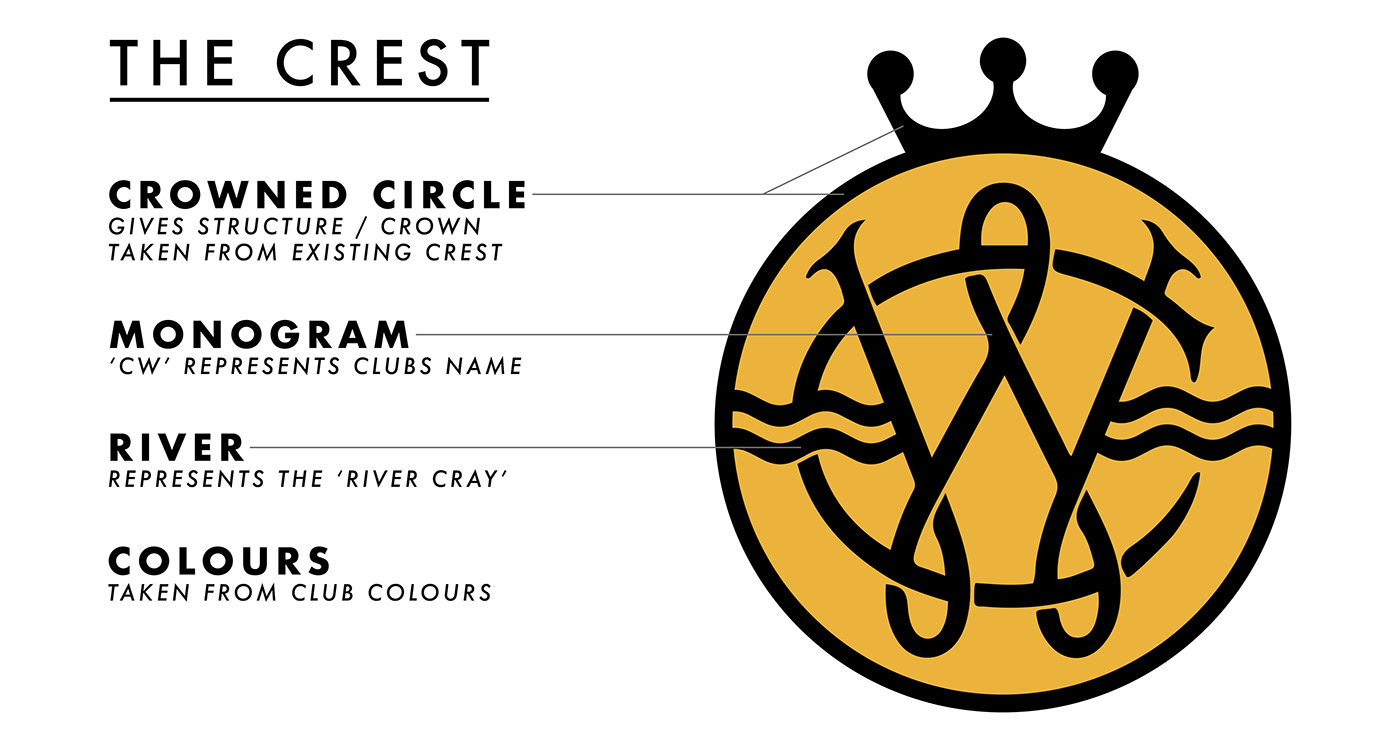
The main aspects I have taken from the existing crest are the club colours, a crown and the river cray. The river is the main feature as its name directly links to the name of the team and also the areas of St Mary Cray and St Paul's Cray. Also the crowns that represent the urban development. I don't feel the Biggin Hill logo is necessary in my design as it is more associated with the Orpington region.
Such aspects discussed above have influenced my design, which I chose to combine a modern style with traditional features.

I chose to base the design around the two main colours of Cray Wanderers. Both have been directly taken from the clubs traditional kit. This straight away provides a relatable identity.
I chose to set my design inside a circle shield border. On this border I incorporated a crown. Two crowns are present on the existing crest; representing the urban development of the regions. I chose to only use one for design purposes as well as the fact I believe the representation can be served by the use of only one crown.
The main emblem of the crest was a 'CW' monogram, which incorporates the wavy lines that represent the river cray. I believe monograms depicted in this style can be viewed as both modern and traditional (Rangers FC monogram logo). This works well as it is updating the badge whilst still having that 'old school' feel; an important aspect for such an old, historic team.

Single Colour Variant (1)

Two Colour Variant (Shield Fill)

The way the logo has been constructed means it can be displayed in a single colour variant. This is very important as having too many colours can be hard to construct a sleek final design when it comes to embroidery or being put on other mediums. By being able to use only one colour over the whole design also means it is easier to change. The fact that Cray Wanderers identity is directly linked to the use of two main colours is very beneficial.
This new logo has been created by taking aspects from the existing crest, reworking them into a simplified form whilst still ensuring their representation remains genuine and meaningful. Presenting these elements in in a modern, yet traditional format that is structured and minimal, brings Cray Wanderers crest up to date with modern design whilst ensuring the clubs historic heritage is also represented.

Logo Variants Embroidered Mockups