


Architecture and Transitional Spaces | Type Experiments
A school project for Academy of Art University
Art direction, Typography, Graphic design
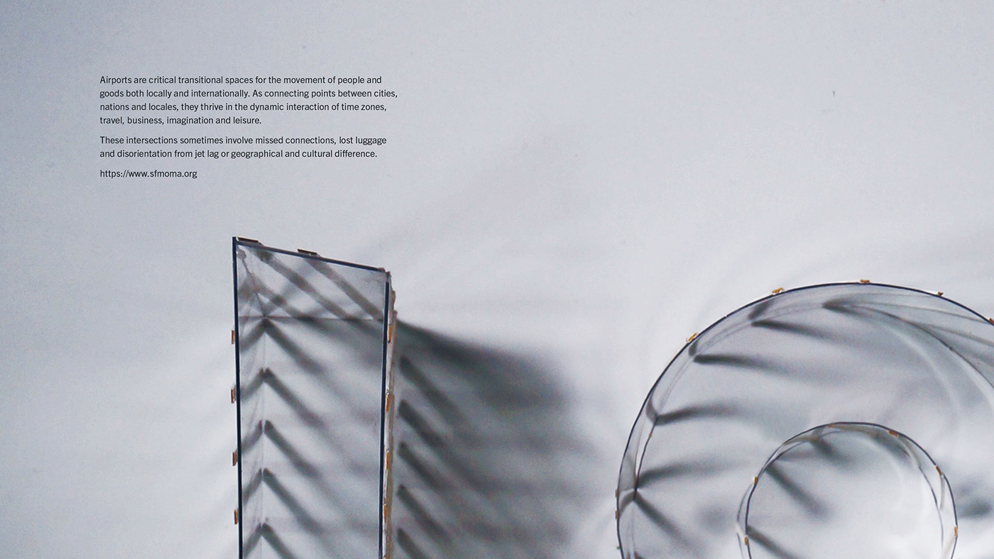
To promote a hypothetical architecture exhibition by creating an architectural typography poster series. The goal of this project was to experiment with typography through the use of physical materials. Each poster expresses a place with a word representing its spatial or experiential characteristics.
I chose transitional places as the topic of this hypothetical exhibition. Airports, subway stations, hotels, and ports are transitional spaces for travelers, workers, and products, both globally and locally. They sometimes feature innovative architectural design, but they also have to provide comfort and efficiency. They are used every day, yet no one is a permanent resident.
Therefore, these spaces are transient even though they are a permanent part of our lives. The inspiration for the overall design vibe and the materials was the actual architectural space.
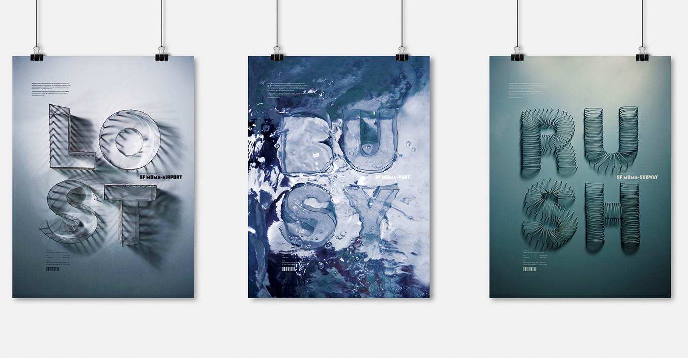
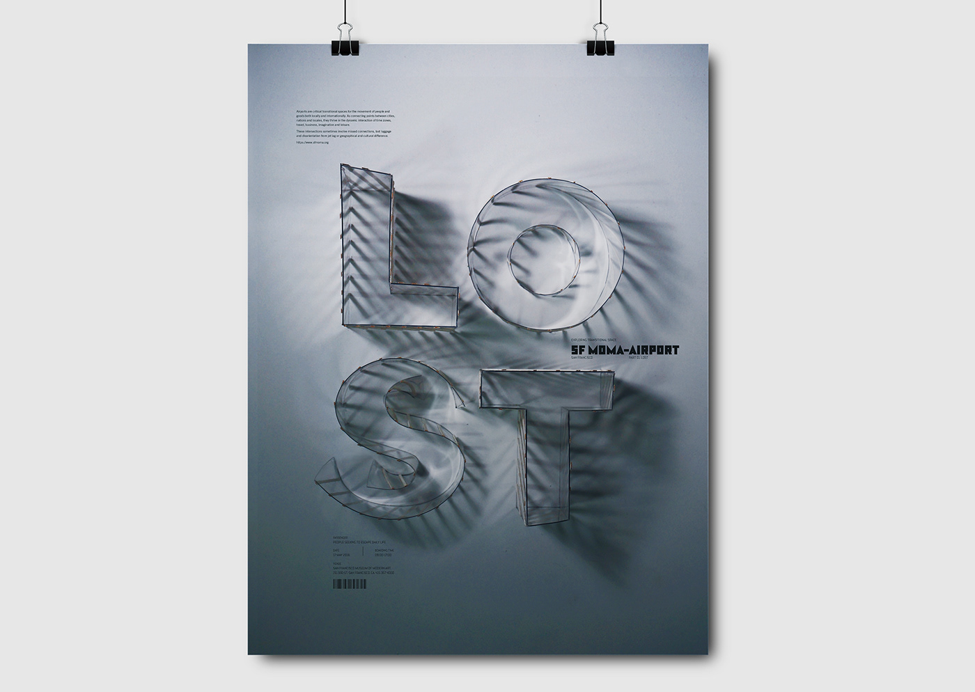
01. Airport | Lost
Airports are usually airy, open spaces with high ceilings. It is easy to get lost or disoriented, especially when traveling internationally. Airports represent dislocation as well as transit and comfort. So I chose 'Lost' as a representative word.
For the architectural structure, the type has repeated elements such as big windows, moldings and columns that create interesting shadows. The combination of the repeated structures and shadows reminds me of the interior of an airport and a sense of disorientation.

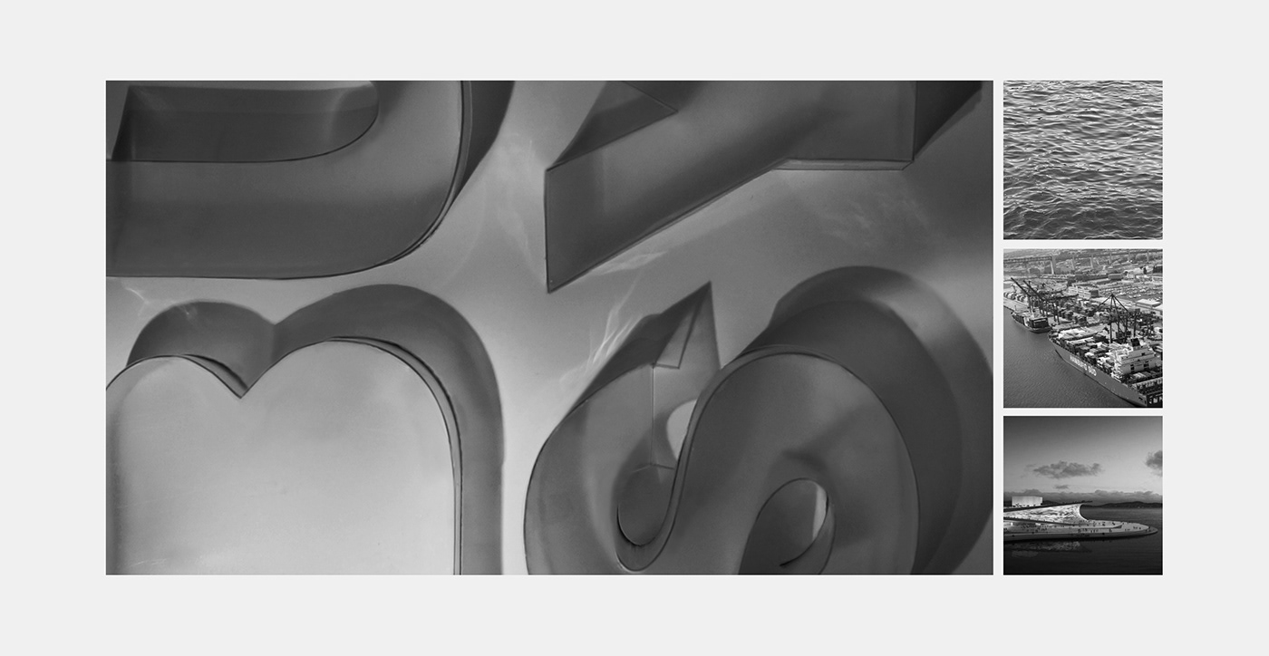
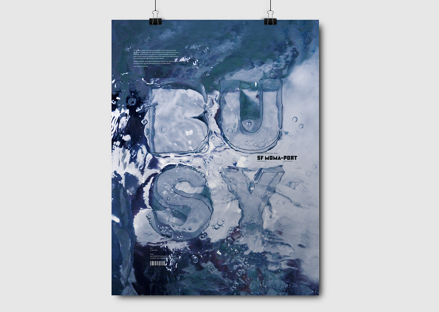
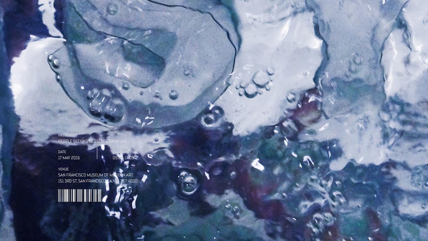
02. Sea port | Busy
Seaports are the oldest transitional space of the three that I chose. They have been around since ancient times and always represent the busy activity of travel and commerce, including people and products. This is why I chose the word 'Busy'.
The architectural structures are similar to those of the airport because of the big open spaces but also relate to the idea of water, so I tried to express that in the design elements.
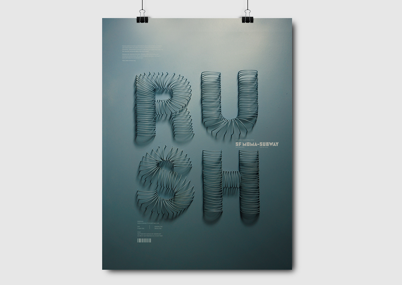
03. Subway station | Rush
Subways represent the hectic lifestyle of the urban worker and commercial environment, with rushed timelines, deadlines, hurrying to work and living at an accelerated pace. This is why I chose the word 'Rush'.
The atmosphere of the subway is dark, gloomy and somber because they mostly function underground and represent the stressful life of the worker, so I used grayish-blue for the palette and emphasized subway tunnel arch structures in the design.


Thank you :D


