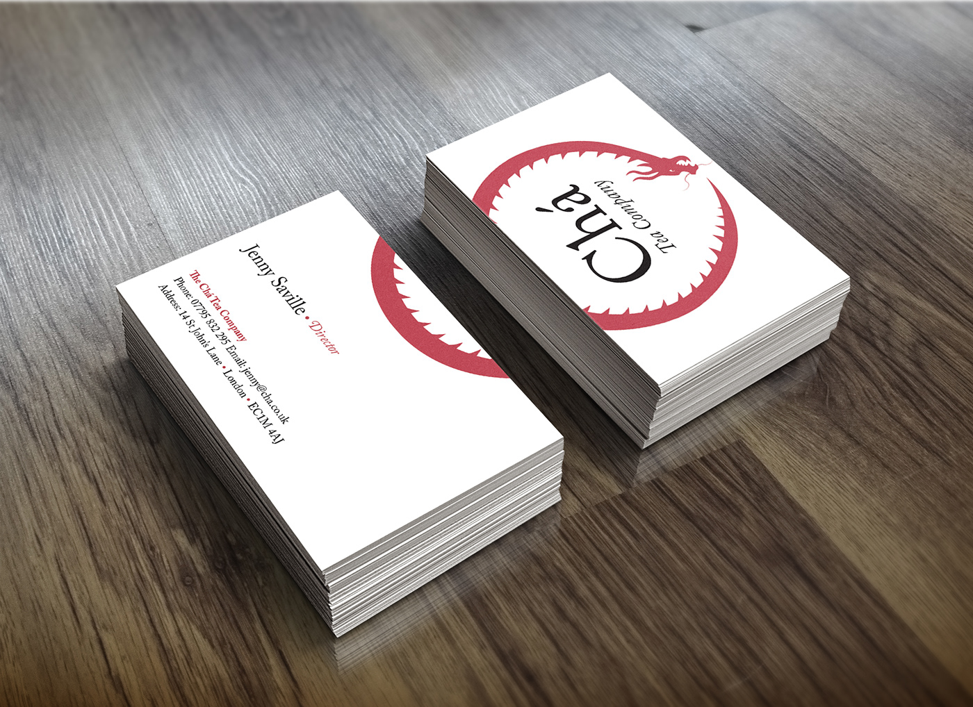
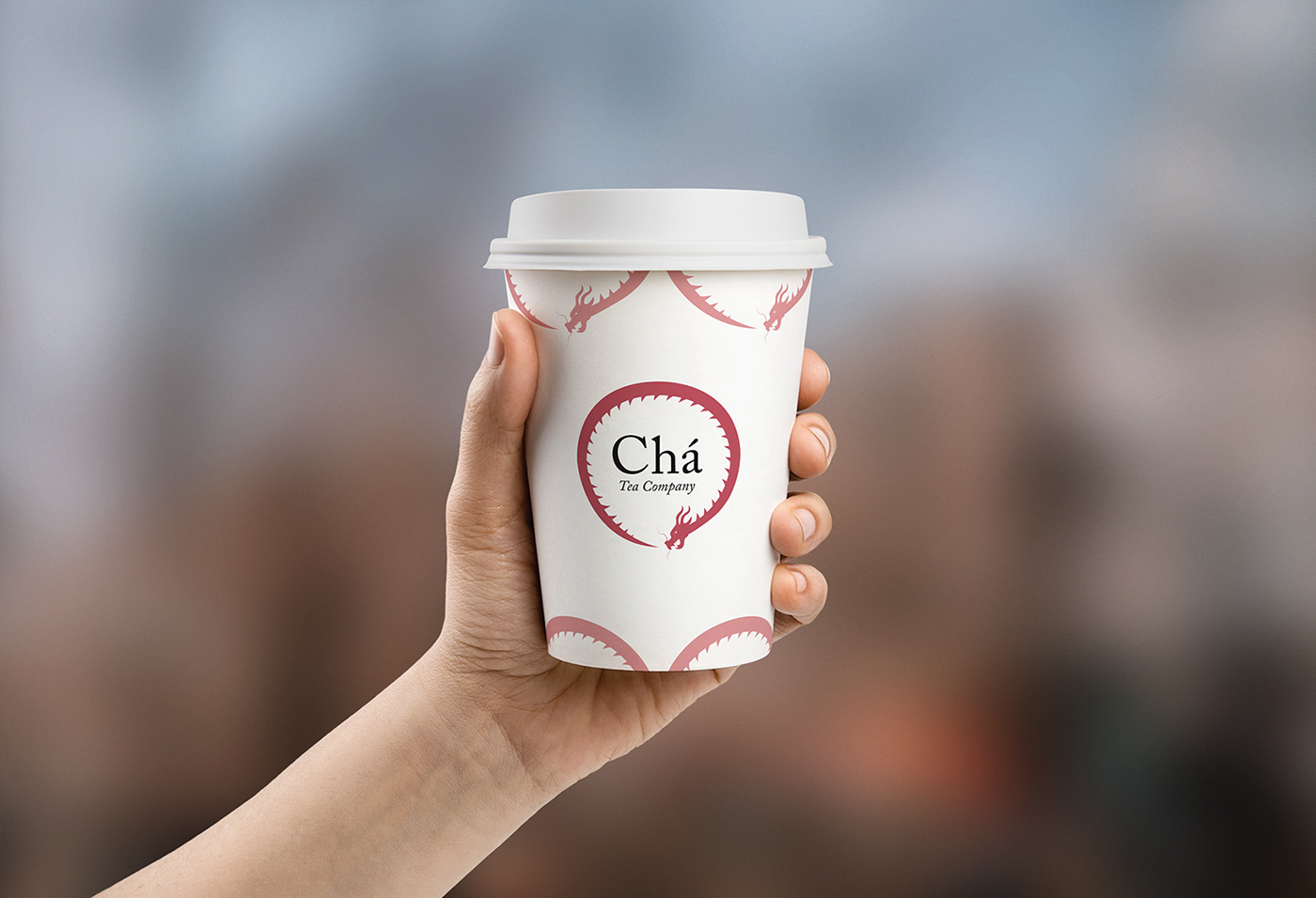
The brief for this project was to design an identity for Chá, a high quality tea company brand with heritage from the east, specifically the cultural roots of tea that come from China. The company was opening a series of new tea-houses, in the UK, and it needed designs for their take-a-way cups and for the company identity.
I chose the symbol of the dragon for the illustrative element of the logo for several reasons. The dragon is the symbol of China and has associations with luck, wealth, power, and nobility; they were not seen as monsters that they typically are portrayed as in Western stories. The dragon is illustrated in a circle to look like the ancient symbol of an ouroboros – a snake eating its own tail. The red that was used for the dragon was chosen because red in Chinese culture is associated with fire, good fortune and joy. Red is found everywhere during Chinese New Year, holidays and family gatherings and in China today, red remains a very popular colour and is widely used by the Chinese Government.


Business card design

Compliments slip design

Letterhead design

Cup design without sleeve

Cup design with sleeve


