

The WIT list, standing for “Women in Tech” list, is a is a searchable, inclusive, online directory resource of organizations, lists, meetups and groups aimed at women and girls in STEM. By bringing everything in one place and providing the ability to search by country, city, age group, content area, and more, the WIT list makes it much easier for women, girls and allies to and explore women in technology initiatives in their areas and elds.

How does the past can
influentiate the present.
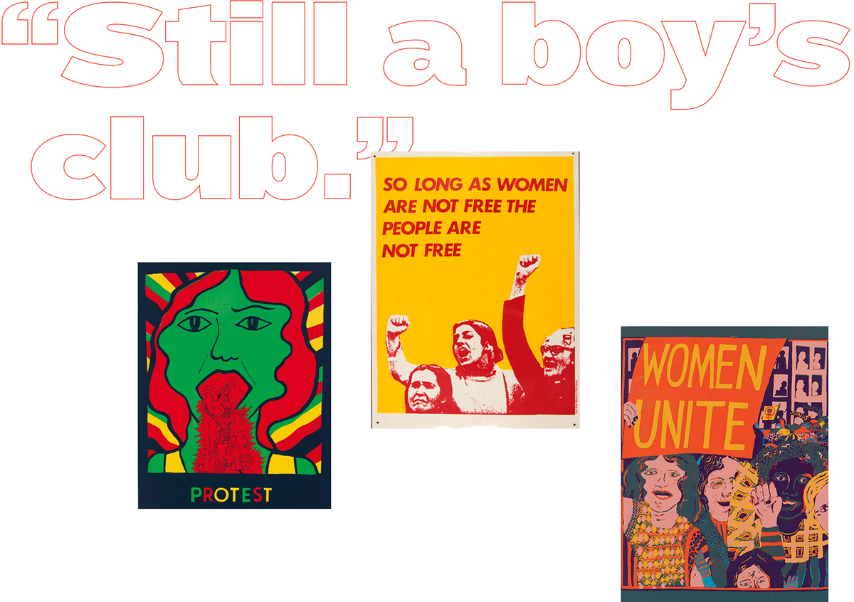
In the past, when women started to have a bigger window of opportunity and openings to be able to fight for their rights, many groups and communities appeared with a very important role to empower women in their fight for these rights. With that motivation in mind and the strength to change, we’ve decided to focus in the similarities between other women and groups that continue to fight for what is currently happening in the modern world.
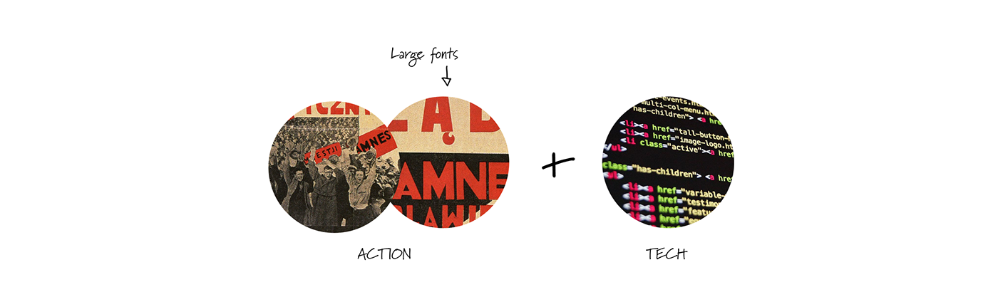
In the 70’s, two groups, See Red Women’s Workshop and Chicago Women’s Graphic Collective, were responsible for actively participating in these kind of events. These two groups produced many graphic supports to express their beliefs to the world; We used these groups as inspiration for our language given that they were made by women that experienced first hand the inequalities of that time: Strong messages, strong lines, collaborative work, informal communication, Culminating in a result of outstanding values and a sharp images.
The Branding


To feel the action in the design and to provoke sensation of movement, strength and power, we embody a campaing style which through simplification of the graphic elements allows to obtain a balanced and neutral feeling in the final image that reinforces the message of equality.
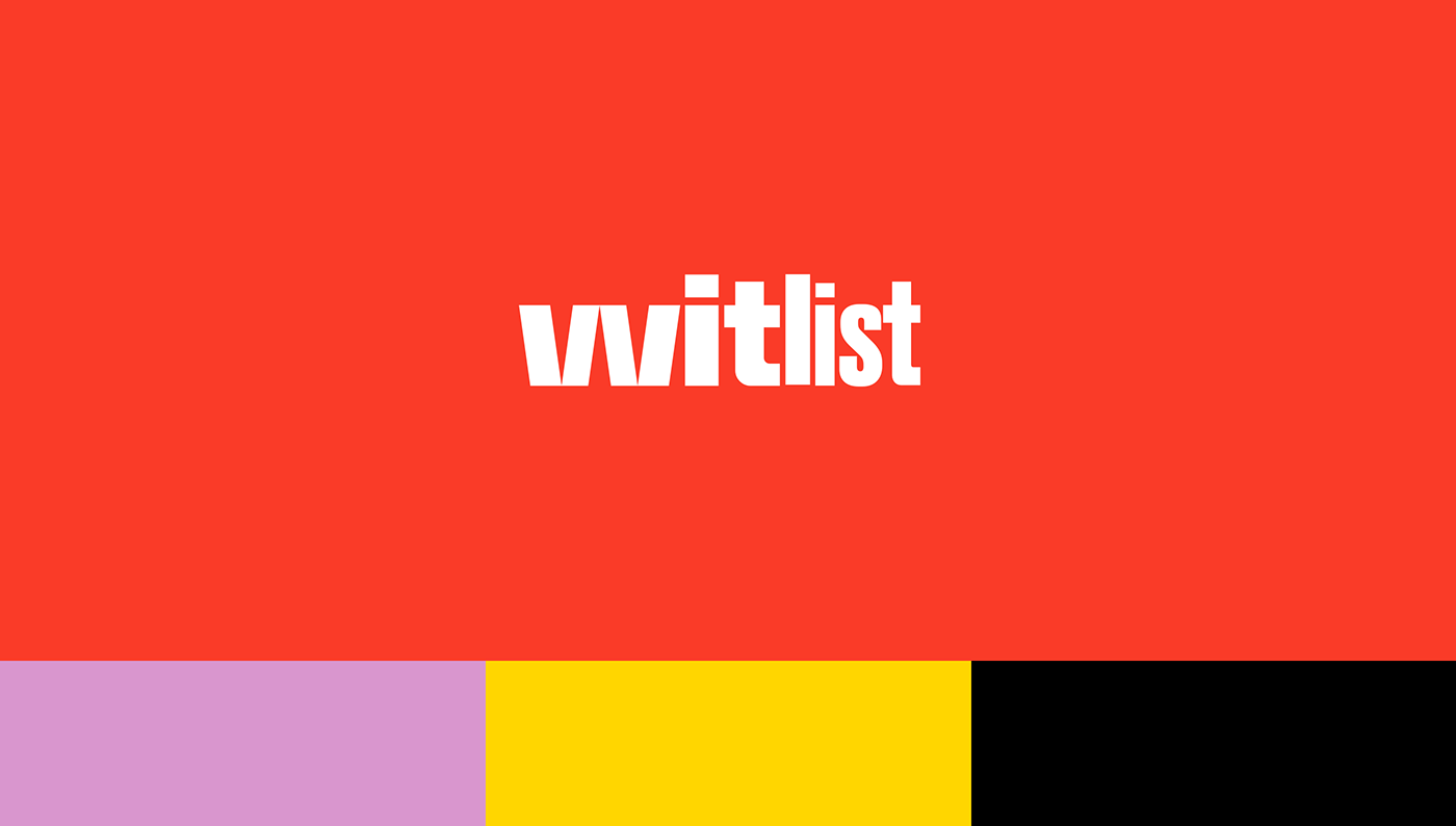
In the logo, angle brackets are used for representing the W on the “Wit” word. The form of the two V’s was adjusted to get a similar image of a angle bracket (“>” bigger then, “<” smaller then), being positioned vertically, they’d lost meaning and connotation, which combined with the symmetry between them, reinforces the affirmation for equality.
The use of two different weights of the same font, creates a flow on the word, which suggests a movement and action supporting the value of the project intention.


Credits
Company: Seegno
Creative Director: Luís Oliveira
Designer: Barbara Martins, Luís Oliveira
Motion Graphics & Sound: Fernando Viana


