


Halston Properties
"Colorful places to live and play"
Halston Properties is a UK base property company. Halston build wonderful country
home set in UK. Company's aim to provide a positive and stress-free, country home experience and they want their brand should like Bold, Country and Stability look.
home set in UK. Company's aim to provide a positive and stress-free, country home experience and they want their brand should like Bold, Country and Stability look.
Project Goal
To solve such problems, we created a new brand Identity that can express a unique brand identity and visual system to differentiate the brand from its market as a brand created
by the real estate professionals. We define the brand direction and develop a design language reflecting the Identity of Halston and apply it to various media.

Inspiration
The clients gave us some Inspiration below. The main Keyword is Halston, Home, Hold, Building, Strength, Brick.

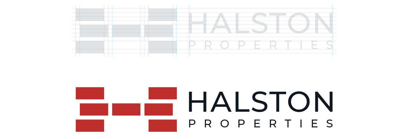
Brick Formation and Brand Keywords Research

Logo Concept & Sketch
During the research, our goal was to find a shape that feels Bold, Strong and Old at the same time.

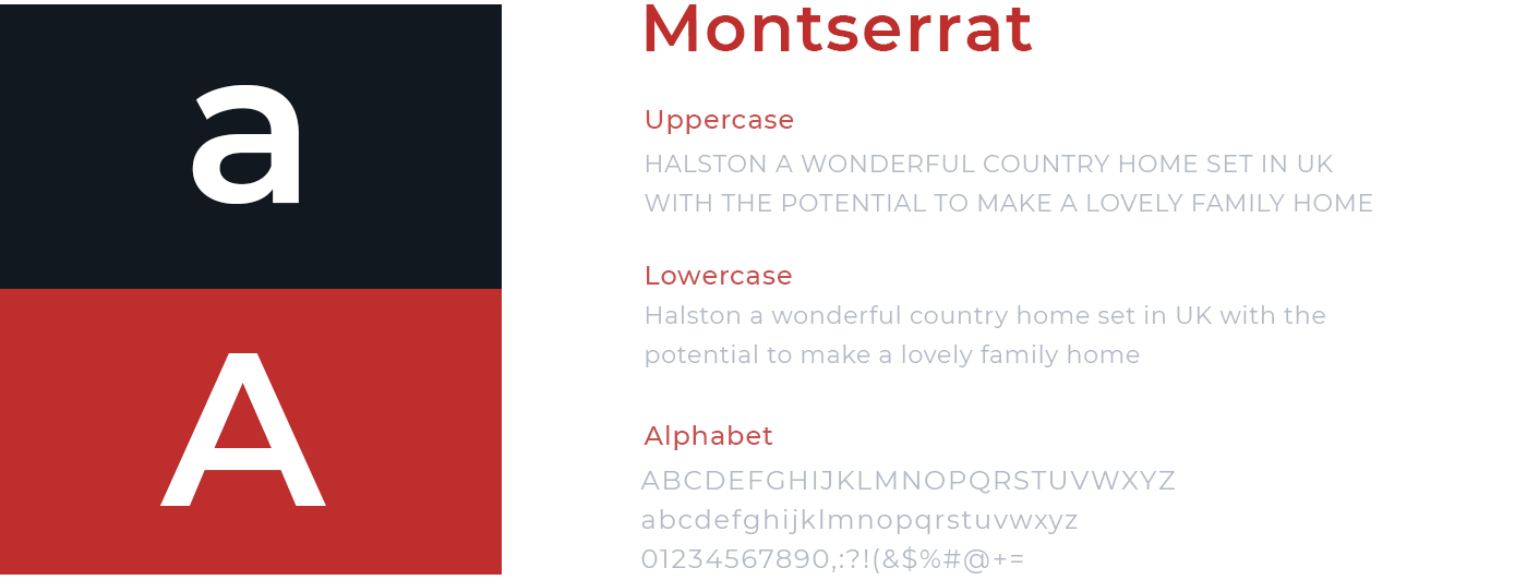
Typography Research
We started working on the word mark, After the logo mark was ready. It's important to maintain consistency between the logo mark and the word mark elements.

Recommended Typeface
Finalized the logo
Finalized the logo is one of the most exacting steps in our branding workflow.
We use our own grid system that always leads to high quality results.


Background usage

Horizontal Logo
Logo Space

Brand Color
Brand Color

Brand Pattern

Iconography
Halston iconography stems from a petal shape, reflecting formal characteristics
of the visual motif.


Photography

Applications

Bus Stand Poster

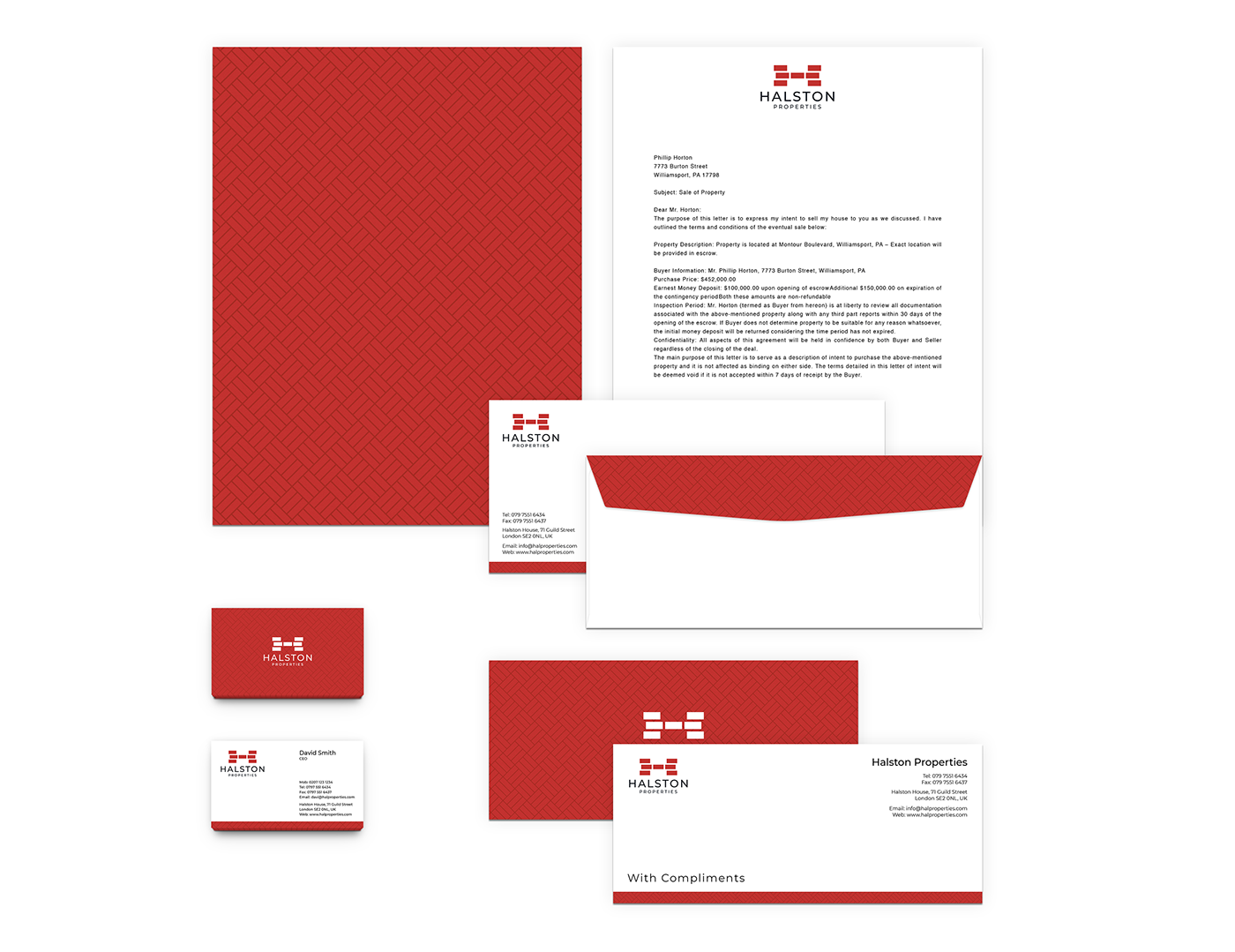
Stationary
Indoor Office Desk

Newspaper Ads

Outdoor Metal Sign

Website

Sale Pictogram Sign

Park Pictogram Sign

Halston Properties
Brand Identity Design
RespoGrid
BX Planner : Shahin
BX Designer : Shahin
BX Planner : Shahin
BX Designer : Shahin
Motion Designer : Abir
UI Designer : Abir


