"So, show me what you can do!"
Building a résumé for a Graphic Designer can be a true nightmare!
He has to show his skills both with the words and with the layout. Sometimes it's not enough, sometimes one element prevails on the other. Sometimes there are too many colours, sometimes it's too show-off!
For this version I wanted to create a good balance between readibility and legibility.
Therefore I mainly focused on the typography and its beauty, trying to create a page that flows and is "easy on the eye" and perpetrating the invisible art.
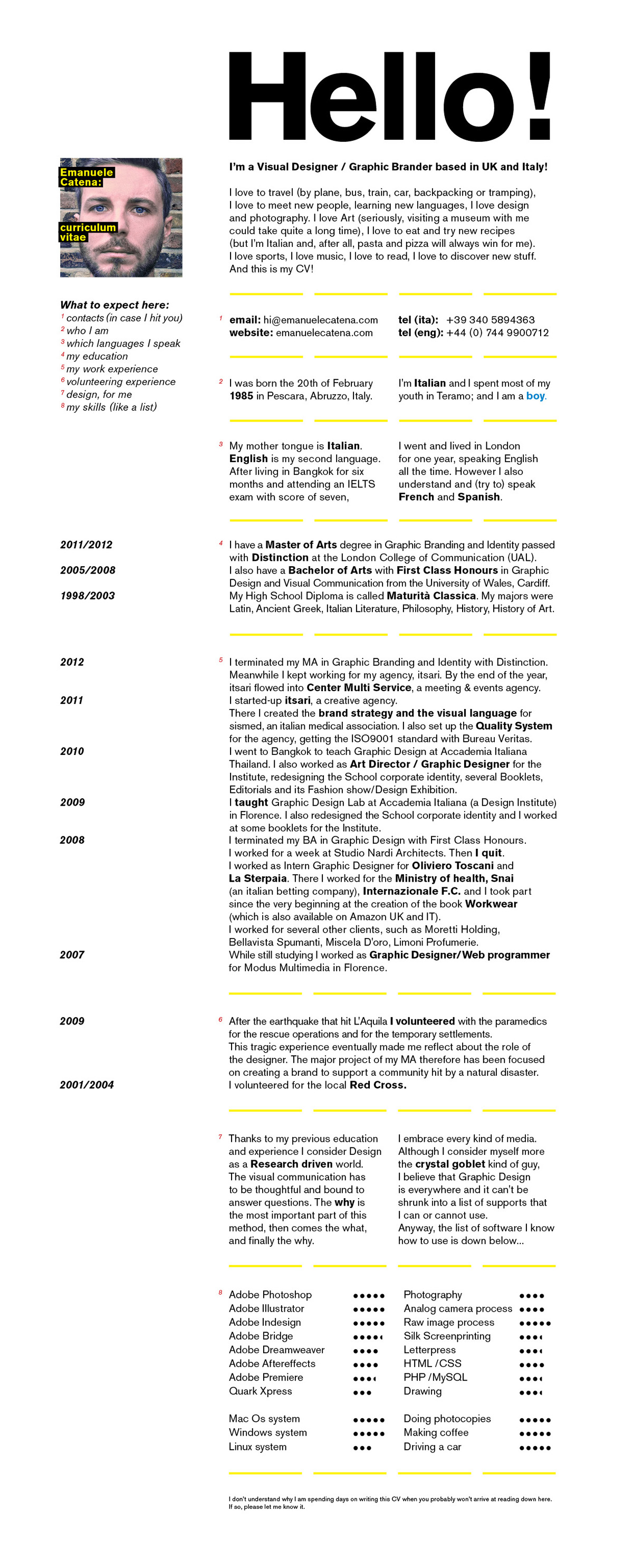
I wanted to use a Sans-serif not humanist.
I also didn't want to use Helvetica, due to its massive x-height.
Therefore I decided to use Bertold Akzidenz Grotesque, a modern(ist) type with a good readibility and a great balance between ascenders and x-height.

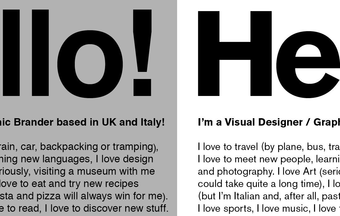
Grey: the layout, six grids elastic.
Red: the spacing between the text follows the golden rule.
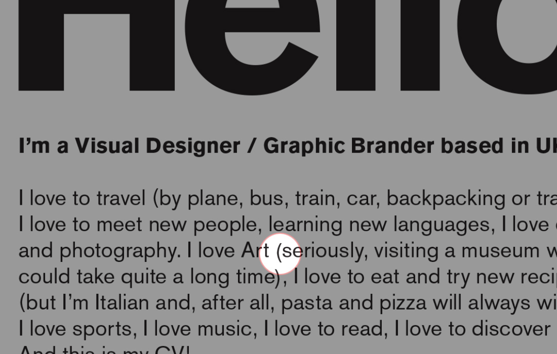
For the parenthesis I modified the height and the kerning in order to better fit the smallcaps.
Sometimes the @ is higher than the smallcaps, creating an akward effect.
That's why i moved the height of the letter in order to better fit the general x-height.
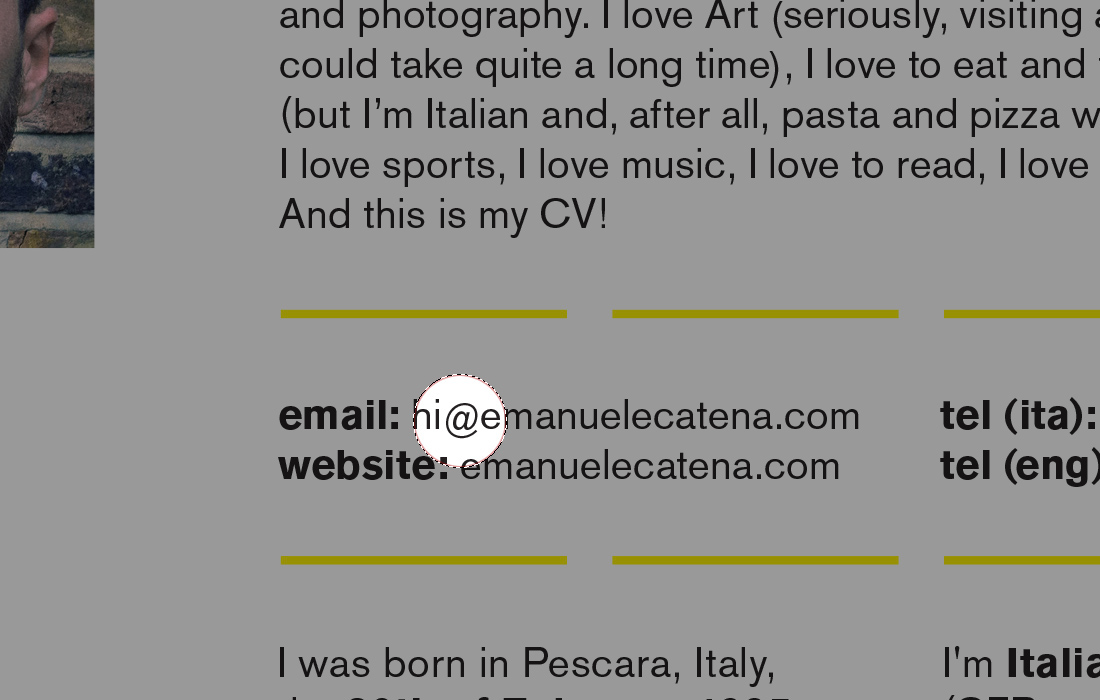
A matter of choice.
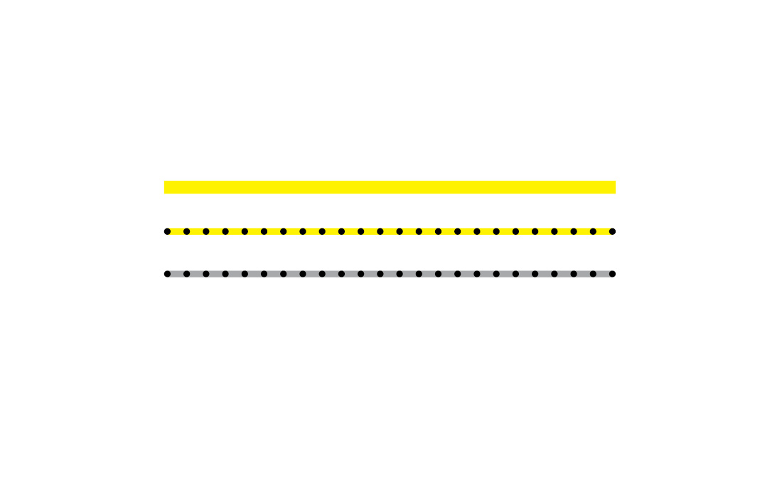
The dividers I picked for the different paragraphes.
Eventually I decided to use the simplest one.


