
European Music Incubator is a European project coordinated by the Trempolino team (in Nantes), who entrusted us with designing its visual identity and website.
Client: European Music Incubator
Year: 2017
More at: murmure.me/en/project/emi
Identity
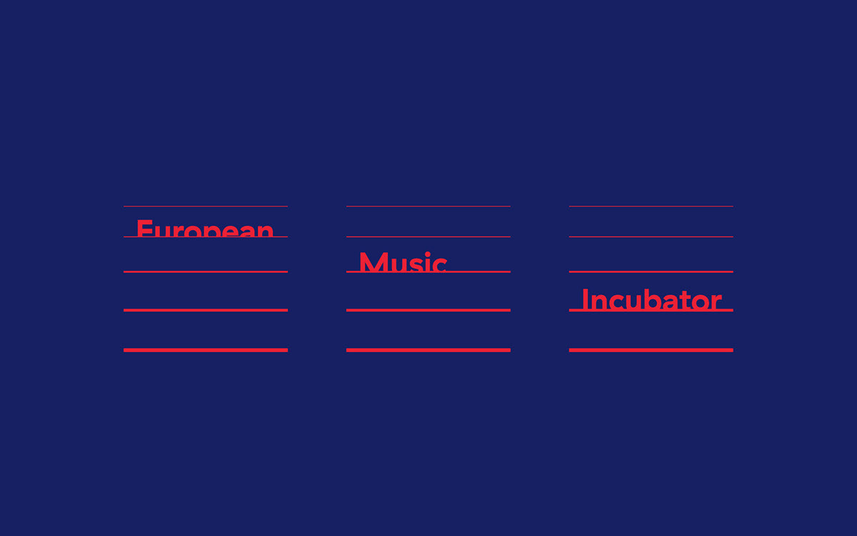
The logo reveals the stages in the coaching and musical training process the incubator offers. Working both as a logo and a logotype, it has been designed from GT Haptik, a modern geometric and grotesque typeface, legible and elegant, accompanied by a strong, graphic and resolutely digital two-colour printing process.


We place the user at the centre of the experience
Through a strong highlighting of the project’s graphic charter and identity, the Internet user is directly immersed within the brand’s universe.


One-Page
A One-Page website, entirely manageable, is recreational and dynamic, custom-designed in order to communicate on the project and present its timing, content and partners.


We develop visual identities which are singular and meaningful
Silk screen-printed on red and blue Curious Matter Arjowiggins paper, the EMI’s stationery reveals the simplicity and effectiveness of the logo and its graphic charter.


