
The brief of the project was to establish a new Belgian beer identity and packaging design differentiable from its competitors such as Leffe, Hoegaarden and Duvel.
-----
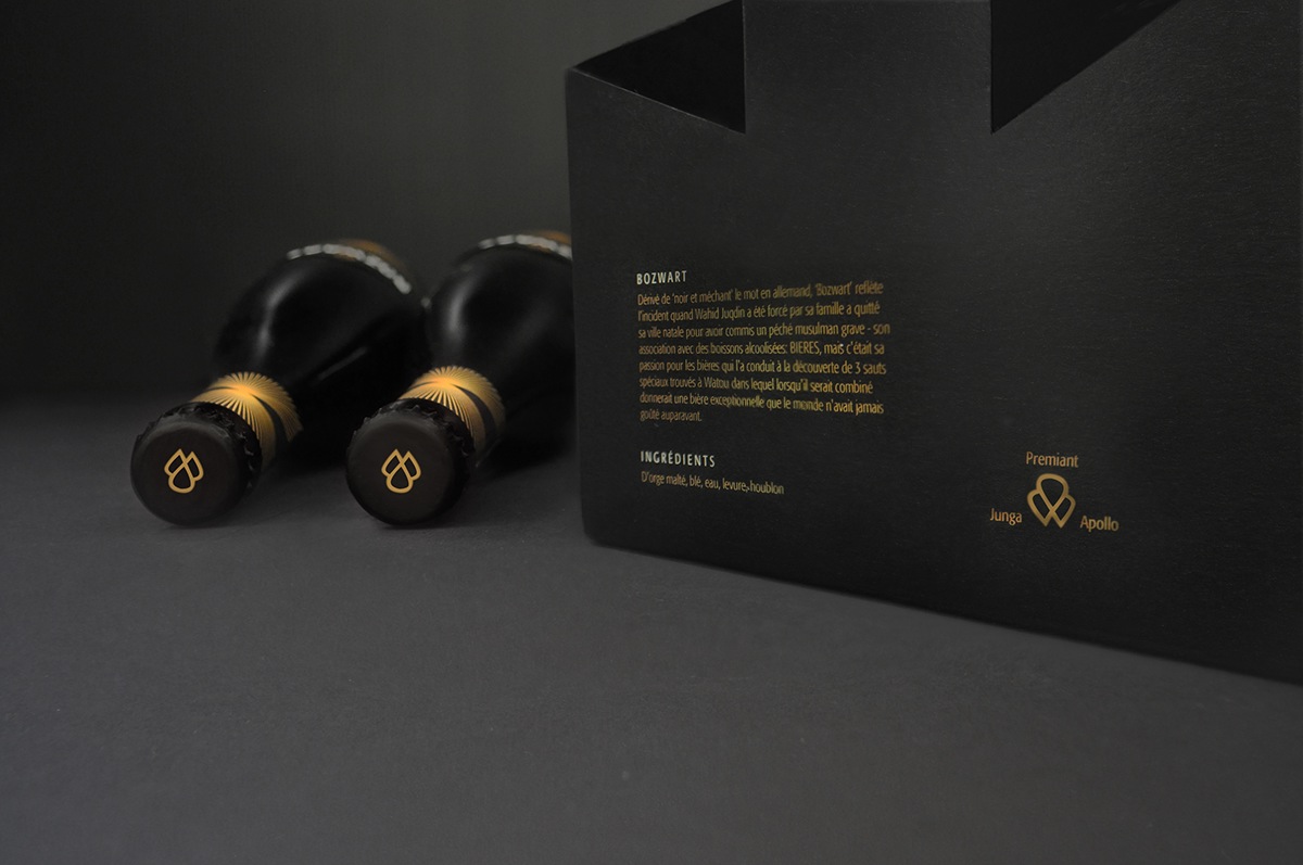
Derived from the word ‘black and evil’ in Dutch, ‘Bozwart’ reflects the incident when Wahid Juqdin was forced to leave his hometown by his family for committing a severe Muslim sin – his association with alcoholic drinks : BEERS, yet it was his passion in beers that led him to the discovery of 3 special hops found in Watou, Belgium in which when combined, yield an outstanding beer that the world has never tasted before.
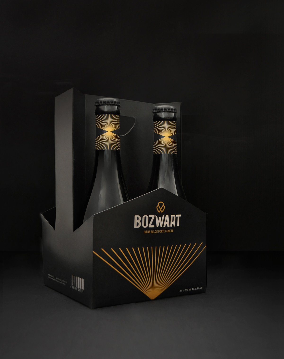
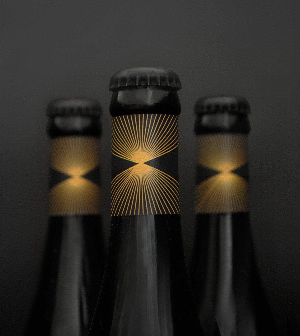
Bozwart beer thus embraces a rather masculine appearance and a dark colour palette. The golden divergent rays along with the logo that is built based on the three hops serve as visual instruments to commemorate the history of this dark ale Belgian beer.


designed by Aik Chin Teoh