ROMA EDITORA
book publisher branding
A proposta para a marca da editora (Roma Editora), teve por base a praça Campidóglio, símbolo de referência do centro de Roma. Desenhada por Miguel Ângelo (1536), destaca-se pela sua singularidade geométrica e beleza arquitectónica inconfundível. De forma trapezoidal, a sua orientação permite-nos compreender a evolução da cidade que, em dada altura voltara costas a Roma Antiga para se dirigir para o novo centro de poder, o Vaticano.
Com isto, a criação do logotipo partiu por redesenhar e redimensionar o traçado característico ornamental desta praça, concebendo, assim, uma marca geometricamente interessante e apelativa, de grande simplicidade.
-
The proposal for the brand of the publisher (Publisher Rome), was based on the Campidoglio square, a symbol reference from the center of Rome. Drawn by Michelangelo (1536), stands out for its uniqueness geometric and architectural beauty unmistakable. Trapezoidal in shape, its orientation allows us to understand the evolution of the city that, at some point returned back to Ancient Rome en route to the new power center, the Vatican.
With this, came the creation of the logo by redesigning the layout and resize ornamental characteristic of this square, conceiving thus a brand geometrically interesting and appealing, of great simplicity.


simbolo
symbol

tipografia italiana: bodoni por Giambattista Bodoni
Italian typography: bodoni by Giambattista Bodoni


Capas de livro - 3 colecções
Books covers - 3 collections
Colecção Faces de Penelope


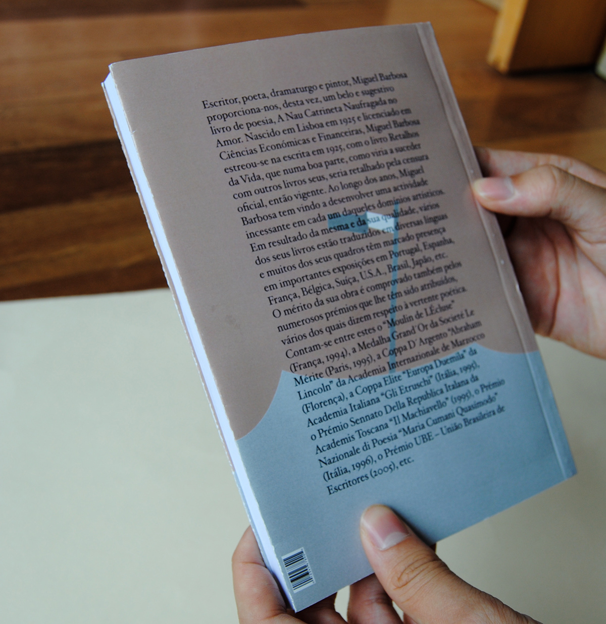
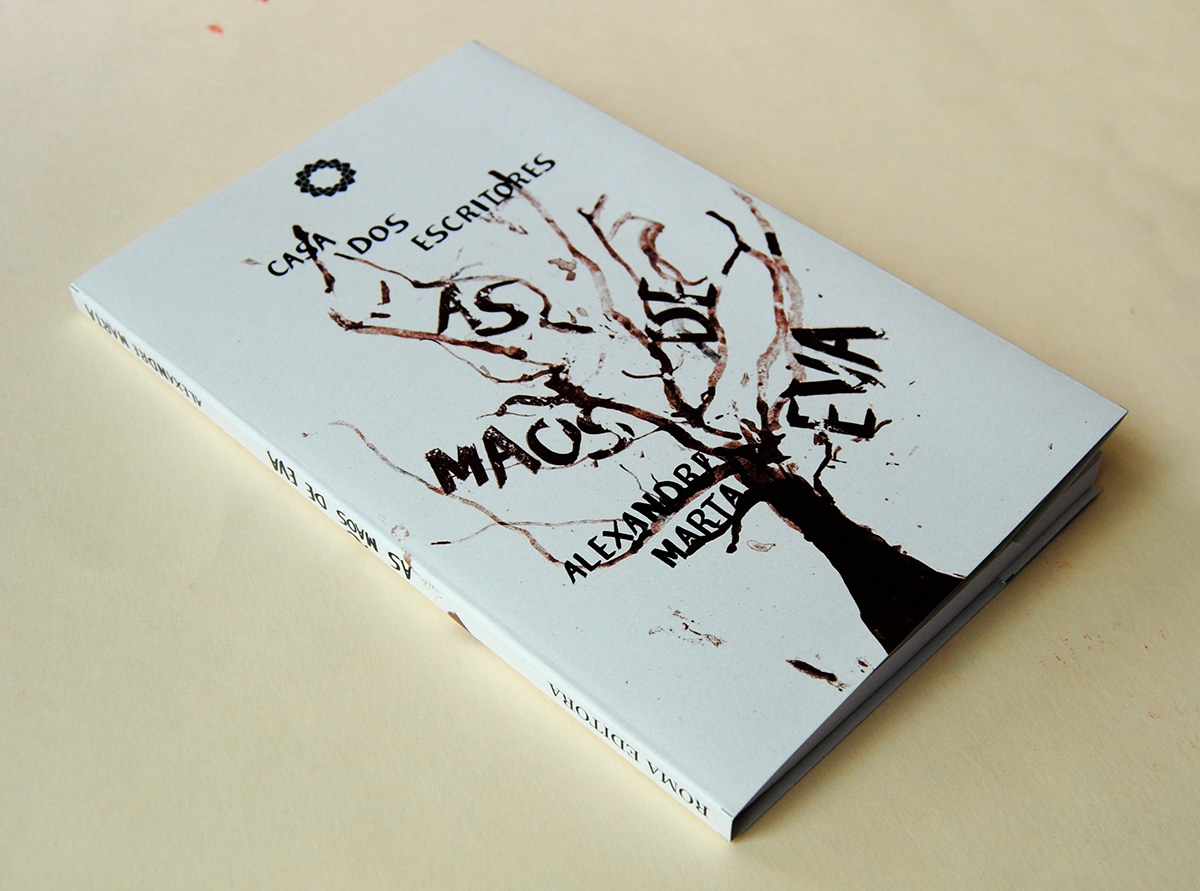
Colecção Casa dos Escritores


Colecção Casa dos Poetas