


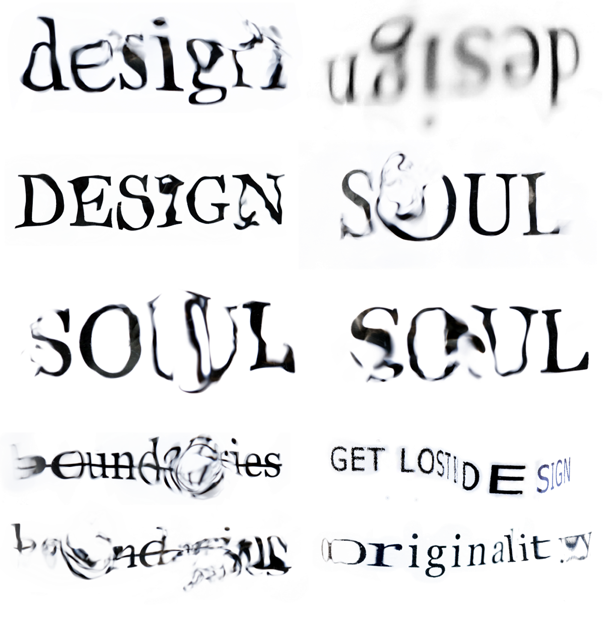
In this brief, we were required to write our own person design manifesto and create a typographic triptych poster series to express it. The posters had to change in a systematic order from a constructed to a deconstructed layout or vice verse, keeping the same overall aesthetic as well as being able read in series as well as individually. Typographic experimentation captured through photography was a large part of the process and I personally learnt a lot and a had a ton of fun.

the finals - black and white


the finals - colour


ink experimentation


my very amateur setup


ripple tank and glass warping experimentation
unedited image


poster process


up close and personal with the posters


