Arcadia Magazine
Arcadia is a gardening magazine with fresh green shoots whose tendrils aim to explore the garden from a different perspective. Each issue explores the idea of the garden and the relationship between people and plants, from a range of interconnected viewpoints such as architecture, art, literature, history and personal stories. Issue 1 'Robotanica' focusses on the theme of technology and the emergence of robotics in our society, exploring the ways in which this influences gardening. The main feature article of the magazine looks at the half-garden, half-machine robot 'Hortum Machina' by Interactive Architecture Lab, showcasing exclusive, original drawings and delving into the reasons why a robot garden is a real thing in 2018.
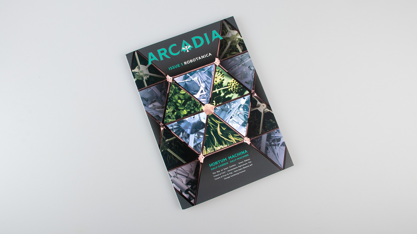
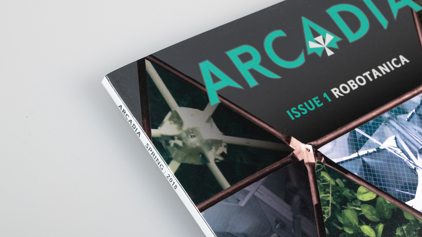
Front cover design for Issue 1 of Arcadia 'Robotanica'

Masthead design for Issue 1 and 2 of Arcadia Magazine
The masthead for Arcadia Magazine uses Joseph Miceli's Romano Grotesque, it's chiseled, angular appearance creates a sense of symmetry and a focus on the central letter 'A' designed as a custom, special character. The geometric glyph that fits inside the central 'A' portrays the skeletal structure of a leaf, chosen as a symbol for nature and 'the garden'.

Feature article with front cover, showcasing 'Hortum Machina'
For the front cover I created a design that reflected the geodesic structure of 'Hortum Machina', I chose not to reveal a full image of the machine but to hint at the concept behind the machine: the contrast between technology and nature.

First double page spread: an introduction to the topic of the feature article

The first double spread of 'Hortum Machina: Half Garden, Half Machine' acts as an introduction to the topic, showcasing a full page image of the robot garden, a bright orange headline and a stand-first that introduces the reader to the written article. I chose Romano Grotesque as the headline typeface because of it unique, angular characteristics that stand out from the rest of the page.

Second doublep page spread: the main body of text and illustrations

For the main body of text I used the typeface Imago, its narrow, modern appearance contrasts well against Romano and allows for a comfortable, legible line-length. I experimented with the balance of colour between each page, using a bright pop of orange to highlight the imagery. The second double spread of the article was designed with a three column grid, at the top and bottom of each column is an illustration of one of the 12 british plants housed within Hortum Machina.
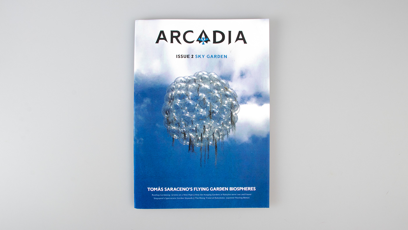
Front cover design for Issue 2 of Arcadia Magazine, theme 'Sky Garden'
Issue 2 of Arcadia focusses on the theme 'Sky Gardens' with a feature article on architect Tomás Saraceno's 'Floating Garden Biospheres'. The cover design takes a more photographic approach, with the masthead sitting nicely at the top of the image as if it is resting on top of the clouds.

Issue 1 'Robotanica' and Issue 2 'Sky Garden'