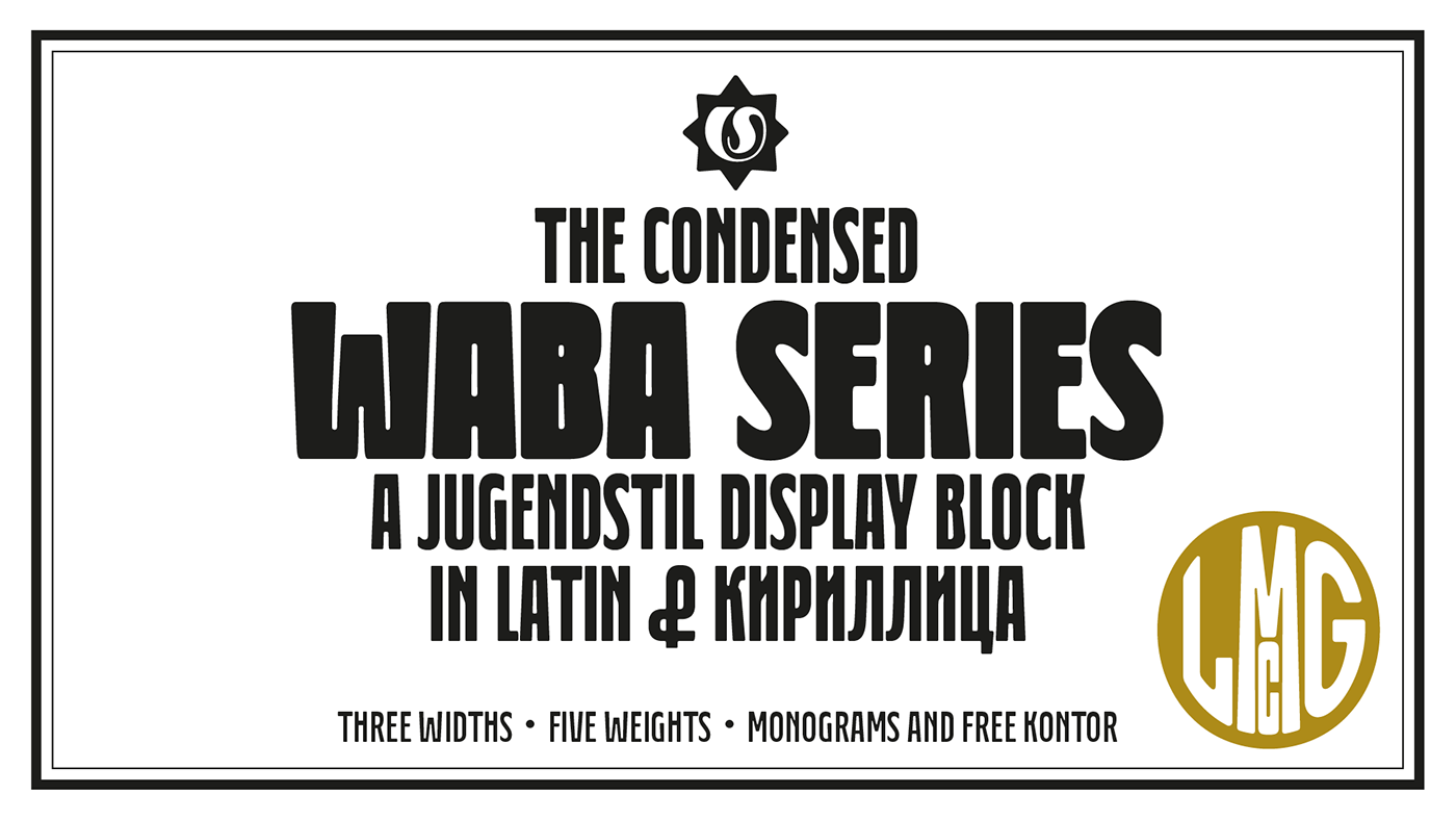
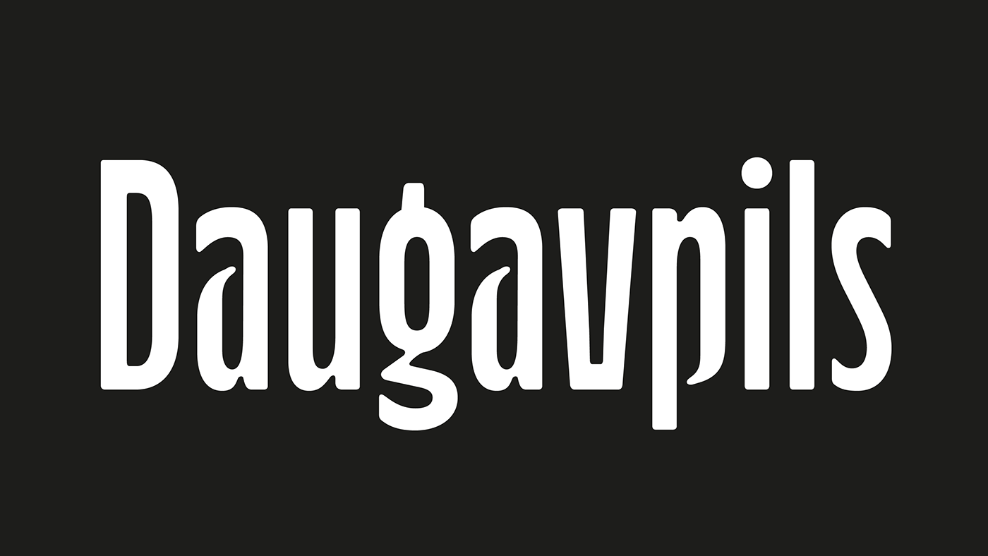
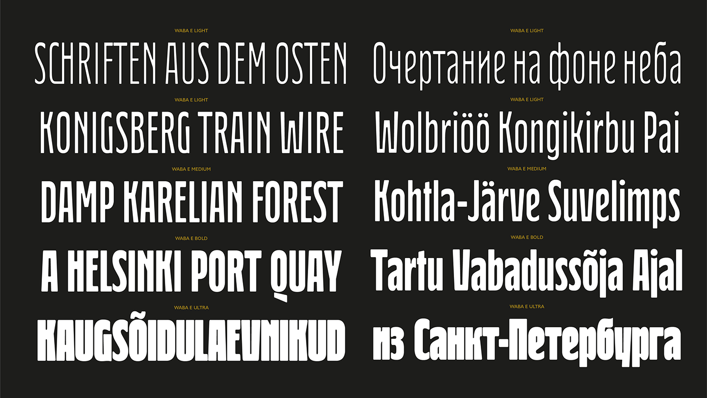
Waba
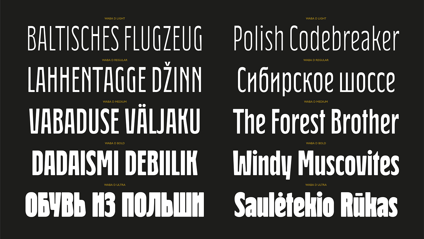
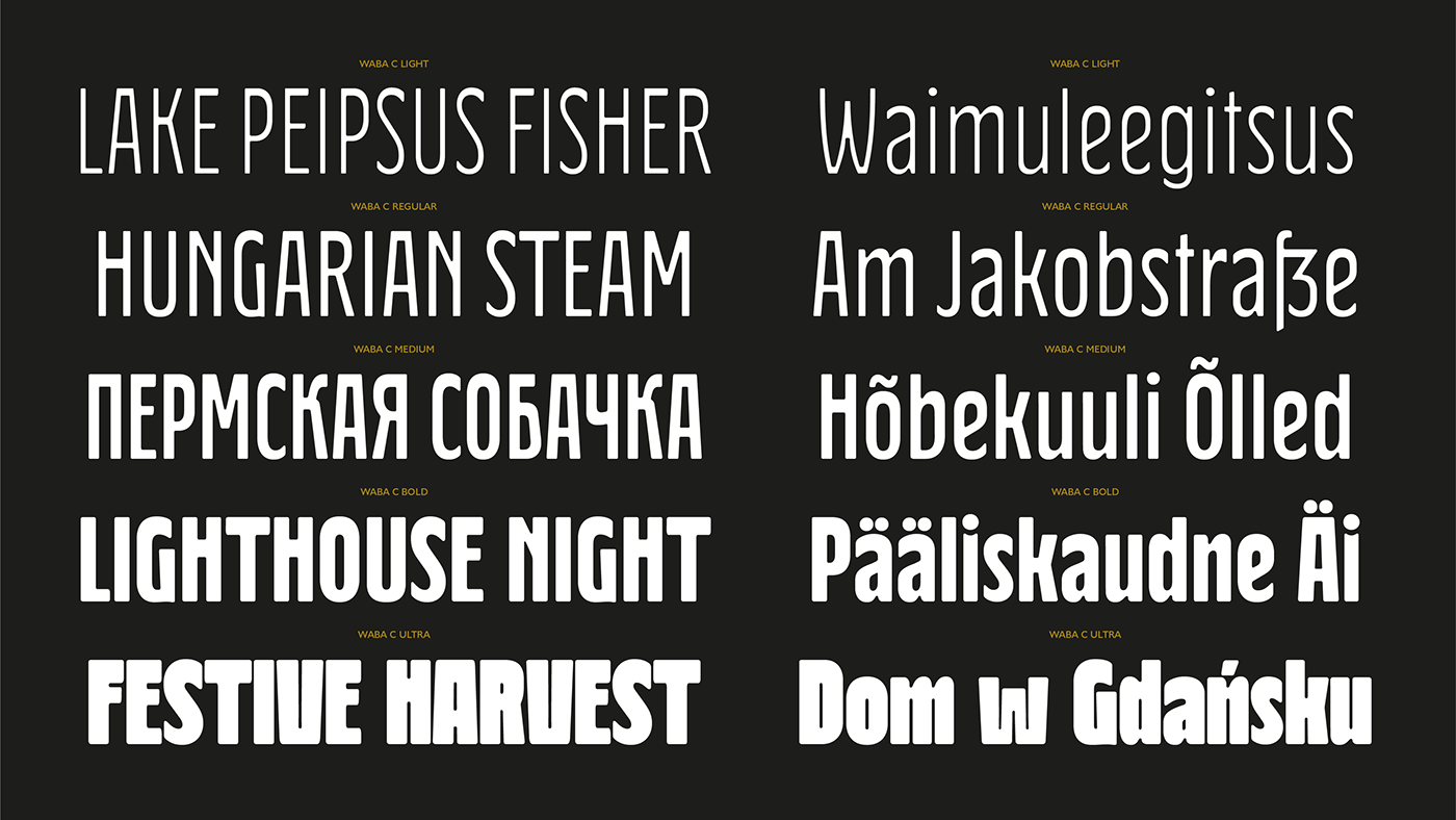
Pronounced ‘Vah-bah’, Waba is a font family that I designed. The name comes from a historical variation on the Estonian word ‘vaba’ – meaning ‘free’, or 'at liberty'.
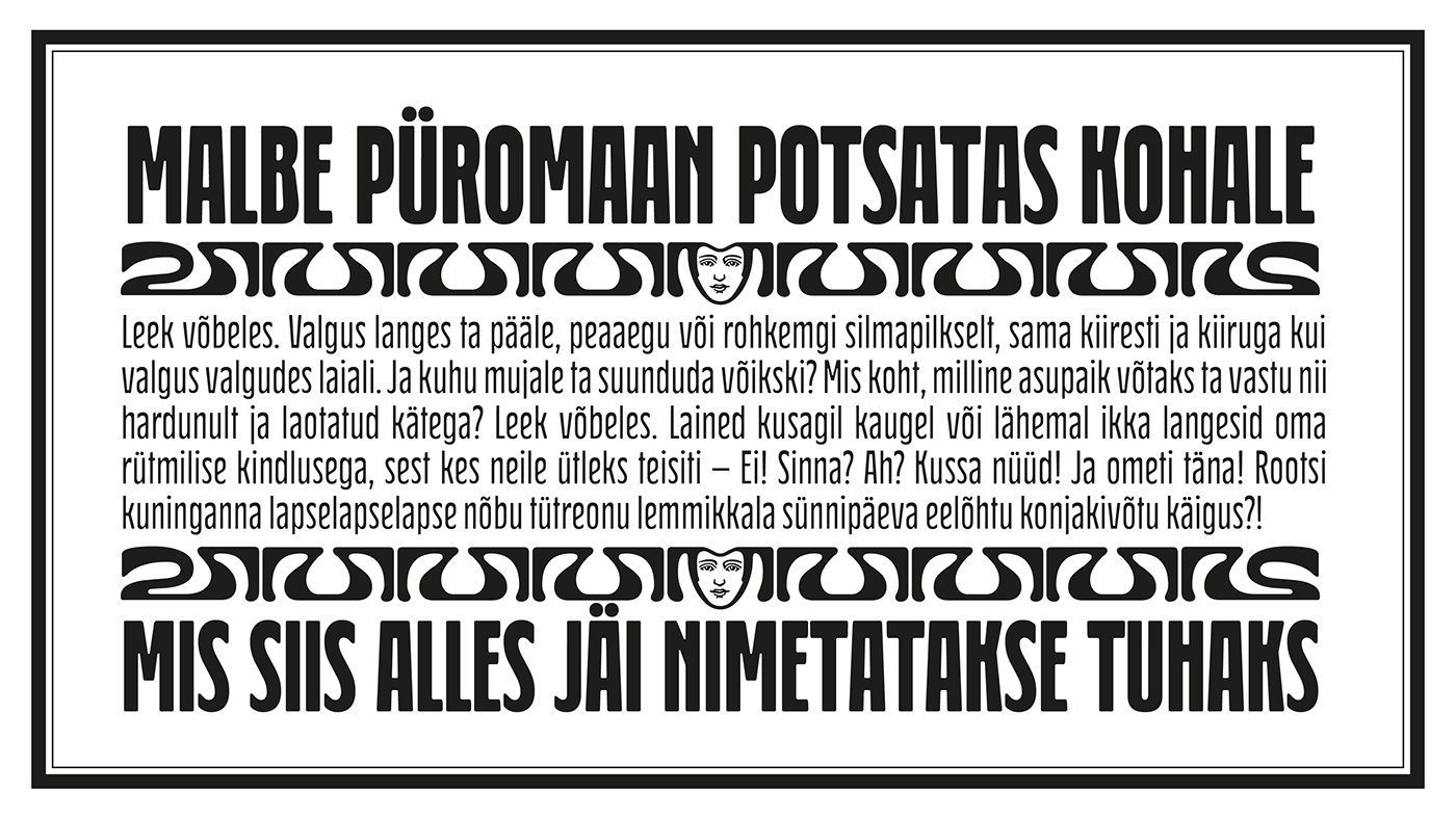
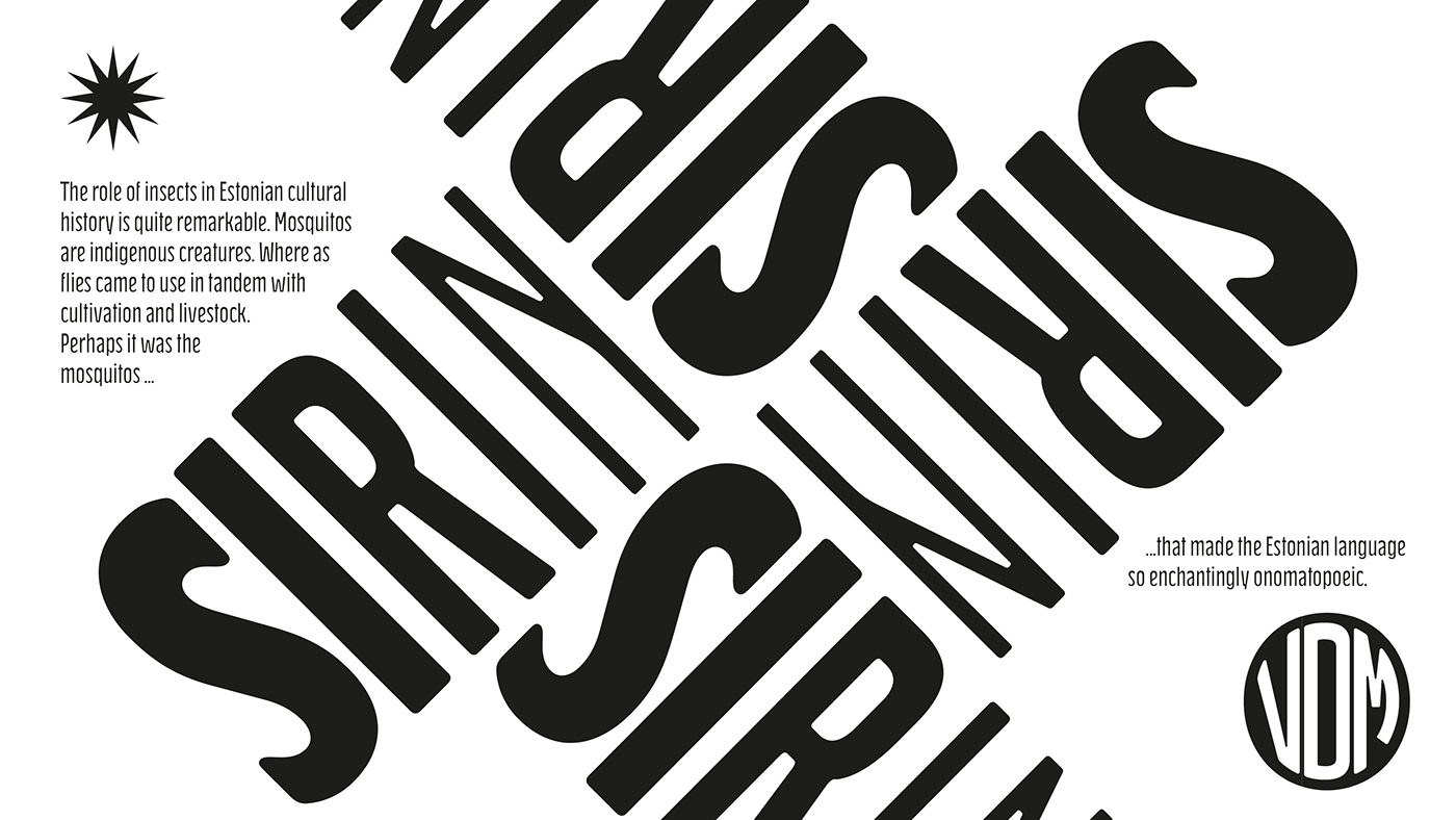
Back in 2017 I visited the Estonian Print & Paper Museum in Tartu to see its great collection of type (well worth a visit!). While I was there I saw some big woodcut blocks of Reklameschrift Herold - a super Art Nouveau/Jugendstil style display font. The Print & Paper Museum's collection covers both Latin and Cyrillic faces and as a foreigner in these parts I'm kind of fascinated by the exoticism of Cyrillic. How it is different but the same to the Latin letters I take for granted (as a humble Englander – no excuses). Not to mention, Jugendstil with its imitation of natural form, reverse-weights and looping-delicious curves (like you've left the window open all summer and the garden plants are climbing in). This mix of Jugendstil, Cyrillic letters and the beautiful historical border town of Tartu inspired me to start drawing Waba.
Trimming the serifs from Herold, simplifying those angles and expanding the category of weights, then taking look at the magical logic of Berthold Block and doing a few things that just seemed right at the time – Waba is a bit of love letter to Estonia, the Baltics and the visual history of Eastern Europe.
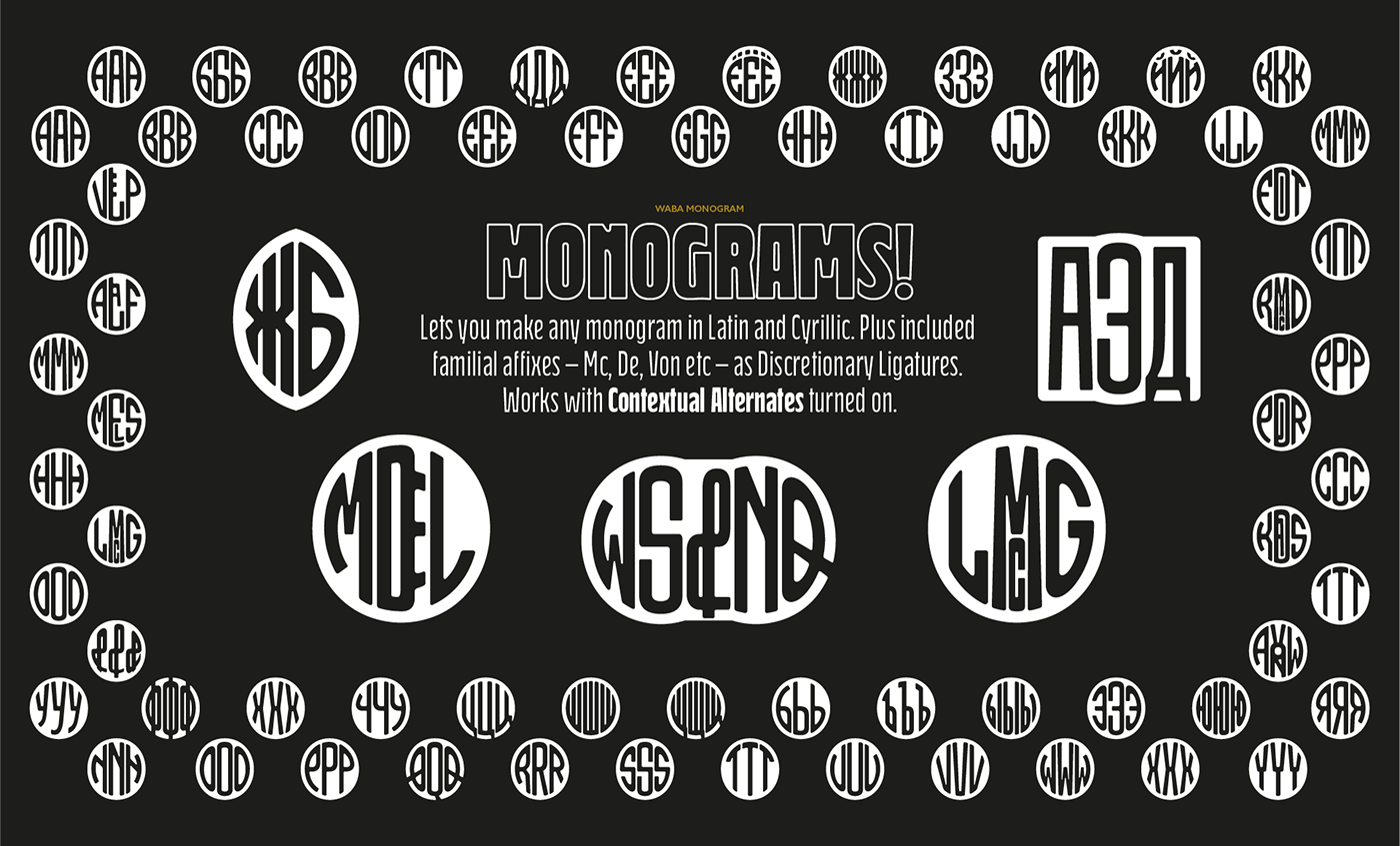
Waba Monogram
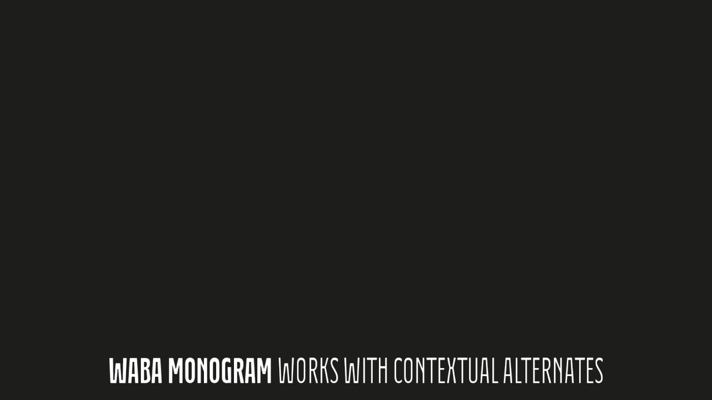
Waba also contains a monogram face, which allows you to create any monogramming latin and cyrillic. Simply type out your 2-3-4 characters in Waba Monogram, making sure Contextual Alternates is turned on them voila! Monograms can be customised manually using the OpenType select-pop-up in Adobe. Also included are a few Discretionary Ligatures for Mc, De, Von etc.
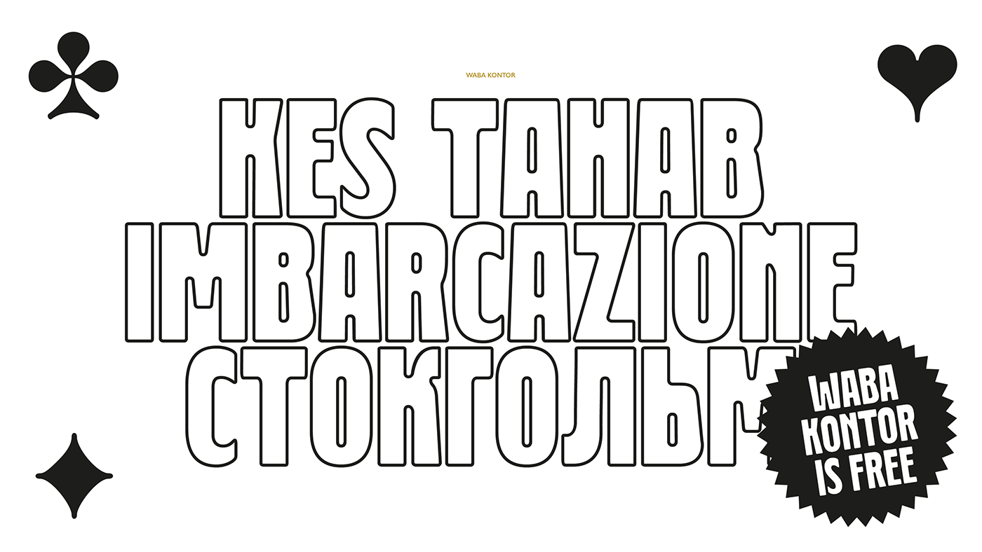
Waba Kontor
An outline uppercase version of Waba is available for free. Because I'm a nice guy.
Waba Border
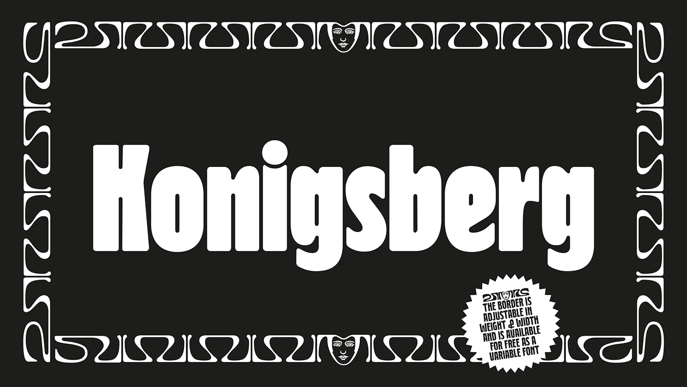
A basic nouveau-style border is also available for free as a Variable Font. This border was a bit of an experiment so it isn't super developed, but it works. The file is coded so beginning and end glyphs are generated automatically, then a repeating set of middle glyphs will appear, with each tap of any letter. A centre piece glyph of a face can be added manually through the Glyphs panel. Make sure you have your Contextual Alternates turned on and know how to use Variable Fonts. The border can be adjusted in width and weight to suit your taste using the Variable axes sliders.
A special thanks is owed to Manu de Lignières for his work on the monograms and helping wrap-up the font, Minnesotan-Estonian translator and poet Adam Cullen for writing the bulk of the type specimens and the Estonian Print & Paper Museum for the inspiration behind the Waba.

The full Waba Condensed Series is
Waba Border Variable Font is
available here.
available here.
Thanks for the appreciation!

