


Description:
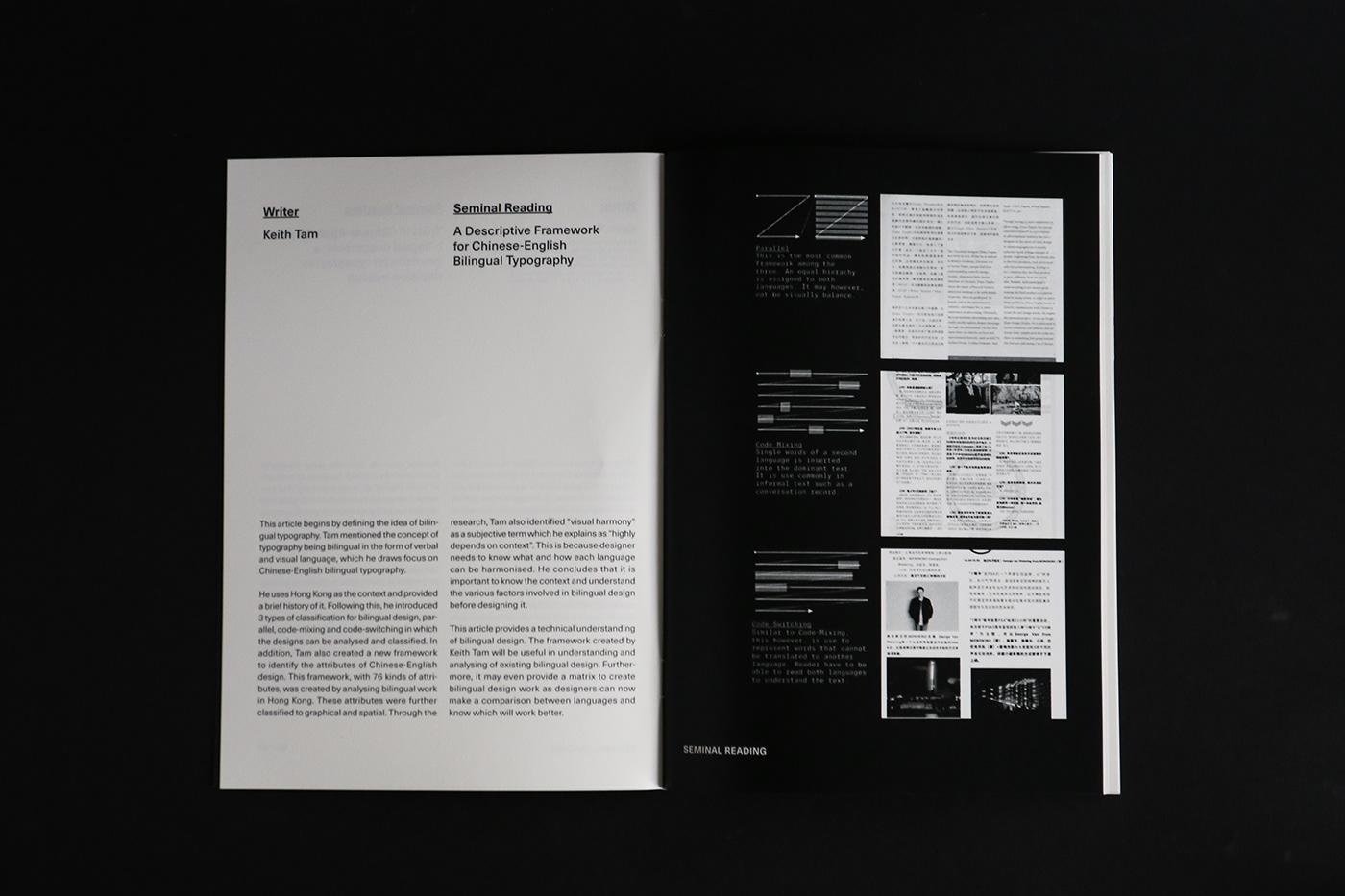
A study on bilingual typography, particularly in the area of Chinese-English. This research intends to build upon the recent discussion by Keith Tam on bilingual typography.
The research aims to identify the practice of bilingual typography internationally through various affecting factors such as globalisation, cultural changes and accessibility to resources.
-
Follow the Instagram visual research @bilingualtypo.sg


(Below) Some of the alternate layouts which was rejected and improved on.


Details:
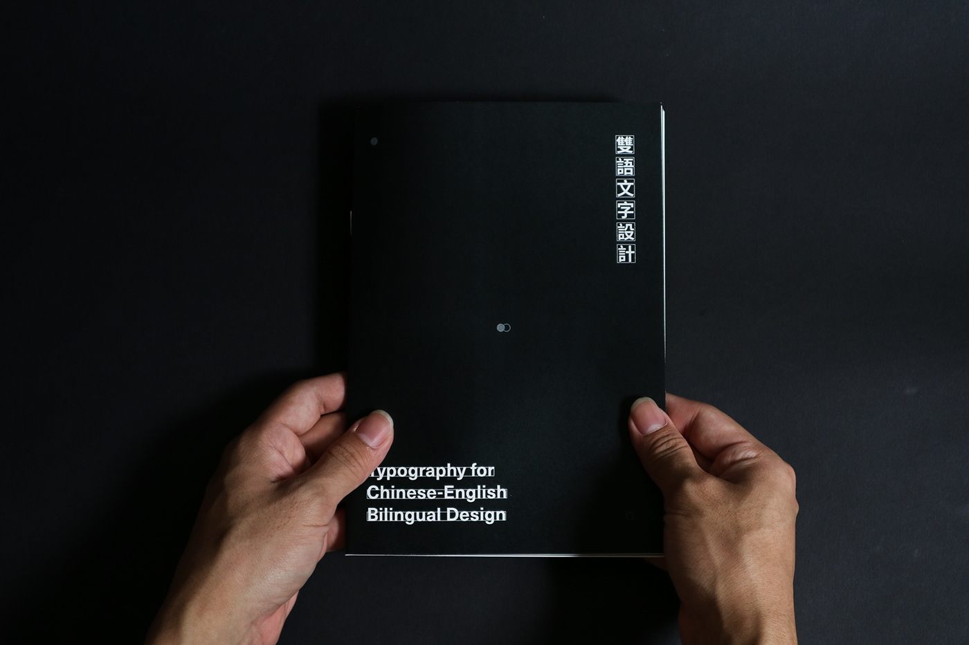
The cover itself was represented by highlighting the difference between the forming of a character in Latin and Chinese characters. It showcases the idea of baseline and x-height in the Latin and the idea of forming character in a square grid for Chinese characters.
The book was printed on Maple Stucco which is a coated paper with uncoated texture. This symbolises the concept of hybridity which is reflected upon the idea of Chinese-English typography.
The typeface choice of Neue Haas Unica also reflects the ideology of hybridity which in this case is the mix of Helvetica, Univers and Akzidenz Grotesk.
Production Details:
148x210mm
Typeset in Neue Haas Unica
Printed full black and white
-
Helpful critiques are appreciated.
For job enquiries, please drop an email to zhiliang.work@gmail.com


