


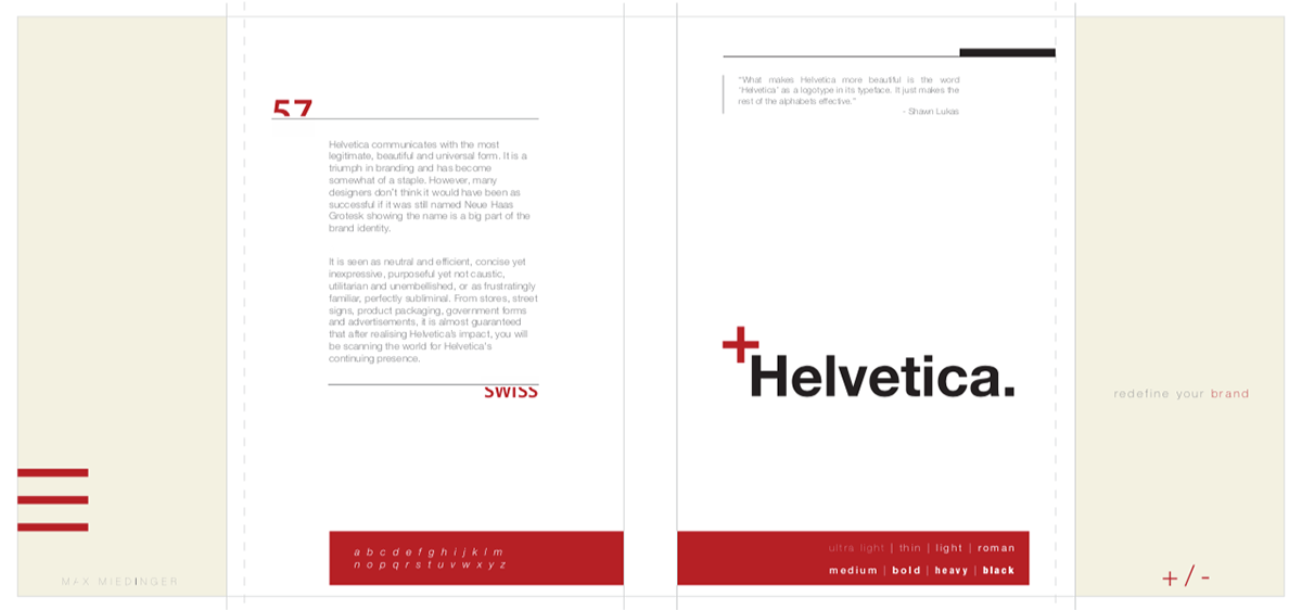
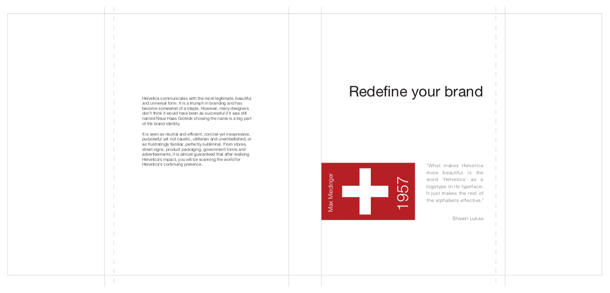
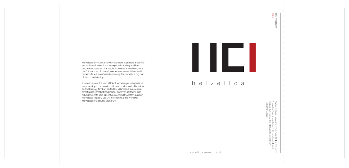
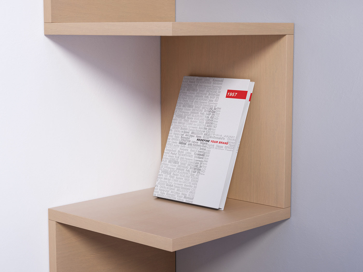
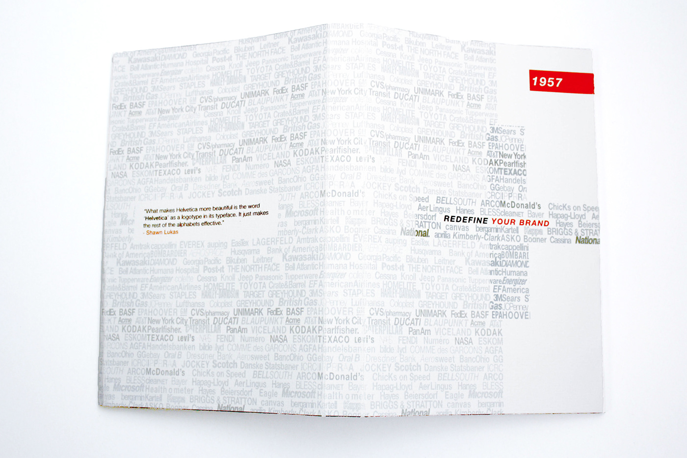
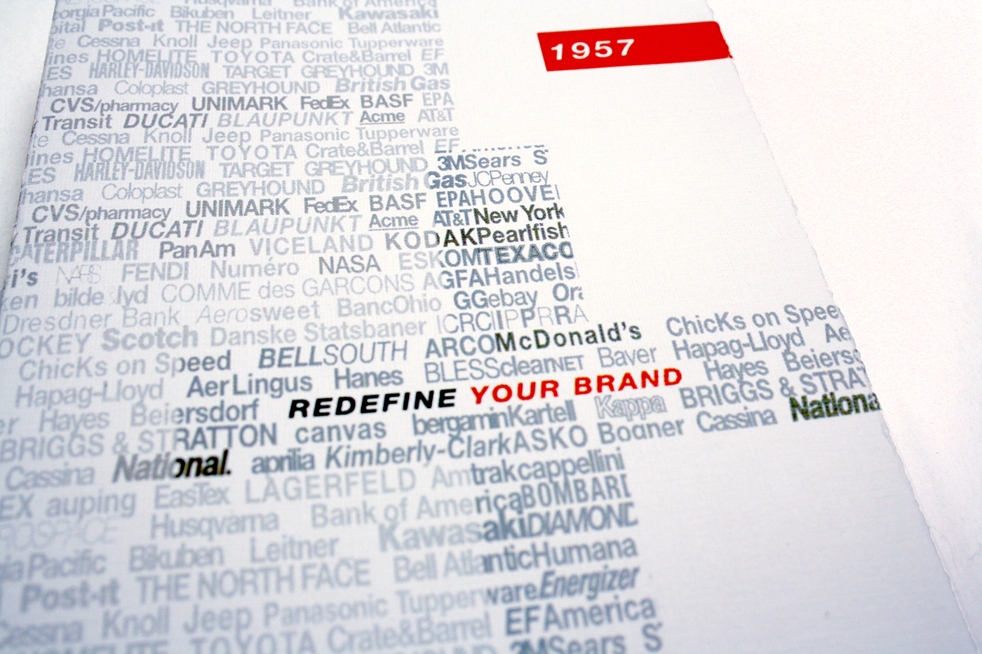
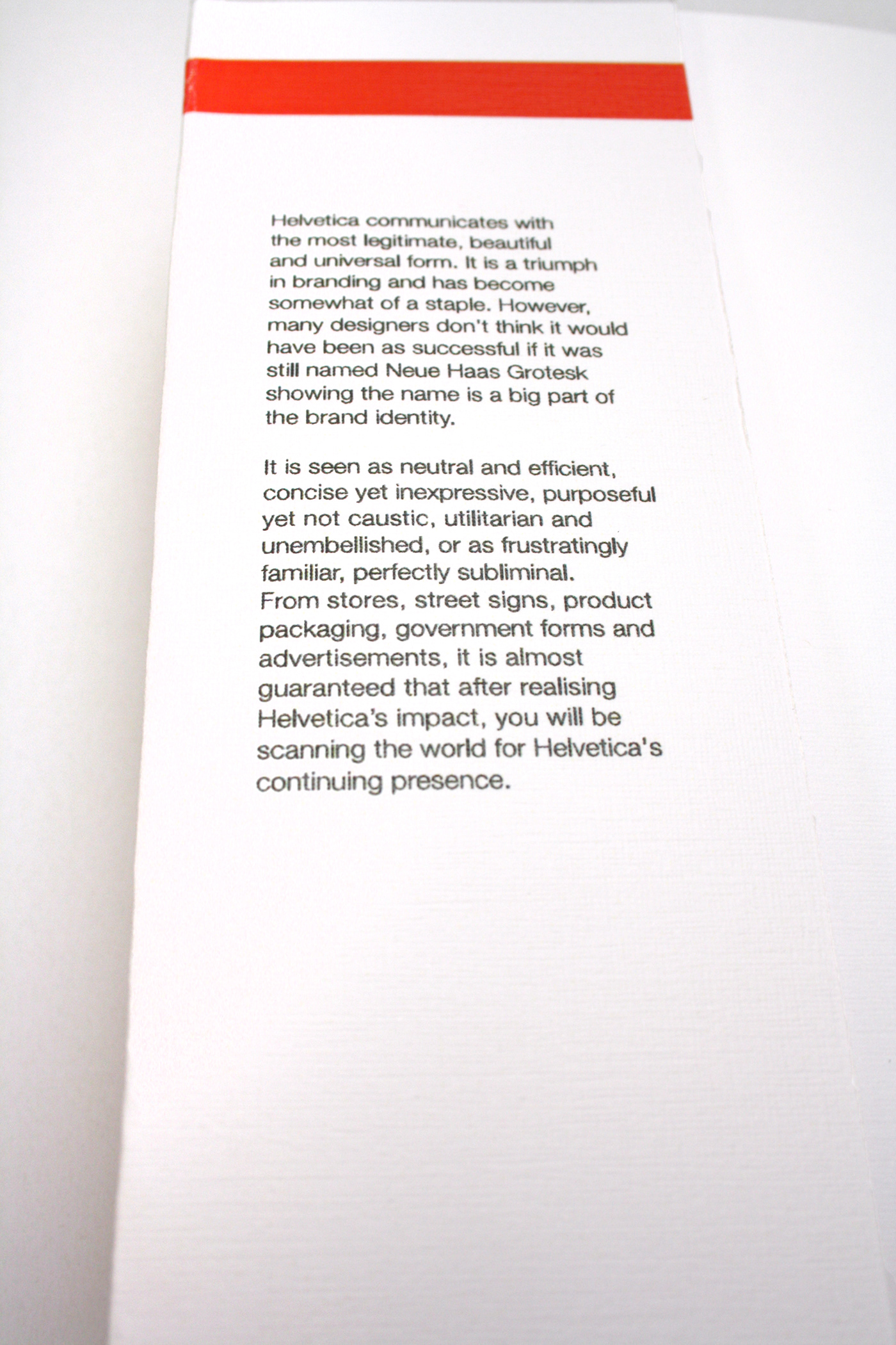
In this third-year project, I was given the brief of designing a typographic dust cover. The aim was to showcase the Helvetica font with its pros and cons, as well as drawing inspiration from the Helvetica Documentary by Gary Hustwit (2007). The dust cover showcases hundreds of famous brands designed using the Helvetica font. Although the lists of brands seem overwhelming at first glance, the entire cover is designed in a Swiss style with the emphasis on the tagline (Redefine your brand). This statement is to show how over saturated Helvetica brands have become, making Helvetica the go-to font when designing logos. Although the tag line serves to show the over saturation in the design industry, it is neither a negative nor positive critique, but merely an observation. The phrase "Redefine your brand" is meant to evoke deeper thinking and conception within the design community. Newer designers can be exposed to this trend and more experienced designers will be able to form their opinion on the dust cover based on their personal opinion of Helvetica. The small rationale within the book dust cover was created with research in mind as well as personal opinions on the Helvetica font.

A clean and monochromatic design style was formed from looking at these precedents. The focus was predominantly on a black and white design with a red spot colour coming from the Swiss style. With this in mind, a combination was formed between a clean style and a deconstructed typographic grid.

In the beginning of the project it was a challenge to find my own style within the brief and maintain it but through trial and error, the style was eventually realised and worked cohesively with the brief. Finding the correct style allowed me to become more experimental. With each step of the process, there was ample room for continuous improvement in order to better the design according to the brief as well as understanding the workings and ethics of a dust cover design. If you have any feedback or comments on this process or the design, please feel free to share them.


Overall, the look and feel I was aiming to achieve was realised towards the end of the process allowing for a very refined dust cover. The brief asked for a typographic dust cover which was delivered printed and mocked up. However, a project is never truly perfect and there will always be room for improvement.


