
THE PROBLEM
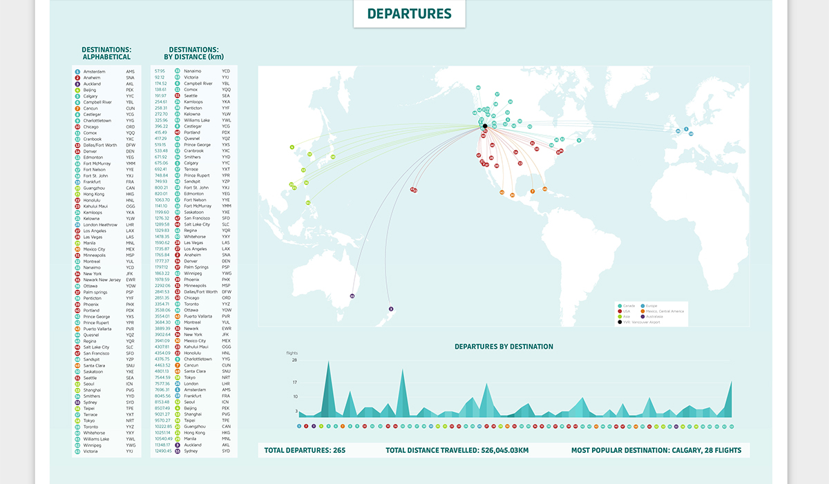
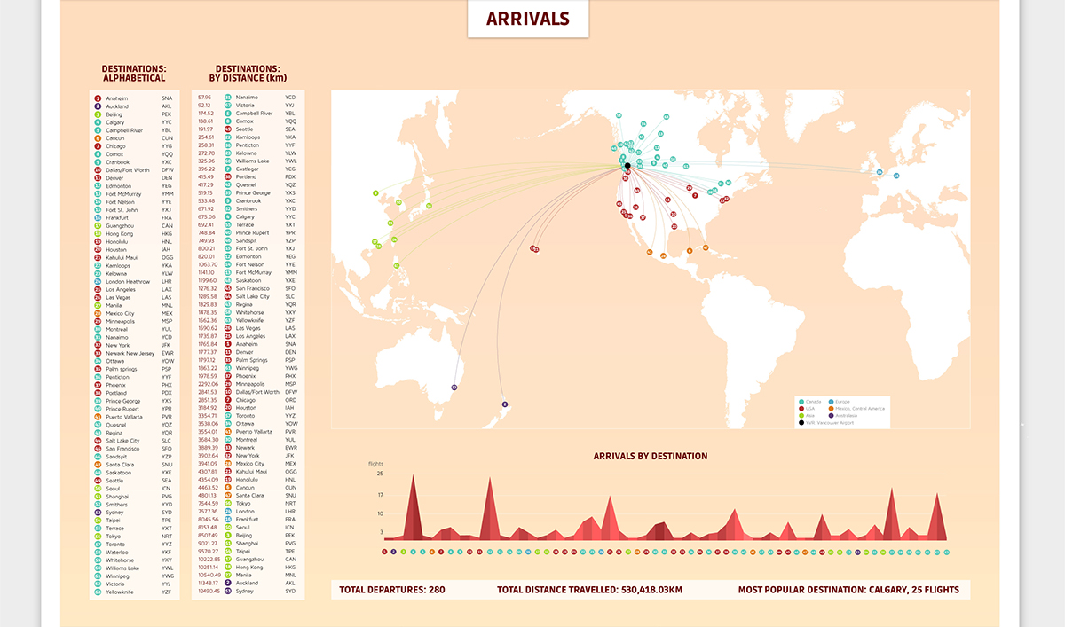
The project brief was to utilize mapping for an information design project. Out of interest, I chose to show the flights that go in and out of YVR, the Vancouver International Airport, within 24 hours. It details what airport the flight is going to or coming from, the distances travelled per flight and overall, and what time is the busiest over those 24 hours. This project was an opportunity to research, calculate, and plot the maps accurately. Learning the relationships between the information and coming up with different ways to show those relationships were the most interesting parts of the project.
THE OBJECTIVES
· To accurately research information, calculate distances, and plot maps
· To clearly communicate the relationships between the information
THE SOLUTION
Information Design
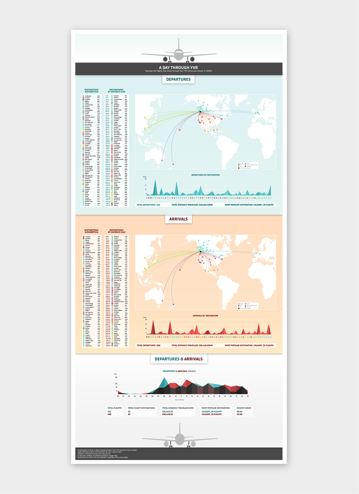

To deal with the density of the map points within the area surrounding YVR, I created a number system to relate to each destination.

Each of the destinations are numbered by alphabetical order, and then again in a seperate list by distance from YVR.
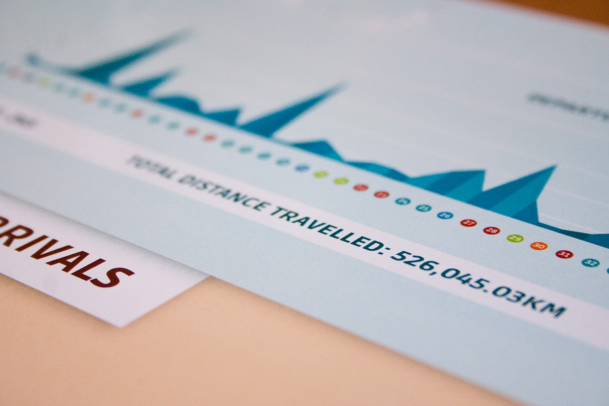
I also included the total distance travelled for all of the collective flights in 24 hours, both for the arrivals and the departures, to showcase just how many kilometres planes travel to arrive to YVR.

I designed three sections: departures, arrivals, and departures & arrivals, where I compared the two. The first two sections have two lists of destinations, one by alphabetical order and the other by distance. There is also a graph showing how many flights occur in each hour. On the bottom, I've included some quick stats as well.

Thanks for your time!
