The project - Understanding FIKA as a concept
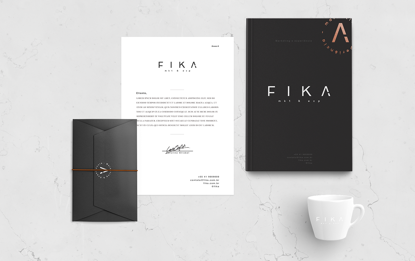
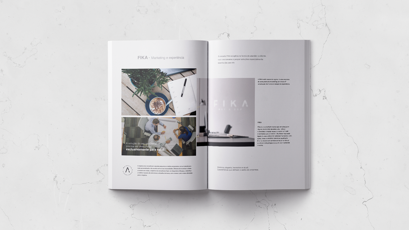
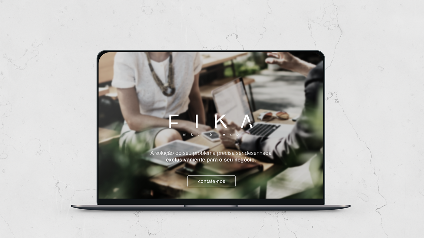
FIKA is a marketing consulting company focused on brand building and experience design.
The name FIKA has a meaning: Fika is a Swedish tradition that involves stopping a few moments during the day, relaxing and socializing.
FIKA is a marketing consulting company focused on brand building and experience design.
The name FIKA has a meaning: Fika is a Swedish tradition that involves stopping a few moments during the day, relaxing and socializing.
This ritual is linked to a culture of valuing moments, people, living and working with more quality.
It is a pause that allows to refresh the ideas and to put under perspective what really matters.
Challenge
To represent the real meaning of the company and bring strength and identity with the elements.
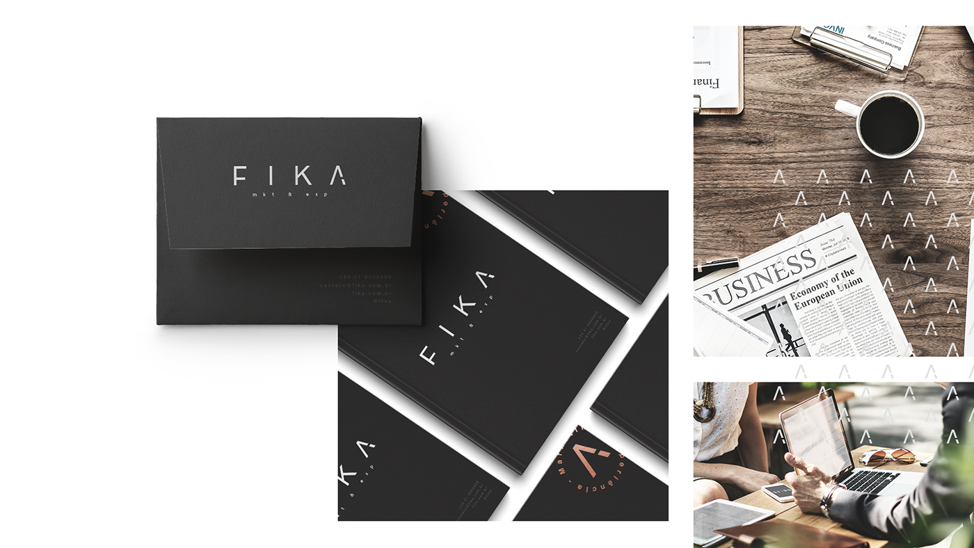
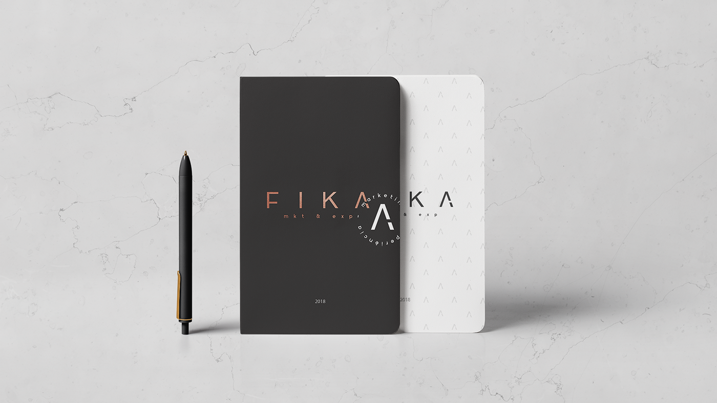
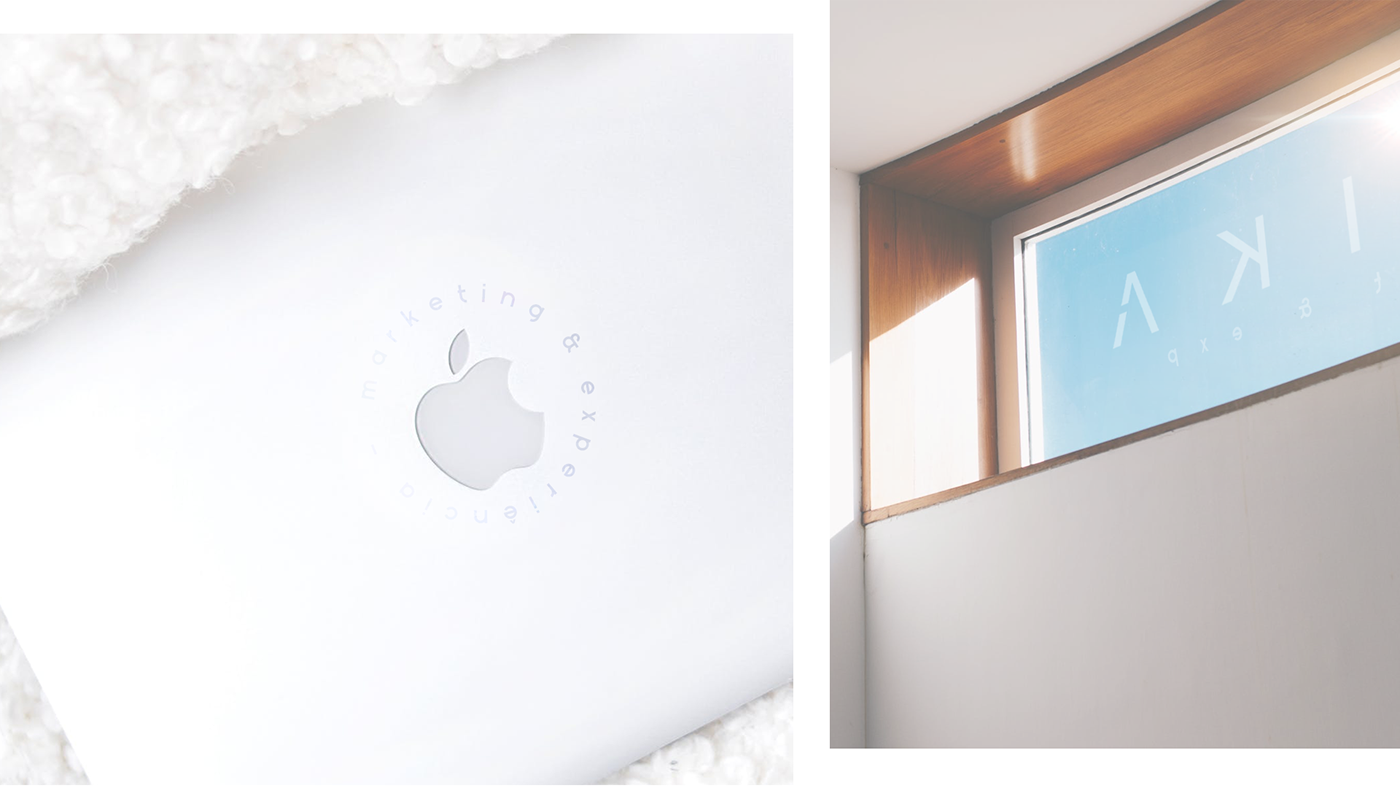
To use some detail that can be unfolded and adapted in several formats giving versatility.
What we did
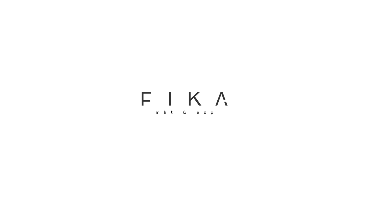
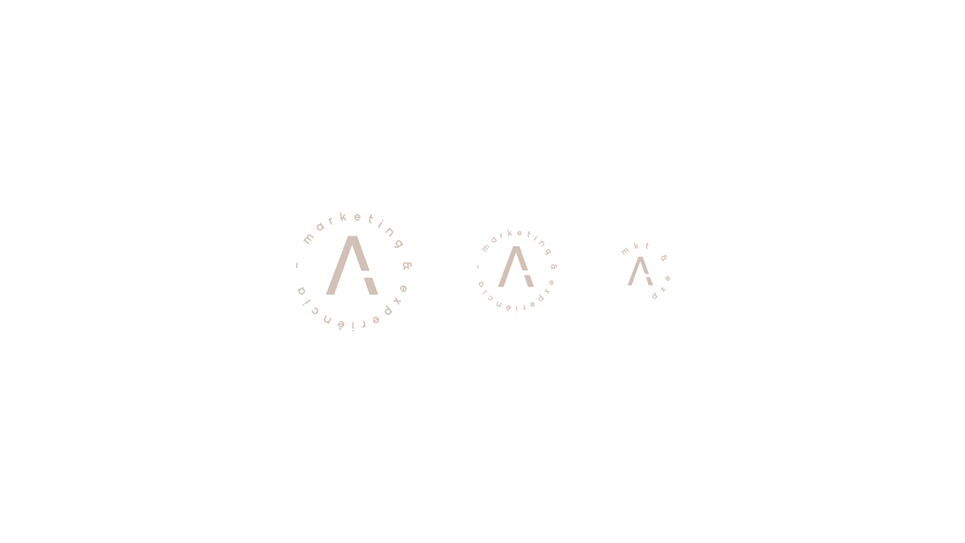
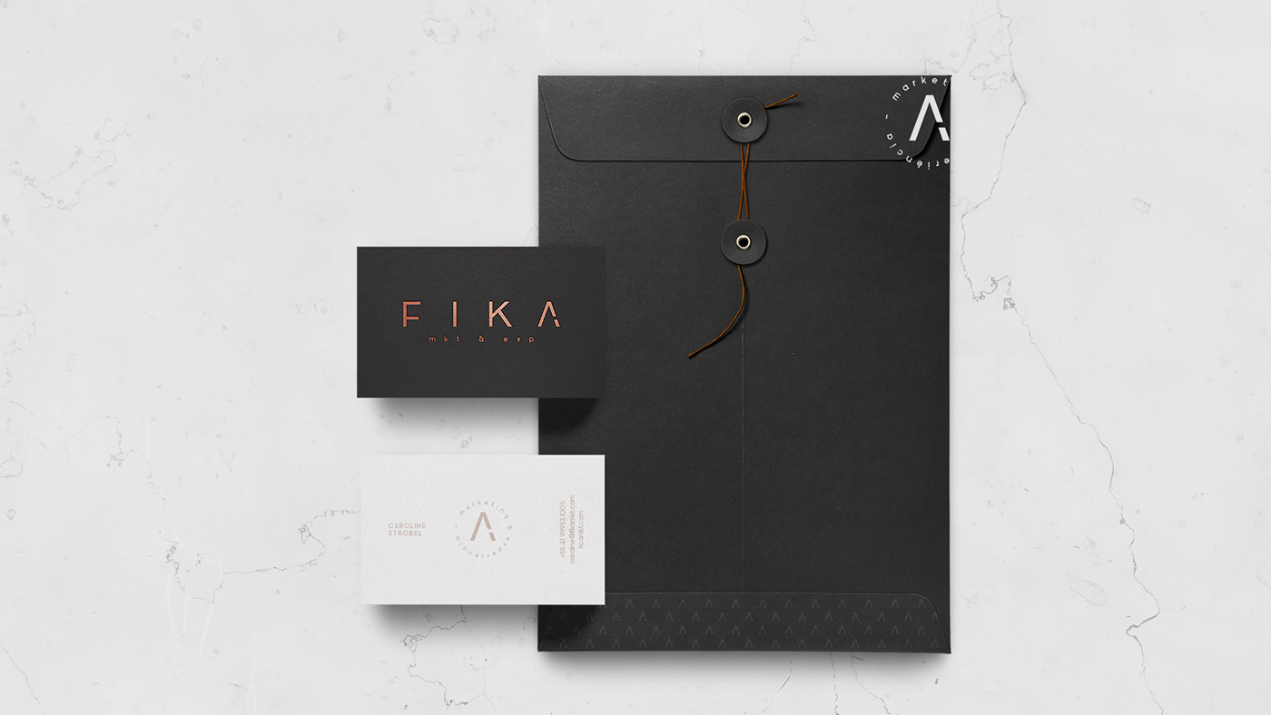
The typography was adapted to achieve the main goal: Saying too much with too little. The concept "less is more" brings the whole visual structure of the brand. A detail was created in the letter "A". The detail is a pause, a break in the vector making reference to the Swedish tradition.