A True Brand Update
Removing the excess and focusing on what truly makes the Lifepoint Church brand thrive: the people.
We believe that we exist so that people far from God will become fully alive in Christ.
One way that we can do this is through effective, beautiful, and forward-thinking design. Lifepoint has stood as an institution of inspiration for so many but, as any organization does, our beloved church needs a fresh brand update. This is not a rebrand as much as it is the next step of our brand's evolution.
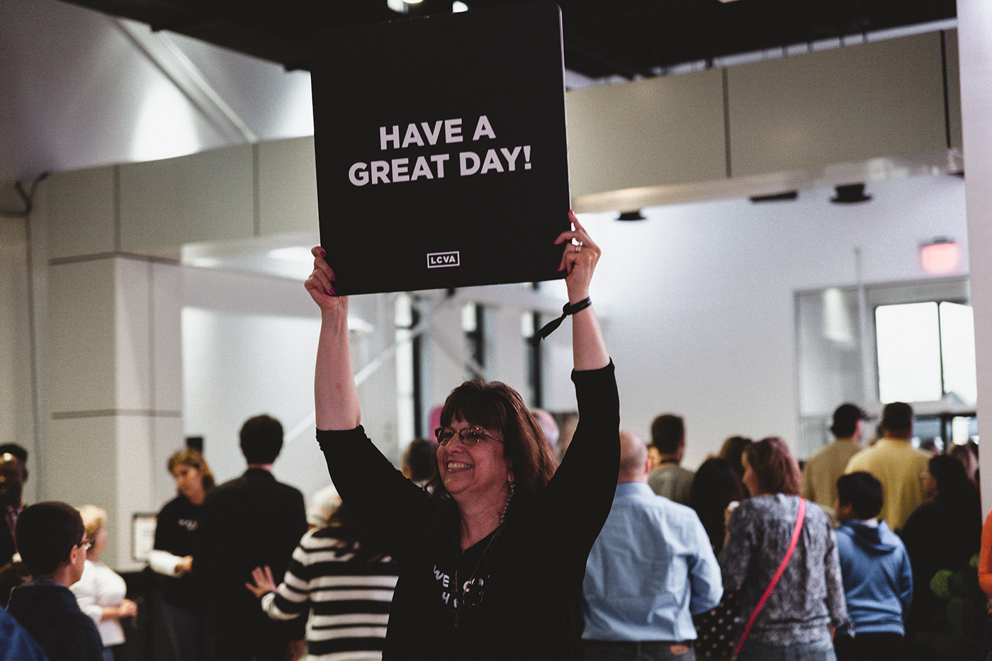
A photo is worth a thousand words, so let's use that medium to speak on our behalf of who we are as a ministry, right? The previous branding was so bold that a lot of photographs could not live alongside it, so we tore away the extraneous and allowed simplicity to be our strongest weapon. This transition helps us to fulfill the church's mission by letting every aspect of the brand communicate clearly, have a clean unified aesthetic, be fully alive.
A Flexible Brand
With such a strong and defined typographically driven identity, the Lifepoint brand has to be able to adapt to whatever situation it is in.


First-Name Basis: Sometimes we don't need formal, we need relational.
Stacked: This alternative shines in those moments when there simply isn't enough room to fit a two-word logo. The spacing and alignment allows for high legibility and a brilliant uniformity to the original single-lined mark.
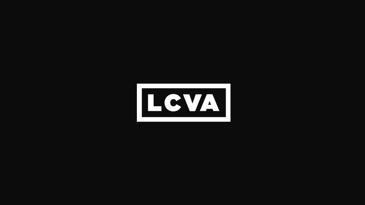
Lettermark: The sleekest of our marks, this acronym gives us the most efficient use of space while clearly identifying our church from the approx. 72 other Lifepoint Churches across the world. Worried about what happens to it when we leave the state? No worries. We have a system for different states & countries. By maintaining the rectangular shape and replacing the state acronym we create consistency in the midst of variation.


Brand Application
Understandably, it can be difficult to imagine how this updated brand would be applied to the ministry. As stated earlier, allowing the brand to take a back-seat to what the church is truly about lets the distractions fall to the wayside and the life-giving spirit shine through.


Simplicity Is Always In Style
This minimal approach to branding doesn't go out of style and we celebrate that. Whatever series, event, season, or decoration is happening around our campuses the branding system we created will stand strong and maintain the organization's visual integrity.