
University Bookstore at Texas State Responsive Website Redesign - 2017
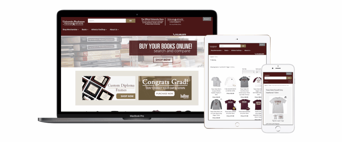
On this project I worked as the lead UI/UX designer as well as Project Coordinator. The University Bookstore had an outdated non-responsive website which needed to be migrated over to something more flexible which would allow for a better mobile experience.
In my role I collaborated with multiple teams through-out the Texas State University System as well as our CMS Vendor. I personally designed the website wireframes and mockup interfaces for both Mobile and Desktop experiences. Digital deliverables such as the promotion/event items were also created in-house.
In my role I collaborated with multiple teams through-out the Texas State University System as well as our CMS Vendor. I personally designed the website wireframes and mockup interfaces for both Mobile and Desktop experiences. Digital deliverables such as the promotion/event items were also created in-house.
Date: 2017 - Present
Service: Responsive Design, User Experience Research and Design, Digital Strategy, Content Creation & Strategy, Social Media Strategy,
Technologies: ASP.net, ASP.net Storefront CMS (eRATEX), Bootstrap, Google Analytics, HTML, CSS, and JavaScript.
Tools Used: Pen / Paper, Sketch, Surveying, Google Analytic

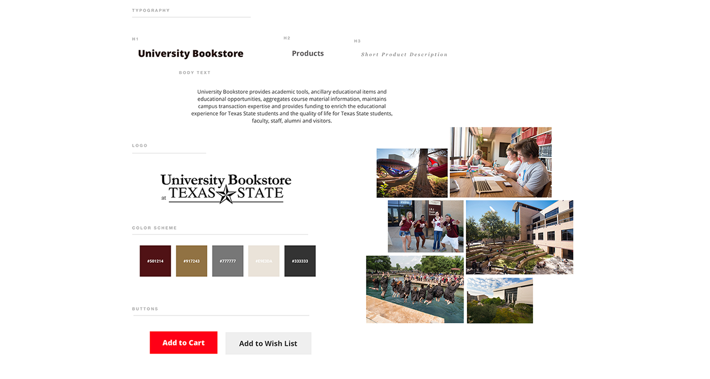
Mood board
When creating this mood board I wanted use current design language established by Texas State University to better create unity between the University Bookstore and University.

User Research
We conducted preliminary research with Google Analytics data as well as in-person interviews with student workers. Data from our analytics showed that 45% of our users were between the age of 18-24 and 60.3% are female between Jan 1st, 2016 - Dec 1st, 2017.
One thing to consider was that students wanted to compare and price their course materials within the store. So having a responsive website was very important to them.
Data below shows that desktop and mobile users had almost the same amount of sessions, but the conversion rate had a difference of 6.05%.
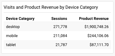
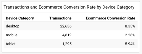
Jan 1, 2016 - Dec 1, 2017

Sketching - Crazy 8's
The idea is to generate as many ideas as possible within a short time frame, focusing on quantity of ideas not quality, and then once you’ve got a bunch of divergent thinking on one topic, to begin converging on some winning ideas by voting on the favorites.
These chosen ideas can then be worked up into prototypes, more refined designs, or you could even do another round of rapid sketching on them and then another round of voting to hone in even further on the top top ideas.


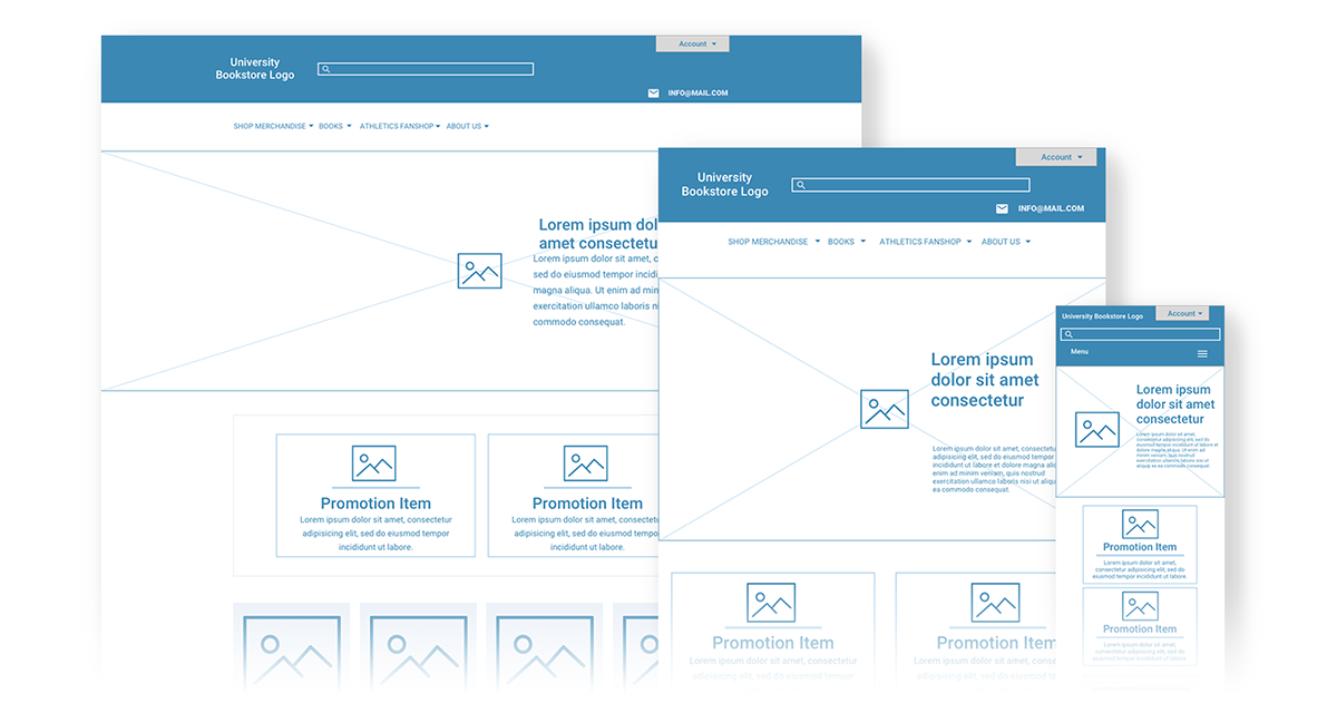
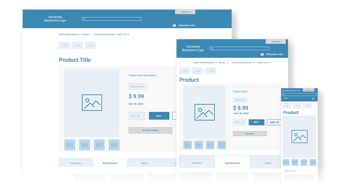
Sketch App Wireframing
I used Sketch to create both home and products pages with a "mobile first" mind set.


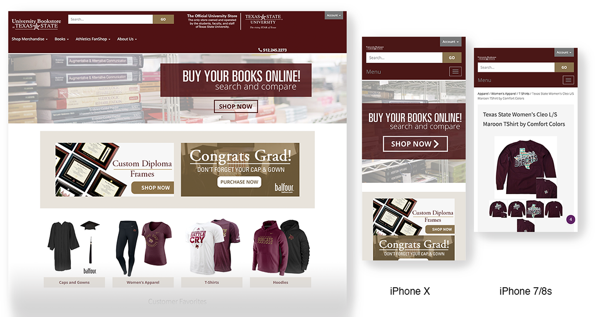
Results


Take Aways
Currently the textbook / bookstore industry has pivoted to more electronic course material offerings. This has slightly hurt our revenue, but we have seen a increase in General Merchandise sales with the implementation of the responsive site.
Due to the limitations of the shared base code that the vendor has in their production environment, I wasn't able to do a complete overhaul to the framework without compromising the CMS. I do feel that the UI/UX could be improved if modification were allowed to key areas. One area would be "Single Page" check out.
Due to the limitations of the shared base code that the vendor has in their production environment, I wasn't able to do a complete overhaul to the framework without compromising the CMS. I do feel that the UI/UX could be improved if modification were allowed to key areas. One area would be "Single Page" check out.

Overall I feel like I've gained a lot of knowledge especially with a project that had over 23,000 of items that needed to be either purged or migrated over.

