
POLAR® 10th year book
-
Logo & Editorial Design
-
Adobe Live Editorial Design ( December 19–21, 2017 )
I was honored to accept Adobe's invitation to be a guest speaker of an Adobe three-day live session focusing on editorial design from December 19 to 21, 2017. During the live streaming, I shared my design experience and worked on editorial design project. Around a month before the show, my wife and I traveled to Death Valley national park in California. Admiring the beauty and magnificence of our mother nature, I decided to work on a project related to nature. After a thoughtful consideration, I decided to work on an imaginative brand called "POLAR", which is a camera accessories brand.
Creative Brief
POLAR® Background
POLAR® specializes in camera accessories such as camera backpack, tripod, camera strap, and so on. The mission of Polar® is to produce the best gears for protecting and supporting photographers’ camera, lens, etc. in order to support outdoor activities and promote exploration of the nature.
POLAR® specializes in camera accessories such as camera backpack, tripod, camera strap, and so on. The mission of Polar® is to produce the best gears for protecting and supporting photographers’ camera, lens, etc. in order to support outdoor activities and promote exploration of the nature.
Objective
POLAR® intends to publish a company 10 years anniversary book to celebrate and document the past 10 years of success. The book will mainly be given or sell to loyal customers, distributors, wholesales, and retails for marketing and advertising purpose.
Target Audiences
Ages: 25-45
Gender: all genders
Hobby: hiking / camping / outdoor activities / photography
Ages: 25-45
Gender: all genders
Hobby: hiking / camping / outdoor activities / photography
Logo

The logo borrowed the shape of igloo and aperture. The igloo shape symbolized toughness and protection during extreme natural circumstances while the aperture is to keep the brand related to camera industry. The golden ratio has been applied to the logo design so as to enhance its aesthetics. An unsaturated blue brand color cohesively established heavy-duty and protection for the brand.
COLOR
C 100 M 81 Y 17 K 4

GOLDEN RATIO


Editorial Design
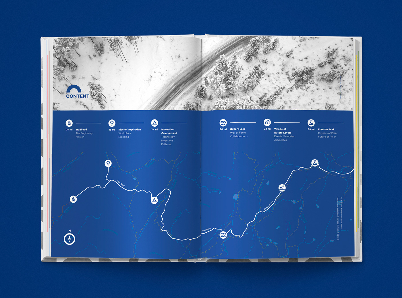
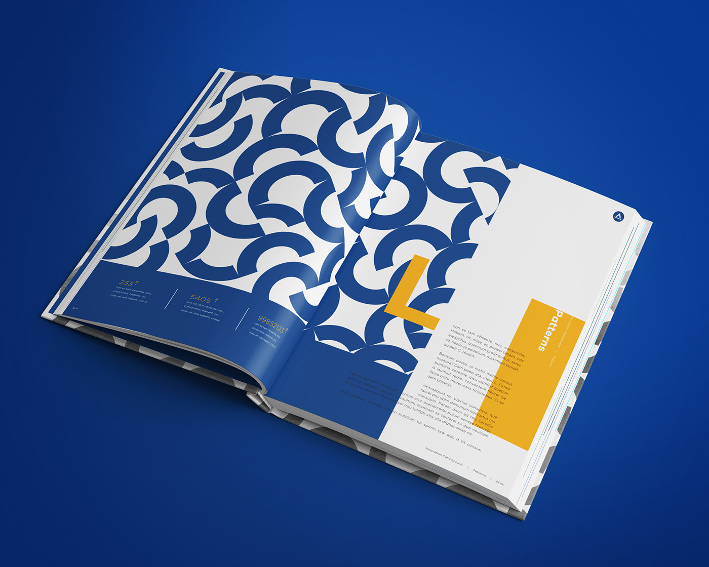
Since I didn't finish my project during the show, I spent some time developing and refining my project afterwards. I simplified the logo and used it to create patterns for the editorial design and as well as backpacks in product photography mock-ups. Landscape and product photographs from Adobe Stock and Pexels.com had been used in the design to emphasize the brand's target audience are landscape photographers. In addition, creating a theme throughout the book design, I attempted to use a hiking map as a metaphor of the company's 10 years of journey. The map graphics and simplified logo are to tie all pages together as a cohesive design.


Thank you


