

So the task at the university was to make up a cover for a cd-album of any metal group. Well, one of my exes made me fall in love with Slayer years ago. Fun story, times passed and I still love them (apparently, the ex lost this battle). So the decision was made — I am making a CD-cover for a thrash metal band that mostly sings about blood and death. PERRRRFECT
But before I got down to the cover itself, there was one more thing to do — make an ambigram logotype. Which means, it must be read upside-down same as normally. Thank God, Slayer has only 6 letters!
And one more rule to take into consideration: the logo should be in gothic style. All right, we'll see what we can do here.
The first trials assured me: you gotta fight for your right to have a good (goddamn) ambigram.


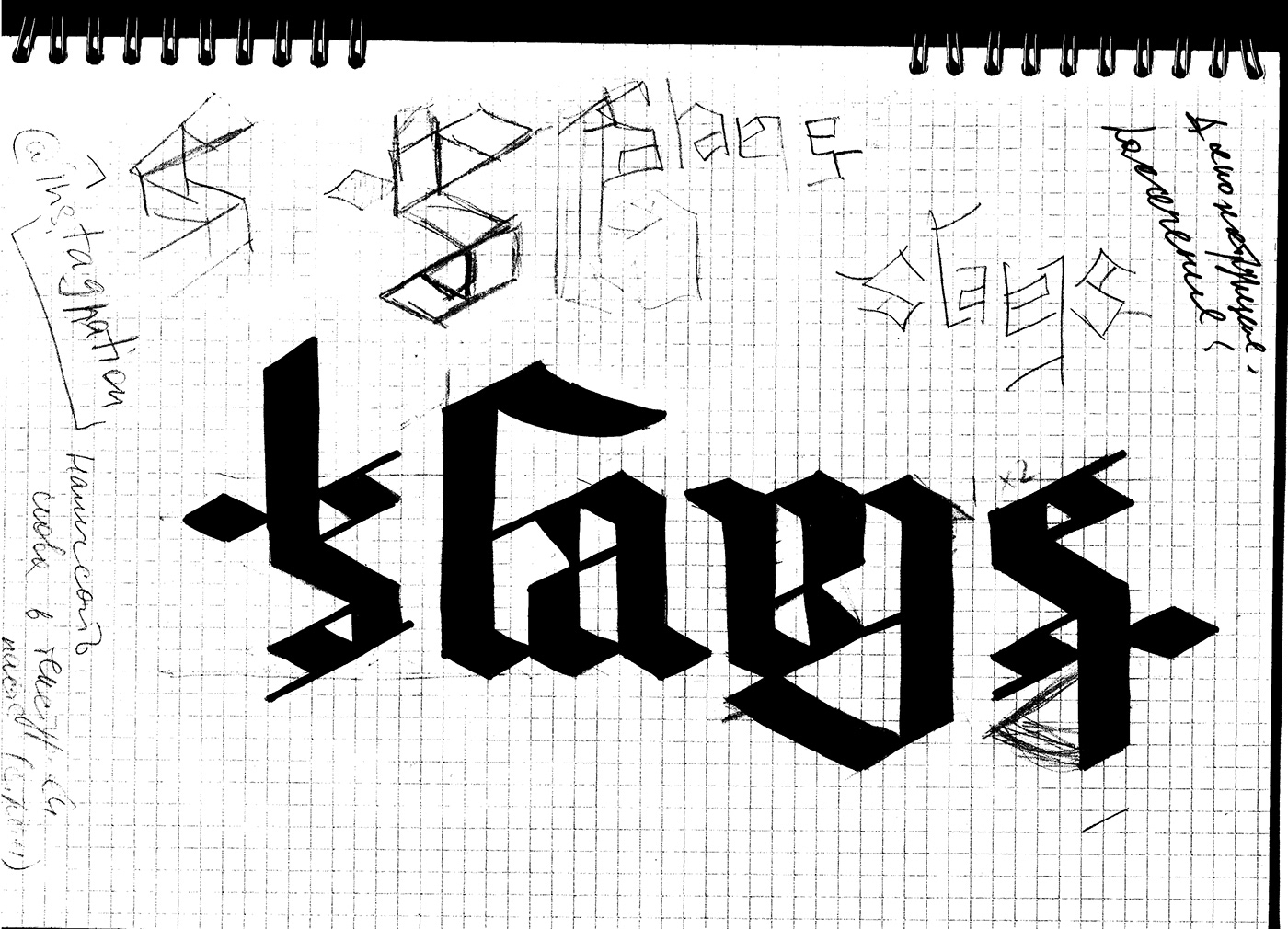
What I also learned then: writing (or better to say, drawing) gothic letters with a feather is not my thing for now. But, good news! Gothic writing is very modular — and that's my cup of tea.
So, for the ambigram I decided that S can easily become e+r, but the problem with "ay" was kinda hard for me. After don't remember how many iterations the solution finally came down: I got rid of the hole in "a", making it a simple stroke — and it worked.

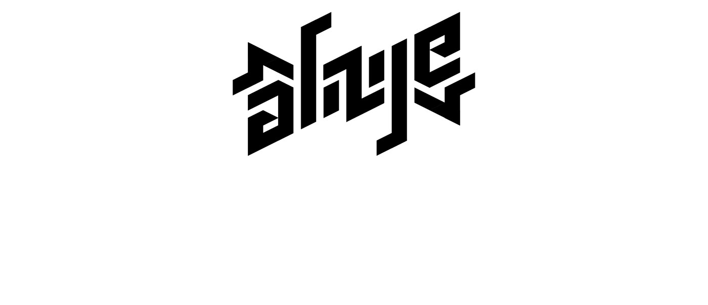
Okay, Slayer logo was ready (and who thinks it's not gothic, cast the first stone).
Then came the cover's turn. I decided to get hardcore and went to the nearest supermarket in search for some meat. Well, I definitely found some.

This concept with chicks didn't get to the final result, but now I got huge material on the anatomy of them — so no surprise for me if sometime later it comes up in some other "specific" project I get chance to work on.
And this time I decided to try my other pre-made materials also using hands, but here they were scanned, giving some torn texture with anxious effect.
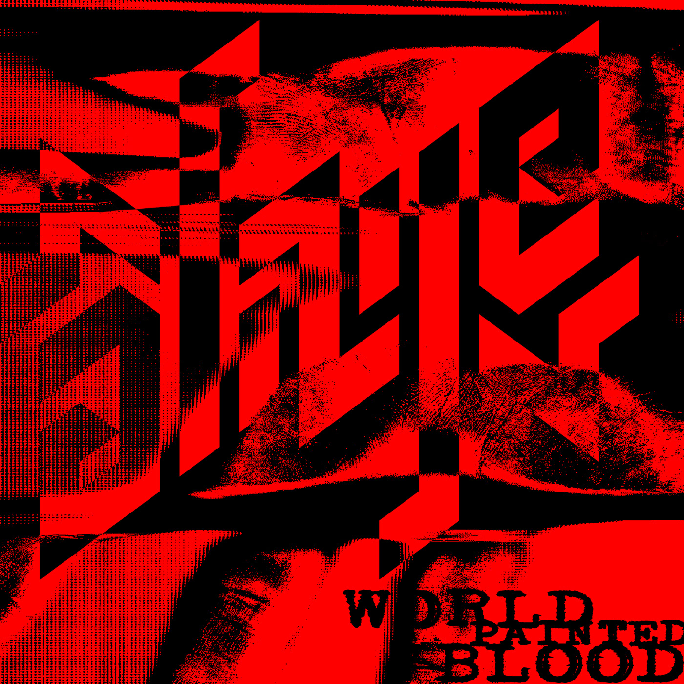
Finally, the logo fully blended into this texture, creating a good tension. What I also wanted to achieve was the sense of 'multi-layerness' — to make the logo not flat.
For the name of the album "World Painted Blood" I chose typewriter font with broken leading and no justification — to make it more raw and out of order.
The lyrics from the main track (which, I must admit, I really love) went for the inside of the pack — and made a good broken rhythm.
The backside gives the list of tracks and the names of producers — just like on the original CD.

That's all, folks!
Listen to good music and be in peace (even listening to Slayer).
Thanks!


