That's Toast !
This was the brand name chosen for a new Brunch which has opened in Bruges. That's toast is new place for nice food and service that is affordable. They pride themselves on using toast with every meal they serve.
For That's Toast! Toast is a form of celebration. Identity design, packaging and some illustration on the restaurant walls was based on a simple, Young, Cosmopolitan but distinctive idea, following the client’s brief.
That's Toast owners : Steven Wamelink & Wang Yijie
That's Toast owners : Steven Wamelink & Wang Yijie


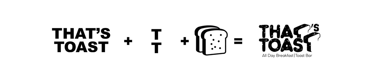
__ THE LOGO

__ LOGO CONCEPT
The repetition of the T letter shaped it giving us the opportunity to make it like a toast
In addition, we have made the logo font with toast texture.
In addition, we have made the logo font with toast texture.
__Visual Identity
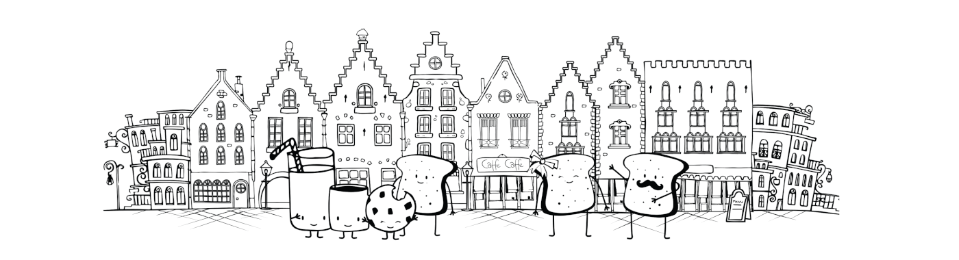
Meet the TOAST family

Interior Design
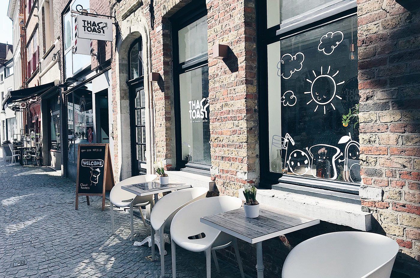
__ entrance


terrace


__ stationery


The Menu design change based on the season and the new dishes.


Part II of that's Toast Porject 2022
Following the successful opening of "That's Toast" in Bruges, The team has made the strategic decision to expand the brand presence by opening a new branch in Antwerp, Belgium.
With a focus on continuing the "That's Toast" story,


To further expand the reach of our brand, we have developed a diverse array of merchandise options that serve both as take-away food containers and souvenirs available for purchase.


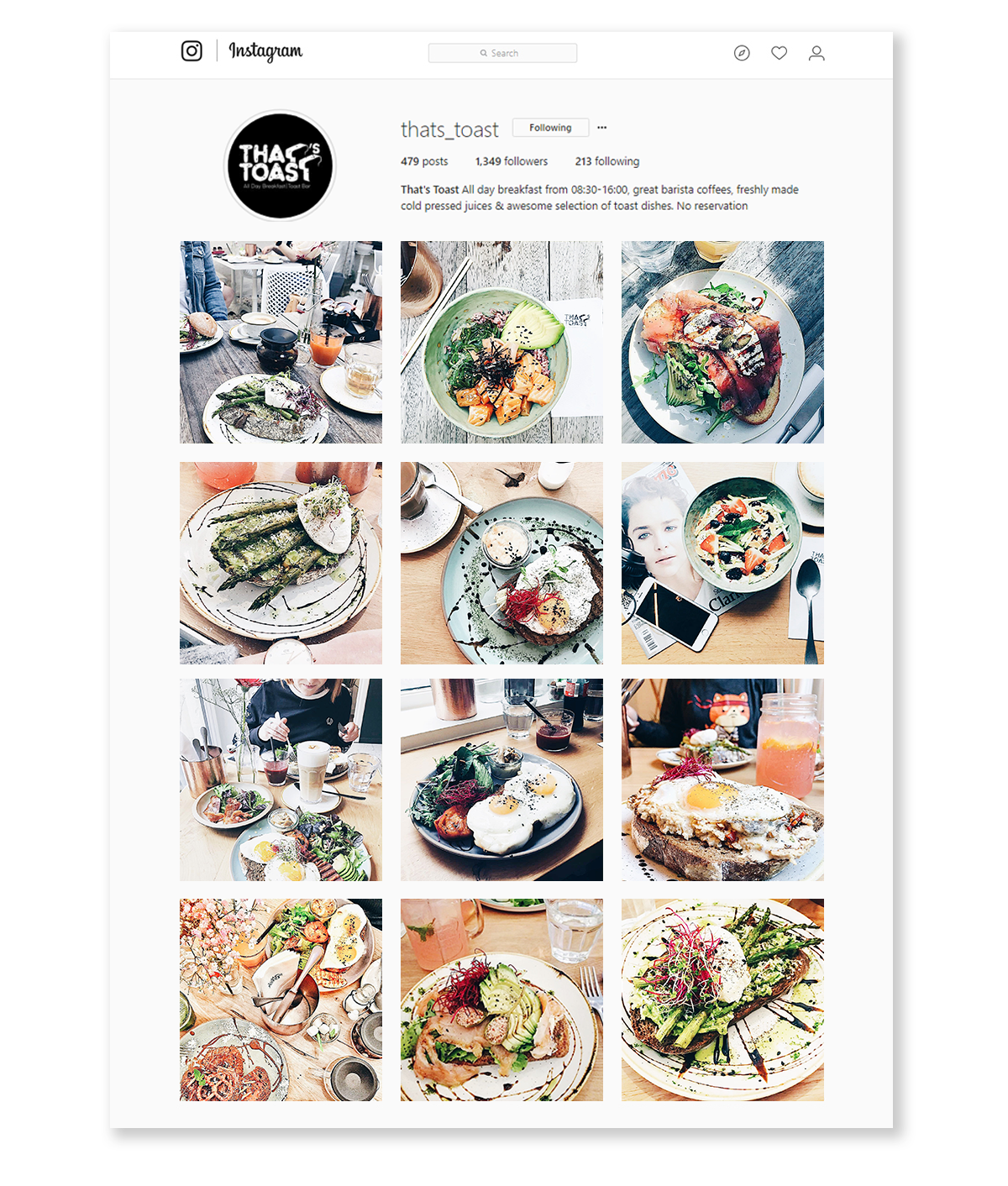
__ that's toast instagram
AWARDS
Indigo Award 2018 THAT'S TOAST
Category : Non-Professional Branding
Position: Gold Winner in Logos Category - Gold Winner in Branding Category - Silver Winner in Illustration Category
Category : Non-Professional Branding
Position: Gold Winner in Logos Category - Gold Winner in Branding Category - Silver Winner in Illustration Category
Published in
Brand visualization by Sandupublishing
IDN world v26n2 magazine: Identity for Restaurants, Bistros, Bars & Cafes
‘請排隊候餐——人氣餐飲品牌設計的秘密 : Please Queue for Meal - The Secret of Popular Catering Brand Design’ by HIGHTONE (H.K.) PUBLISHING Co.
IDN world v26n2 magazine: Identity for Restaurants, Bistros, Bars & Cafes
‘請排隊候餐——人氣餐飲品牌設計的秘密 : Please Queue for Meal - The Secret of Popular Catering Brand Design’ by HIGHTONE (H.K.) PUBLISHING Co.
Thank you!