
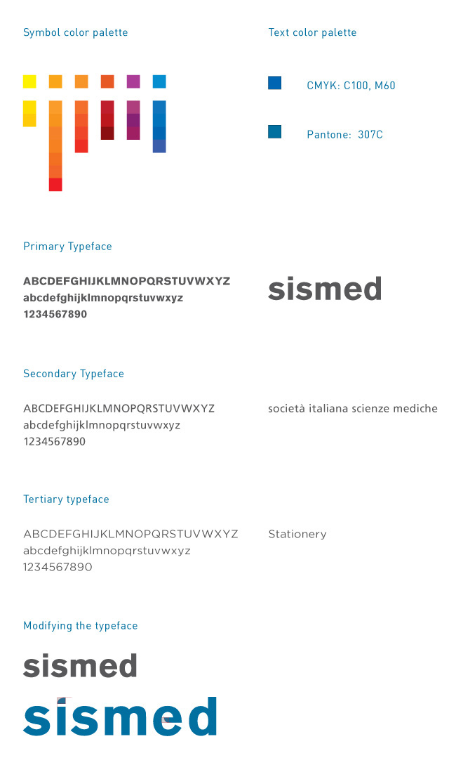
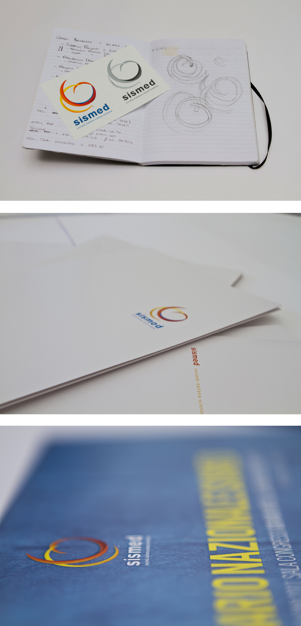
After a couple of meetings with the client, the Attributes that the Brand had to express were defined:
Fresh, Elastic, Direct, Multidisciplinary, Professional.
We also defined their mission: improve together.
We came out with the Idea that the visual language of the Brand had to be:
simple, readible, minimal yet catchy.


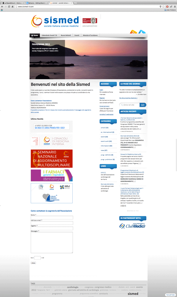
The website mantains the white background of the symbol and the colour palette of the logo through the buttons and the links. Furthermore it has a user-friendly control panel that allows the administrative office of the association to keep the website always up-to-date.
Moreover, it has been developed following the editorial rules (i.e. the grids, the readibility issues...)
Moreover, it has been developed following the editorial rules (i.e. the grids, the readibility issues...)


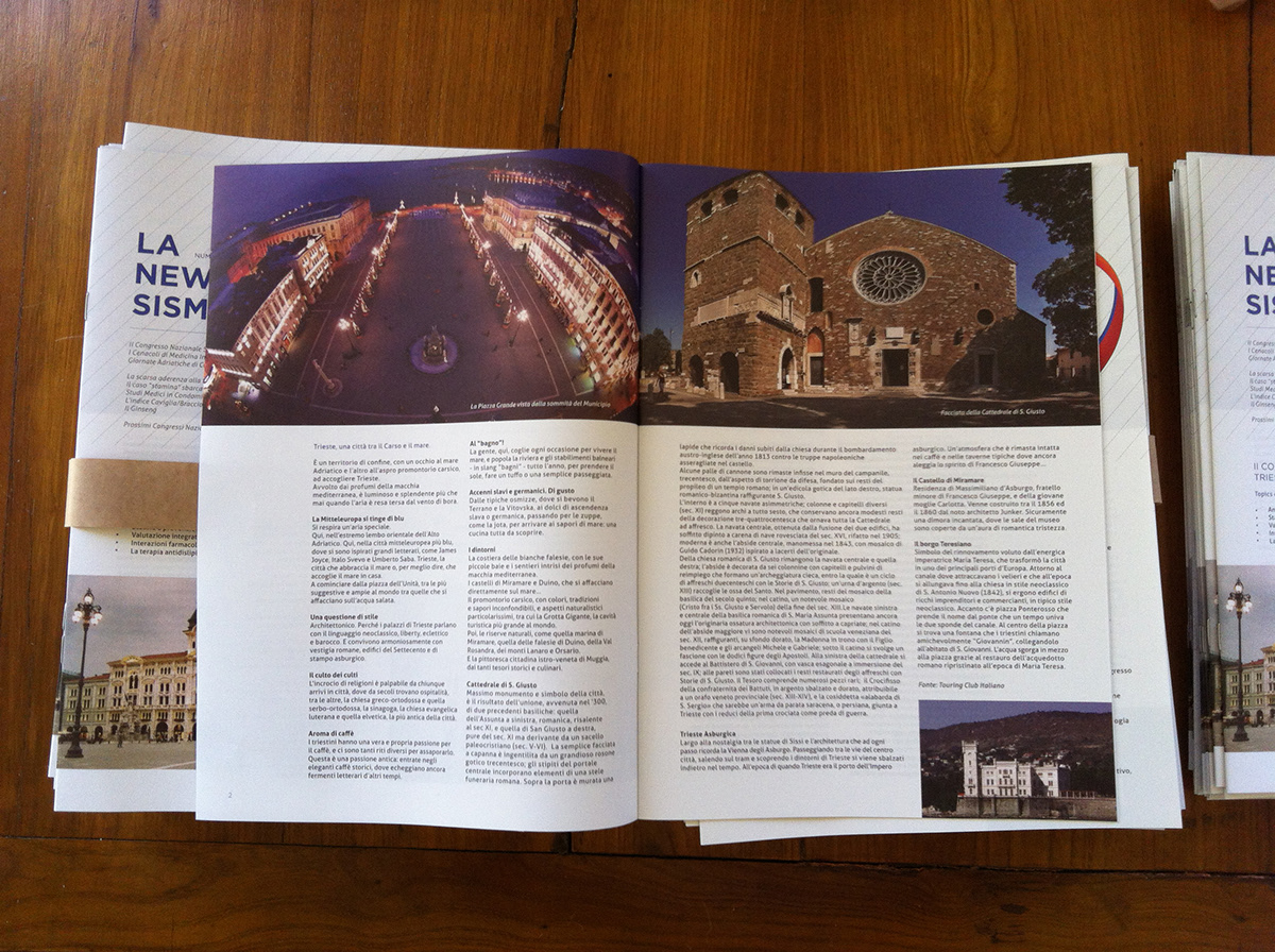
As part of the brand experience, I lead the Visual Communication for the meetings and the events of the Association. The process of creating a new visual language is always the result of a brief from the client and a research on the field; the place, its history, the ways to communicate the core of the event within a specific place.
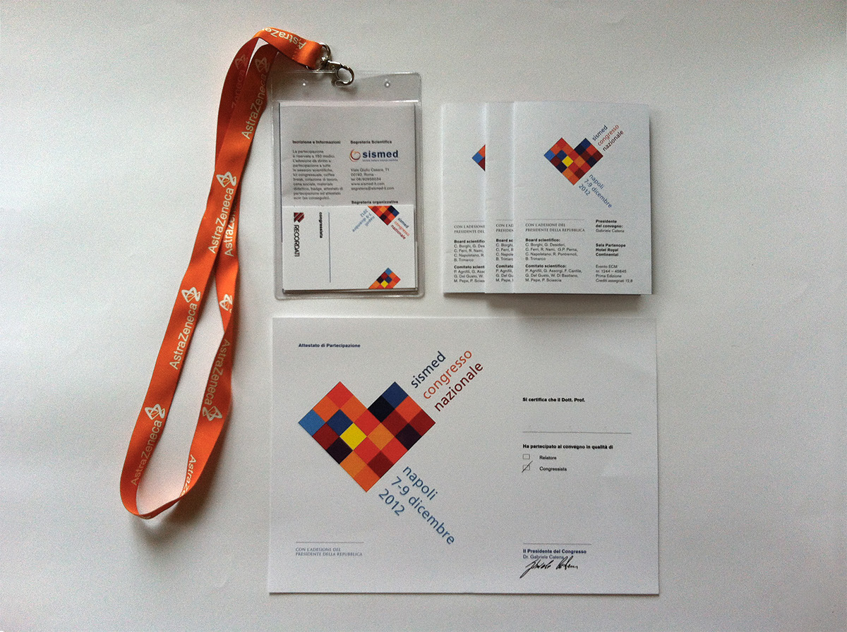
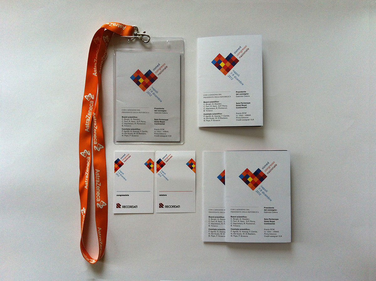
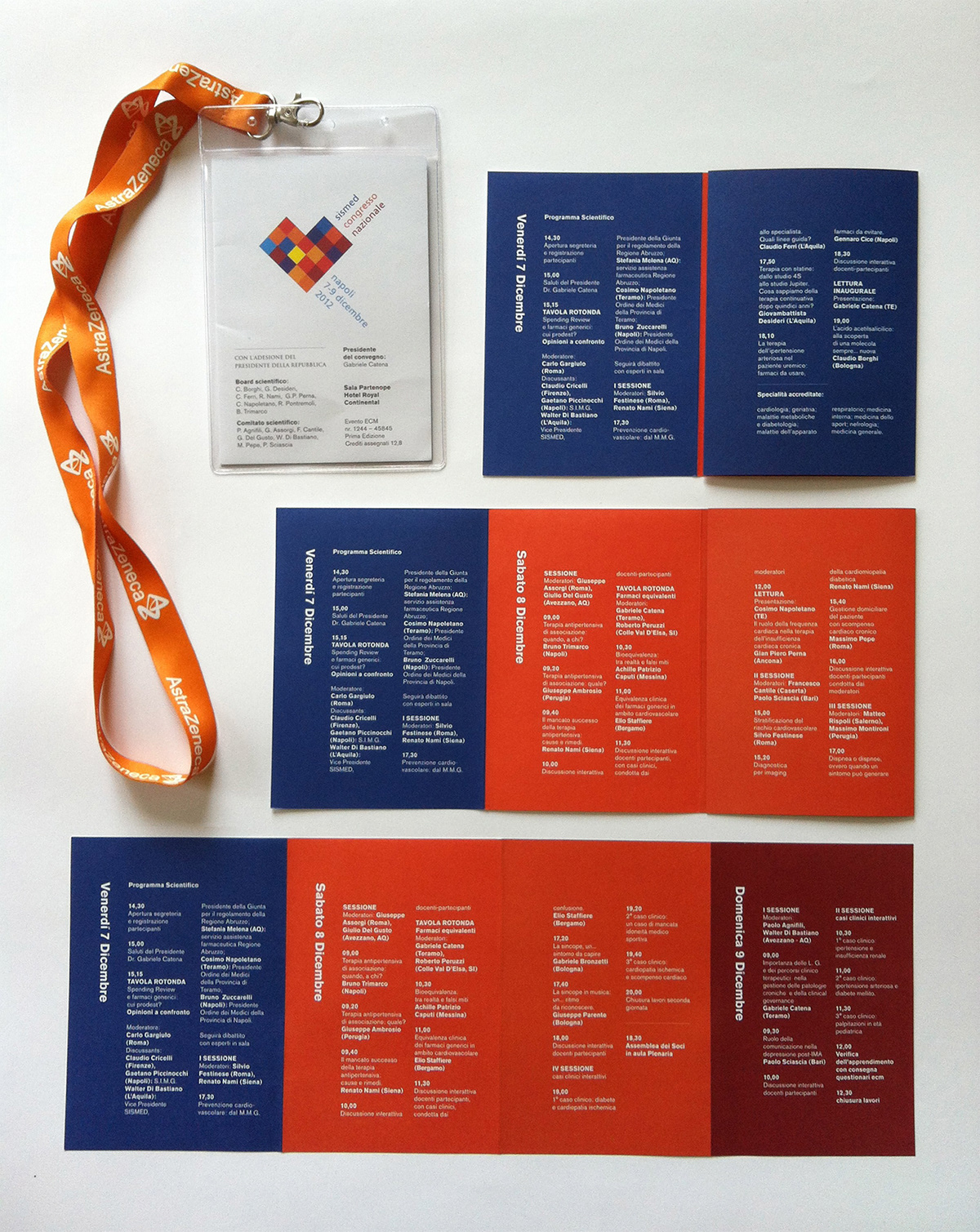
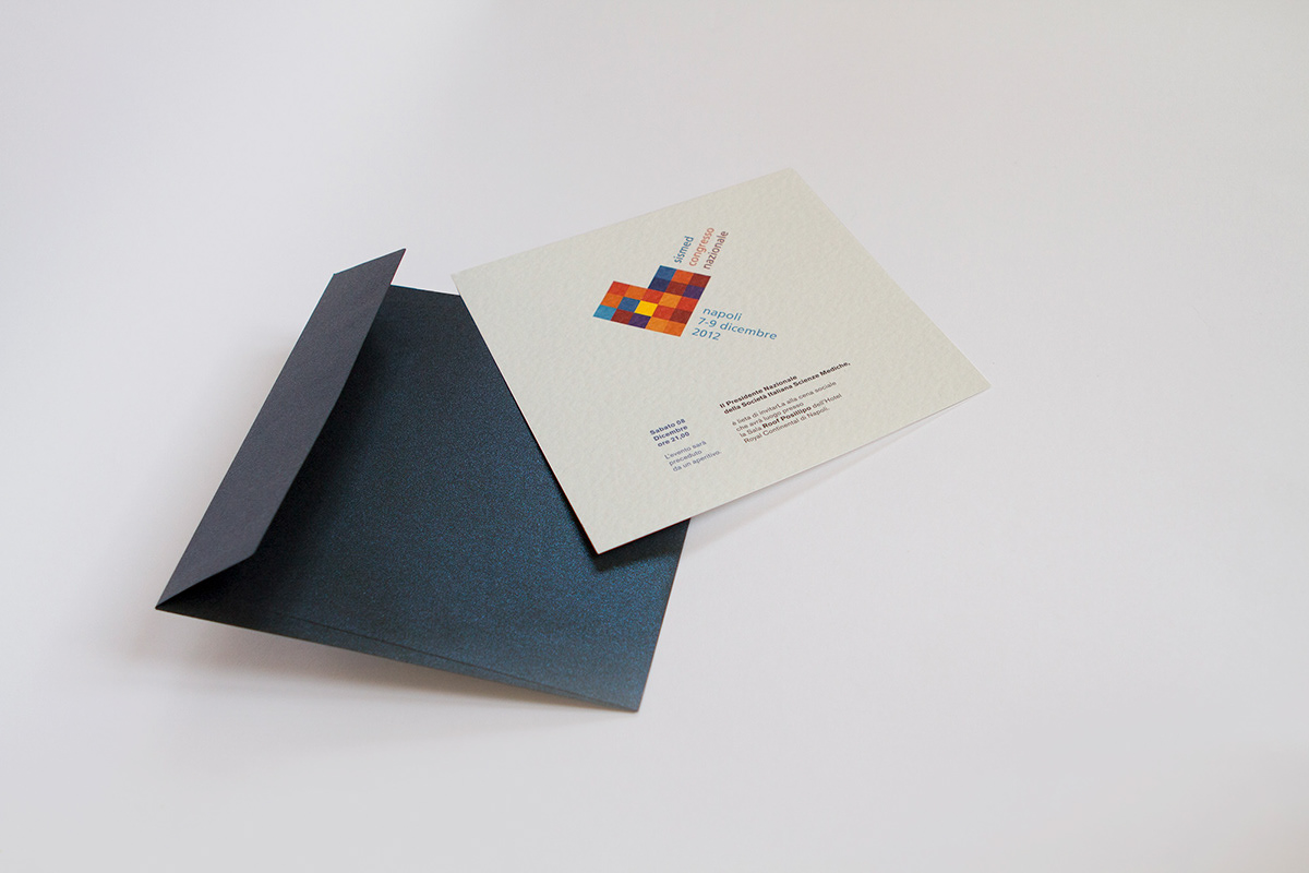
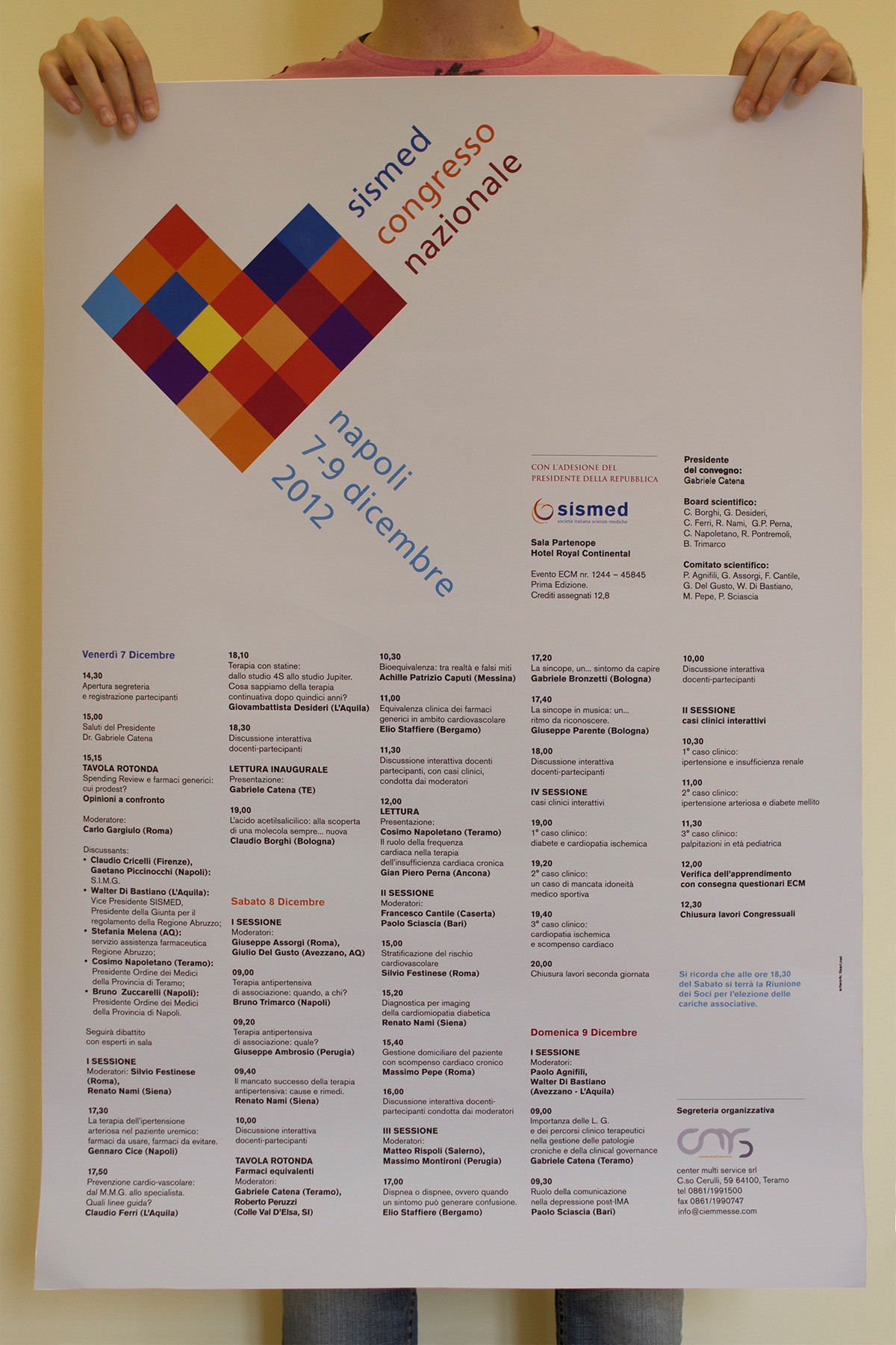
First National Congress
This event has been held In Naples in December 2012.
After a meeting with the client it was clear they wanted a symbol that could become a sub-brand of the association, something that was recognisable as THE national event of the association.
Therefore I decided to create a logo that wasn't connected with the colour pattern of the place where it was held. Also, I wanted to keep the colour palette of the Sismed Logo.
The final result is a heartshaped logo made by multi coloured squares (ref. the two seminars shown below), and with two orders of text. The first, the upper one, will be the same every year.
The second will change depending by the place (the colour will change in order to adapt on the new place) and the date.
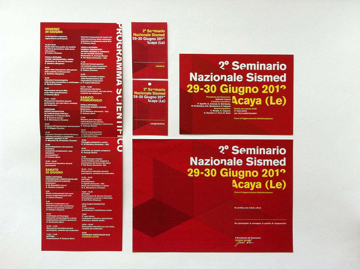
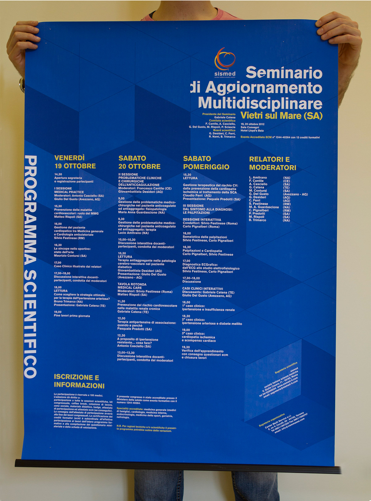
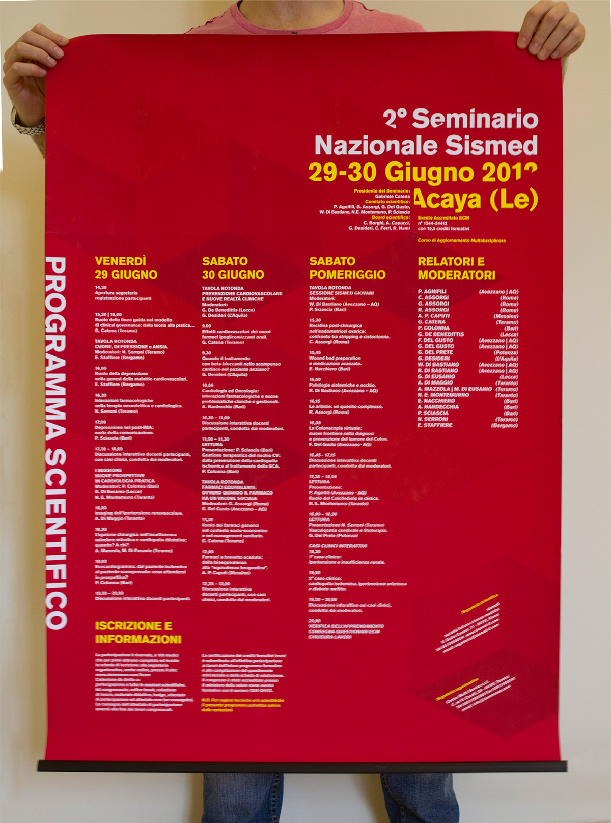
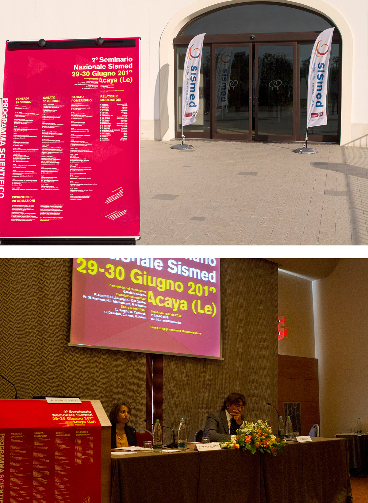
Two Seminars, June and October 2012
For these events I created a connected visual communication.
The idea of the squares in the background came out after a meeting with the client. They asked for a project were it was possibile to understand how the different faces of the association were together in the seminars and built something new.
The colours are related to the different locations of the events.
As a matter of fact the colours of the cities were red and yellow for the first one, and blue for the second.


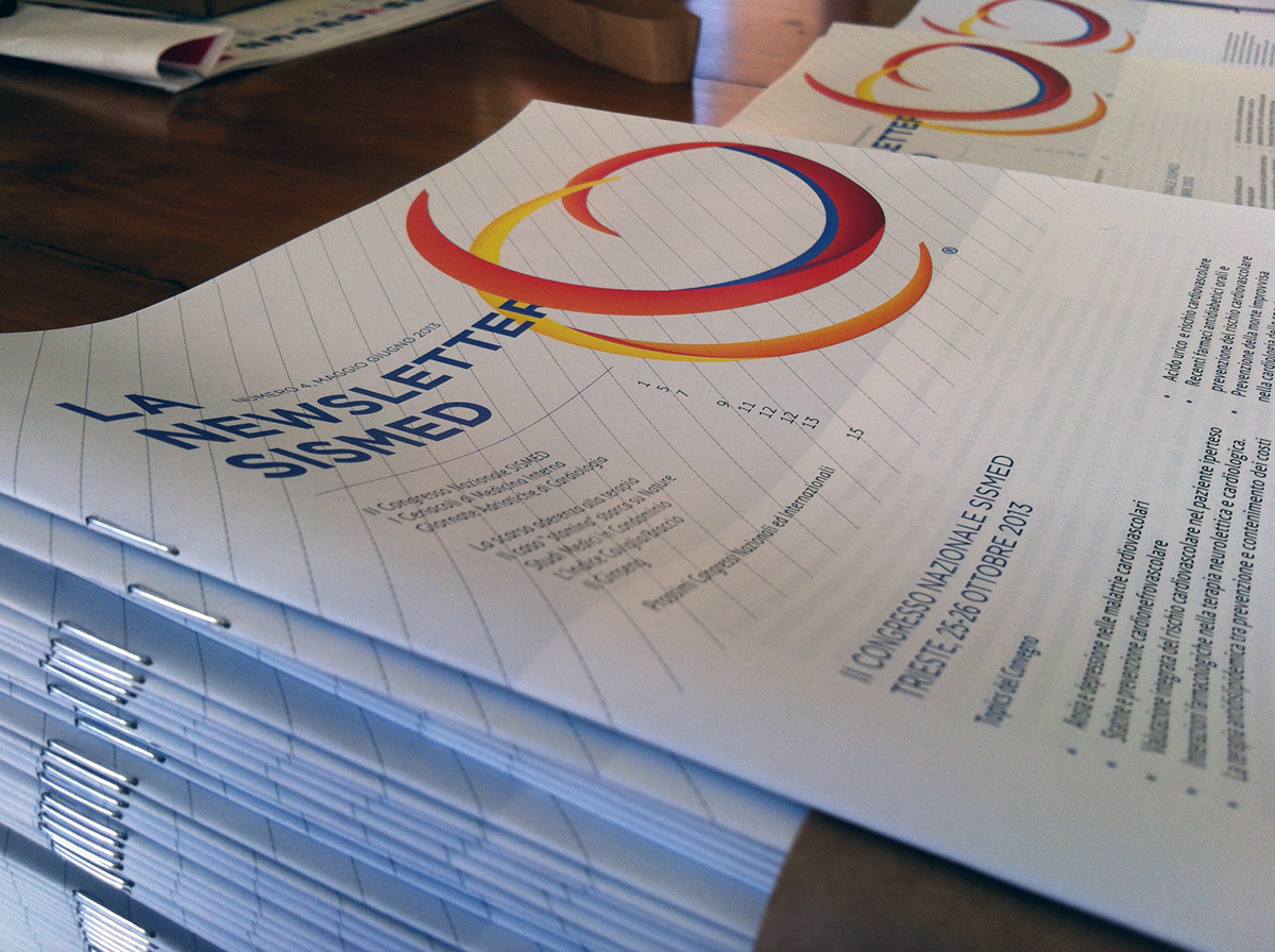
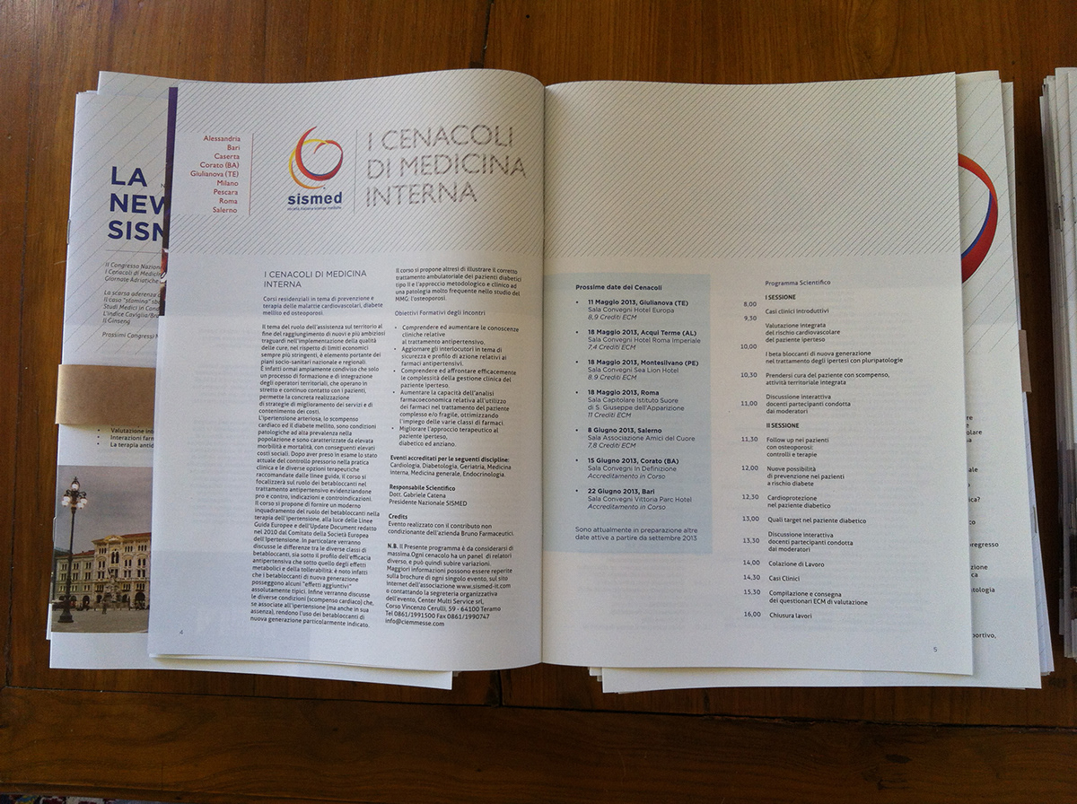
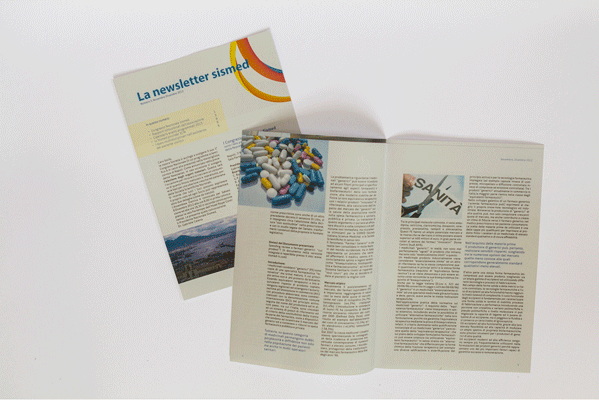
The society produces also a quarterly issue about the events and the news of the association.
It reflects also the achievements SISMED obtained during times.
When we started, the journal was nothing more than a flyer (thus the first issue is missing).
The fourth issue is now something that can be called a real editorial work.
When we started, the journal was nothing more than a flyer (thus the first issue is missing).
The fourth issue is now something that can be called a real editorial work.
Never use more than two different typefaces2
Printed in 2000 copies, it uses a 70gs recycled paper. Uncoated.
The A4 size has been chosen to better fit the paper folder that is used during the congresses as documents holder.
The A4 size has been chosen to better fit the paper folder that is used during the congresses as documents holder.
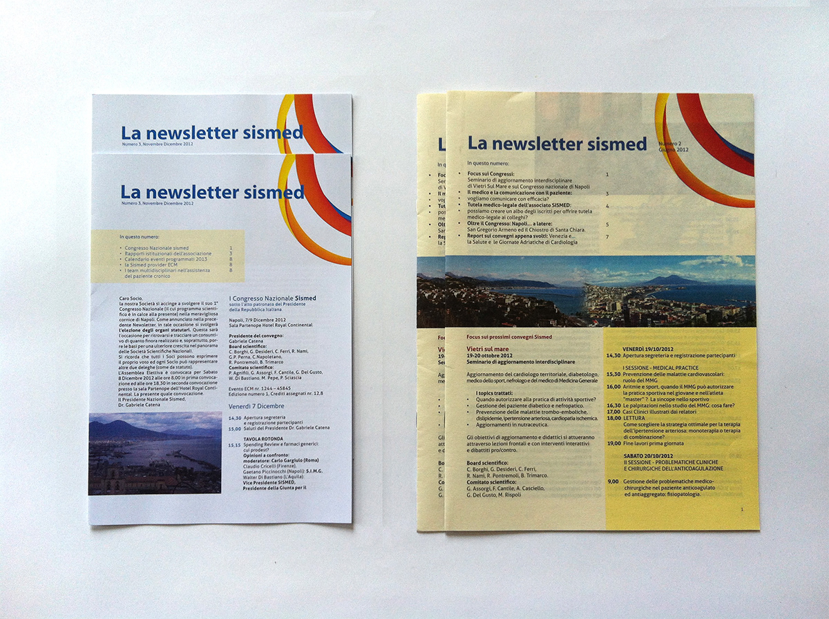
The second and the third issue of the magazine.
Although they had a very low budget, I still wanted to use a good grid and follow the editorial rules.
Although they had a very low budget, I still wanted to use a good grid and follow the editorial rules.

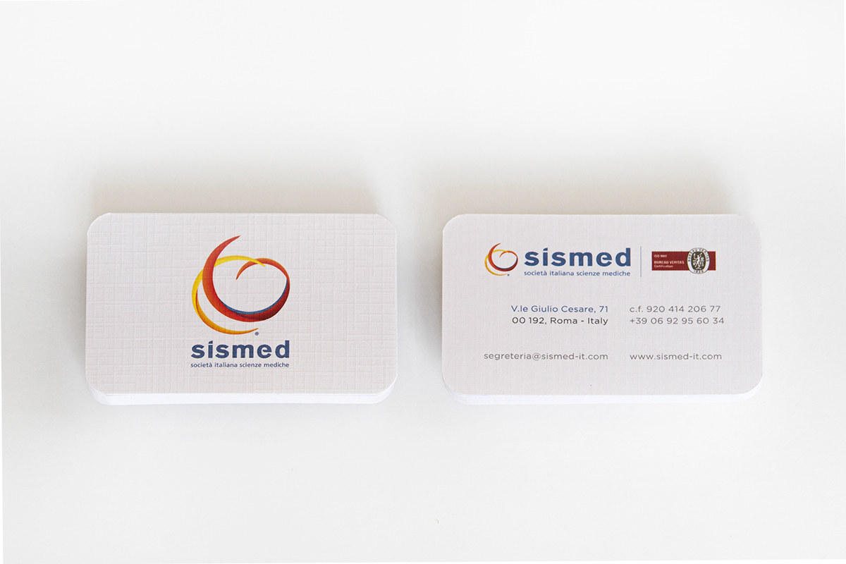
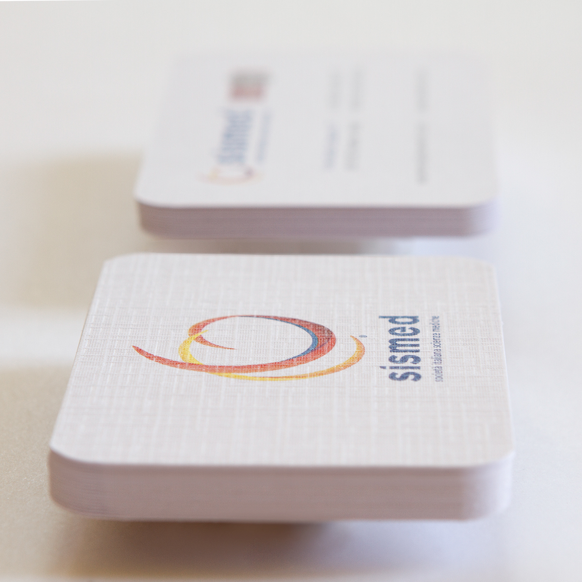
As part of the work i'm performing with SISMED, I am working on several sides of the brand identity.
You can watch some of the related work HERE (Venezia), HERE (GIornate Adriatiche) and HERE (small congresses)... Soon I will be posting updates and reviews!
Bibliography:
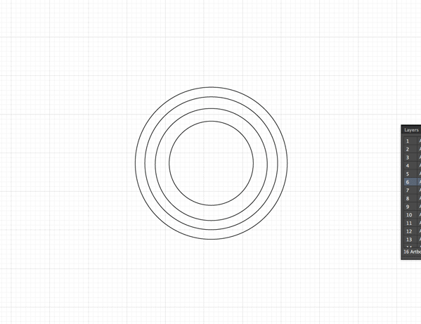
1. Munari, B. Discovery of the Circle - 1966 - Wittenborn publisher
2. van Gaalen, A. - Never use more than two different typefaces - 2011 - BIS publishing