The Major Project Definition and the related Visual Summary are two preliminary exams of the MA in Graphic Branding and Identity at London College of Communication.
The project is composed by two separate books, connected themselves through their covers.
The common Research Question of the studies has been used to join the two covers, while the opposed colours created a visual differentiation.
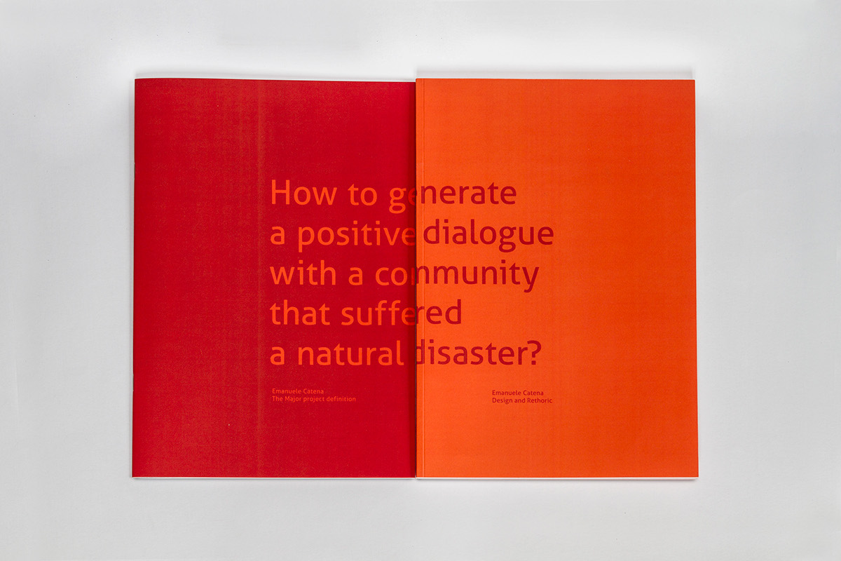
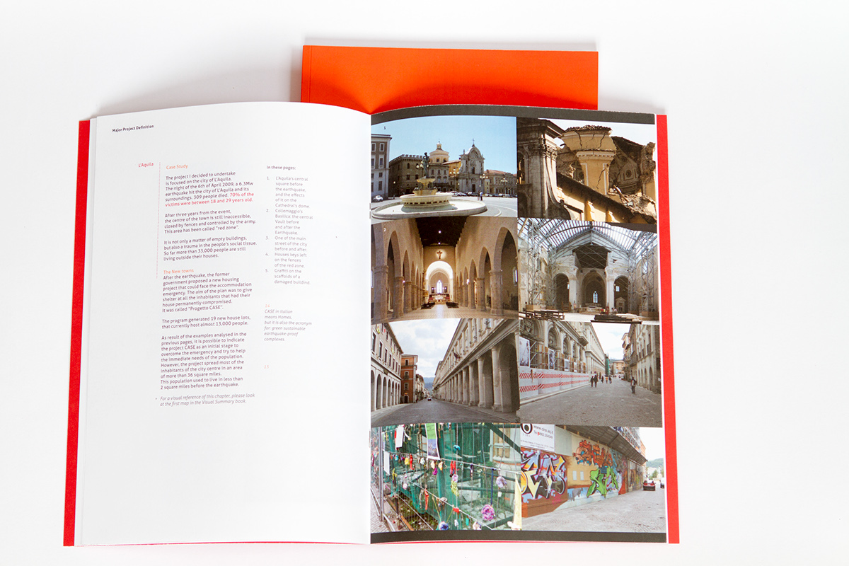
The red covered book is about the context and the field of study of my research.
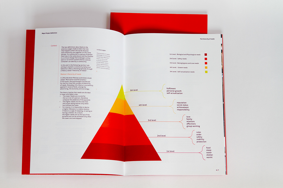
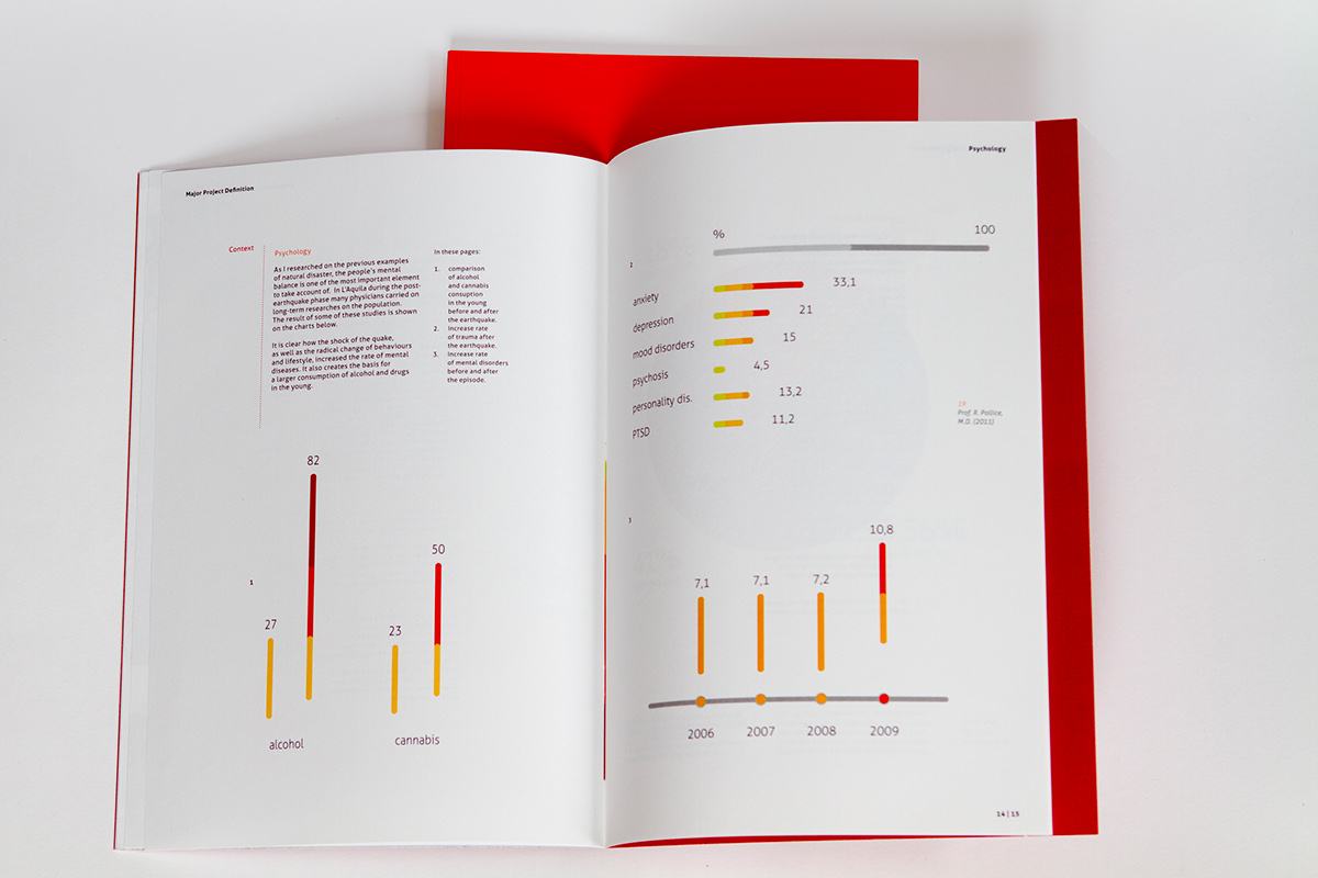
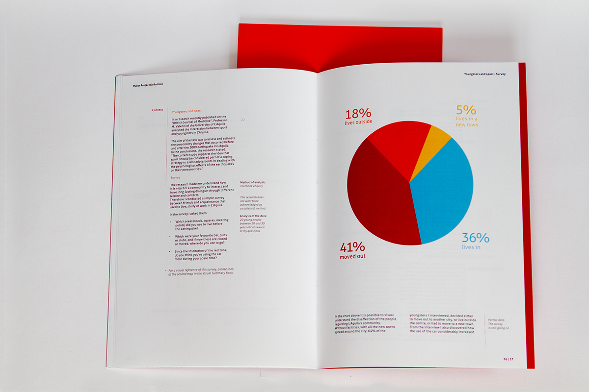
In the red book I also used several infographics.
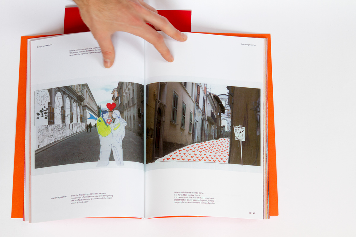
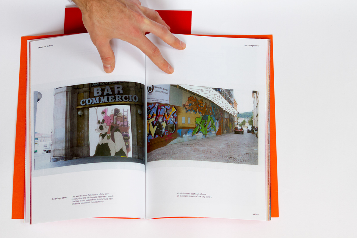
The orange book is the Visual Summaryof the project. This book is mainly a collection of the visual experiments and the references I used during my researches on the subject.
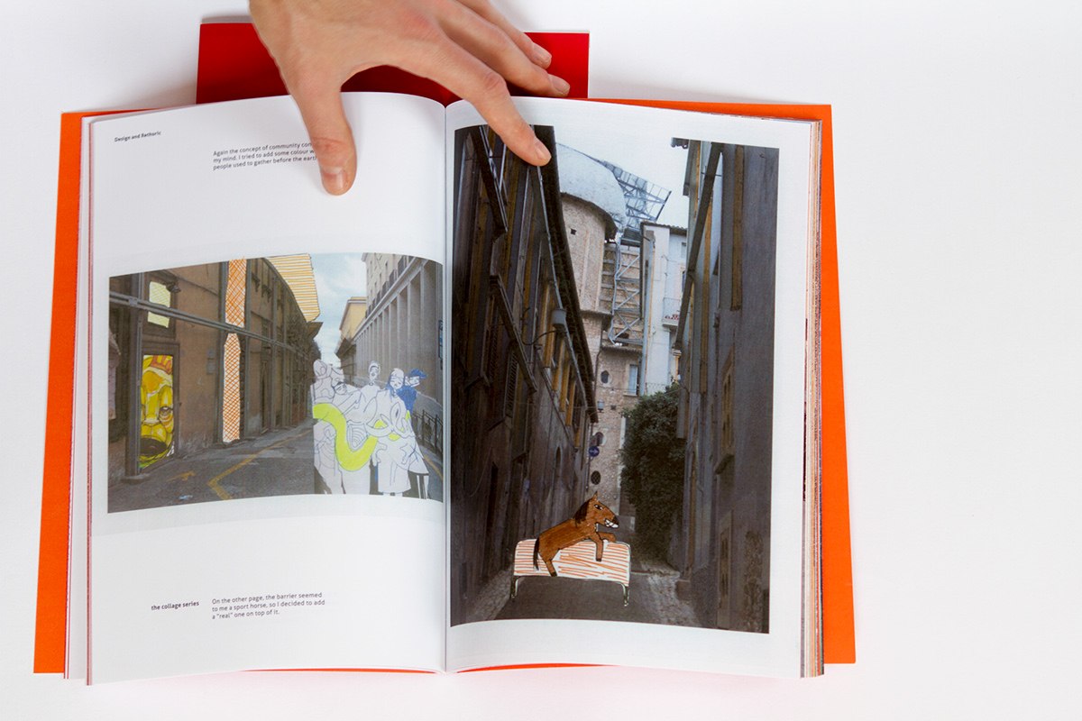
As my research question was "how to generate a positive dialogue with a community hit by a natural disaster", a couple of experiments involved the destruction of tools. Below some examples...
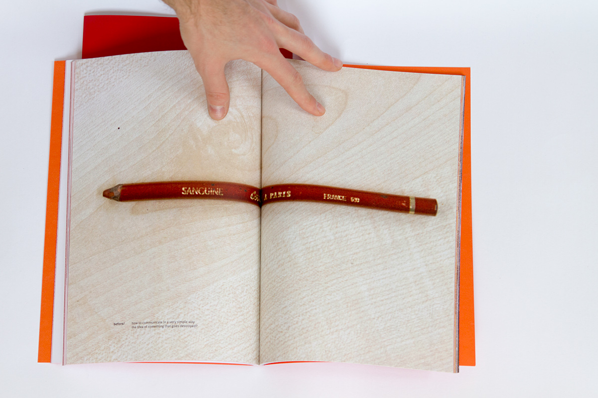
A pencil.
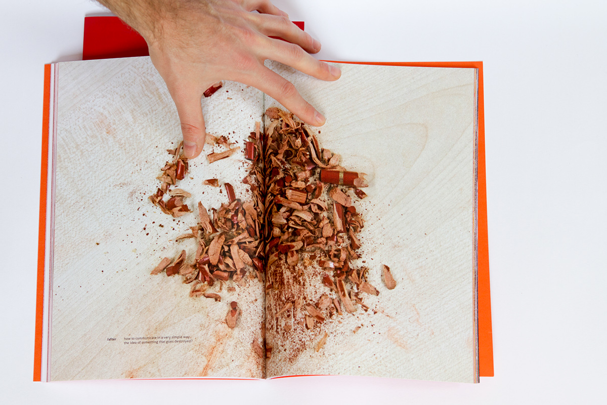
Still a pencil?
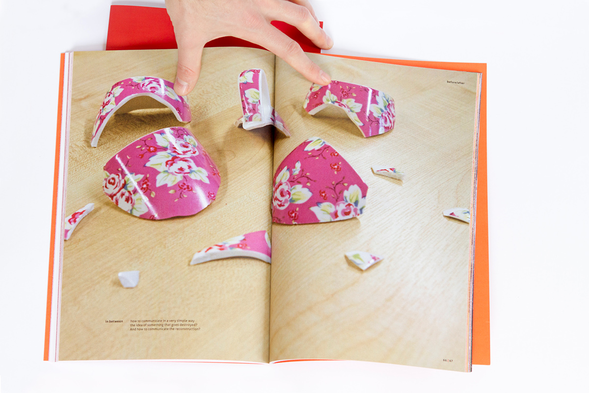
A shattered mug. I also destroyed several other objects: a booklet, a house made of lego...
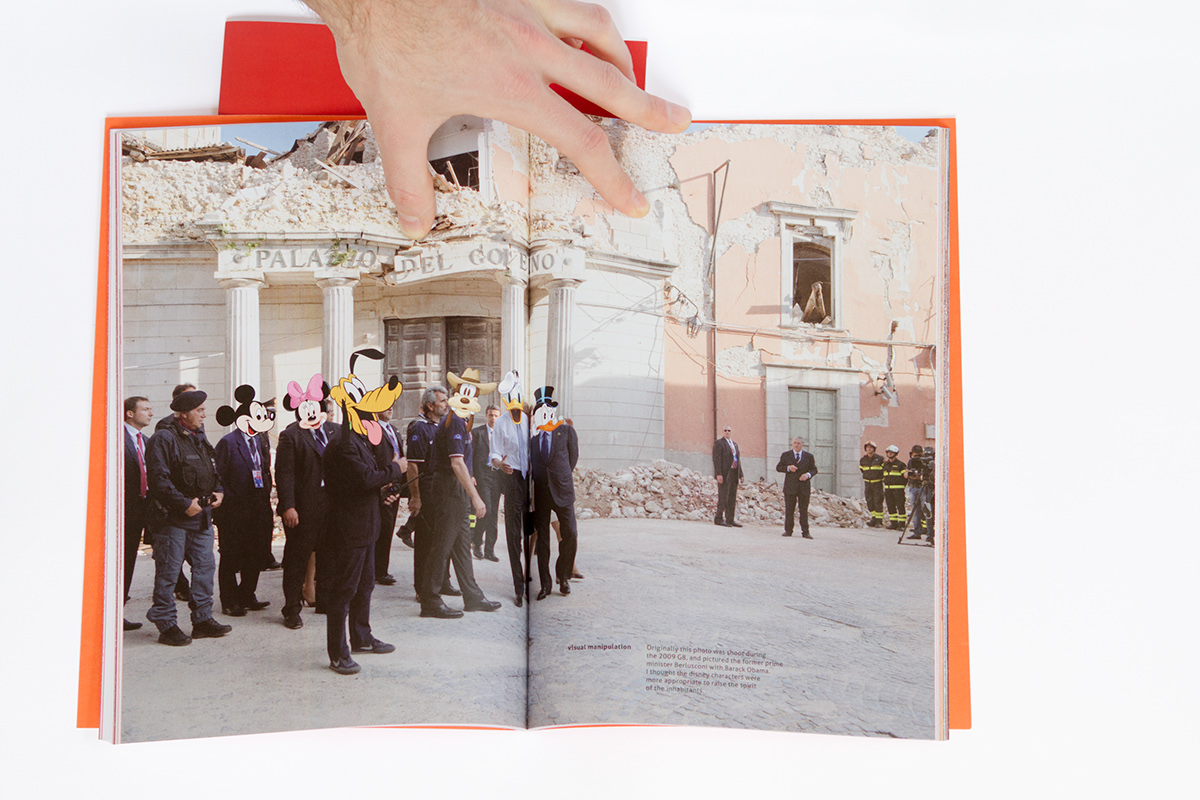
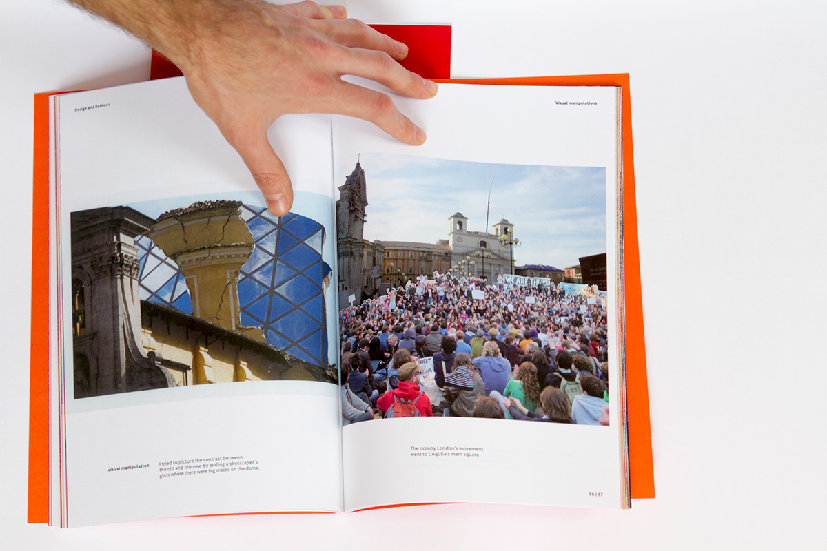
Visual Manipulation:
I still believe these faces are more distinguished than the real ones (up to you to go looking for the original pic).
I still believe these faces are more distinguished than the real ones (up to you to go looking for the original pic).
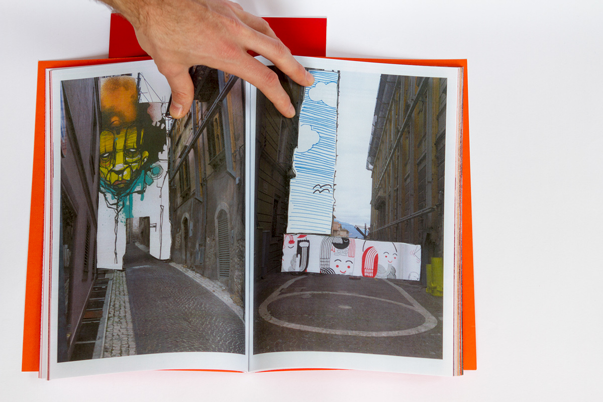
Visual Experiment: trying to change the environment through graphic design.
If you are a student of the MAGBI, you're welcome!
The Output:
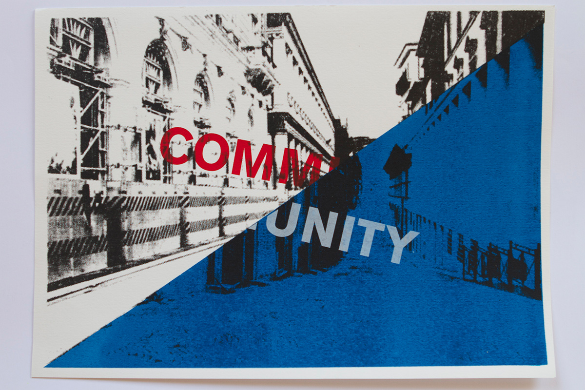
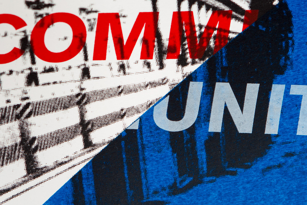
As a representative piece for the Major Project Definition I decided to create a silk screenprinted poster.
The final project is an overlapping of two picture I took in L'Aquila connected throuth the word community; I get inspired by the Bauhaus compositions and by the related exhibition I'd recently visited at the Barbican.
THANK YOU FOR THE VISIT!


