


Doughheads started as a small local market stall that cleverly flipped the humble doughnut on its head. They rapidly grew into one of the most popular and enjoyable taste experiences in Newcastle. Their incredible team of skilled bakers and pastry chefs use the highest quality produce to create doughnuts with real flavour.
I was selected by Doughheads to deliver a handcrafted rebrand to reposition them in a new marketplace for their flagship store in the beachside suburb of The Junction in Newcastle Australia.
Hand Drawn Logo + Brand Identity + Lettering Design + Gold Leaf Signage + Sign Painting
Stationary Design + Packaging Design + Print Design + Environmental Design + Uniforms
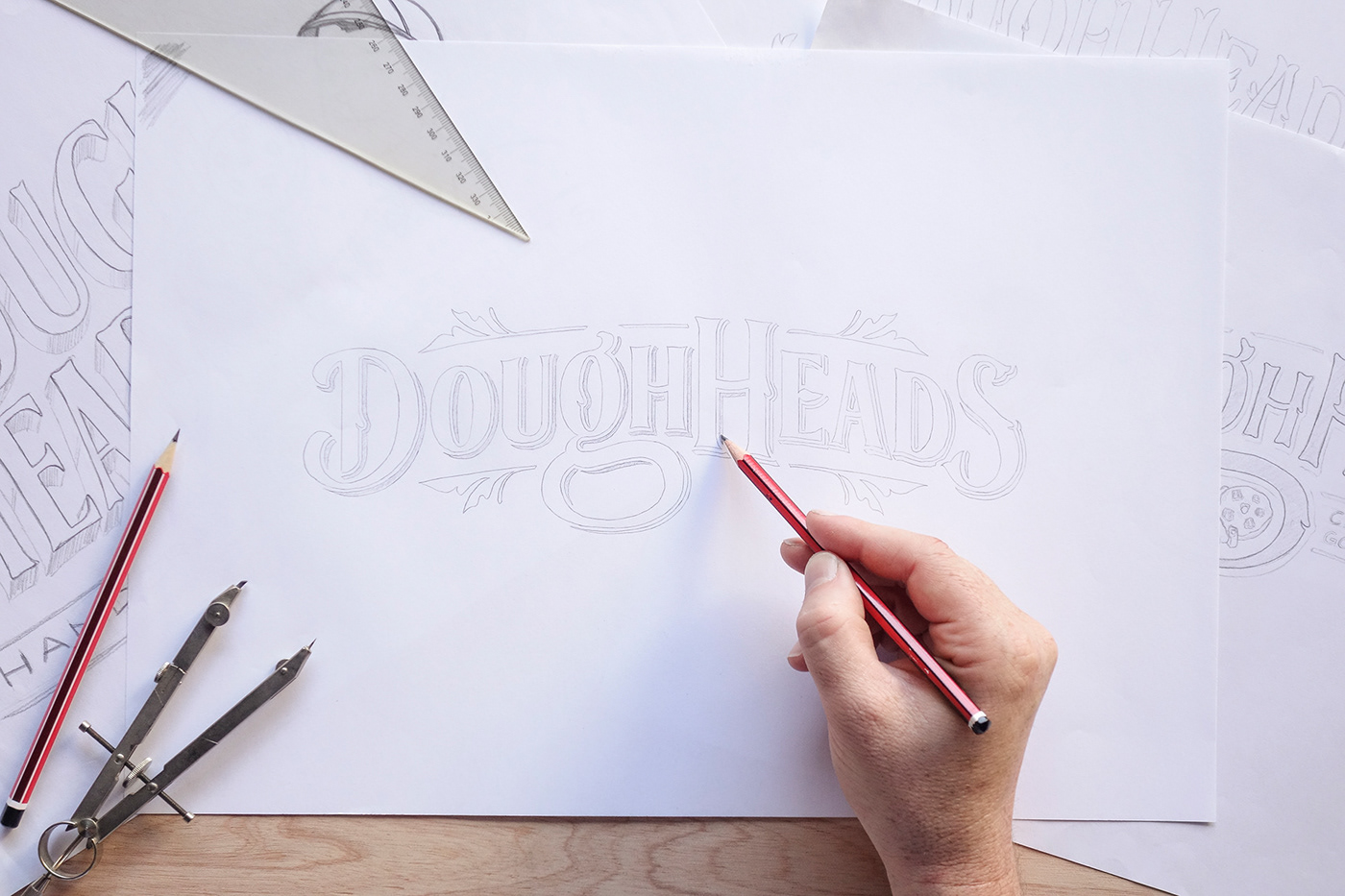
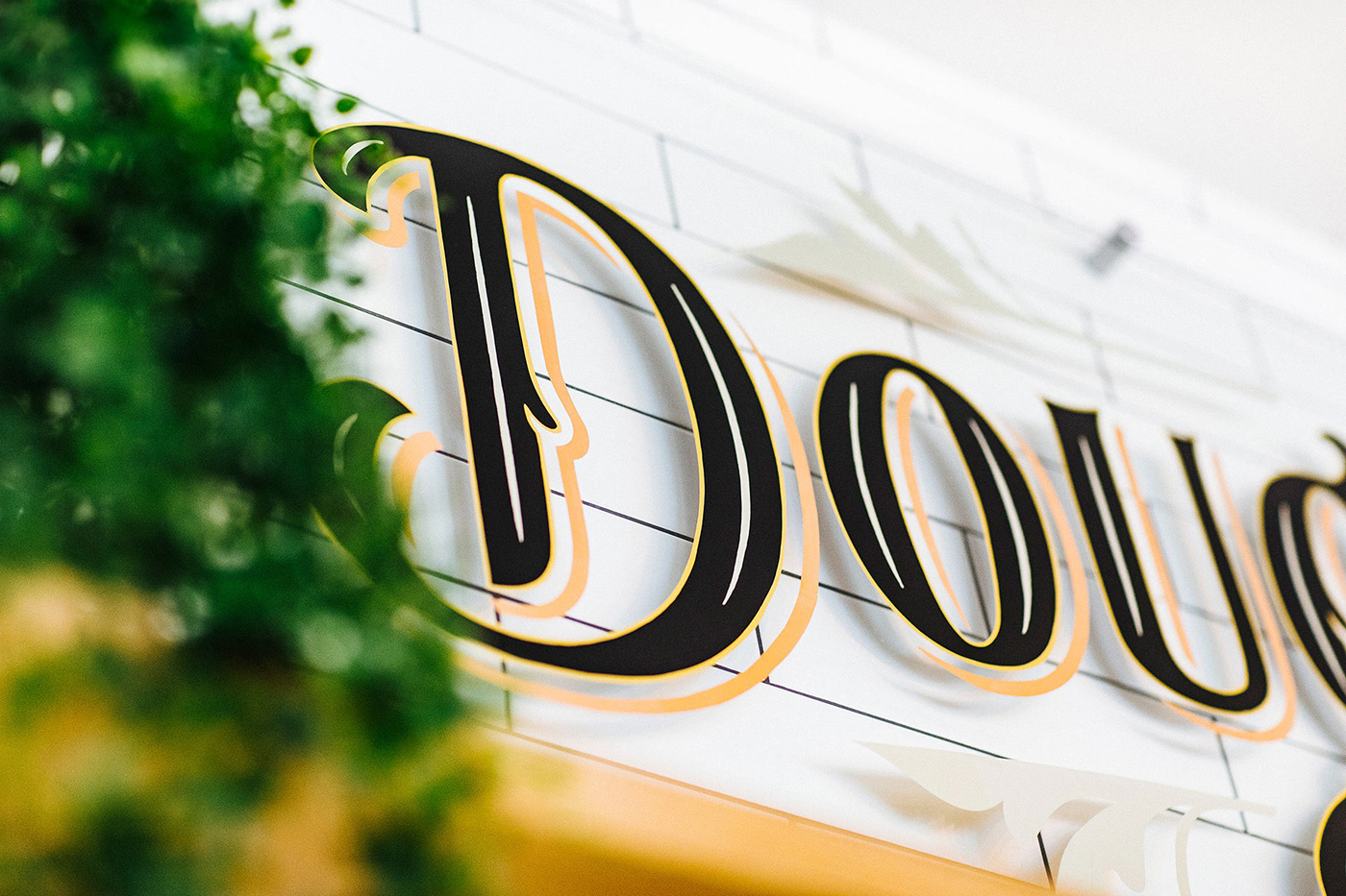
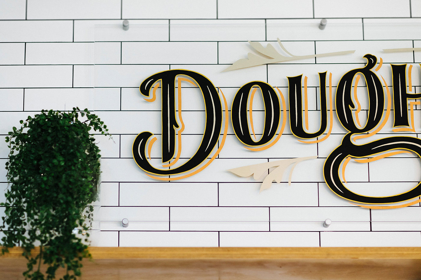
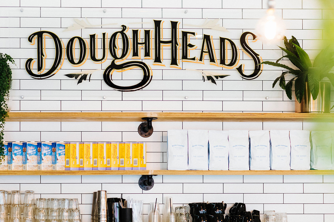
The unique hand-drawn logo design strongly focuses on the delicious, sticky and gooeyness of the Doughheads experience. With minimal effects, we could accentuate the edge of icing on their doughnuts within the D, G, H and the S of the lettering for emphasis and better legibility. The lettering design shares a fun experience with a classic serif which is also rounded off in relation to the clean and curved edge of their delicious icing.
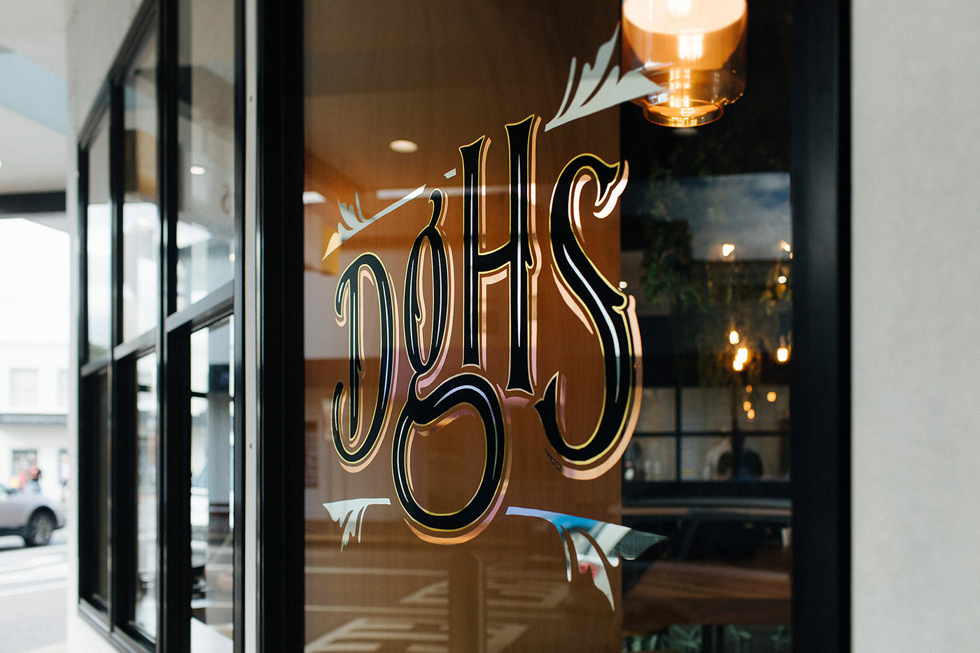
An effective plan was adhered to when considering the new logos future developments. The design needed to fit comfortably within a large area but also have breathability within tighter spaces. We designed two logo variations that follow this process for various brand collateral. The second variation houses an abbreviated logo that can comfortably fit within tighter areas of brand materials like coffee cups, embroidered shirt designs and was highly considered to be the main form of street signage for the cafe. By staying true to the exact styling of the full logo, the abbreviated version proves to be easily recognised as the Doughheads brand.
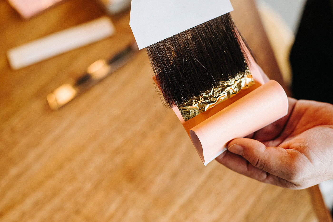

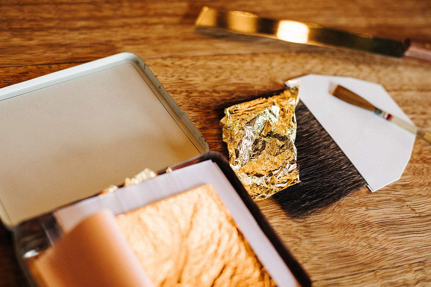
Elegant forms of gold leaf signage were hand painted and gilded to accentuate the sophisticated experience of the new cafe and the precision of each doughnuts creation. Signage was created using three different leaves consisting of 23 karat gold, 12 karat white gold, and copper leaf with black enamel paint. 23 karat gold was introduced for the outline to make the lettering stand out from the glass and create the correct visual hierarchy for better legibility against the dark window. The same was considered for the interior signage so that the lettering could be separated from the black grout lines of the tiles sitting behind the logo.

For brand consistency, we created foil business cards. Again a visual hierarchy was considered for the foiling in the design by keeping the lettering in black as the strongest component. The relief shade uses gloss copper foil to accentuate the lettering while the silver foil uses a matt finish to work as a subtle decorative element that lays behind the key elements of lettering for correct legibility.


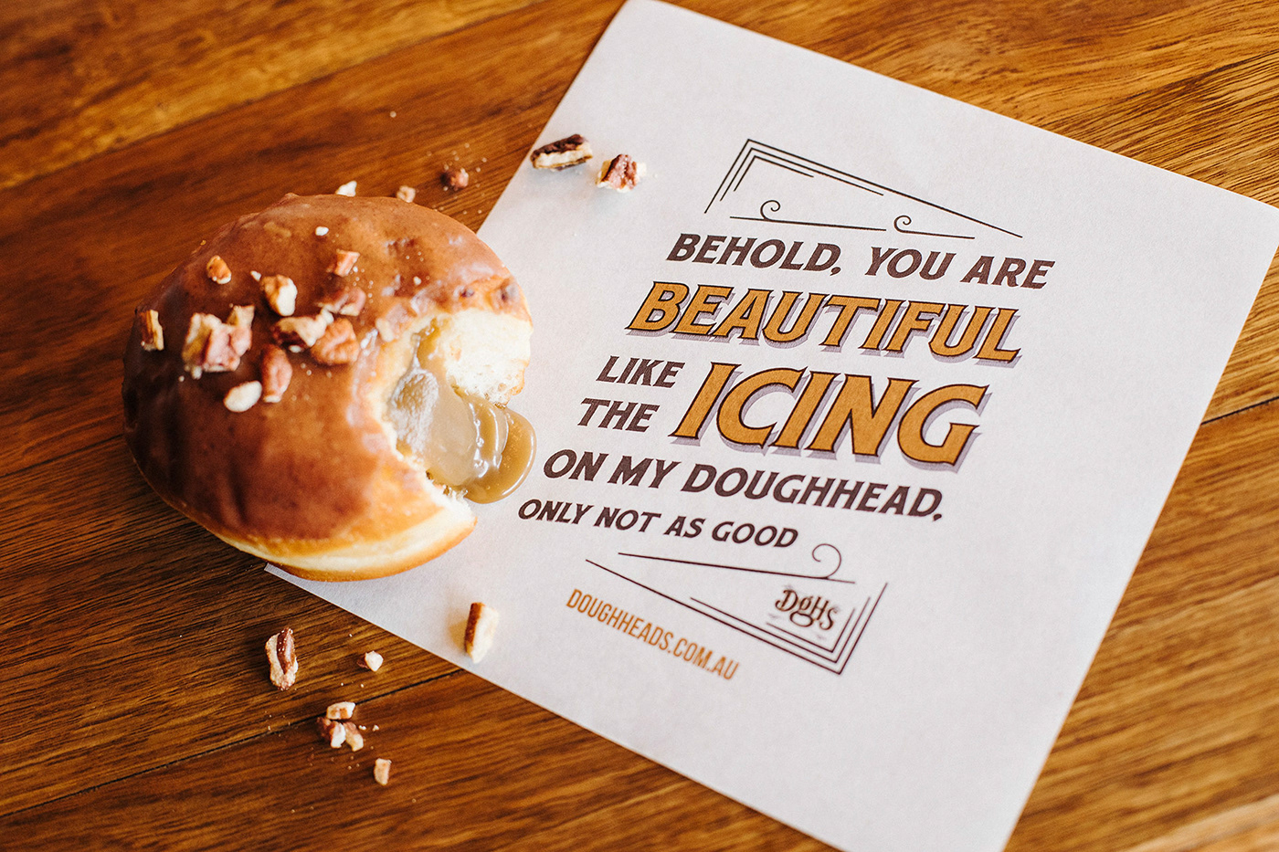
Product packaging which includes greaseproof paper designs were created to deliver an extended memorable experience for the brand. Doughheads puns were cleverly designed to give the customer enjoyment and share it with their audience. These were created to extend the brands presence not only in the cafe but across further distances through a great success of social media posts by Doughheads customers. The Doughheads rebrand and packaging gained a greater following and appreciation towards the delicious product and quickly became a more recognisable brand in Newcastle and Australia.


Learn more about the project at


