Sushi Taxi
In 2016, the overership of Sushi Taxi changed hands, and with it came the need for a new identity.
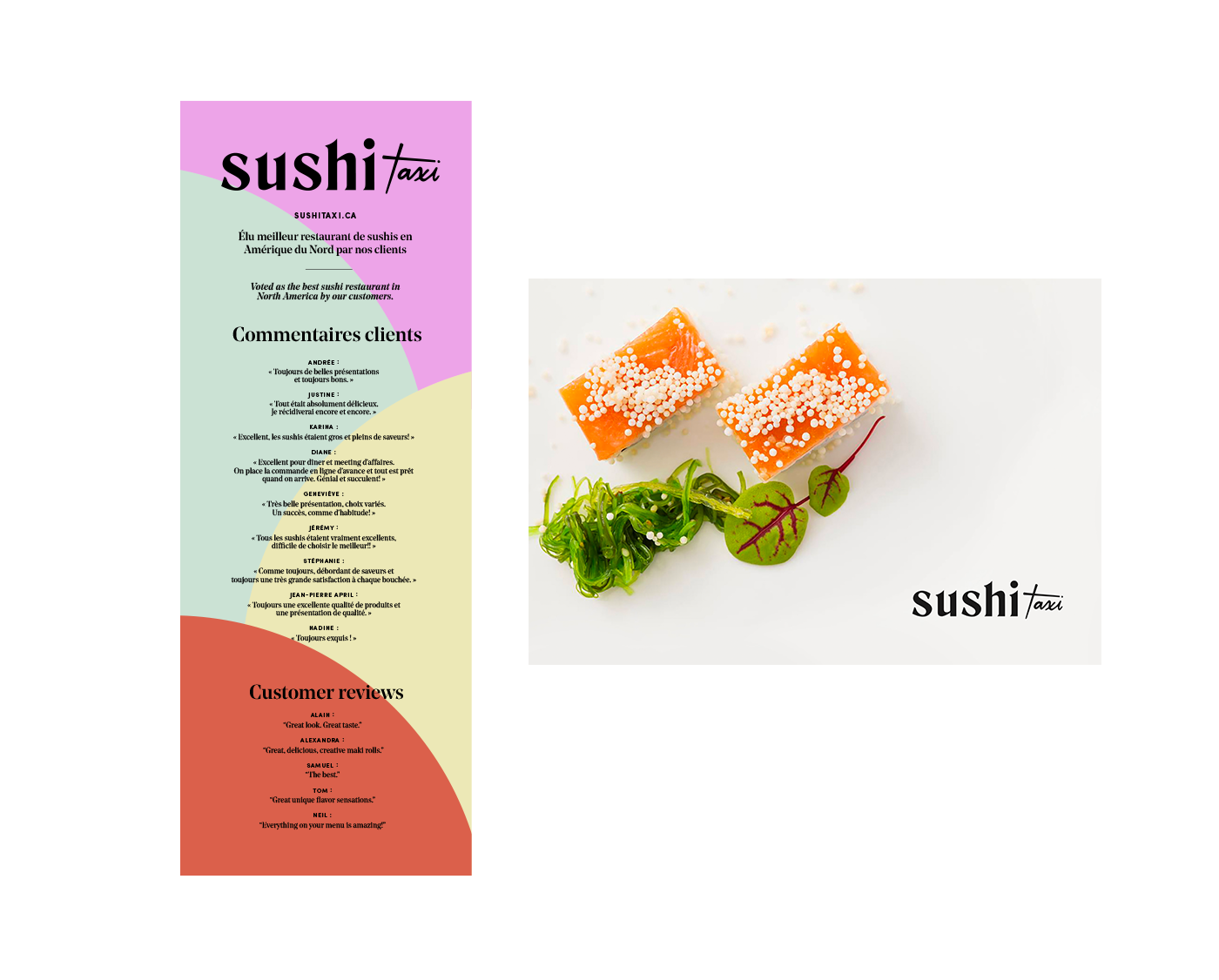
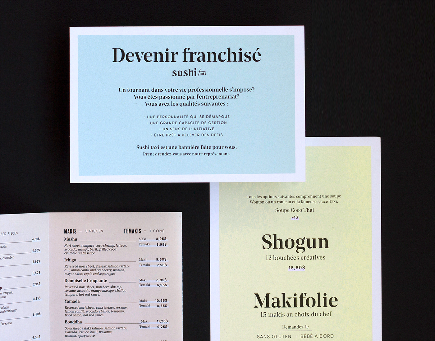
The new brand direction focuses on freshness and simplicity, allowing the quality of the product to shine.
The new brand direction focuses on freshness and simplicity, allowing the quality of the product to shine.
The goal was to create a universe that is part whimsical and part chilled-out, for a sushi brand that doesn’t take itself too seriously.
The brand’s main font features sharp edges, reminiscent of the sharp precision required to craft specialty sushi. The typography is mixed with a playful and contemporary colour palette which is harmonious, but retains some playful touches from the old identity.