Description
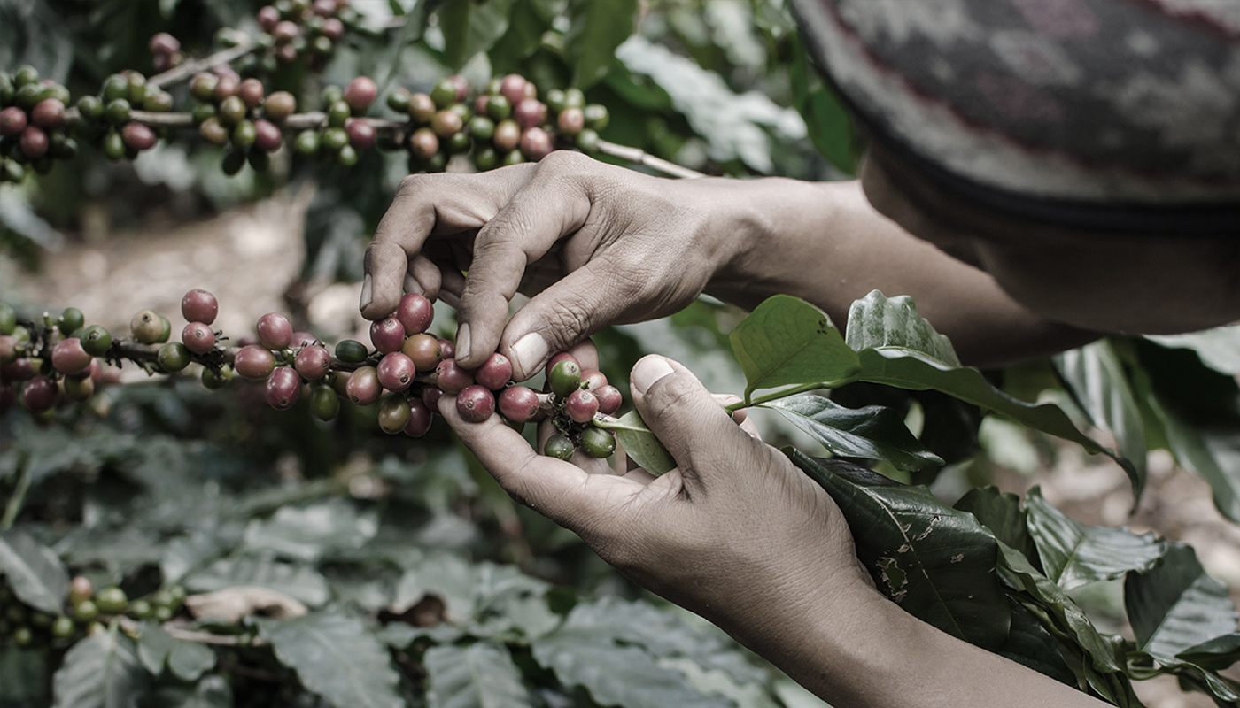
Komer comes through fresh handpicked coffee beans from local coffee farmers with the blessing of fertile soil from the volcanic ash of Mount Merapi. Making Merapi coffee beans have the best quality with a unique and delicious coffee taste.
Challenge
Create a visual display that shows Komer as an established coffee roaster, and communicates that Komer is something fresh and different, but still a roaster you can trust.
Concept
Designing a friendly and approachable visual world for both kinds of audience, while emphasizing aspects of high coffee quality, elegant, strong, and memorable creation.

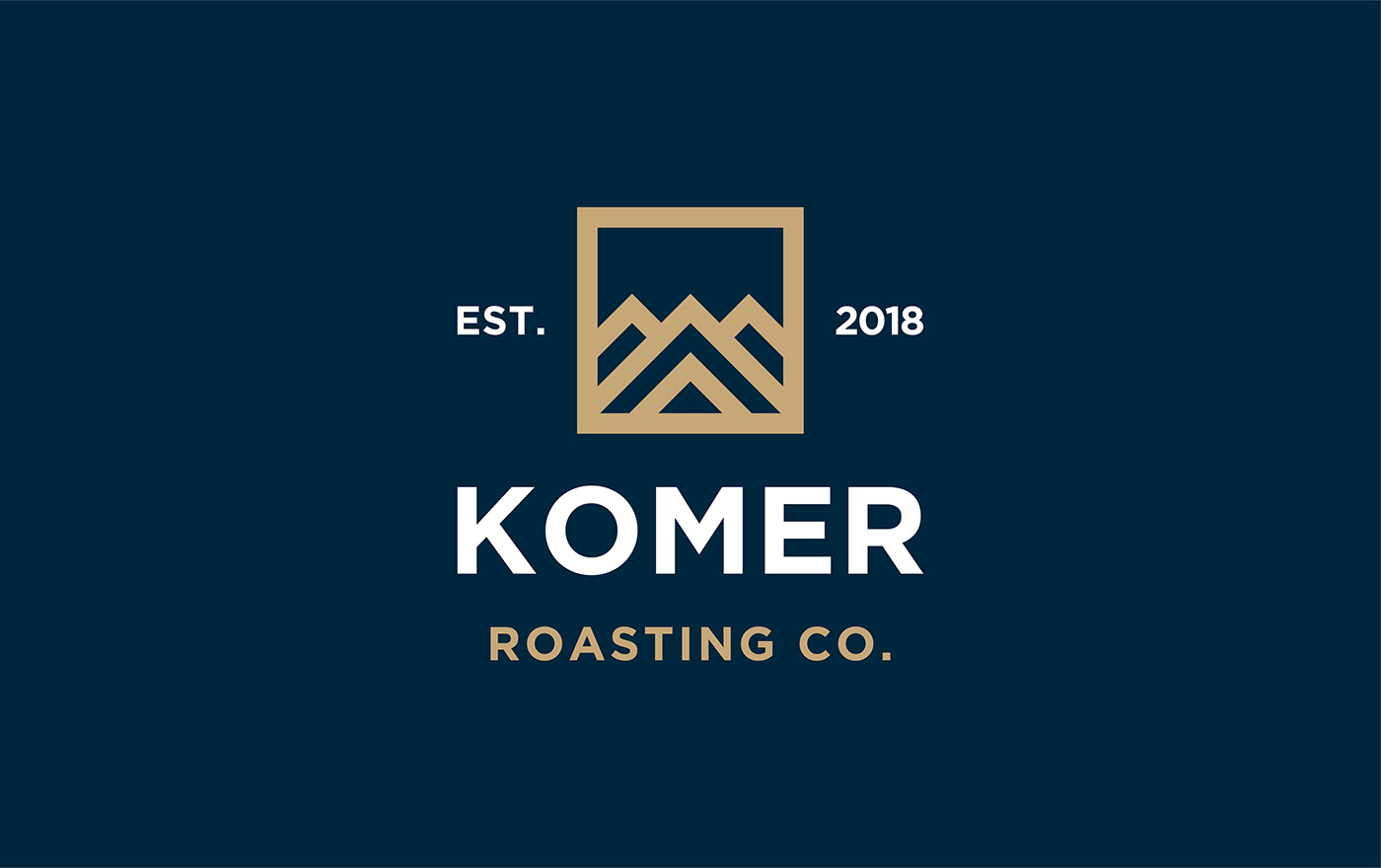
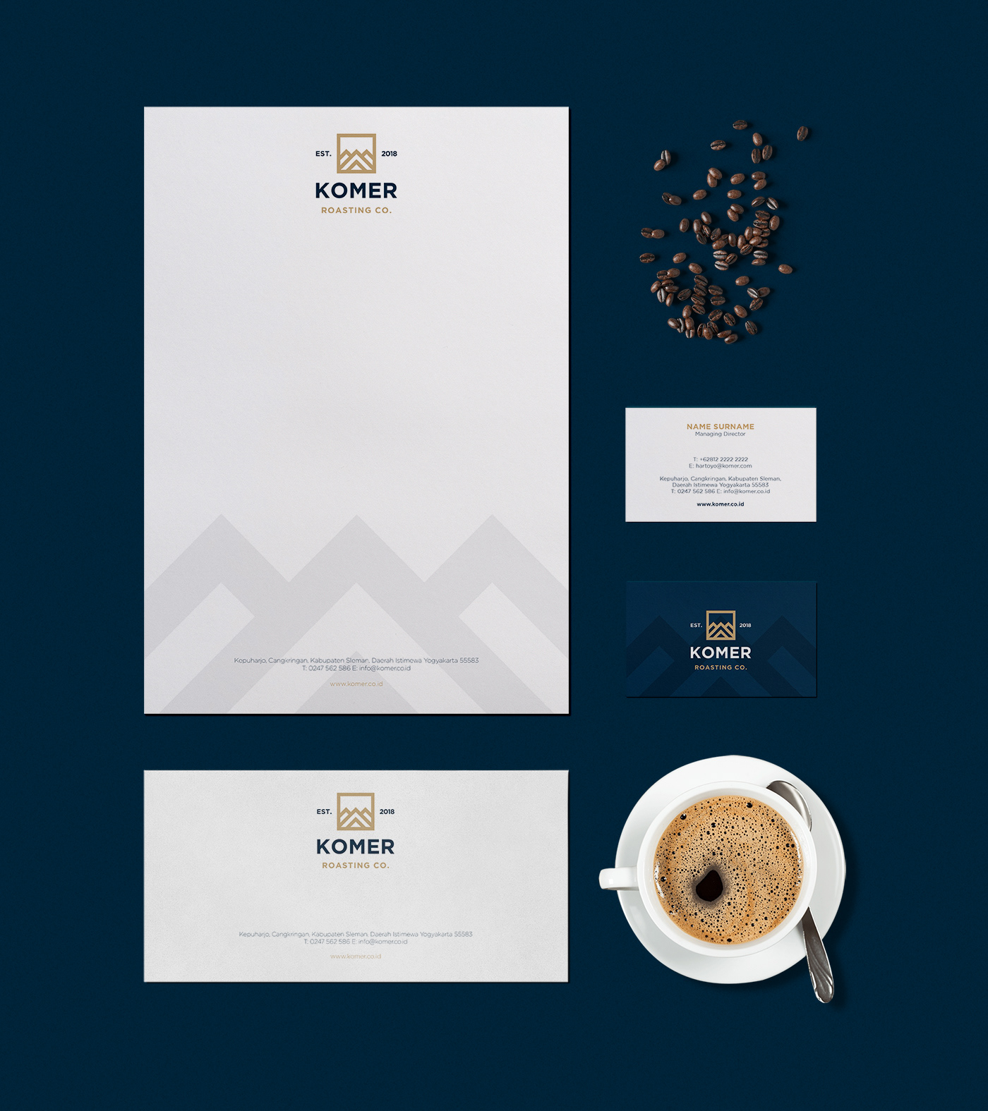
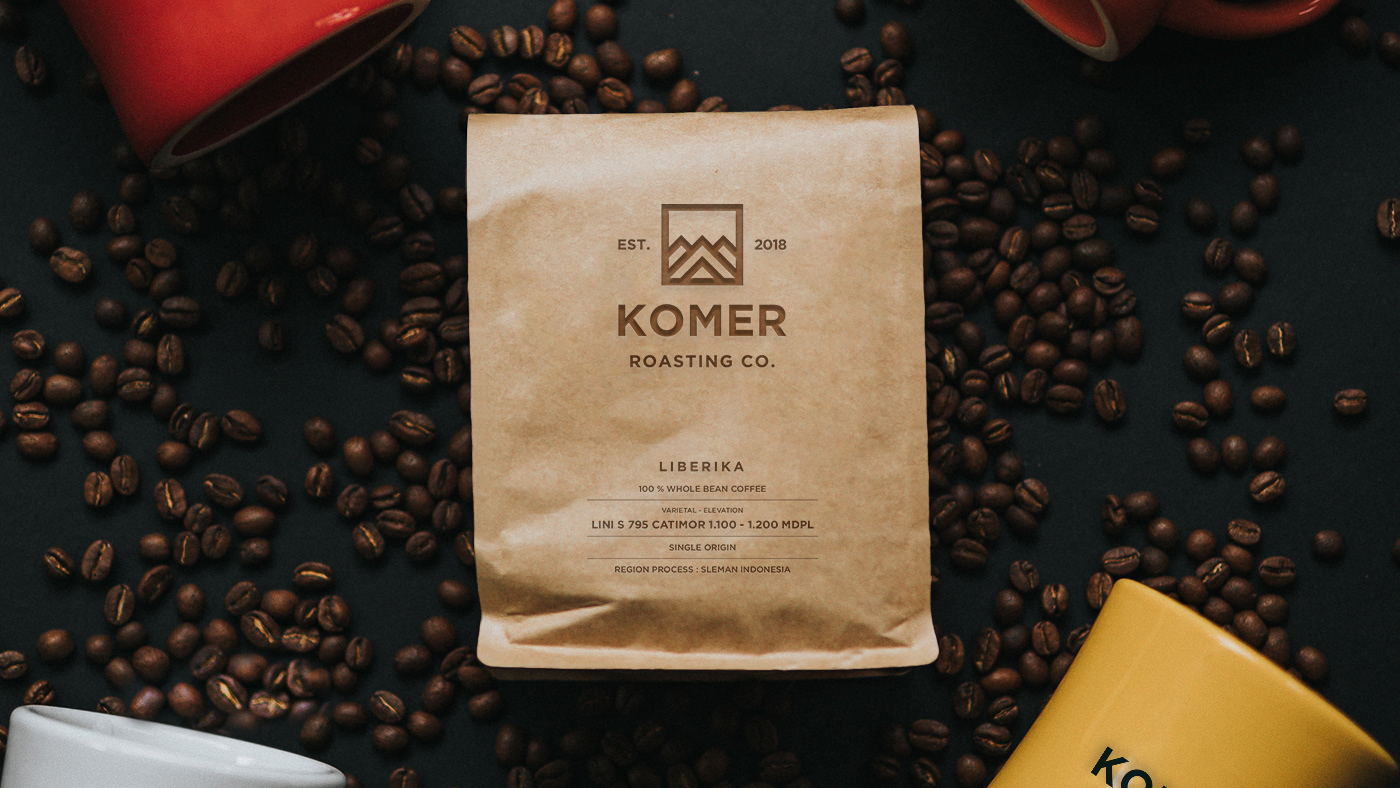
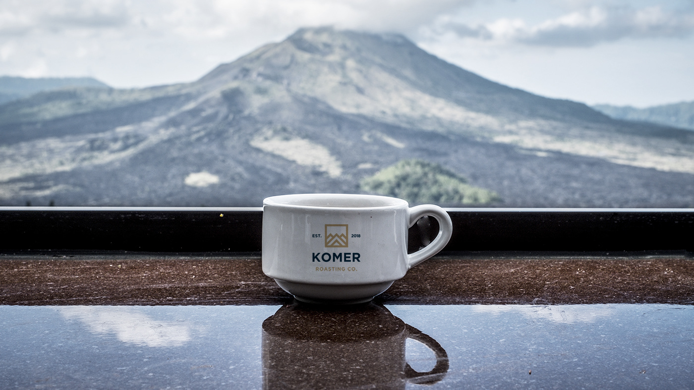
Komer is brand new, without any history or legacy, essential to creating memorable visuals to build its iconic brand and logo. The symbol is the shape of a mountain, which is inspired by the name of the Merapi Coffee company. Its main feature is the triangle as the Comer principle, (company, community and, customer). Dark blue as the main color of the brand makes it stronger and more reliable, with gold as one of the most valuable commodities.
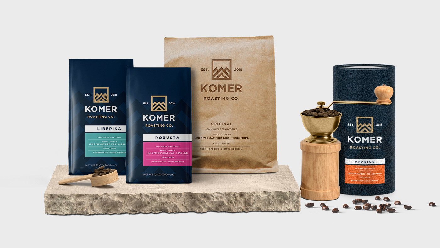
Komer logo melds elements more closely together to form the combination lockup and developed a hand-applied label system that is color-coded by coffee type. This not only helps to differentiate the various products but also gives the brand a bold and colorful shelf look. The
bag itself features blue, with graphic elements to support and reinforce the brand.