GEOMEDIA
Geomedia is a project born in collaboration with a French research laboratory composed by journalistsand geomaticians.
The following project is a wireframe proposal developed during my internship at DensityDesign Lab.
The aim of the project is to create an interface allowing researchers to visualize and study complex data to enable
a deeper comprehension of the topics. Some of the topics the interface will help studying are for example the ebola case,
civil wars and earthquakes. The datasets is composed by articles extracted from newspapers from all over the world talking
about the selected topic.
INTERFACE
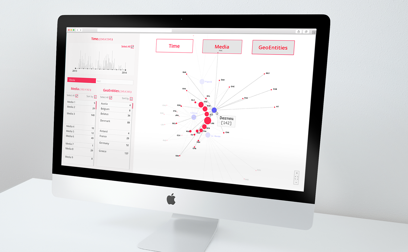
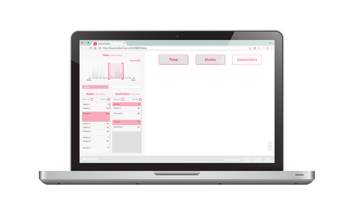
After uploading the dataset, the user will see the main interface. It is composed by two parts: on the right side there
is the ‘visualization’ space, while on the left are collected the filters. The main visualization is the result of user’s selection among
the three kinds of entities defined in the dataset: time, media, and geo-entities (places cited in the articles). Depending on user selection, the application will supply the most useful visual model to make sense of the data. There are indeed seven possible views.

STRUCTURE
Filters, on the left, allows to narrow down the portion of dataset analysed. In the upper left corner, a timeline represents the overall distribution of articles: it allows to select a particular timeframe. Articles are then divided among tagged and non-tagged ones,
allowing the user to focus on the firsts or the laters. Finally, all media and all geo-entities are listed, as well as the number of articles and of citations. Again, the user can use the list to filter media and geo-entities. With ‘select/deselect all’ the user can quickly filter
the dataset. The visualizations are updated in real time according to filters.

--------------------------------------------------------------------------------------------------------------------------------------------------------------------------------

--------------------------------------------------------------------------------------------------------------------------------------------------------------------------------
Is possible to select multiple buttons to combine different parameters with each other:
MEDIA+GEOENTITIES, a network visualization where media are depicted as blue nodes, the color opacity is proportional
to the total number of articles. GeoEntities are represented as red nodes, whose size is proportional to the amount of citations.
MEDIA+TIME, the number of published articles per media over time is represented with a stacked area chart. Each media
is represented as area. On the horizontal axis time is represented, the area width is proportional to the number of articles.
TIME+GEOENTITIES, the number of citation per geoentity over time is represented with a stacked area chart. Each geo-entity
is represented as area. On the horizontal axis time is represented, the area width is proportional to the number of citations.


TIME + MEDIA + GEOENTITIES
With a bump chart, relationships among media and geo-entities are shown over time. Each media is represented as a set of flows.
Each bump char represents a media: on the horizontal axis is represented time, and the most cited geo-entities are represented
as flows. Flows are aggregated and coloured according to continent. To avoid visual cluttering, the least cited geo-entities are aggregated by continent. On rollover, the user can see the punctual value of selected flow. The same interaction on an aggregated
flow (e.g. “Others Asia”) the single countries are listed.


