Yoteq
_
EN
Shifting the lines
_
EN
Shifting the lines
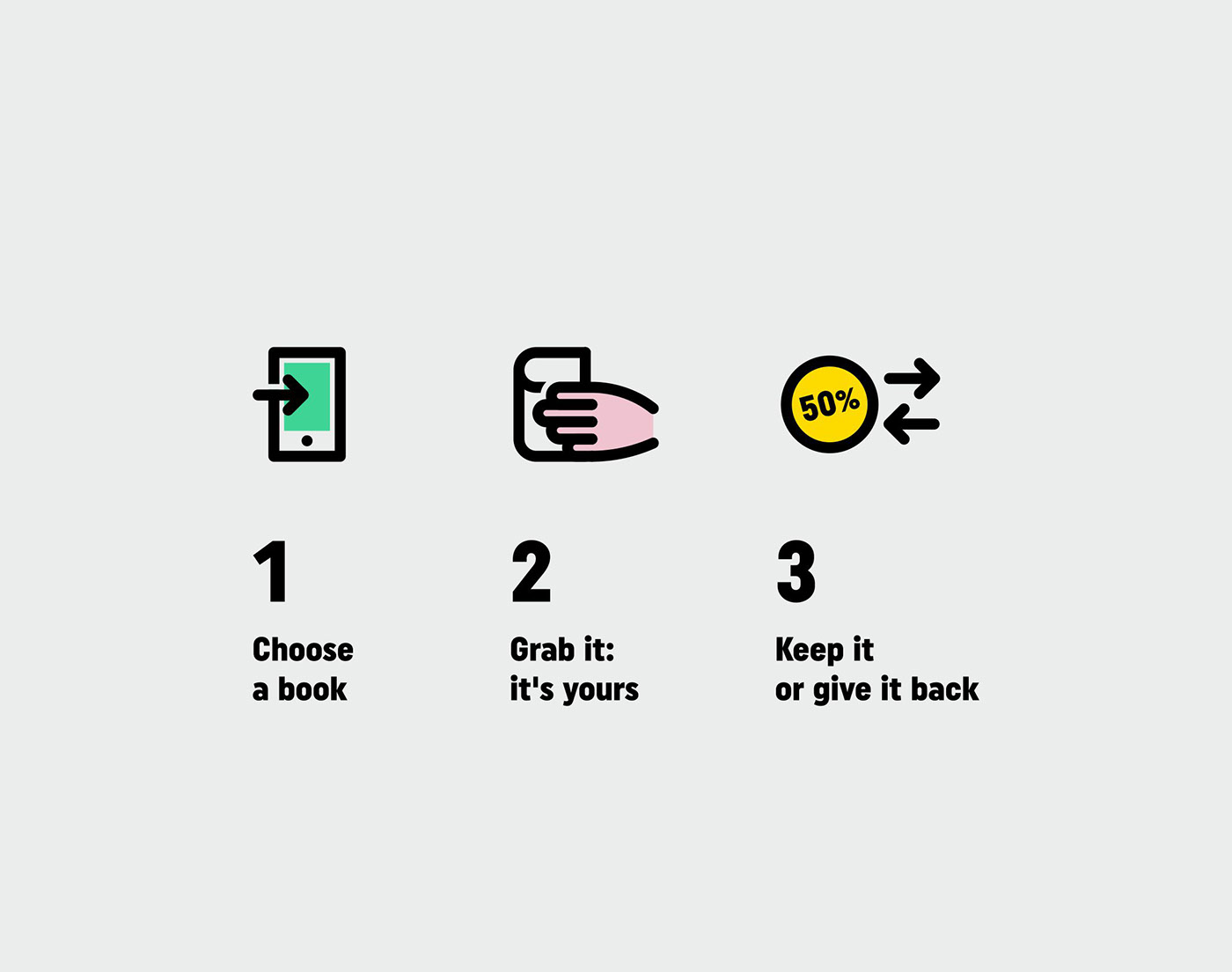
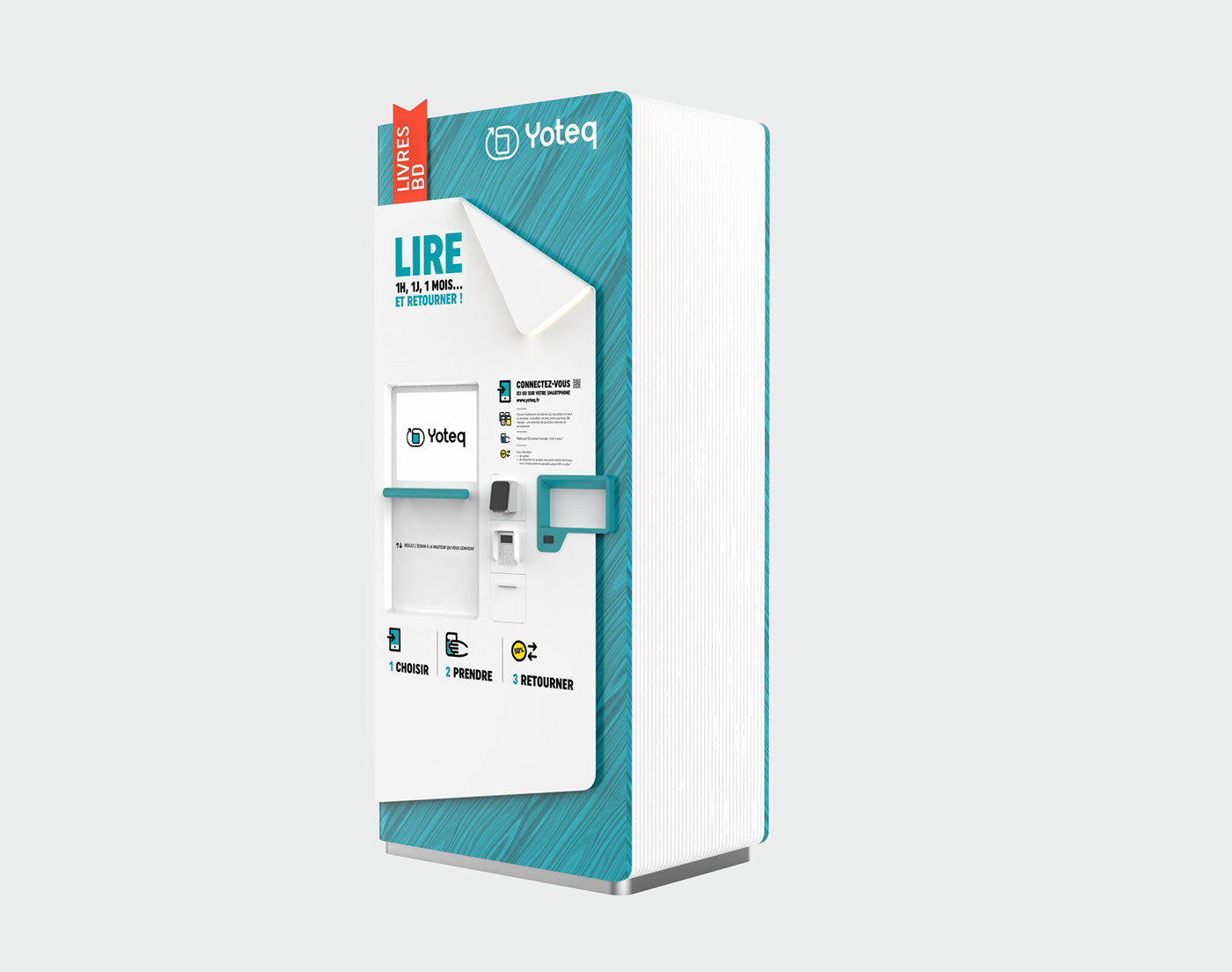
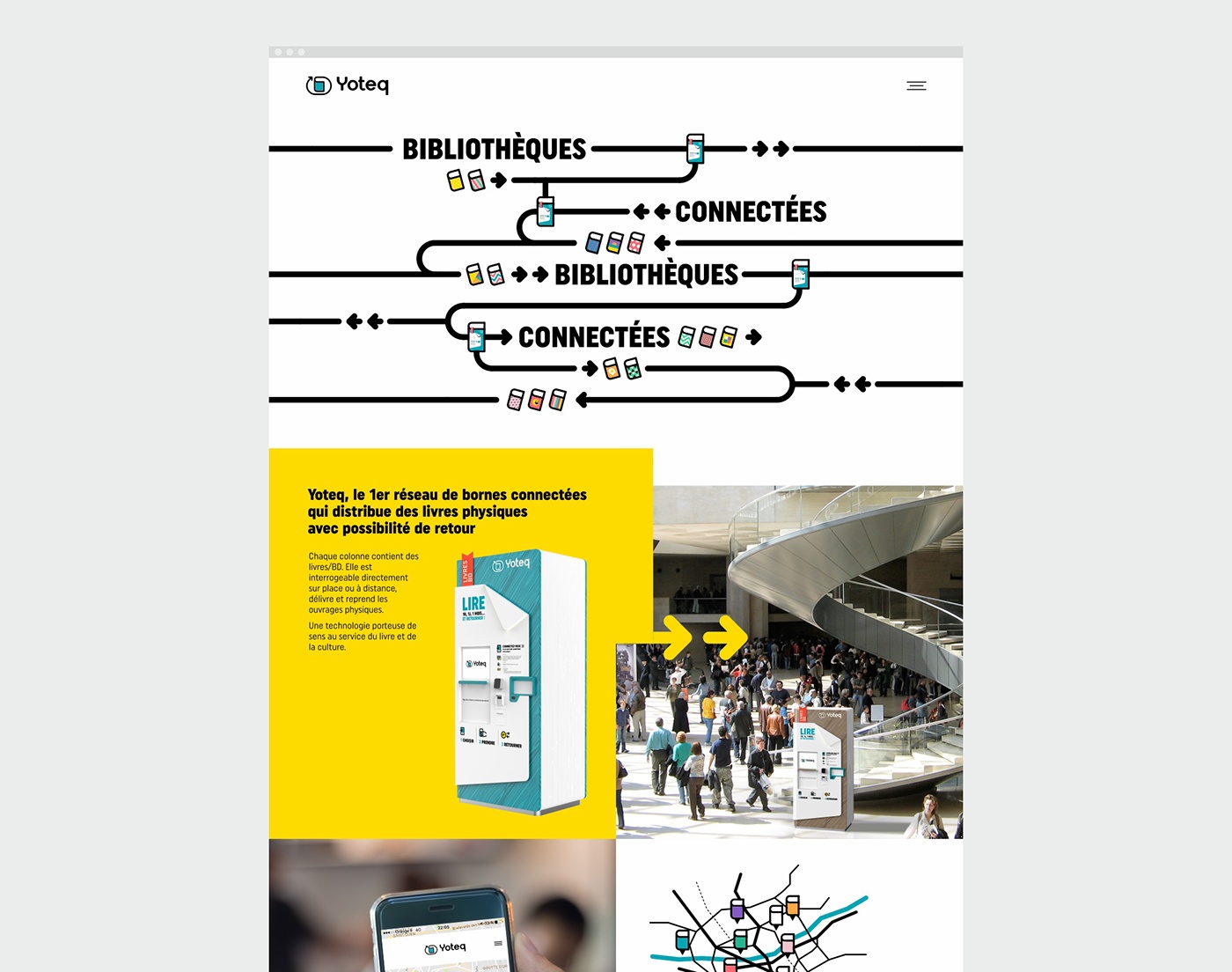
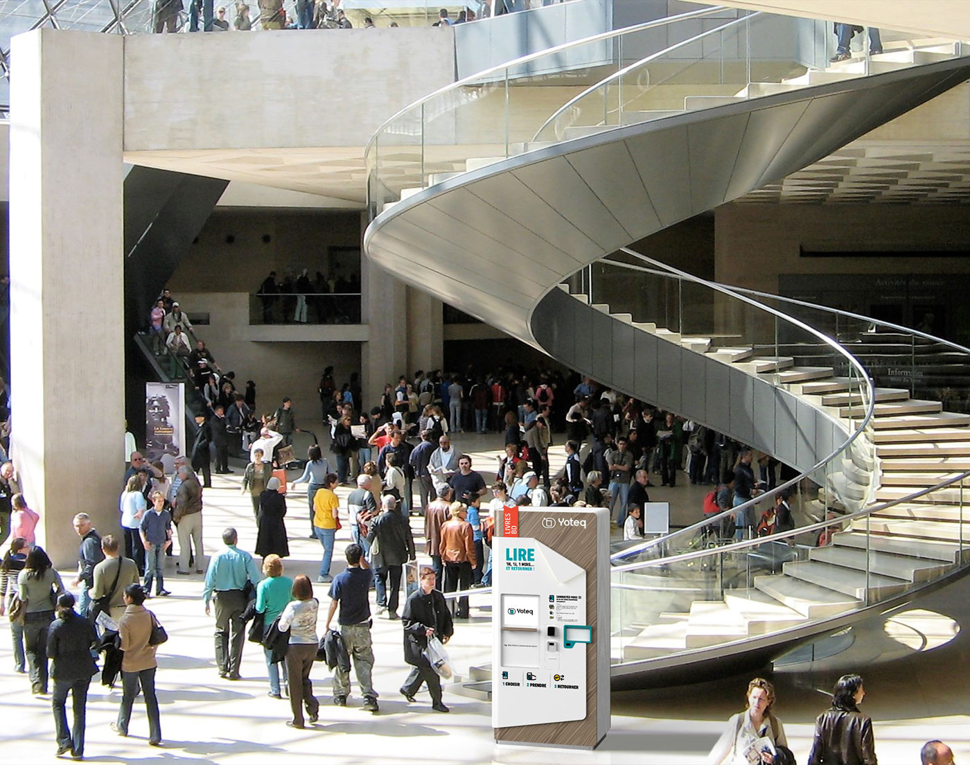
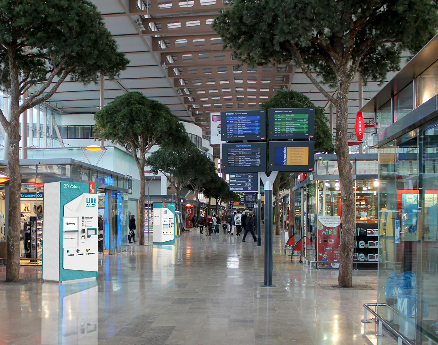
Yoteq is the very first network of connected terminals, which distributes physical books with the possibility of return. The innovative concept is articulated around dispensing columns, each containing nearly 300 books and comic strips, searchable directly on site or remotely, and which make it possible to deliver and take back the items with great simplicity.
Our creative proposal is oriented towards the materialization of bridges between culture and digital uses. Yoteq’s primary vocation being to take the book to places of transit and to simplify its acquisition, we have chosen to go beyond the classic graphic territory of literature and the world of publishing, to offer a visual identity based on simplicity of use, innovation, diversity and access to culture.
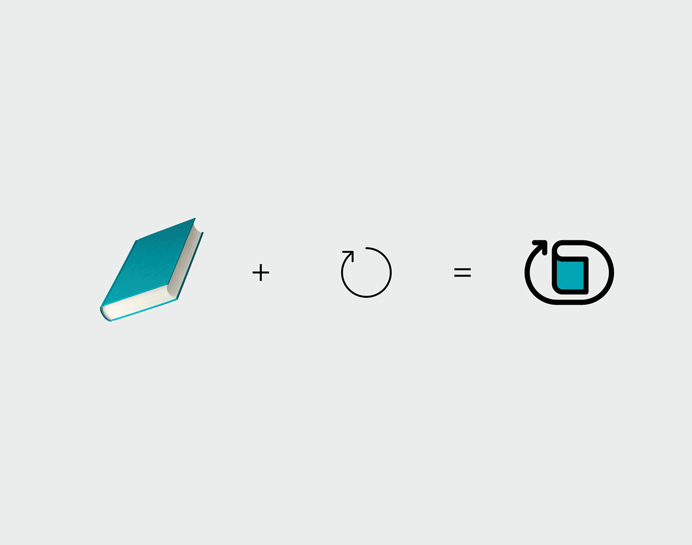
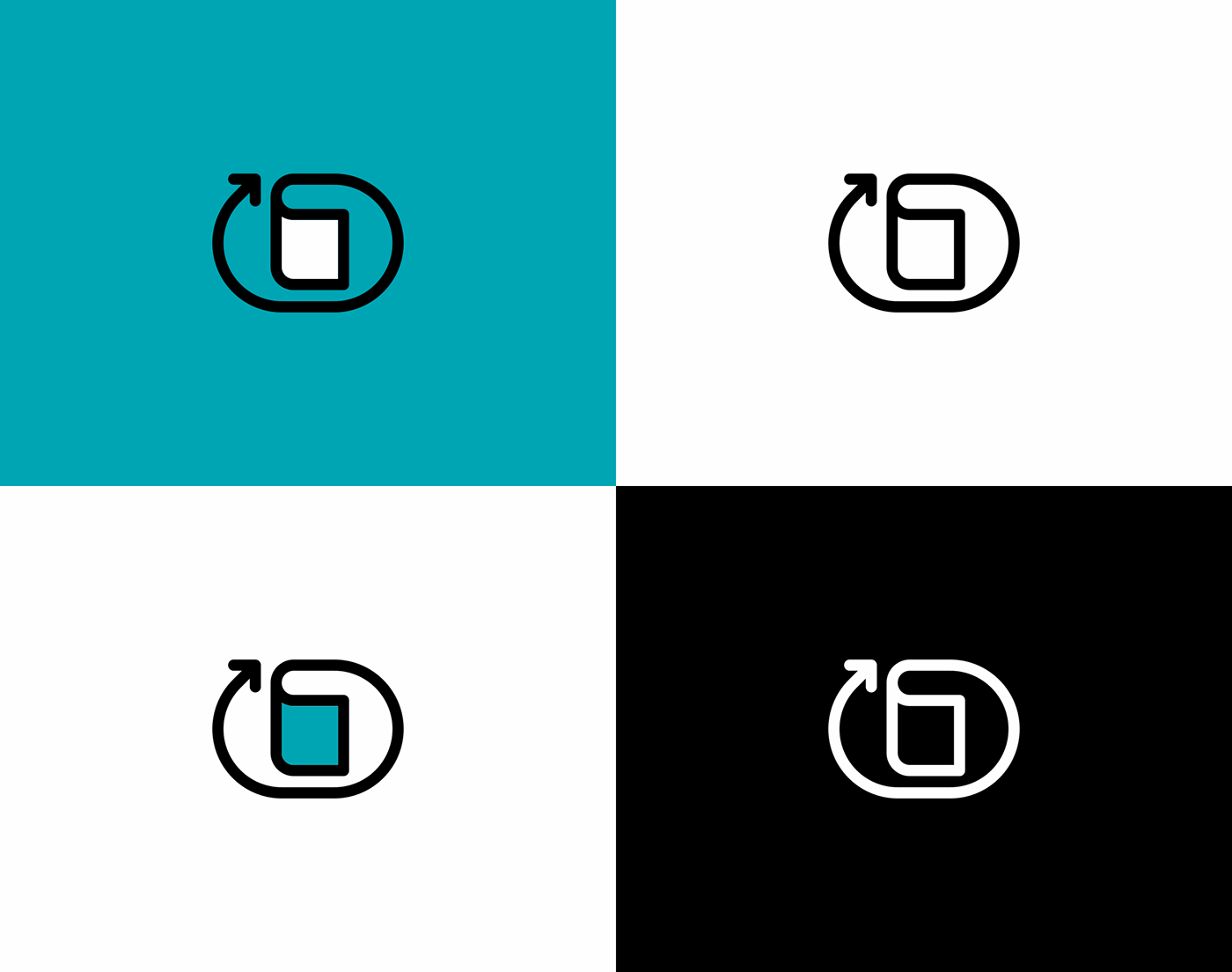
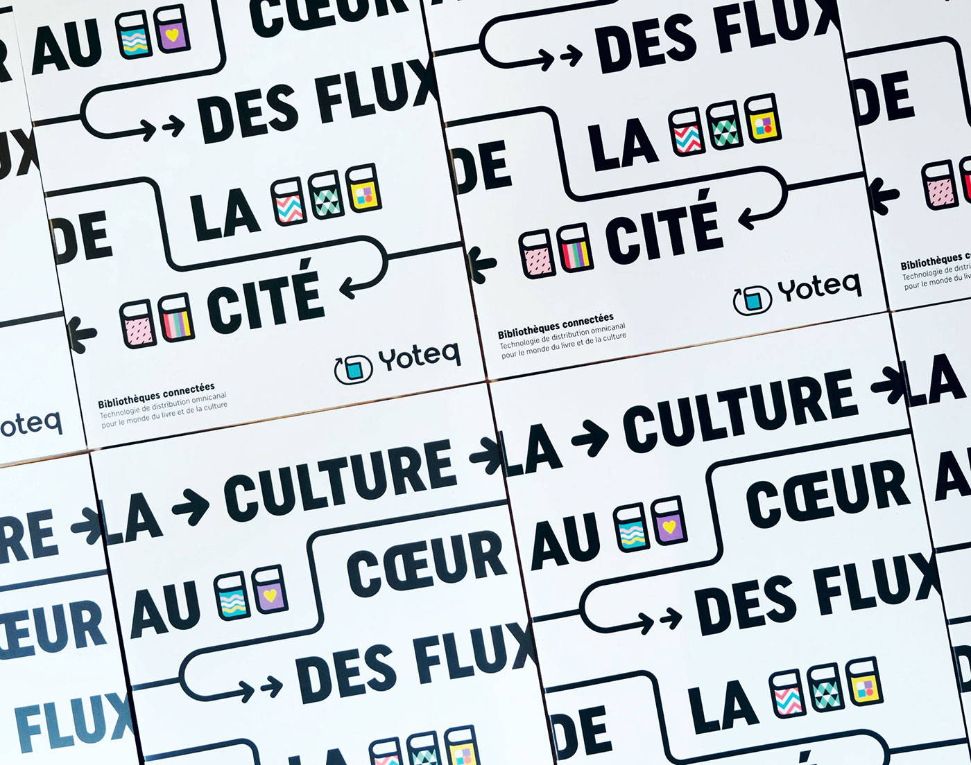
The symbol mixes the edge of a book with an arrow describing a circular route, symbolizing the availability of the book to the public at the very heart of urban flows, but also the possibility of return. We have developed an evolutionary graphic language based on the diversity of literary styles, the renewed pleasure of reading and movement, through bright colours and thick lines. We dressed the terminal in collaboration with product designer Pierre Charrié, designed the brand’s editorial materials, the website and structured the branding for the official launch of Yoteq, which took place at the Paris 2018 Book Fair.
In partnership with the SNCF, the first columns will be deployed in 5 stations in Paris and the inner suburbs before the end of 2018.
_
FR
Faire bouger les lignes
Yoteq est le tout premier réseau de bornes connectées, qui distribue des livres physiques avec possibilité de retour. Le concept novateur s’articule autour de bornes contenant chacune près de 300 livres et bandes-dessinées, interrogeables directement sur place ou à distance, et qui permettent de délivrer et reprendre les ouvrages avec une grande simplicité.
Notre proposition créative s’est orientée vers la matérialisation de ponts entre la culture et les usages numériques. La vocation première de Yoteq étant d’emmener le livre sur les lieux de transit et d’en simplifier l’acquisition, nous avons choisi de sortir du territoire graphique classique de la littérature et du monde de l’édition, pour proposer une identité visuelle basée sur la simplicité d’usage, l’innovation, la diversité et l’accès à la culture.
Le symbole mêle la tranche d’un livre avec une flèche décrivant un parcours circulaire, symbolisant la mise à disposition du public du livre au coeur même des flux urbains, mais également la possibilité de retour. Nous avons décliné un langage graphique évolutif basé sur la diversité des styles litéraires, le plaisir retrouvé de la lecture et le mouvement, au travers de couleurs vives et de lignes épaisses. Nous avons habillé la borne en collaboration avec le designer produit Pierre Charrié, conçu les supports éditoriaux de la marque, le site web et structuré l’ensemble du branding, en vue du lancement officiel de Yoteq, qui a eu lieu au Salon Livre Paris 2018.
En partenariat avec la SNCF, les premières colonnes seront déployées dans 5 gares à Paris et petite couronne avant la fin 2018.