Visual identity for Recla
The brand was founded at the end of 2017 and it is specializing in supporting marketing activities. The main audience are small and medium-sized local companies that would like to support promotional activities using external competences. Recla offers comprehensive promotional activities ranging from concept to implementation and monitoring.
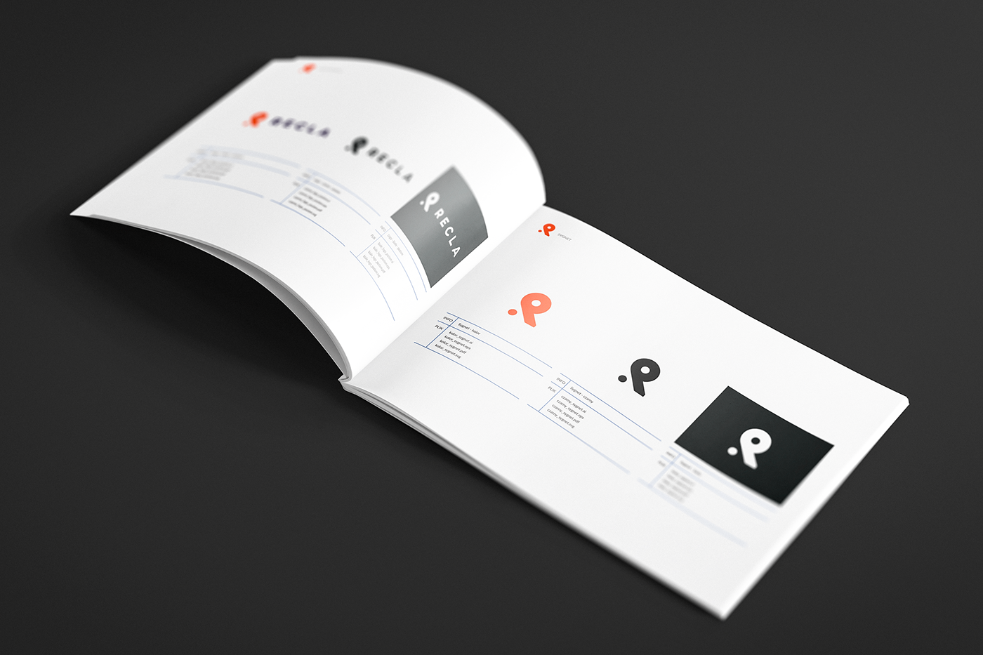
Our team dealt with the development of brand’s visual identification and supported branding processes.

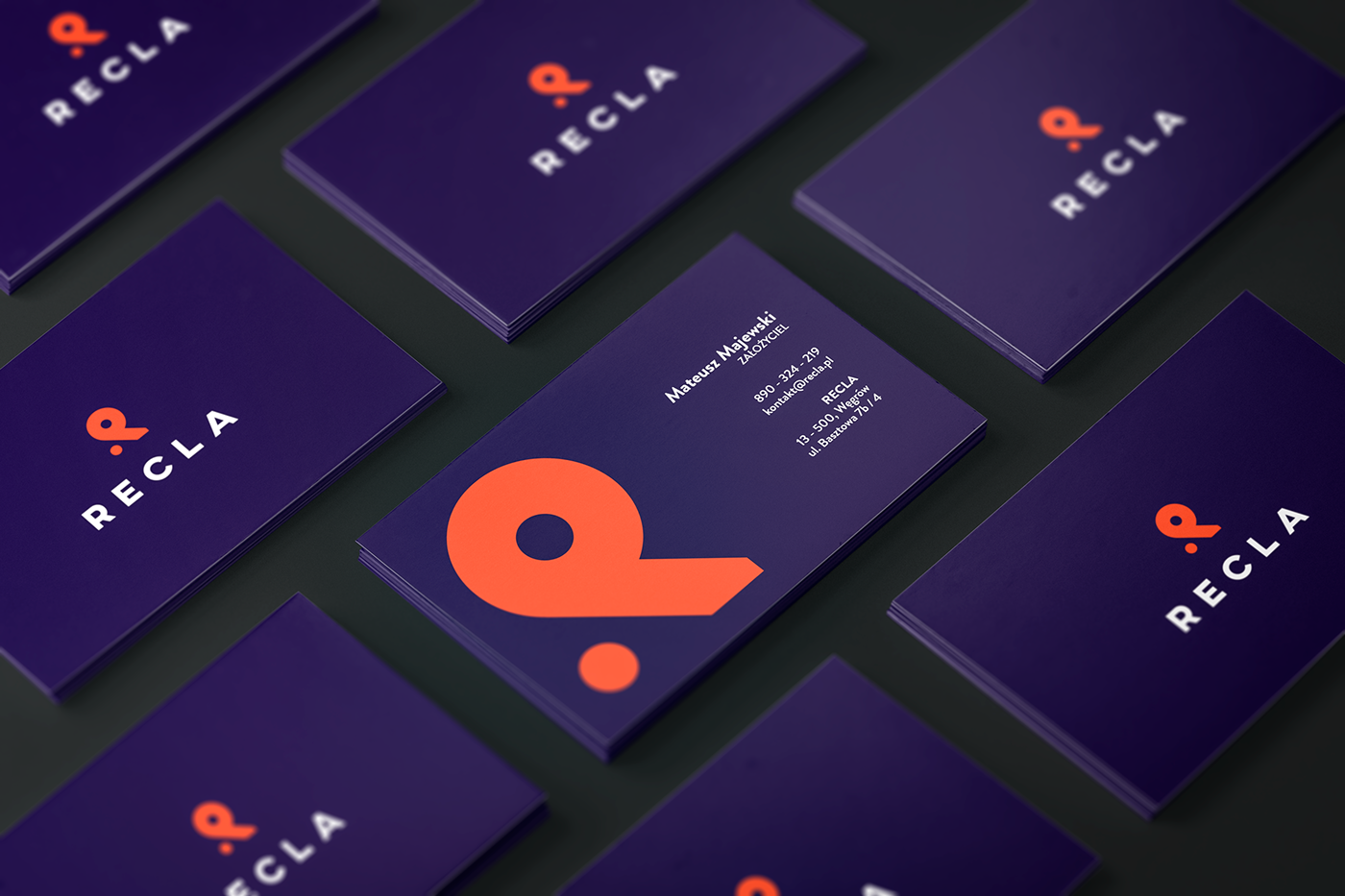
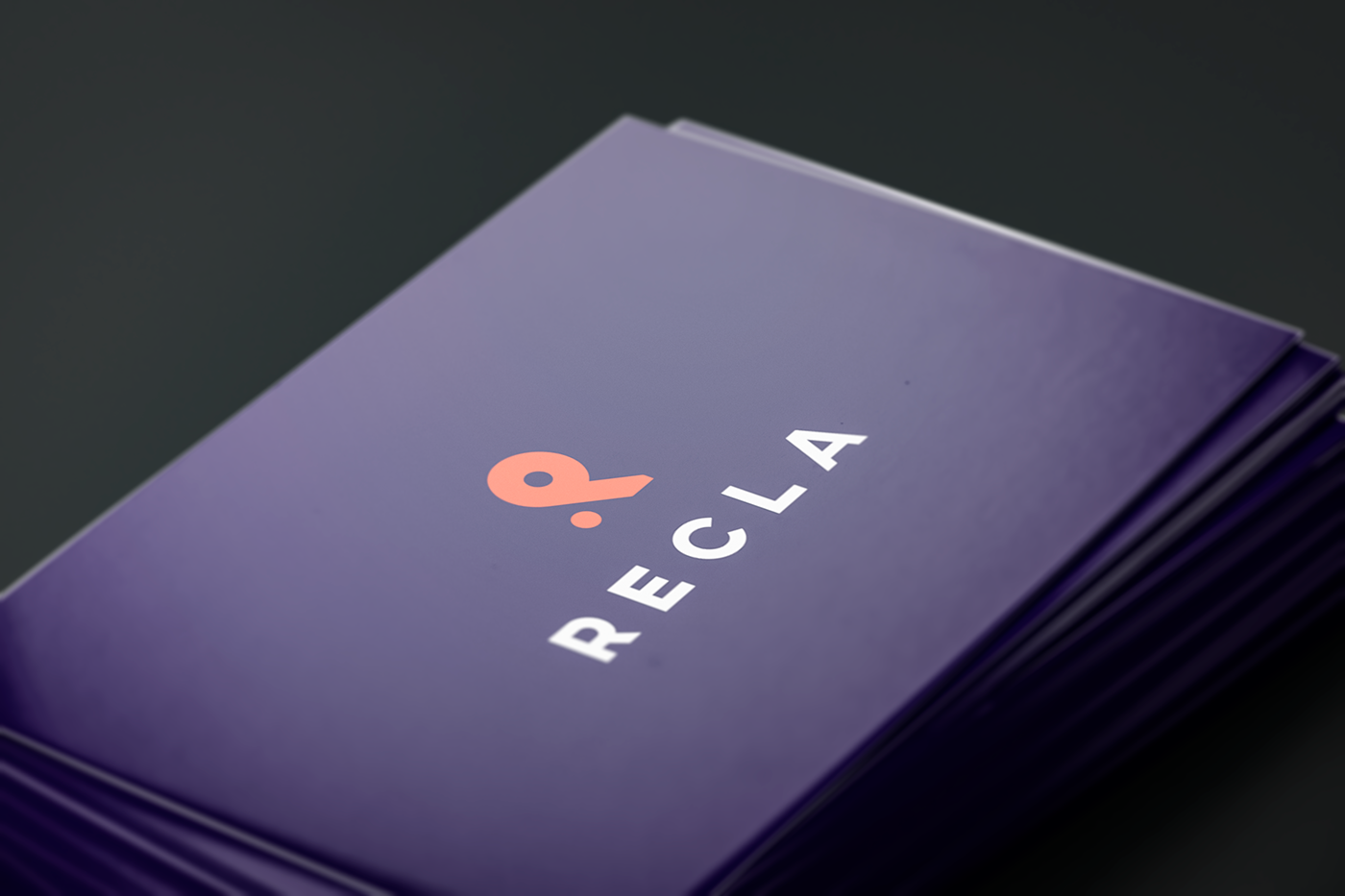
Proposition of the sign
While creating the symbol, the main assumption was to design a simple figure representing the letter "R". This modern form has been supplemented with simple typography. The sign was created with the use of contrasting colors, resulting in giving it a unique character and combining the creation into a whole.

CLIENT:
Recla
DATE:
2017
SERVICES:
VISUAL IDENTITY
DATE:
2017
SERVICES:
VISUAL IDENTITY