Cerveza Ilustrada
packaging illustration
Designing a beer label has always been a dream of mine and I'm so excited to tell you that it finally happened! The guys behind Cerveza Ilustrada gave me complete creative freedom to illustrate these three packages, and boy - was that fun!
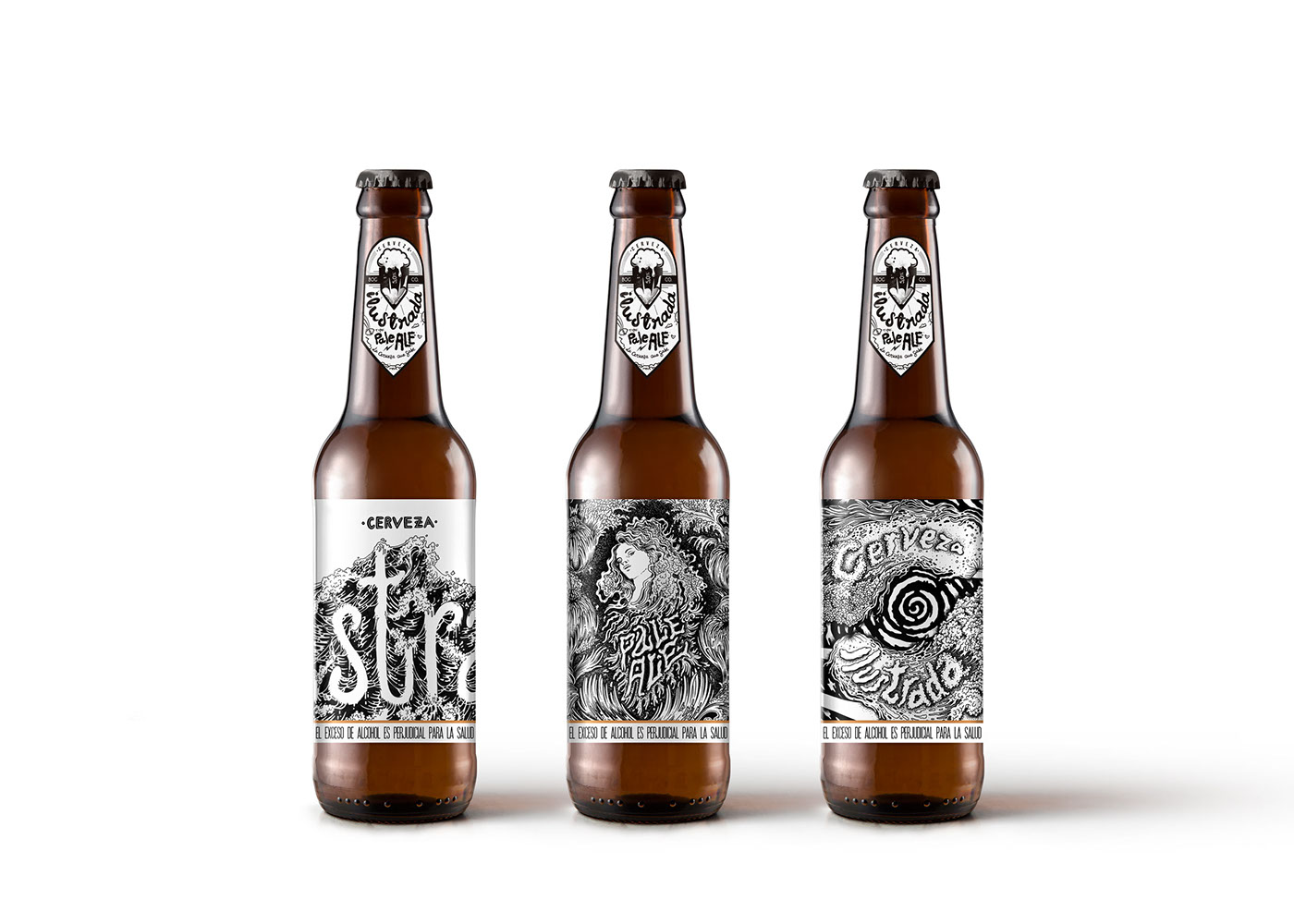
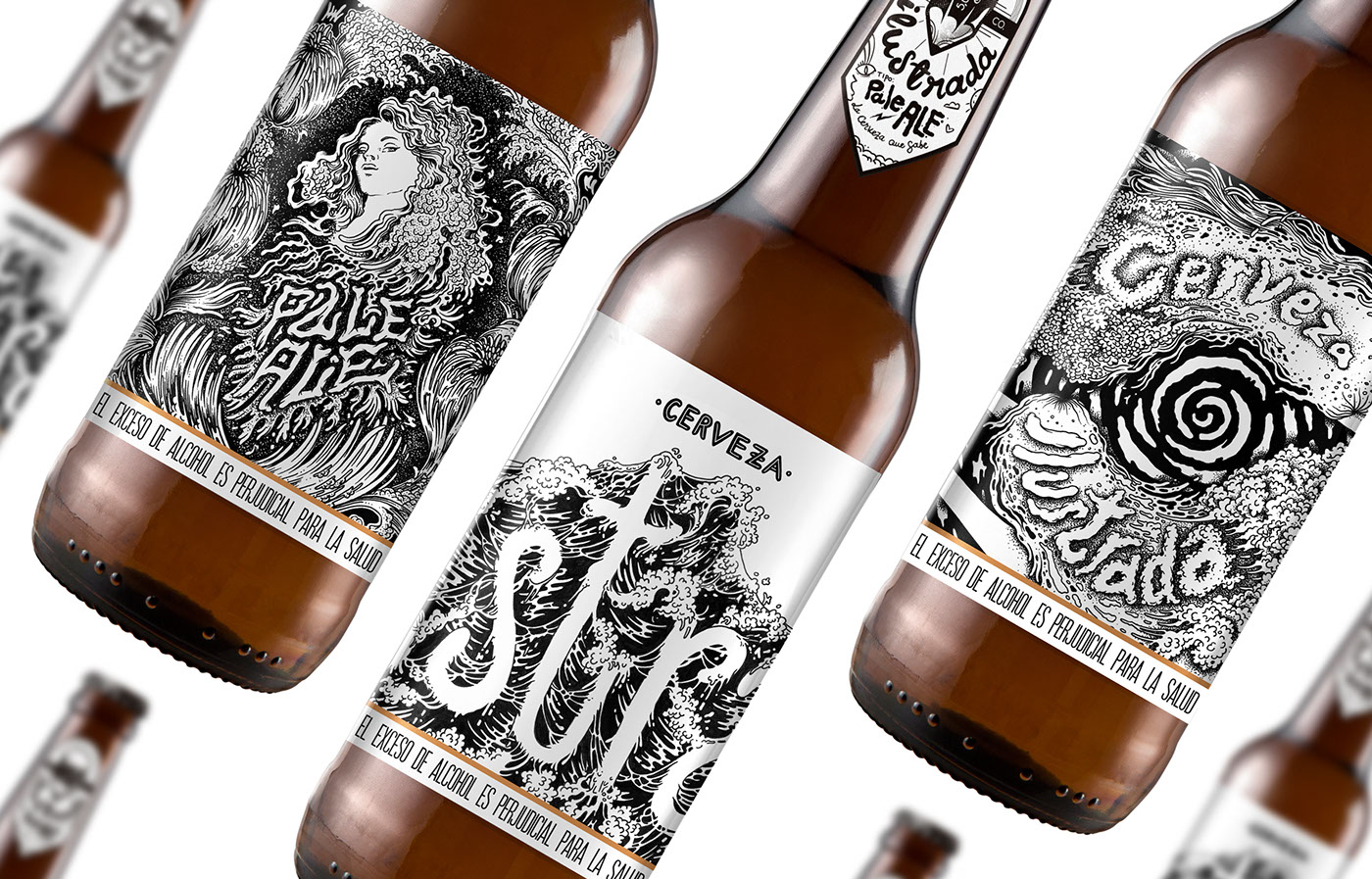
With these designs I wanted to pay tribute to the product itself - beer, and make it the hero of the illustration. So all of the three designs represent something made by... beer.
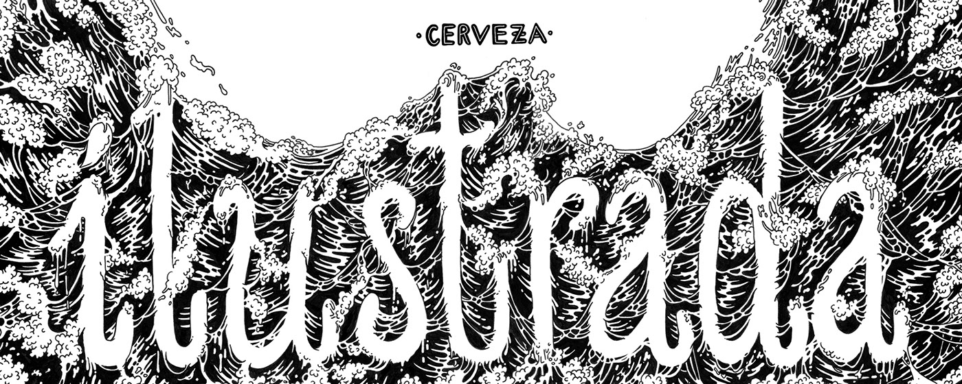

The first design is inspired by Japanese folk illustration and features a sea of beer and foam spelling out the second part of the name of the brand. Not seeing the whole word at a first glance makes you rotate the bottle to read all the letters, thus offering you the opportunity to spend more time looking at the illustration.

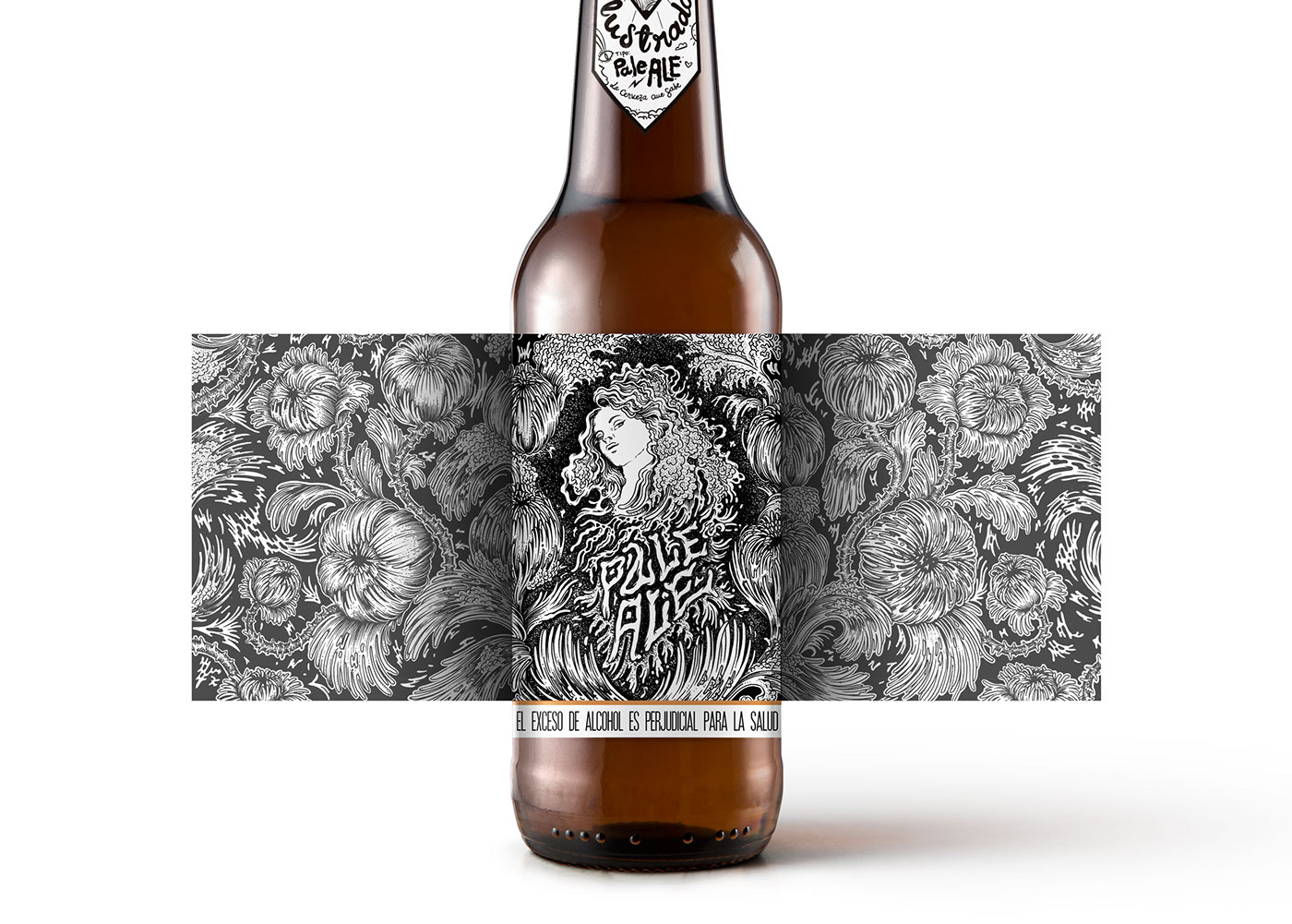
This option was inspired by romantic art nouveau posters from artists like Alphonse Mucha, and represents a sumptuous beer goddess with hair made out of what starts like hair, turns into beer foam, and ends like splatters of beer spelling out the style of the product: Pale Ale. The goddess is surrounded by an array of hops florets made out of... beer.

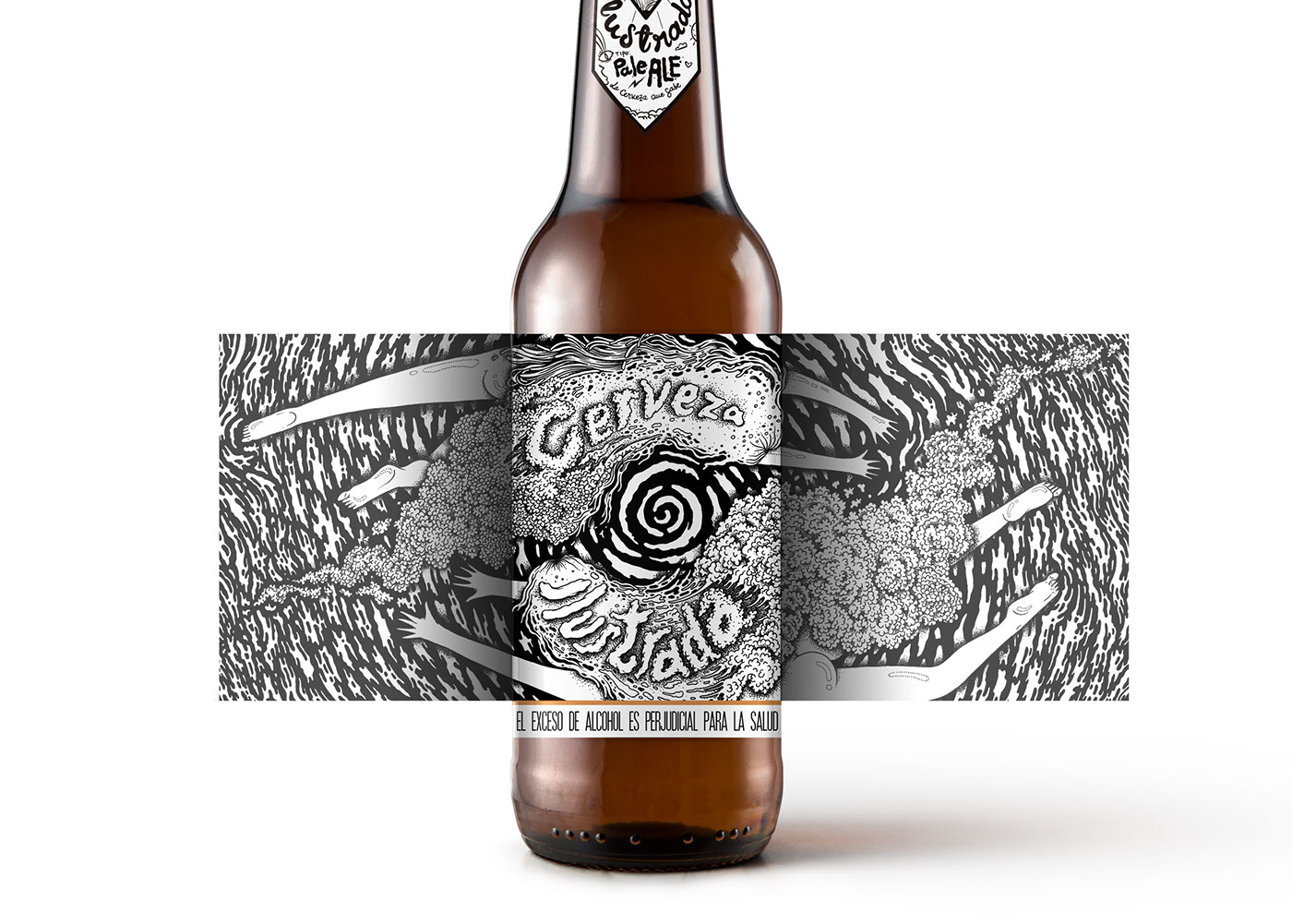
And for the third and final design we are looking at two beer muses - two cheeky little creatures that live in your brew and swim around to make it extra bubbly. One can't fail to notice that their hair is made out of... you guessed it - beer, spelling out the name of the brand in foam.