


CHANG TVC "Lamiat" project
illustration & visualization concept design
For this project i'm working as art director and visual artist illustrator
Credits
Agency : Iris Bangkok
Production house : Phenomena Bangkok
Director : Satit Kalawantavanich
Animation team : YGGDrazil Group Co.,LTD
illustrator : Chatchanok Wong
And many more staffs we couldn't thank you enough

"Lamiat" in Thai "ละเมียด"; gently ; softly ; tenderly
Task:
We want everyone who sees this advertising, to look at their next Chang beer differently.
Appreciating the La Miat that goes into every bottle which the story behind every bottle of Chang come from delicate process and carefully selected every ingredients for the best.
Idea:
Nothing is more uniquely Thai than La Miat. So using hand drawn stop-motion animation, we want to bring the different elements of the Chang logo to life, to tell a story about the La Miat that goes into brewing Chang.
STORYBOARD
The idea of story originally came from logo.
We start from the bottle packaging and represent all 4 main ideas from CHANG logo
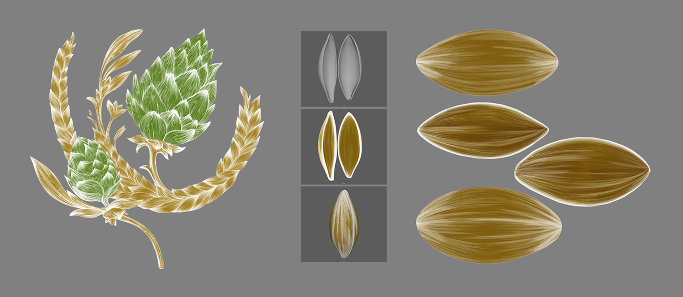
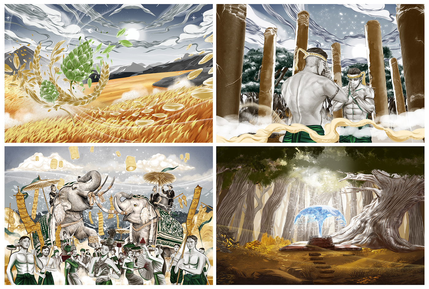
Craftsmanship ; focuses on the hops symbol as it bursts into a thousand leaves. A barley plant comes into view and it bursts into a thousand of seeds too. A gust of wind collects the leaves and seeds, and mixes them together in a twirl. Represent that CHANG carefully selected every good ingredients
Respect ; The twirl of wind transforms into a Muay Thai fighter wearing a mongkol, squaring up to an opponent in a ring. They look posed to fight, but instead simultaneously change poses and respectfully bow to each other.
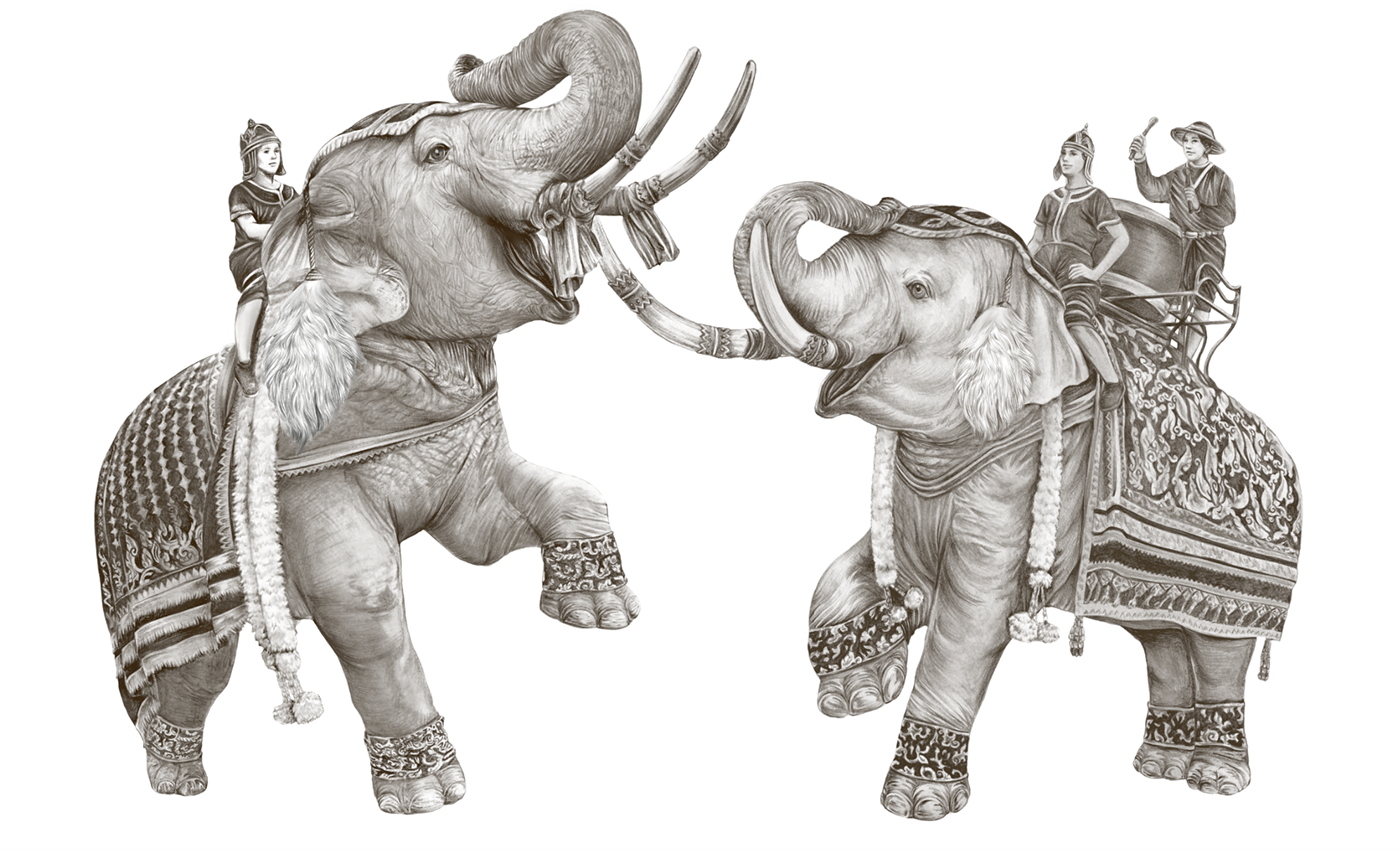
Harmony ; two traditional Thai war elephants mounted by ancient warriors, salute each other. The details of the warriors and elephant’s chatras dissolve, as the warring elephants solidify, becoming the white Chang Elephants.
Refreshment ; Go past traditional lush greenery, jagged mountains and spectacular waterfalls before reaching a water well. Water sprouts from the well up into the sky. The water solidifies into the fountain icon at the top of the label.

TYPOGRAPHY DESIGN
For typography design I'm working as art director and calligraphy designer is Sorravis Prakon
Together we worked through process of quite sketches design but end up as adaptation of client's company typeface
and add some sense of Thai elements instead.

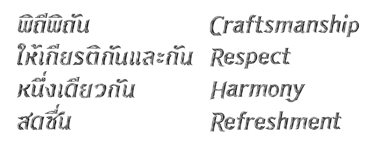
Selected style finalize version

Finishing typography design in animation
Visual design & illustration process
From first brief and visual sketches of storyboard, i have to come up and stylize design to use in print version and animation. Working together with the director ; Satit Kalawantavanich and YGGDrazil animate team.
The main key visual was 4 parts according from earlier subject.
Craftsmanship - Respect - Harmony - Refreshment
From Key visual process, animation team develop the animatic guide

focuses on the hops symbol as it bursts into a thousand leaves. A barley plant comes into view and it bursts into a thousand of seeds too. A gust of wind collects the leaves and seeds, and mixes them together in a twirl.
Represent that CHANG carefully selected every good ingredients

From first draft / some variation of style / finalization
3D mapping skin from illustration
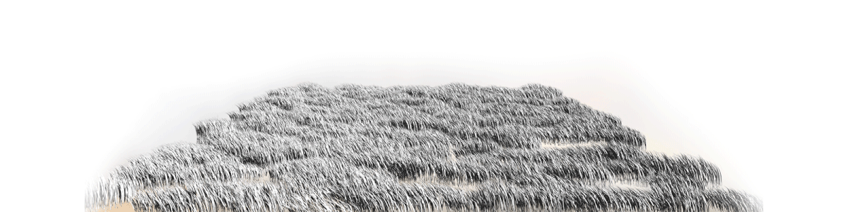
Grasses from animatic

Finalize key visual 01 - Craftsmanship


The twirl of wind transforms into a Muay Thai fighter wearing a mongkol, squaring up to an opponent in a ring. They look posed to fight, but instead simultaneously change poses and respectfully bow to each other.

From first draft / some variation of style / finalization

Reference of Muay Thai from Tony-Ja official Ong-Bak movie

3D mapping skin from illustration
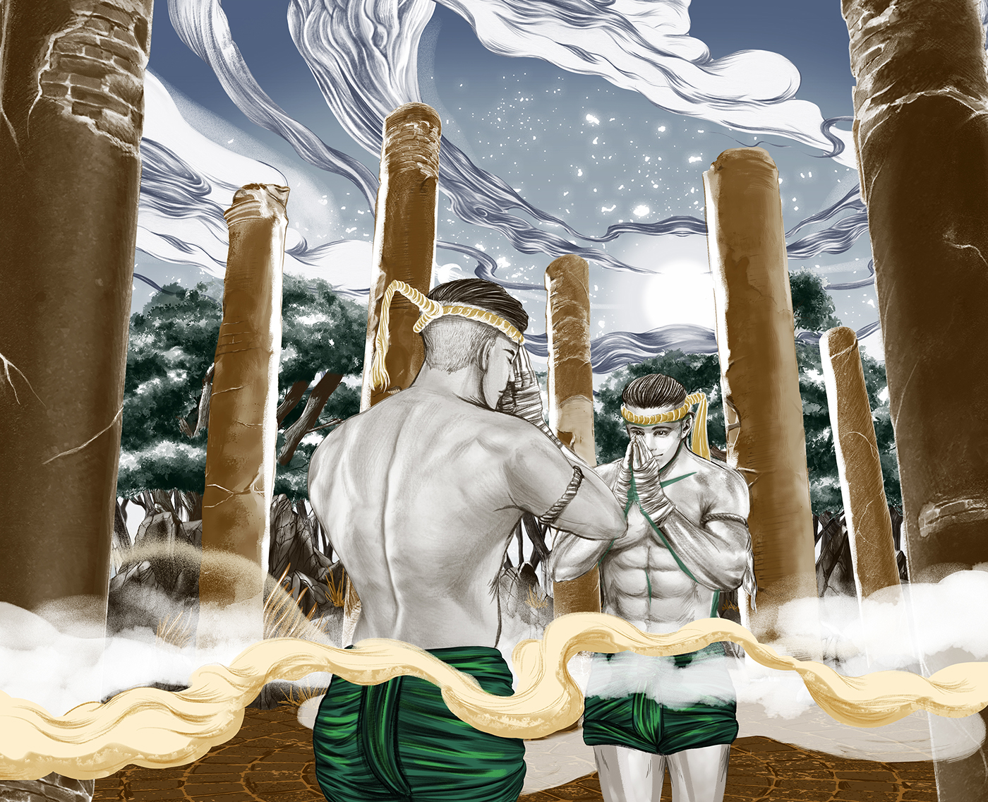
Finalize key visual 02 - Respect


two traditional Thai war elephants mounted by ancient warriors, salute each other. The details of the warriors and elephant’s chatras dissolve, as the warring elephants solidify, becoming the white Chang Elephants.
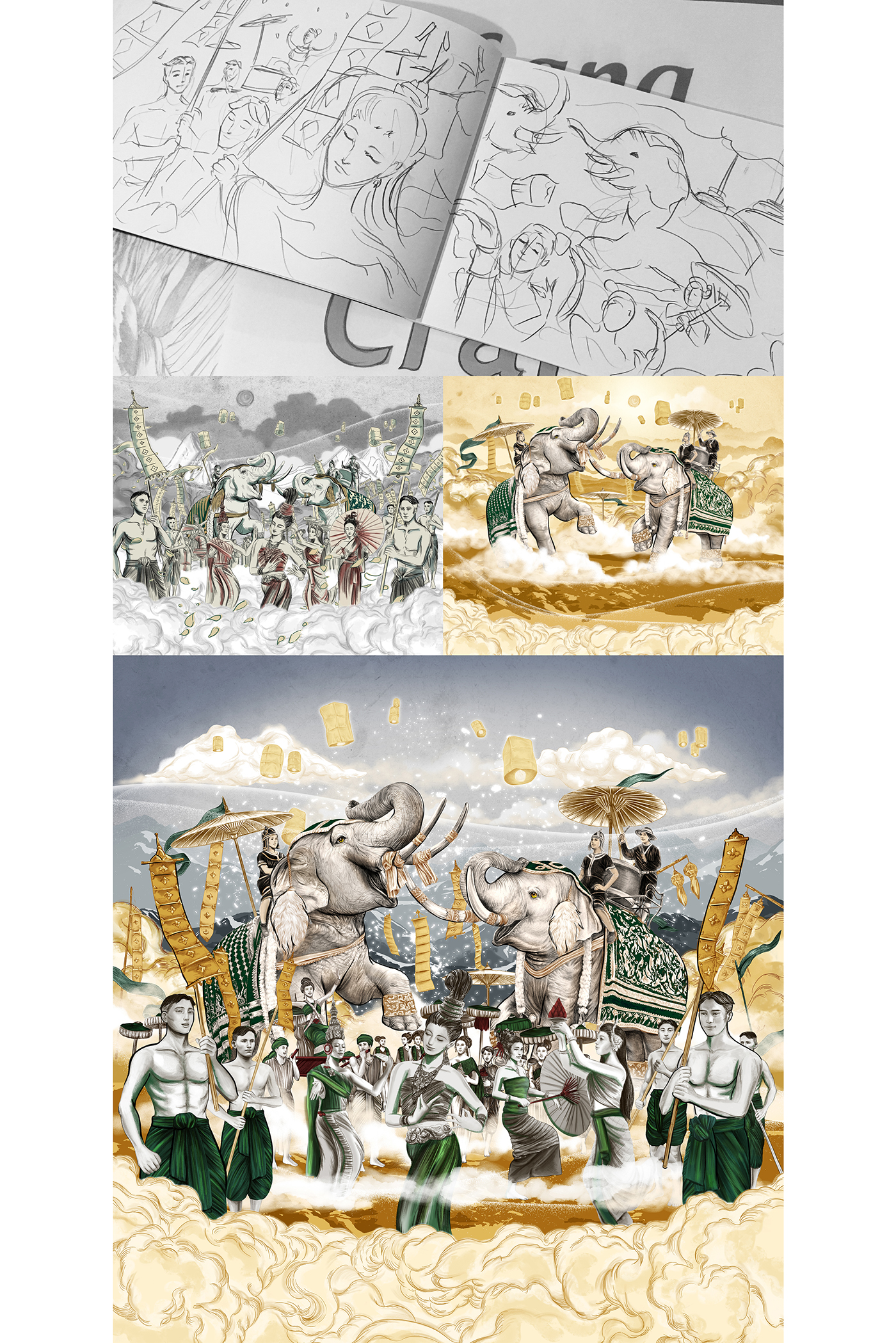
From first draft / some variation of style / finalization

3D mapping skin from illustration
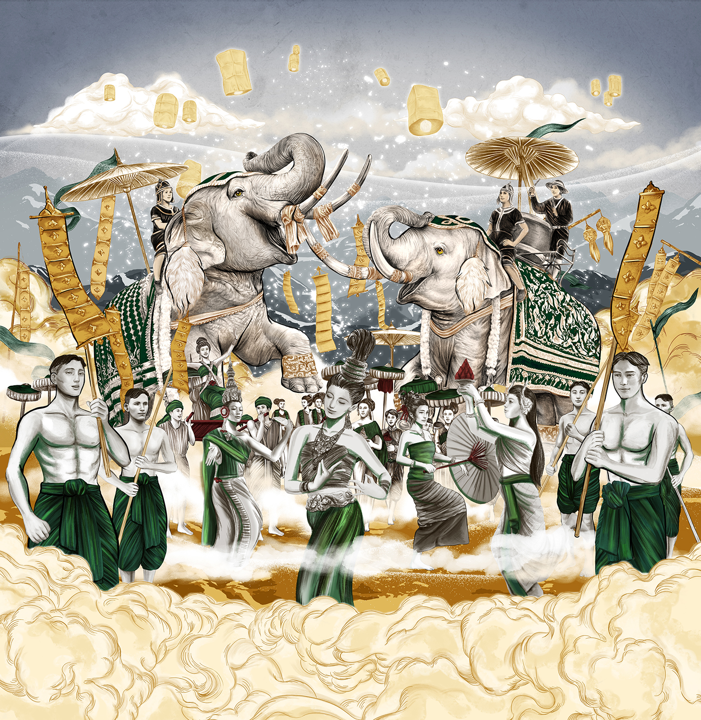
Finalize key visual 03 - Harmony


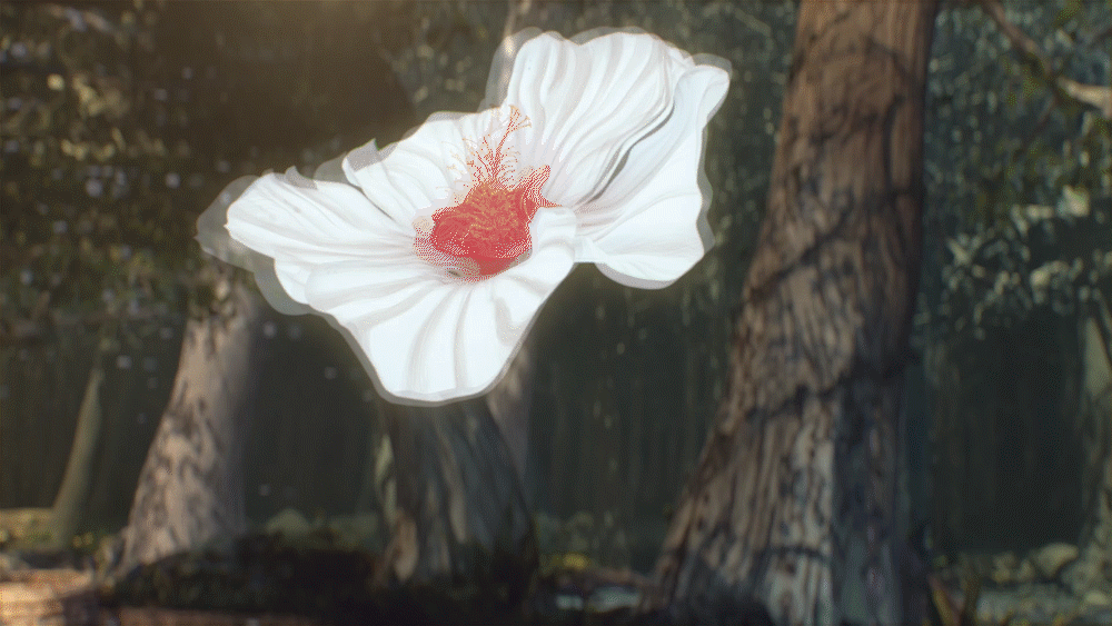
Go past traditional lush greenery, jagged mountains and spectacular waterfalls before reaching a water well. Water sprouts from the well up into the sky. The water solidifies into the fountain icon at the top of the label.

From first draft / some variation of style / finalization
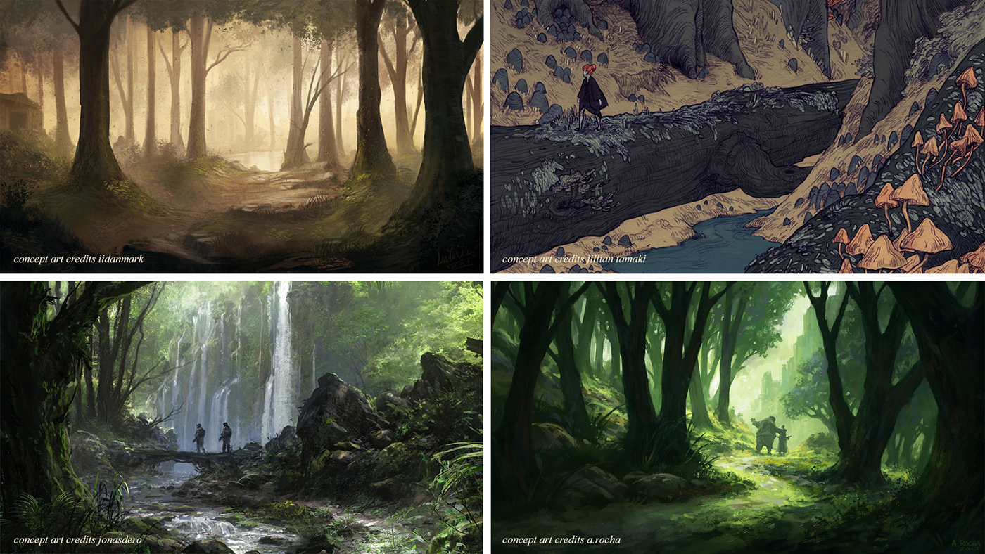
For this scenery, we study light and texture from various concept art design to find the way represent the well in the forrest.

3D mapping skin from illustration
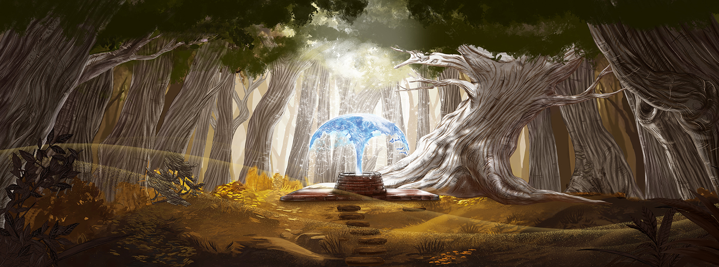
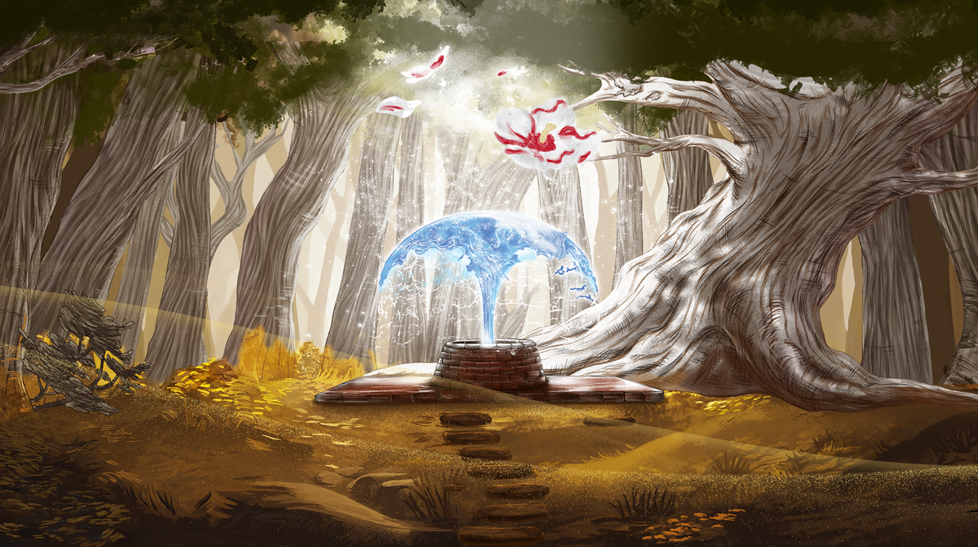
Finalize key visual 04 - Refreshment
All key visual design
It's been a pleasure working with great people as a team.
Together, we carried this project to the end and meet the expectation of client.
Thank you "CHANG" for giving us the opportunity.
Production house team, Animation team also my junior illustrators team.


